Detailed explanation of how to use CSS bubble box
气泡框(或者提示框)是网页中一种很常见的元素,大多用来展示提示信息,如下图所示:

拆分来看,形如这种气泡框无外乎就是一个矩形框+一个指示方向的三角形小箭头,要制作出这样的气泡框,如果解决了三角形小箭头就容易了。一种方法就 是制作这样一个三角形箭头的图片,然后定位在矩形框上。但这种解决办法在后期更改气泡框会很不方便,可能每修改一次气泡框都要重新制作一个三角形小图标。 如果我们能够直接用HTML和CSS代码实现这样一个三角形小箭头一切都迎刃而解了。
1、把div的width和height都设为0,四边都形成三角形。
# test{width:0; height:0; border-width:75px; border-style:solid; border-color:#09F #990 #933 #0C9;}

2、在主流浏览器中检测一下,发现IE6中存在一个小问题,上下边能形成三角形,左右两边仍然还是梯形。

解决:把div的font-size和line-height都设为0的,此时,div的四边在IE6下都能形成完美的三角形。
#test{ width:0; height:0; border-width:75px; border-style:solid; border-color:#09F #990 #933 #0C9; font-size:0; line-height:0;}

3、我们只需要其中的一个三角形,那么只需要将其他三边的color设置为透明或者跟页面背景一样的颜色,就能模拟出一个三角来,推荐将其他三边颜色设置为透 明,即color的值为transparent,如果其他三边颜色跟页面背景一样,虽然视觉上只能看到一个三角,但背景颜色一旦改变,其他三边颜色也要随 之改变。
#test{ width:0; height:0; border-width:75px; border-style:solid; border-color:#09F transparenttransparent; font-size:0; line-height:0;}

4、在IE6下transparent无效,其他三边被设置成默认的黑色了。
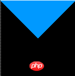
解决:把border-style设置为dashed后,IE6下其他三边就能透明了。
5、到这一步我们已经成功的模拟出了一个小三角,下一步我们把这个小三角同矩形框结合起来。先设置一个矩形框,然后把小三角定位到矩形框上。先来写出HTML结构:
CSS气泡框实现
.tag{ width:300px; height:100px; border:5px solid #09F; position:relative;}
.tag em{display:block; border-width:20px; position:absolute; bottom:-40px; left:100px;border-style:solid dashed dashed; border-color:#09F transparent transparent;font-size:0; line-height:0;}

6,
Now the triangular arrow indicating the direction is solid, and what we want is a hollow effect. Here we overlay a small triangle with the same color as the background color of the bubble box. , and then move the position of this superimposed small triangle to achieve it.
First of all, the HTML structure needs to be adjusted, as follows:
CSS bubble box implementation
CSS style is modified to:
.tag{ width:300px; height:100px; border:5px solid #09F; position:relative; background-color:#FFF;}
.tag em{display:block; border-width:20px; position:absolute ; bottom:-40px; left:100px;border-style:solid dashed dashed; border-color:#09F transparent transparent;font-size:0; line-height:0;}
.tag span{ display:block; border-width:20px; position:absolute; bottom:-33px; left:100px;border-style:solid dashed dashed; border-color:#FFF transparent transparent;font-size:0; line-height: 0;}
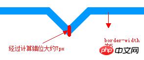
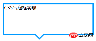 Note: The bottom value of the superimposed small triangle span is not the border-width value. The difference between the two small triangle bottoms should theoretically be 2( border-width) square root of 2.
 Finally, let’s optimize the code so that it is easier to maintain in the later stage. The complete HTML structure:
;
CSS bubble box implementation
CSS style is modified to:
.tag{ width:300px; height:100px; border:5px solid #09F; position:relative; background-color:#FFF;}
.arrow{ position:absolute; width:40px; height:40px; bottom:-40px; left:100px; }
.arrow *{ display:block; border-width:20px; position:absolute; border-style:solid dashed dashed; font-size:0; line-height:0; }
.arrow em{border-color:#09F transparent transparent;}
.arrow span{border-color:#FFF transparent transparent; top:-7px;}
The above is the detailed content of Detailed explanation of how to use CSS bubble box. For more information, please follow other related articles on the PHP Chinese website!

Hot AI Tools

Undresser.AI Undress
AI-powered app for creating realistic nude photos

AI Clothes Remover
Online AI tool for removing clothes from photos.

Undress AI Tool
Undress images for free

Clothoff.io
AI clothes remover

AI Hentai Generator
Generate AI Hentai for free.

Hot Article

Hot Tools

Notepad++7.3.1
Easy-to-use and free code editor

SublimeText3 Chinese version
Chinese version, very easy to use

Zend Studio 13.0.1
Powerful PHP integrated development environment

Dreamweaver CS6
Visual web development tools

SublimeText3 Mac version
God-level code editing software (SublimeText3)

Hot Topics
 1379
1379
 52
52
 How to use bootstrap in vue
Apr 07, 2025 pm 11:33 PM
Using Bootstrap in Vue.js is divided into five steps: Install Bootstrap. Import Bootstrap in main.js. Use the Bootstrap component directly in the template. Optional: Custom style. Optional: Use plug-ins.
 The Roles of HTML, CSS, and JavaScript: Core Responsibilities
Apr 08, 2025 pm 07:05 PM
HTML defines the web structure, CSS is responsible for style and layout, and JavaScript gives dynamic interaction. The three perform their duties in web development and jointly build a colorful website.
 How to write split lines on bootstrap
Apr 07, 2025 pm 03:12 PM
There are two ways to create a Bootstrap split line: using the tag, which creates a horizontal split line. Use the CSS border property to create custom style split lines.
 How to insert pictures on bootstrap
Apr 07, 2025 pm 03:30 PM
There are several ways to insert images in Bootstrap: insert images directly, using the HTML img tag. With the Bootstrap image component, you can provide responsive images and more styles. Set the image size, use the img-fluid class to make the image adaptable. Set the border, using the img-bordered class. Set the rounded corners and use the img-rounded class. Set the shadow, use the shadow class. Resize and position the image, using CSS style. Using the background image, use the background-image CSS property.
 How to resize bootstrap
Apr 07, 2025 pm 03:18 PM
To adjust the size of elements in Bootstrap, you can use the dimension class, which includes: adjusting width: .col-, .w-, .mw-adjust height: .h-, .min-h-, .max-h-
 How to set up the framework for bootstrap
Apr 07, 2025 pm 03:27 PM
To set up the Bootstrap framework, you need to follow these steps: 1. Reference the Bootstrap file via CDN; 2. Download and host the file on your own server; 3. Include the Bootstrap file in HTML; 4. Compile Sass/Less as needed; 5. Import a custom file (optional). Once setup is complete, you can use Bootstrap's grid systems, components, and styles to create responsive websites and applications.
 How to use bootstrap button
Apr 07, 2025 pm 03:09 PM
How to use the Bootstrap button? Introduce Bootstrap CSS to create button elements and add Bootstrap button class to add button text
 How to view the date of bootstrap
Apr 07, 2025 pm 03:03 PM
Answer: You can use the date picker component of Bootstrap to view dates in the page. Steps: Introduce the Bootstrap framework. Create a date selector input box in HTML. Bootstrap will automatically add styles to the selector. Use JavaScript to get the selected date.


