Detailed explanation of the flexible box model of CSS3

Flexbox usually allows us to better manipulate the layout of its sub-elements, for example:
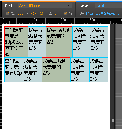
If the element container does not have enough space, we do not need to calculate the size of each element. width, you can set them on the same line;
You can quickly arrange them in a column;
You can easily align them to the left, right, middle, etc. of the container;
You can change their display order without modifying the structure;
If the element container setting percentage and the viewport size change, don't worry about not specifying the exact width of the element and breaking the layout, because each child element in the container can be automatically Allocate a proportion of the width or height of the container.
Highlights:
Width adaptive. Development is much more convenient and faster than table and float.
Note compatibility:
.nav{
    display: -webkit-box;
    display: -moz-box;
    display: -o-box;
    display: -ms-flexbox;
    display: flex;
    overflow: hidden;
    width:100%;//火狐不加宽度是无效的
}
.nav a{
    display: block;
    height:40px;
    line-height: 40px;
    color:#fff;
    text-align: center;
    border:1px solid #fff;
    background: #f60;
    text-decoration: none;
    -moz-box-flex: 1;
    -webkit-box-flex: 1;
        -o-box-flex: 1;
        -ms-flex: 1;
            flex: 1;
}The above is the detailed content of Detailed explanation of the flexible box model of CSS3. For more information, please follow other related articles on the PHP Chinese website!

Hot AI Tools

Undresser.AI Undress
AI-powered app for creating realistic nude photos

AI Clothes Remover
Online AI tool for removing clothes from photos.

Undress AI Tool
Undress images for free

Clothoff.io
AI clothes remover

AI Hentai Generator
Generate AI Hentai for free.

Hot Article

Hot Tools

Notepad++7.3.1
Easy-to-use and free code editor

SublimeText3 Chinese version
Chinese version, very easy to use

Zend Studio 13.0.1
Powerful PHP integrated development environment

Dreamweaver CS6
Visual web development tools

SublimeText3 Mac version
God-level code editing software (SublimeText3)

Hot Topics
 1376
1376
 52
52
 How to achieve wave effect with pure CSS3? (code example)
Jun 28, 2022 pm 01:39 PM
How to achieve wave effect with pure CSS3? This article will introduce to you how to use SVG and CSS animation to create wave effects. I hope it will be helpful to you!
 Use CSS skillfully to realize various strange-shaped buttons (with code)
Jul 19, 2022 am 11:28 AM
This article will show you how to use CSS to easily realize various weird-shaped buttons that appear frequently. I hope it will be helpful to you!
 How to hide elements in css without taking up space
Jun 01, 2022 pm 07:15 PM
Two methods: 1. Using the display attribute, just add the "display:none;" style to the element. 2. Use the position and top attributes to set the absolute positioning of the element to hide the element. Just add the "position:absolute;top:-9999px;" style to the element.
 How to implement lace borders in css3
Sep 16, 2022 pm 07:11 PM
In CSS, you can use the border-image attribute to achieve a lace border. The border-image attribute can use images to create borders, that is, add a background image to the border. You only need to specify the background image as a lace style; the syntax "border-image: url (image path) offsets the image border width inward. Whether outset is repeated;".
 It turns out that text carousel and image carousel can also be realized using pure CSS!
Jun 10, 2022 pm 01:00 PM
How to create text carousel and image carousel? The first thing everyone thinks of is whether to use js. In fact, text carousel and image carousel can also be realized using pure CSS. Let’s take a look at the implementation method. I hope it will be helpful to everyone!
 How to enlarge the image by clicking the mouse in css3
Apr 25, 2022 pm 04:52 PM
Implementation method: 1. Use the ":active" selector to select the state of the mouse click on the picture; 2. Use the transform attribute and scale() function to achieve the picture magnification effect, the syntax "img:active {transform: scale(x-axis magnification, y Axis magnification);}".
 Does css3 animation effect have deformation?
Apr 28, 2022 pm 02:20 PM
The animation effect in css3 has deformation; you can use "animation: animation attribute @keyframes ..{..{transform: transformation attribute}}" to achieve deformation animation effect. The animation attribute is used to set the animation style, and the transform attribute is used to set the deformation style. .
 css3 what is adaptive layout
Jun 02, 2022 pm 12:05 PM
Adaptive layout, also known as "responsive layout", refers to a web page layout that can automatically recognize the screen width and make corresponding adjustments; such a web page can be compatible with multiple different terminals instead of making a specific version for each terminal. . Adaptive layout was born to solve the problem of mobile web browsing, and can provide a good user experience for users using different terminals.


