 WeChat Applet
 Mini Program Development
 Detailed explanation of WeChat applet components: input input box
Detailed explanation of WeChat applet components: input input box
input input boxComponent description:
This article introduces various input input boxes parameters and characteristics.
input input boxThe sample code runs as follows:
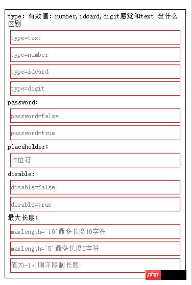
The following is the WXML code:
##
<view class="content">
type:有效值:text 感觉没什么区别
<input placeholder="type=text" type="text" value="" />
<input placeholder="type=number" type="number" value="" />
<input placeholder="type=idcard" type="idcard" value="" />
<input placeholder="type=digit" type="digit" value="" />
password:
<input type="text" password="{{false}}" placeholder="请输入密码"/>
<input type="text" password="{{true}}" placeholder="请输入密码"/>
placeholder:
<input placeholder="占位符" />
disable:
<input placeholder="disable={{false}}" disabled='{{false}}'/>
<input placeholder="disable={{true}}" disabled='{{true}}'/>
最大长度:
<input maxlength="10" placeholder="maxlength='10'最多长度10字符"/>
<input maxlength="5" placeholder="maxlength='5'最多长度5字符"/>
<input maxlength="-1" placeholder="值为-1,则不限制长度"/>
</view>The following is the WXSS code:
.content{
  border:1px black solid;
  margin: 10px;
  font-size: 10pt;
  padding: 5px;
}
input{
  border:1px red solid;
margin: 5px;
}##Event renderings:
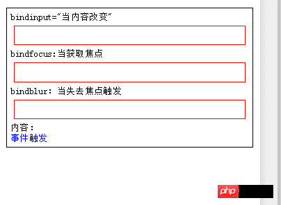
The following is the WXML code: <view class="content">
bindinput="当内容改变"
<input bindinput="bindinput"/>
bindfocus:当获取焦点
<input bindfocus="bindfocus"/>
bindblur:当失去焦点触发
<input bindblur="bindblur"/>
内容:
<view style="color:blue">
{{log}}
</view>
</view>
The following is the JS code: Page({
data:{
log:'事件触发'
},
bindblur:function(e){
var value=e.detail.value;
this.setData({
log:"bindblur失去焦点.输入框值="+value
})
},
bindinput:function(e){
var value=e.detail.value;
this.setData({
log:"bindinput内容改变.输入框值="+value
})
},
bindfocus:function(e){
var value=e.detail.value;
this.setData({
log:"bindfocus获取焦点.输入框值="+value
})
}
})
The following is the WXSS code: .content{
border:1px black solid;
margin: 10px;
font-size: 10pt;
padding: 5px;
}
input{
border:1px red solid;
margin: 5px;
}
Component properties:
| Description | Type | Default value | |
| Initial content of the input box | String | ||
| Valid values: text, number, idcard, digit | String | text | ##password |
is the password type | Boolean |
false |
##placeholder |
| Placeholder when the input box is empty | String | ##placeholder -style |
|
| String |
| ##placeholder-class||
| String |
input-placeholder |
disabled | |
| Boolean | false | maxlength | |
| , there is no limit to the maximum length | Number 140 |
auto-focus | |
| Boolean | false | focus | |
Boolean |
false |
||
bindinput |
除了date/time类型外的输入框,当键盘输入时,触发input事件,处理函数可以直接 return 一个字符串,将替换输入框的内容。 |
EventHandle |
|
bindfocus |
输入框聚焦时触发event.detail = {value: value} |
EventHandle |
|
bindblur |
输入框失去焦点时触发event.detail = {value: value} |
EventHandle |
属性解析:
下面是WXML代码:
<!--属性:-->
<!--value:输入框内容-->
<input value="内容"/>
<!--type:有效类型text,number,idcard,digit,小编感觉其他三个和text没有明显区别,不清楚是什么问题,正常number应该只允许输入数字,但结果和text一样-->
<input type="text"/>
<input type="number"/>
<input type="idcard"/>
<input type="digit"/>
<!--password:密码格式 boolean需要{{}}表示-->
<input password="{{true}}"/>
<input password/>  等同于  <input password="{{false}}"/>
<!--placeholder:占位符,对输入框内容提示-->
<input placeholder="占位符" placeholder-class="占位符静态样式"   placeholder-style="占位符动态样式,可用{{}}进行动态赋值"/>
<!--disabled:控制标签有效,或者失效状态,在失效状态,不能获取该值-->
<input disabled="{{true}}"/>
<input disabled/> 等同于 <input disabled="{{false}}"/>
<!--maxlength:内容长度限制,默认140-->
<input  maxlength="100"/>
<input  maxlength/> 等同于 <input  maxlength="140"/>
<!--focus:初始化时,获取输入焦点(目前开发工具暂不支持)-->
<input  focus="{{true}}"/>
<input focus/> 等同于 <input focus="{{false}}"/>
<!--auto-focus:当界面只有一个input,自动获取焦点-->
<input   auto-focus="{{true}}"/>
<input   auto-focus/> 等同于 <input auto-focus="{{false}}"/>
<!--事件:-->
<!--bindinput:当内容改动时触发-->
<input bindinput="自己定义函数名">
<!--bindfocus:当获取焦点,可用输入状态时触发-->
<input bindfocus="自己定义函数名">
<!--bindblur:当失去焦点触发-->
<input bindblur="自己定义函数名">The above is the detailed content of Detailed explanation of WeChat applet components: input input box. For more information, please follow other related articles on the PHP Chinese website!

Hot AI Tools

Undresser.AI Undress
AI-powered app for creating realistic nude photos

AI Clothes Remover
Online AI tool for removing clothes from photos.

Undress AI Tool
Undress images for free

Clothoff.io
AI clothes remover

Video Face Swap
Swap faces in any video effortlessly with our completely free AI face swap tool!

Hot Article

Hot Tools

Notepad++7.3.1
Easy-to-use and free code editor

SublimeText3 Chinese version
Chinese version, very easy to use

Zend Studio 13.0.1
Powerful PHP integrated development environment

Dreamweaver CS6
Visual web development tools

SublimeText3 Mac version
God-level code editing software (SublimeText3)

Hot Topics
 1387
1387
 52
52
 Xianyu WeChat mini program officially launched
Feb 10, 2024 pm 10:39 PM
Xianyu's official WeChat mini program has quietly been launched. In the mini program, you can post private messages to communicate with buyers/sellers, view personal information and orders, search for items, etc. If you are curious about what the Xianyu WeChat mini program is called, take a look now. What is the name of the Xianyu WeChat applet? Answer: Xianyu, idle transactions, second-hand sales, valuations and recycling. 1. In the mini program, you can post idle messages, communicate with buyers/sellers via private messages, view personal information and orders, search for specified items, etc.; 2. On the mini program page, there are homepage, nearby, post idle, messages, and mine. 5 functions; 3. If you want to use it, you must activate WeChat payment before you can purchase it;
 WeChat applet implements image upload function
Nov 21, 2023 am 09:08 AM
WeChat applet implements picture upload function With the development of mobile Internet, WeChat applet has become an indispensable part of people's lives. WeChat mini programs not only provide a wealth of application scenarios, but also support developer-defined functions, including image upload functions. This article will introduce how to implement the image upload function in the WeChat applet and provide specific code examples. 1. Preparatory work Before starting to write code, we need to download and install the WeChat developer tools and register as a WeChat developer. At the same time, you also need to understand WeChat
 Implement the drop-down menu effect in WeChat applet
Nov 21, 2023 pm 03:03 PM
To implement the drop-down menu effect in WeChat Mini Programs, specific code examples are required. With the popularity of mobile Internet, WeChat Mini Programs have become an important part of Internet development, and more and more people have begun to pay attention to and use WeChat Mini Programs. The development of WeChat mini programs is simpler and faster than traditional APP development, but it also requires mastering certain development skills. In the development of WeChat mini programs, drop-down menus are a common UI component, achieving a better user experience. This article will introduce in detail how to implement the drop-down menu effect in the WeChat applet and provide practical
 Implement image filter effects in WeChat mini programs
Nov 21, 2023 pm 06:22 PM
Implementing picture filter effects in WeChat mini programs With the popularity of social media applications, people are increasingly fond of applying filter effects to photos to enhance the artistic effect and attractiveness of the photos. Picture filter effects can also be implemented in WeChat mini programs, providing users with more interesting and creative photo editing functions. This article will introduce how to implement image filter effects in WeChat mini programs and provide specific code examples. First, we need to use the canvas component in the WeChat applet to load and edit images. The canvas component can be used on the page
 Use WeChat applet to achieve carousel switching effect
Nov 21, 2023 pm 05:59 PM
Use the WeChat applet to achieve the carousel switching effect. The WeChat applet is a lightweight application that is simple and efficient to develop and use. In WeChat mini programs, it is a common requirement to achieve carousel switching effects. This article will introduce how to use the WeChat applet to achieve the carousel switching effect, and give specific code examples. First, add a carousel component to the page file of the WeChat applet. For example, you can use the <swiper> tag to achieve the switching effect of the carousel. In this component, you can pass b
 What is the name of Xianyu WeChat applet?
Feb 27, 2024 pm 01:11 PM
The official WeChat mini program of Xianyu has been quietly launched. It provides users with a convenient platform that allows you to easily publish and trade idle items. In the mini program, you can communicate with buyers or sellers via private messages, view personal information and orders, and search for the items you want. So what exactly is Xianyu called in the WeChat mini program? This tutorial guide will introduce it to you in detail. Users who want to know, please follow this article and continue reading! What is the name of the Xianyu WeChat applet? Answer: Xianyu, idle transactions, second-hand sales, valuations and recycling. 1. In the mini program, you can post idle messages, communicate with buyers/sellers via private messages, view personal information and orders, search for specified items, etc.; 2. On the mini program page, there are homepage, nearby, post idle, messages, and mine. 5 functions; 3.
 Implement the sliding delete function in WeChat mini program
Nov 21, 2023 pm 06:22 PM
Implementing the sliding delete function in WeChat mini programs requires specific code examples. With the popularity of WeChat mini programs, developers often encounter problems in implementing some common functions during the development process. Among them, the sliding delete function is a common and commonly used functional requirement. This article will introduce in detail how to implement the sliding delete function in the WeChat applet and give specific code examples. 1. Requirements analysis In the WeChat mini program, the implementation of the sliding deletion function involves the following points: List display: To display a list that can be slid and deleted, each list item needs to include
 Implement image rotation effect in WeChat applet
Nov 21, 2023 am 08:26 AM
To implement the picture rotation effect in WeChat Mini Program, specific code examples are required. WeChat Mini Program is a lightweight application that provides users with rich functions and a good user experience. In mini programs, developers can use various components and APIs to achieve various effects. Among them, the picture rotation effect is a common animation effect that can add interest and visual effects to the mini program. To achieve image rotation effects in WeChat mini programs, you need to use the animation API provided by the mini program. The following is a specific code example that shows how to


