In CSS3 Complex animation sequences can be created through animation, which is used to control CSS properties to achieve animation effects like the transition attribute. animation is mainly composed of two parts.
##Declare key frames
keyframes, followed by the name of the animation (animation-name), plus a pair of curly brackets "{...}", in the brackets are Style rules for multiple different time periods. The style rules in a @keyframes are composed of multiple percentages, and each percentage style rule can set different style attributes. You can use the keyword "from". "to" represents the start and end of an animation, "from" is equivalent to 0%, and "to" is equivalent to 100%
@keyframes yxz {
 0% {
    margin-left: 100px;
    background: green;
 }
 40% {
    margin-left: 150px;
    background: orange;
 }
 60% {
    margin-left: 75px;
    background: blue;
 }
 100% {
    margin-left: 100px;
    background: red;
 }
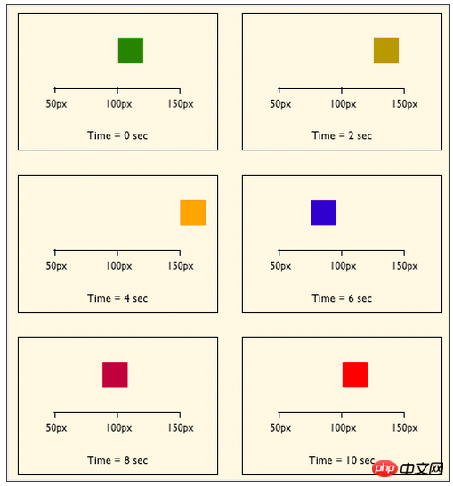
} Here we define an animation called "yxz", and its animation is. It starts from 0% and ends at 100%, and also goes through two processes of 40% and 60%. The specific meaning of the above code is: when the "yxz" animation is at 0%, the element is positioned at the left position of 100px, and the background color is green. , then at 40%, the element transitions to the left position of 150px and the background color is orange, at 60%, the element transitions to the left position of 75px, the background color is blue, and finally the position where the animation ends at 100% returns to the starting point, left is At 100px, the background color changes to red. Assume that we only give this animation 10s of execution time, then the state of each period of execution is as shown below: The keyframes in @keyframes do not have to be specified in order. In fact, the keyframes can be specified in any order, because the keyframe order in the animation is determined by the percentage value rather than the declaration. The order.
@keyframes yxz{
    0%,40%{
        width:200px;
        height:200px;
    }
    20%,60%,80%{
        width:100px;
        height:100px;
    }
    100%{
        width:0;
        height:0;
    }
} In this example, the same style is applied to 0%, 40%, the same style is also applied to 20%, 60%, and 80%, and another style is applied to 100%.  These two animations have no effect because they are not attached to any elements. After declaring
keyframes animation, for the animation to take effect, you need to call the animation declared by @keyframes through CSS properties.
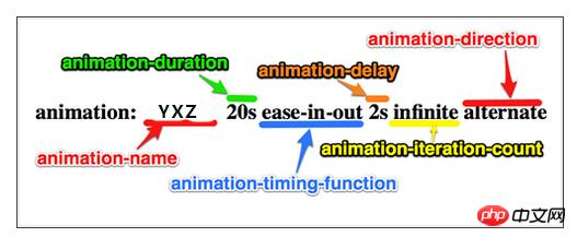
Calling keyframes Use the animation attribute animation to call the animation declared by @keyframes. The animation attribute, animation, is a composite attribute that contains eight sub-attributes. The syntax is as follows:
animation:[<animation-name> || <animation-duration> || <animation-timing-function> || <animation-delay> || <animation-iteration-count> || <animation-direction> || <animation-play-state> || <animation-fill-mode>] *</animation-fill-mode></animation-play-state></animation-direction></animation-iteration-count></animation-delay></animation-timing-function></animation-duration></animation-name>
animation-name: Mainly used to specify the name of a keyframe animation. This name must be the same as
The names declared by keyframes are the same. When css loads animation, the corresponding name will be used to execute it. 
animation-name:none | IDENT [,none | IDENT] *
@keyframes. None: Default value. When the value is none, there is no animation effect and can be used to override the animation.
: Mainly used to set the time required for animation playback, the unit is s (seconds) or ms (milliseconds), the default value is 0. <div class="code" style="position:relative; padding:0px; margin:0px;"><div class="code" style="position:relative; padding:0px; margin:0px;"><pre class="brush:php;toolbar:false">animation-duration:<time> [,<time>] *</time></time></pre><div class="contentsignin">Copy after login</div></div><div class="contentsignin">Copy after login</div></div>
animation-timing-function
Similar to transition-timing-function, you can click to view it.
animation-delay: Mainly used to set animation delay time.
<div class="code" style="position:relative; padding:0px; margin:0px;"><div class="code" style="position:relative; padding:0px; margin:0px;"><pre class="brush:php;toolbar:false">animation-duration:<time> [,<time>] *</time></time></pre><div class="contentsignin">Copy after login</div></div><div class="contentsignin">Copy after login</div></div> When time is a positiveinteger
, it is the delay time. When it is a negative integer, the playback time will be truncated (cut off part of the time used for animation-duration, that is, skip this part of the value and directly Carry out subsequent animations)animation-iteration-count
: Mainly used to set the number of times the animation is played.animation-iteration-count: infinite | <number> [,infinite | <number>] *</number></number>
animation-direction: Mainly used to set the direction of animation playback.
animation-direction:normal | alternate [,normal | alternate] *
loops
. alternate, the animation plays forward once and backward once.animation-play-state
: Mainly used to control the state of animation playback.animation-play-state:running | paused [,running | paused] *
animation-fill-mode:主要用来设置动画时间之外的属性,也就是动画开始前或者结束后的属性。
animation-fill-mode:none | forwards | backwards | both
默认值为none,表示动画按期执行与结束,在动画结束时,会反回初始状态。forwards,当动画结束时,停留在最后最后一帧(保持最后的状态)。backwards,当动画开始时迅速应用第一帧。both,同时拥有forwards与backwards的作用。
学以致用,学习完动画的基础知识后,就需要练习一下,把学的东西用出来。可以把代码复制在浏览器中观看效果。
nbsp;html>


<meta>
<title></title>
<style>
    /*元素从左边出现*/
    @keyframes bga {
        0% {
            left: -500px;
        }

        100% {
            left: 0;
        }
    }
    /*元素从下边出来*/
    @keyframes bgb {
        0% {
            top: 350px;
        }

        100% {
            top: 0;
        }
    }
    /*元素从小到大*/
    @keyframes bgc {
        0% {
            transform: scale(0.1);
        }

        100% {
            transform: none;
        }
    }
    /*元素从大到小*/
    @keyframes bgd {
        0% {
            transform: scale(2);
        }

        100% {
            transform: none;
        }
    }
    /*元素旋转并放大*/
    @keyframes bge {
        0% {
            transform: rotate(-360deg) scale(0.1);
        }

        100% {
            transform: none;
        }
    }
    /*选中元素时,隐藏其他元素*/
    @keyframes no {
        0% {
            z-index: 23;
        }

        100% {
            z-index: 23;
        }
    }
    /*兼容webkit浏览器*/
    @-webkit-keyframes bga {
        0% {
            left: -500px;
        }

        100% {
            left: 0;
        }
    }

    @-webkit-keyframes bgb {
        0% {
            top: 350px;
        }

        100% {
            top: 0;
        }
    }

    @-webkit-keyframes bgc {
        0% {
            transform: scale(0.1);
        }

        100% {
            transform: none;
        }
    }

    @-webkit-keyframes bgd {
        0% {
            transform: scale(2);
        }

        100% {
            transform: none;
        }
    }

    @-webkit-keyframes bge {
        0% {
            transform: rotate(-360deg) scale(0.1);
        }

        100% {
            transform: none;
        }
    }

    @-webkit-keyframes no {
        0% {
            z-index: 23;
        }

        100% {
            z-index: 23;
        }
    }

    * {
        margin: 0;
        padding: 0;
    }

    html, body {
        height: 100%;
    }

    img.bg {
        width: 100%;
        height: 100%;
        position: fixed;
        left: 0;
    }

    .demo p {
        position: absolute;
        z-index: 9999;
    }

    a {
        display: block;
        width: 100px;
        height: 100px;
        background: rgba(255, 0, 0,.2);
        margin-bottom: 15px;
        text-decoration: none;
        color: #ffffff;
    }

    #bga:target {
        z-index: 100;
        -webkit-animation:bga 2s ease;
        animation:bga 2s ease;
    }

    #bgb:target {
        z-index: 100;
        -webkit-animation:bgb 2s ease;
        animation:bgb 2s ease;
    }

    #bgc:target {
        z-index: 100;
        -webkit-animation:bgc 2s ease;
        animation:bgc 2s ease;
    }

    #bgd:target {
        z-index: 100;
        -webkit-animation:bgd 2s ease;
        animation:bgd 2s ease;
    }

    #bge:target {
        z-index: 100;
        -webkit-animation:bge 2s ease;
        animation:bge 2s ease;
    }
</style>


<p>
    </p><p>
        </p>


CSS3动画完。
The above is the detailed content of Detailed explanation and examples of CSS animation implementation. For more information, please follow other related articles on the PHP Chinese website!


