How to use CSS for web page layout
Day 1: What kind of DOCTYPE to choose
Preface
Hi everyone! This series of articles is written based on Ajie's own process of creating the w3cn.org site. Ajie has never produced a website that truly complies with web standards before. Now I am making reference to foreign materials and recording my thoughts and experiences in the process. I hope it will be helpful to everyone. Okay, let's get started.
The first day
Start making a site that meets standards. The first thing to do is to declare the DOCTYPE that meets your needs.
Look at the original code of the homepage of this site, you can see that the first line is:
Open some sites that meet standards, such as the famous web design software developer Macromedia and the personal design master Zeldman website, you will find the same code. The code for other standards-compliant sites (such as k10k.net) is as follows:
So what do these codes mean? Does it have to be placed?
What is DOCTYPE
We call the above codes a DOCTYPE statement. DOCTYPE is the abbreviation of document type and is used to indicate what version of XHTML or HTML you are using.
The DTD (such as xhtml1-transitional.dtd in the above example) is called the document type definition, which contains the rules of the document. The browser will interpret the identity of your page based on the DTD you define and display it. come out.
To build a standards-compliant web page, the DOCTYPE declaration is an essential and critical component; unless your XHTML determines a correct DOCTYPE, neither your logo nor your CSS will take effect.
XHTML 1.0 provides three DTD declarations to choose from:
Transitional (Transitional): A DTD with very loose requirements, which allows you to continue to use the HTML4.01 identifier (but must comply with xhtml writing method). The complete code is as follows:
Strict: For strict DTD, you cannot use any presentation layer identifiers and attributes, such as
. The complete code is as follows:
Frameset: A DTD specifically designed for frame pages. If your page contains a frame, you need to use this DTD. The complete code is as follows:
WHAT DOCTYPE DO WE CHOOSE
The ideal situation is of course a strict DTD, but for most of us designers who are new to web standards, Transitional DTD (XHTML 1.0 Transitional) is currently the ideal choice (including this site, which also uses transitional DTD). Because this DTD also allows us to use presentation layer identifiers, elements and attributes, it is also easier to pass W3C code verification.
Note: The "identification and attributes of the presentation layer" mentioned above refer to those tags used purely to control performance, such as tables for typesetting, background color identification, etc. In XHTML, tags are used to represent structures, not to achieve presentation. The purpose of our transition is to ultimately separate data and presentation.
For example: a mannequin changes clothes. The model is like data, and the clothes are the form of expression. The model and the clothes are separated, so you can change clothes at will. In the original HTML4, data and presentation were mixed together, and it was very difficult to change the presentation form at once. Haha, it's a bit abstract. This concept needs to be gradually understood during the application process.
Supplement
The DOCTYPE declaration must be placed at the top of every XHTML document, above all code and markup.
For more details, please visit the W3C website
Day 2: What is a namespace
After the DOCTYPE is declared, the next code is:
Usually our HTML4.0 code is just , what is "xmlns" here?
This "xmlns" is the abbreviation of XHTML namespace, which is called the "namespace" statement. What is the role of namespace? Ajie's own understanding is:
Since xml allows you to define your own logo, the logo you define may be the same as the logo defined by others, but have different meanings. Errors can easily occur when files are exchanged or shared. To avoid this error, XML uses namespace declarations, which allow you to identify your identity through a URL pointing to it. For example:
Both Xiao Wang and Xiao Li have defined a
A more popular explanation is: a namespace is to mark a document to tell others who this document belongs to. It's just that this "who" is replaced by a website address.
XHTML is a markup language that transitions from HTML to XML. It needs to comply with XML document rules, so it also needs to define a namespace. And because XHTML1.0 cannot customize the logo, its namespace is the same, which is "http://www.w3.org/1999/xhtml". It doesn't matter if you don't quite understand it yet, at this stage we just need to copy the code. The lang="gb2312" after
specifies that your document should be in Simplified Chinese.
Day 3: Define the language encoding
The third step is to define your language encoding, similar to this:
In order to be correctly interpreted by browsers and pass W3C code verification, all XHTML documents must declare the encoding language they use. We generally use gb2312 (Simplified Chinese). When making multi-language pages, we may also use Unicode, ISO-8859-1, etc., which can be defined according to your needs.
Usually this definition is enough. However, it should be added that XML documents do not define language encoding in this way. XML is defined as follows:
You can see similar statements in the first line of code on the homepage of Macromedia.com. This is also the definition method recommended by W3C. So why don't we just adopt this approach? The reason is that some browsers have incomplete support for standards and cannot correctly understand such definition methods, such as IE6/windows. Therefore, under the current transition plan, we still recommend using the meta method. Of course, you can write both ways.
Looking at the source code of this website, you will find that there is one more sentence where the language encoding is defined:
This is written for older browsers to ensure that various browsers can interpret the page correctly.
Note: At the end of the above declaration statement, you see a slash "/", which is different from our previous HTML4.0 code writing. The reason is that XHTML syntax rules require that all tags must have a beginning and an end. For example,
and
, etc., for unpaired identifiers, it is required to add a space at the end of the identifier, followed by a "/". For example,is written as
, and
Day 4: Calling style sheets
Use web standards to design websites. The transition method is mainly to use XHTML+CSS. CSS style sheets are essential. This requires all web designers to be proficient in CSS. If you have not used it before, start learning now. To create a website that complies with web standards, you cannot design beautiful pages without knowing CSS.
In fact, all aspects of performance need to be implemented with CSS. We used to use table for positioning and layout, but now we have to use p for positioning and layout. This is a change in the way of thinking, which is a bit uncomfortable at first. Haha, there will be resistance to any change. In order to enjoy the "benefits" brought by standards, it is worthwhile to give up some old traditional practices.
Externally calling style sheets
In the past, we usually used two methods to use style sheets:
Inline method on the page: that is, inserting the style sheet into the page Write it directly in the head area of the page code. Similar to this:
External calling method: Write the style sheet in a separate .css file, and then call it with code similar to the following in the head area of the page.
In a design that complies with web standards , we use the external calling method, and the benefits are self-evident. You can change the style of the page without modifying the page, only modifying the .css file. If all pages call the same style sheet file, then changing one style sheet file can change the styles of all files.
Double-table method to call the style sheet
Look at the original code of some standards-compliant sites. You may see that there are the following two sentences where the style sheet is called:
Why do you have to write it twice?
In fact, under normal circumstances, it is enough to use the external link method (that is, the first sentence). The double table call I use here is just an example. The "@import" command is used to enter the style sheet. The "@import" command is invalid in Netscape 4.0 browsers. In other words, when you want certain effects to be hidden in the Netscape 4.0 browser and displayed in 4.0 or above or other browsers, you can use the "@import" command method to call the style sheet.
Day 5: Other settings in the head area
These tips mainly focus on meta tag settings. In fact, they have little to do with complying with web standards. Just pay attention to adding them at the end. Just "/" to close the tag, but since this is an introductory tutorial, let's write it in more detail.
Favorites icon
If you add this site to your favorites, you can see that the IE icon before the favorites URL becomes a special icon for this site. To achieve this effect is very simple, first make a 16x16 icon, name it favicon.ico, and place it in the root directory. Then embed the following code into the head area:
< ;link rel="shortcut icon" href="/favicon.ico" type="image/x-icon" />
Content prepared for search engines
The code is as follows, just replace it with the content of your own site:
Allow search robots to search all links in the site. If you want certain pages not to be searched, it is recommended to use the robots.txt method
Set site author information
< meta name="author" content="ajie@netease.com,阿杰" />
Set site copyright information
Brief introduction of the site (recommended)
Keywords of the site (recommended)
Let’s introduce this much first. Supplementary explanation, the previous 5 sections were all about the code of the head area, and the actual page content has not been mentioned at all. Haha, don’t worry, in fact, the head area is very important. You can know the designer by looking at the head code of a page. Is it professional enough?
Day 6: XHTML code specifications
Before starting formal content production, we must first understand the code specifications of web standards. Understanding these specifications can help you avoid detours and pass code verification as soon as possible.
1. All tags must have a corresponding closing tag
In the past, in HTML, you could open many tags, such as
and < ;li> instead of necessarily writing the corresponding
and to close them. But this is not legal in XHTML. XHTML requires a strict structure and all tags must be closed. If it is a separate unpaired tag, add a "/" at the end of the tag to close it. For example:
2. The names of all tag elements and attributes must be in lowercase
Unlike HTML, XHTML is case-sensitive,
Left column of page
Middle column of page
Right column of the page
At this time, the effect of the page can only be seen in three parts juxtaposed gray rectangles, and a background image. But I want the height to be full screen, what should I do?
4.100% adaptive height?
In order to keep the three columns with the same height, I tried to set "height:100 in #left, #middle and #right %;", but found that there was no expected adaptive height effect at all. After some attempts, I had to give each p an absolute height: "height:1000px;", and as the content increases, I need to constantly correct this value. Is there no way to adjust the height? As Ajie's own study deepened, he discovered a flexible solution. In fact, there is no need to set 100% at all. We have been too deeply imprisoned by table thinking. This method will be introduced in detail in the next section of study.
Day 10: Adaptive height
If we want to add a footer line at the end of the 3-column layout to put information such as copyright. I encountered the problem of having to align the bottom of 3 columns. In the table layout, we use the method of nesting large tables into small tables, which can easily align the three columns; with the p layout, the three columns are scattered independently and the content is of different heights, making it difficult to align. In fact, we can completely nest p, put three columns into one p, and achieve bottom alignment. Here is an implementation example (a white background box simulates a page):
The main code of the page in this example is as follows:
Specific style sheet All are written in the corresponding sections. The key point is that the #mainbox layer is nested in three layers: #menu, #sidebar and #content. When the content of #content increases, the height of #content will increase, and the height of #mainbox will also expand, and the #footer layer will automatically move down. This achieves a high degree of adaptability.
It is also worth noting that #menu and #content are floating on the right side of the page "FLOAT: right;", #sidebar is floating on the left side of the #menu layer "FLOAT: left;", this is floating Method positioning, you can also use absolute positioning to achieve such an effect.
There is another problem with this method, that is, the background of the sidebar #sidebar cannot be 100%. The general solution is to fill it with the body's background color. (The background color of #mainbox cannot be used, because the background color of #mainbox is invalid in browsers such as Mozilla.)
Okay, the main framework has been built, and the remaining work is just to add bricks and tiles to it. If you want to try other layouts, it is recommended to read the following articles:
Day 11: Menu without tables
The layout was initially set up, and I started filling in the content. The first is to define the logo image:
Style sheet: #logo {MARGIN: 0px;padding:0px;WIDTH: 200px;HEIGHT:80px;}
Page code:

The above code should be easy to understand now. First define a logo layer in CSS, and then call it on the page. It should be noted that in order to make web pages more usable, web standards require everyone to add an alt attribute to all images that are formal content. This alt attribute is used to describe the function of the image (display replacement text when the image cannot be displayed), so don't just write a meaningless image name.
The next step is to define the menu.
1. Menu without tables (vertical)
Let’s first look at the final effect of the menu: demo page
Usually we can at least nest it A 2-layer table is used to implement such a menu. The interval line is implemented by setting the background color in td and inserting a 1px high transparent GIF image; the alternating effect of the background color is implemented by using the onmouseover event of td. But if you look at the page code of this menu, you will see that there are only the following sentences:
- What are Web Standards
- Benefits of using standards
- Web page template download
- WEB standards related tutorials
- Web page production software
- Using Help
- . The secret of realizing the effect of the entire menu lies entirely in id="menu". We Let’s look at the definition of menu in CSS:
(1) First define the main style of the menu layer:
#menu {
MARGIN: 15px 20px 0px 15px; /*Define the outer border distance of the layer*/
PADDING:15px; /*Define the inner border of the layer to 15px*/
BACKGROUND: #dfdfdf; /*Define the background color*/
COLOR: #666; /*Define font color*/
BORDER:#fff 2px solid; /*Define border as 2px white line*/
WIDTH:160px; /*Define content width as 160px*/
}
(2) Next define the style of the unordered list:
#menu ul {
MARGIN: 0px;
PADDING: 0px;
BORDER: medium none; /*Do not display borders*/
LINE-HEIGHT: normal;
LIST-STYLE-TYPE: none;
}
#menu li {BORDER-TOP : #FFF 1px solid; MARGIN: 0px;}
Explanation: The derivation method of the id selector is used to define (refer to Day 7: Introduction to CSS) the child elements in the menu layer< Styles for ;ul> and - . LIST-STYLE-TYPE: none means that the default style of the unordered list is not used, that is, the small dots are not displayed (we will use our own icons to replace the small dots later). BORDER-TOP: #FFF 1px solid; defines a 1px spacing line between menus.
(3) Define onmouseover effect
#menu li a {
PADDING:5px 0px 5px 15px;
DISPLAY: block;
FONT -WEIGHT: bold;
BACKGROUND: url(images/icon_dot_lmenu.gif) transparent no-repeat 2px 8px;
WIDTH: 100%;
COLOR: #444;
TEXT-DECORATION: none;
}
#menu li a:hover { BACKGROUND: url(images/icon_dot_lmenu2.gif) #C61C18 no-repeat 2px 8px;
COLOR: #fff; }
The explanation is as follows:
"display:block;" means to display tag a as a block-level element, making the link become a button;
"BACKGROUND: url(images/icon_dot_lmenu.gif ) transparent no-repeat 2px 8px;" This sentence defines the icon of the small dot that replaces li. "Transparent" means that the background is transparent, and "2px 8px" specifies that the position of the icon is 2px from the left and 8px from the top. This sentence can also be split into four sentences: "BACKGROUND-IMAGE: url(images/icon_dot_lmenu.gif); BACKGROUND-POSITION: 2px 8px; BACKGROUND-REPEAT: no-repeat; BACKGROUND-COLOR: transparent;"
" #menu li a:hover" defines the color change and small icon change when the mouse moves over the link.
OK, this is how the menu without tables is implemented. You can clearly feel that all the presentation styles originally written in HTML have been stripped and put into CSS files. The page code is saved by more than half. It is very simple to modify the menu style through CSS.
2. Menu without table (horizontal)
The above is a vertical menu. If you want to display a horizontal menu, can you also use li? Of course it is possible. The code is given below, and the effect is at the top of this page:
Page code - Web Standards
- Benefits of Standards
- How to transition< ;/a>
- Related tutorials
- Tools
- Resources and links
- FAQ
< ;/ul>
does not use any table, but uses unsequenced
Style Sheet Code
# submenu {
MARGIN: 0px 8px 0px 8px;
PADDING: 4px 0px 0px 0px;
BORDER: #fff 1px solid;
BACKGROUND: #dfdfdf;
COLOR: #666;
HEIGHT:25px; }
#submenu ul {
CLEAR: left;
MARGIN: 0px;
PADDING:0px;
BORDER: 0px;
LIST-STYLE -TYPE: none;
TEXT-ALIGN: center;
DISPLAY:inline;
}
#submenu li {
FLOAT: left;
DISPLAY: block;
MARGIN: 0px;
PADDING: 0px;
TEXT-ALIGN: center}
#submenu li a {
DISPLAY: block;
PADDING:2px 3px 2px 3px;
BACKGROUND: url(images/icon_dot_lmenu.gif) transparent no-repeat 2px 8px;
FONT-WEIGHT: bold;
WIDTH: 100%;
COLOR: #444;
TEXT- DECORATION: none;
}
#submenu li a:hover {
BACKGROUND: url(images/icon_dot_lmenu2.gif) #C61C18 no-repeat 2px 8px;
COLOR: #fff; }
#submenu ul li#one A { WIDTH: 60px}
#submenu ul li#two A { WIDTH: 80px}
#submenu ul li#three A { WIDTH: 80px}
#submenu ul li#four A { WIDTH: 90px}
#submenu ul li#five A { WIDTH: 80px}
#submenu ul li#six A { WIDTH: 80px}
#submenu ul li#seven A { WIDTH: 60px}
#submenu ul li#eight A { WIDTH: 90px}
#submenu ul li#nine A { WIDTH: 80px}
The above codes will not be analyzed one by one . The key to the horizontal menu is: the "FLOAT: left;" statement when defining the
Tips: If the sum of the widths of your submenus is greater than the width of the layer, the menu will automatically fold. Using this principle, you can achieve 2-column or 3-column layout of a single unordered list, which is difficult to achieve with HTML. of.
Day 12: Validation and Common Errors
After working hard for many days, we worked hard to learn to use XHTML+CSS to redesign our website. So how do we know that the pages we create really comply with web standards? W3C and some volunteer websites provide online verification programs to help us check whether pages comply with standards and provide help information for correcting errors. These checks are very useful and are the first thing I do when debugging a page.
1.XHTML verification
Verification URL: http://validator.w3.org/
Verification method: URL verification , File upload verification
If the verification is successful, "This Page Is Valid XHTML 1.0 Transitional!" will be displayed, as shown in the figure: 
Verification failed, More verification options and error messages will be displayed, as shown in the figure: 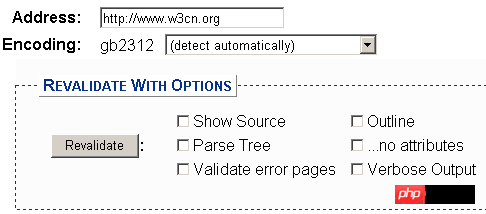
Generally, selecting "Show Source" and "Verbose Output" can help you find the line where the error code is located and the error reason.
XHTML validation common error causes comparison table
No DOCTYPE Found! Falling Back to HTML 4.01 Transitional--DOCTYPE is not defined.
No Character Encoding Found! Falling back to UTF-8.--Undefined language encoding.
end tag for "img" omitted, but OMITTAG NO was specified--The image tag is not closed with "/".
an attribute value specification must be an attribute value literal unless SHORTTAG YES is specified--The attribute value must be quoted.
element "p" undefined---The p tag cannot be uppercase and must be changed to lowercase p.
required attribute "alt" not specified---The image needs to add the alt attribute.
required attribute "type" not specified---The tag called by JS or CSS misses the type attribute.
The most common mistake is the capitalization of labels. Usually these errors are related. For example, if you forget a
2.CSS2 verification
Verification URL: http://jigsaw.w3.org/css-validator/
Verification method: URL verification, file upload verification, direct code verification
If the verification is successful, "Congratulations, this document has passed the style sheet verification!", hoho, the verification information supports Chinese. As shown in the figure:

#If the verification fails, two types of errors will be displayed: errors and warnings. The error means that it must be corrected, otherwise it will not pass the verification; the warning means that there is code that is not recommended by W3C and it is recommended to modify it.
CSS2 verification common error causes comparison table
(Error) Invalid number: color909090 is not a color value: 909090 ---Hexadecimal color value must be added "#" sign, that is, #909090
(error) invalid number: margin-topUnknown dimension : 6pixels ---pixels is not a unit value, the correct way to write it is 6px
(error) attribute scrollbar- face-color does not exist: #eeeeee --- Define the scroll bar color as a non-standard attribute
(error) value cursorhand does not exist: hand is a non-standard attribute value, change it to cursor:pointer
(Warning) Line: 0 font-family: It is recommended that you specify a type family as the last choice--W3C recommends that when defining fonts, end with a type of font, such as "sans-serif", to ensure that it can be used in different operations Under the system, web fonts can be displayed.
(Warning)Line: 0 can't find the warning message for otherprofile --Indicates that there are non-standard attributes or values in the code, and the verification program cannot determine and provide corresponding warning information.
Similarly, after passing the verification, you can place a CSS verification passing icon, the code is as follows:
The above is the detailed content of How to use CSS for web page layout. For more information, please follow other related articles on the PHP Chinese website!

Hot AI Tools

Undresser.AI Undress
AI-powered app for creating realistic nude photos

AI Clothes Remover
Online AI tool for removing clothes from photos.

Undress AI Tool
Undress images for free

Clothoff.io
AI clothes remover

AI Hentai Generator
Generate AI Hentai for free.

Hot Article

Hot Tools

Notepad++7.3.1
Easy-to-use and free code editor

SublimeText3 Chinese version
Chinese version, very easy to use

Zend Studio 13.0.1
Powerful PHP integrated development environment

Dreamweaver CS6
Visual web development tools

SublimeText3 Mac version
God-level code editing software (SublimeText3)

Hot Topics
 1376
1376
 52
52
 How to use bootstrap button
Apr 07, 2025 pm 03:09 PM
How to use the Bootstrap button? Introduce Bootstrap CSS to create button elements and add Bootstrap button class to add button text
 How to resize bootstrap
Apr 07, 2025 pm 03:18 PM
To adjust the size of elements in Bootstrap, you can use the dimension class, which includes: adjusting width: .col-, .w-, .mw-adjust height: .h-, .min-h-, .max-h-
 How to set up the framework for bootstrap
Apr 07, 2025 pm 03:27 PM
To set up the Bootstrap framework, you need to follow these steps: 1. Reference the Bootstrap file via CDN; 2. Download and host the file on your own server; 3. Include the Bootstrap file in HTML; 4. Compile Sass/Less as needed; 5. Import a custom file (optional). Once setup is complete, you can use Bootstrap's grid systems, components, and styles to create responsive websites and applications.
 How to insert pictures on bootstrap
Apr 07, 2025 pm 03:30 PM
There are several ways to insert images in Bootstrap: insert images directly, using the HTML img tag. With the Bootstrap image component, you can provide responsive images and more styles. Set the image size, use the img-fluid class to make the image adaptable. Set the border, using the img-bordered class. Set the rounded corners and use the img-rounded class. Set the shadow, use the shadow class. Resize and position the image, using CSS style. Using the background image, use the background-image CSS property.
 How to write split lines on bootstrap
Apr 07, 2025 pm 03:12 PM
There are two ways to create a Bootstrap split line: using the tag, which creates a horizontal split line. Use the CSS border property to create custom style split lines.
 How to view the date of bootstrap
Apr 07, 2025 pm 03:03 PM
Answer: You can use the date picker component of Bootstrap to view dates in the page. Steps: Introduce the Bootstrap framework. Create a date selector input box in HTML. Bootstrap will automatically add styles to the selector. Use JavaScript to get the selected date.
 How to verify bootstrap date
Apr 07, 2025 pm 03:06 PM
To verify dates in Bootstrap, follow these steps: Introduce the required scripts and styles; initialize the date selector component; set the data-bv-date attribute to enable verification; configure verification rules (such as date formats, error messages, etc.); integrate the Bootstrap verification framework and automatically verify date input when form is submitted.
 How to set the bootstrap navigation bar
Apr 07, 2025 pm 01:51 PM
Bootstrap provides a simple guide to setting up navigation bars: Introducing the Bootstrap library to create navigation bar containers Add brand identity Create navigation links Add other elements (optional) Adjust styles (optional)


