 Web Front-end
 H5 Tutorial
 Mobile front-end adaptive solutions for well-known websites and comparison
Mobile front-end adaptive solutions for well-known websites and comparison
How many adaptive solutions are there on the Internet? As far as I know from personal practice, there are several solutions:
- Fix a certain width, use a pattern, and add a few media query solutions
- Use flexbox solution
- Use percentage plus media query
- Use
rem
rem to solve all settings adaptation in one draft. Before this solution came out, there were quite a few people who took the first approach. Similar to the hook net mentioned below. Take a look at Liuyun Zhuge’s article.
The following is excerpted from: Thinking about the front-end design draft and workflow from the font-size of NetEase and Taobao1. Simple solutions to simple problemsI think there are someweb app does not have to be complicated, such as Lagou.com, you can see how its page looks on iPhone4, iPhone6, iPad:
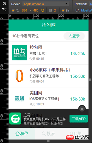
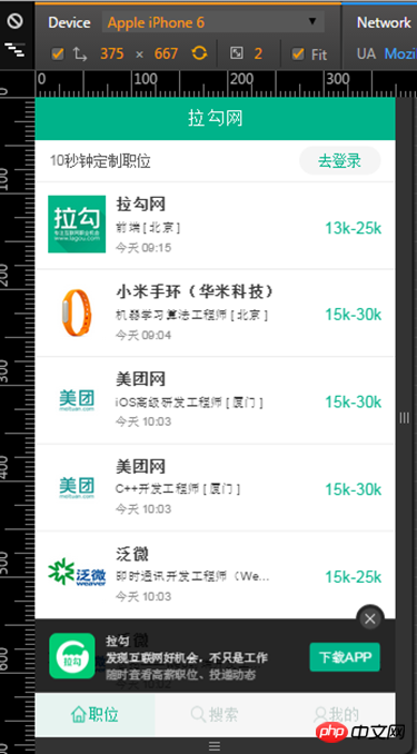
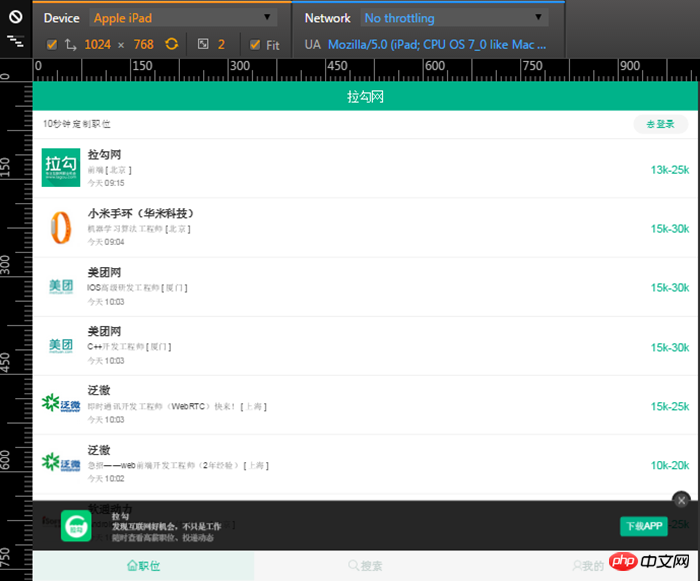
- No matter how the resolution changes, the height and position of the bars at the top and bottom will remain the same. Unchanged
- No matter how the resolution changes for each recruitment information in the middle, the recruiting company’s icon and other information are located on the left side of the entry, and the salary is located on the right side
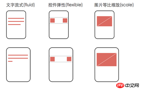
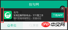
The basis of rem layout. In addition, for apps like Lagou, additional media queries may be needed to adjust the layout for small screen devices. For example, many design drafts are now based on the size of the iPhone 6, and the logical pixels of the iphone 6 device width are 375px, while the logical pixels of the iPhone 4 are 320 pixels, so if you make something based on the design draft, it will It may not be displayed in iPhone 4. For example, the download box at the bottom of Lagou.com can be seen by comparing it. This is 4:

code:

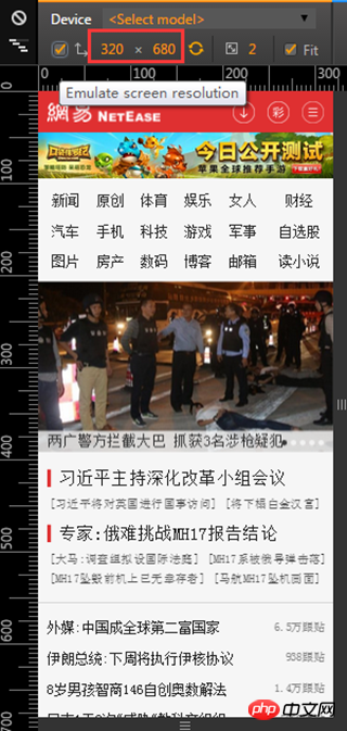
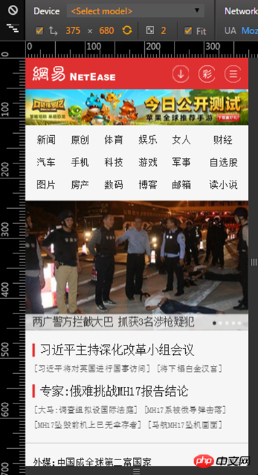
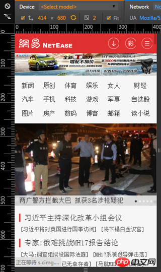
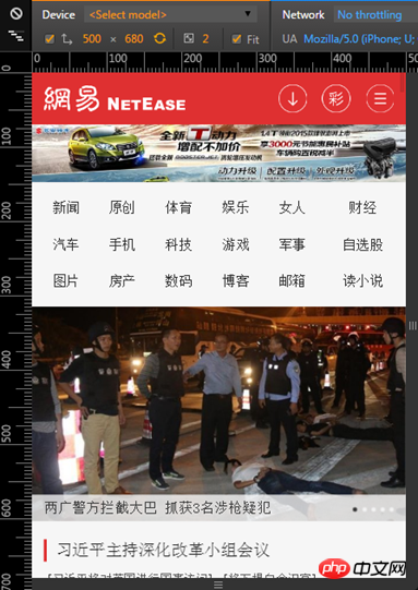
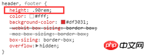
As can be seen from the above pictures, as the resolution increases, the effect of the page will change significantly, mainly reflected in the width, height and spacing of each element. The 375*680 navigation bar is obviously taller than the 320*680 navigation bar. The fundamental reason why this effect can be achieved is that other css sizes except font-size in NetEase pages use rem as the unit. For example, if you look at the height setting code of the navigation bar:
But as mentioned in the first part of this article, using rem layout combined with setting different font-sizes according to different resolutions on html has many troubles that are difficult to solve. How did NetEase solve it? The most fundamental reason is that the font-size of the HTML on the NetEase page is not pre-defined in the CSS through media query, but calculated through JS, so when the resolution changes, the font-size of the HTML It will change, but you have to refresh the page after adjusting the resolution to see the effect. If you look at the code, you will know why font-size is written directly to the style of html (the reason for js settings):

What it is calculated on is related to the design draft. Take NetEase as an example, its design draft should be based on iphone4 or iphone5, so its horizontal resolution when the design draft is placed vertically is 640px. For the convenience of calculation, take a font-size of 100px as a reference, then the width of the body element can be set to width: 6.4rem, so the font-size of html=deviceWidth / 6.4. This deviceWidth is the deviceWidth in the viewport settings. According to this calculation rule, it can be concluded that the font-size of the HTML in the four screenshots at the beginning of this section is as follows:
deviceWidth = 320,font-size = 320 / 6.4 = 50px
deviceWidth = 375,font-size = 375 / 6.4 = 58.59375px
deviceWidth = 414,font-size = 414 / 6.4 = 64.6875px
deviceWidth = 500,font-size = 500 / 6.4 = 78.125px
In fact, this is what NetEase does. You see From its code, we know that the width of the body element is:

Based on this, we can be sure that the horizontal resolution of its design draft when it is vertically oriented is 640. Then you can see if the font-size of HTML is consistent with the calculation above when the resolution of NetEase is 320*680, 375*680, 414*680, 500*680:
 320 *680
 375*680
 414*680
 500*680
This deviceWidth passes document.documentElement .clientWidth can be obtained, so when the dom of the page is ready, the first thing to do is:
document.documentElement.style.fontSize = document.documentElement.clientWidth / 6.4 + 'px';
How did this 6.4 come about? Of course it is based on the design draft. Horizontal resolution/100. Let’s summarize NetEase’s approach:
-
(1) First take the vertical horizontal resolution of the design draft and divide it by 100 to get the width of the body element:
如果设计稿基于iphone6,横向分辨率为750,body的width为750 / 100 = 7.5rem
如果设计稿基于iphone4/5,横向分辨率为640,body的width为640 / 100 = 6.4rem
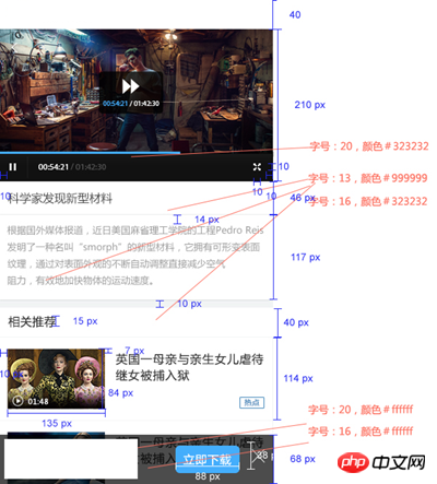
Copy after login (2) During layout, divide the size marked on the design diagram by 100 to get the size in css, such as the following picture:

The player height is 210px. When writing the style, the css should be written like this: height: 2.1rem. The reason why we take 100 as a reference is for the convenience of calculating rem here!
-
(3) After the dom is ready, set the font-size of the html through the following code:
document.documentElement.style.fontSize = document.documentElement.clientWidth / 6.4 + 'px';
Copy after loginCopy after login 6.4 is just an example. If it is a design draft of 750, it should be divided by 7.5.
-
(4) font-size may require additional media query, and font-size cannot use rem, such as NetEase’s settings:
@media screen and (max-width:321px){
    .m-navlist{font-size:15px}
}

@media screen and (min-width:321px) and (max-width:400px){
    .m-navlist{font-size:16px}
}

@media screen and (min-width:400px){
    .m-navlist{font-size:18px}
}
Copy after login
Finally, there are two situations to explain:
First, if NetEase’s approach is adopted, the viewport should be set as follows:
<meta>
Second, when deviceWidth is greater than the horizontal resolution of the design draft, the font-size of html is always equal to the horizontal resolution/body element width:
 640*680
 641*680
之所以这么干,是因为当deviceWidth大于640时,则物理分辨率大于1280(这就看设备的devicePixelRatio这个值了),应该去访问pc网站了。事实就是这样,你从手机访问网易,看到的是触屏版的页面,如果从pad访问,看到的就是电脑版的页面。如果你也想这么干,只要把总结中第三步的代码稍微改一下就行了:
var deviceWidth = document.documentElement.clientWidth;
if(deviceWidth > 640) deviceWidth = 640;
document.documentElement.style.fontSize = deviceWidth / 6.4 + 'px';
3. 淘宝的做法
看看淘宝在不同分辨率下,呈现的效果:



淘宝的效果跟网易的效果其实是类似的,随着分辨率的变化,页面元素的尺寸和间距都相应变化,这是因为淘宝的尺寸也是使用了rem的原因。在介绍它的做法之前,先来了解一点关于viewport的知识,通常我们采用如下代码设置viewport:
<meta>
这样整个网页在设备内显示时的页面宽度就会等于设备逻辑像素大小,也就是device-width。这个device-width的计算公式为:
设备的物理分辨率/(devicePixelRatio * scale),在scale为1的情况下,device-width = 设备的物理分辨率/devicePixelRatio 。
devicePixelRatio称为设备像素比,每款设备的devicePixelRatio都是已知,并且不变的,目前高清屏,普遍都是2,不过还有更高的,比如2.5, 3 等,我魅族note的手机的devicePixelRatio就是3。淘宝触屏版布局的前提就是viewport的scale根据devicePixelRatio动态设置:
 在devicePixelRatio为2的时候,scale为0.5
 在devicePixelRatio为3的时候,scale为0.3333
这么做目的当然是为了保证页面的大小与设计稿保持一致了,比如设计稿如果是750的横向分辨率,那么实际页面的device-width,以iphone6来说,也等于750,这样的话设计稿上标注的尺寸只要除以某一个值就能够转换为rem了。通过js设置viewport的方法如下:
var scale = 1 / devicePixelRatio;
document.querySelector('meta[name="viewport"]').setAttribute('content','initial-scale=' + scale + ', maximum-scale=' + scale + ', minimum-scale=' + scale + ', user-scalable=no');淘宝布局的第二个要点,就是html元素的font-size的计算公式,font-size = deviceWidth / 10:

接下来要解决的问题是,元素的尺寸该如何计算,比如说设计稿上某一个元素的宽为150px,换算成rem应该怎么算呢?这个值等于设计稿标注尺寸/该设计稿对应的html的font-size。拿淘宝来说的,他们用的设计稿是750的,所以html的font-size就是75,如果某个元素时150px的宽,换算成rem就是150 / 75 = 2rem。总结下淘宝的这些做法:
-
(1)动态设置viewport的scale
var scale = 1 / devicePixelRatio;
document.querySelector('meta[name="viewport"]').setAttribute('content','initial-scale=' + scale + ', maximum-scale=' + scale + ', minimum-scale=' + scale + ', user-scalable=no');
Copy after loginCopy after login -
(2)动态计算html的font-size
document.documentElement.style.fontSize = document.documentElement.clientWidth / 10 + 'px';
Copy after login (3)布局的时候,各元素的css尺寸=设计稿标注尺寸/设计稿横向分辨率/10
(4)font-size可能需要额外的媒介查询,并且font-size不使用rem,这一点跟网易是一样的。
最后还有一个情况要说明,跟网易一样,淘宝也设置了一个临界点,当设备竖着时横向物理分辨率大于1080时,html的font-size就不会变化了,原因也是一样的,分辨率已经可以去访问电脑版页面了。


关于这种做法的具体实现,淘宝已经给我们提供了一个开源的解决方案,具体请查看:
https://github.com/amfe/lib-flexible
之前没有找到这相关的资料,实在不好意思:(
4. 比较网易与淘宝的做法
共同点:
都能适配所有的手机设备,对于pad,网易与淘宝都会跳转到pc页面,不再使用触屏版的页面
都需要动态设置html的font-size
布局时各元素的尺寸值都是根据设计稿标注的尺寸计算出来,由于html的font-size是动态调整的,所以能够做到不同分辨率下页面布局呈现等比变化
容器元素的font-size都不用rem,需要额外地对font-size做媒介查询
都能应用于尺寸不同的设计稿,只要按以上总结的方法去用就可以了
不同点
淘宝的设计稿是基于750的横向分辨率,网易的设计稿是基于640的横向分辨率,还要强调的是,虽然设计稿不同,但是最终的结果是一致的,设计稿的尺寸一个公司设计人员的工作标准,每个公司不一样而已
淘宝还需要动态设置viewport的scale,网易不用
最重要的区别就是:网易的做法,rem值很好计算,淘宝的做法肯定得用计算器才能用好了 。不过要是你使用了less和sass这样的css处理器,就好办多了,以淘宝跟less举例,我们可以这样编写less:
//定义一个变量和一个mixin
@baseFontSize: 75;//基于视觉稿横屏尺寸/100得出的基准font-size
.px2rem(@name, @px){
    @{name}: @px / @baseFontSize * 1rem;
}//使用示例:
.container {
    .px2rem(height, 240);
}//less翻译结果:
.container {
height: 3.2rem;
}5. 如何与设计协作
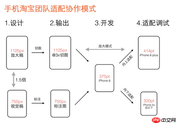
前端与设计师的协作应该是比较简单的,最重要的是要规范设计提供给你的产物,通常对于前端来说,我们需要设计师提供标注尺寸后的设计稿以及各种元素的切图文件,有了这些就可以开始布局了。考虑到Retina显示屏以及这么多移动设备分辨率却不一样的问题,那么设计师应该提供多套设计稿吗?从网易和淘宝的做法来看,应该是不用了,我们可以按照设计稿,先做出一套布局,按照以上方法做适配,由于是等比适配,所以各个设备的视觉效果差异应该会很小,当然也排除不了一些需要媒介查询特殊处理的情况,这肯定避免不了的。下面这张图是淘宝设计师分享的他们的工作流程:
解释一下就是:
第一步,视觉设计阶段,设计师按宽度750px(iphone 6)做设计稿,除图片外所有设计元素用矢量路径来做。设计定稿后在750px的设计稿上做标注,输出标注图。同时等比放大1.5倍生成宽度1125px的设计稿,在1125px的稿子里切图。
第二步,输出两个交付物给开发工程师:一个是程序用到的@3x切图资源,另一个是宽度750px的设计标注图。
第三步,开发工程师拿到750px标注图和@3x切图资源,完成iPhone 6(375pt)的界面开发。此阶段不能用固定宽度的方式开发界面,得用自动布局(auto layout),方便后续适配到其它尺寸。
第四步,适配调试阶段,基于iPhone 6的界面效果,分别向上向下调试iPhone 6 plus(414pt)和iPhone 5S及以下(320pt)的界面效果。由此完成大中小三屏适配。
注意第三步,就要使用我们以上介绍的网易跟淘宝的适配方法了。假如公司设计稿不是基于750的怎么办,其实很简单,按上图做一些相应替换即可,但是流程和方法还是一样的。解释一下为什么要在@3x的图里切,这是因为现在市面上也有不少像魅蓝note这种超高清屏幕,devicePixelRatio已经达到3了,这个切图保证在所有设备都清晰显示。
The above is the detailed content of Mobile front-end adaptive solutions for well-known websites and comparison. For more information, please follow other related articles on the PHP Chinese website!

Hot AI Tools

Undresser.AI Undress
AI-powered app for creating realistic nude photos

AI Clothes Remover
Online AI tool for removing clothes from photos.

Undress AI Tool
Undress images for free

Clothoff.io
AI clothes remover

Video Face Swap
Swap faces in any video effortlessly with our completely free AI face swap tool!

Hot Article

Hot Tools

Notepad++7.3.1
Easy-to-use and free code editor

SublimeText3 Chinese version
Chinese version, very easy to use

Zend Studio 13.0.1
Powerful PHP integrated development environment

Dreamweaver CS6
Visual web development tools

SublimeText3 Mac version
God-level code editing software (SublimeText3)

Hot Topics
 1387
1387
 52
52
 How to configure content adaptive brightness on Windows 11
Apr 14, 2023 pm 12:37 PM
Adaptive brightness is a feature on Windows 11 computers that adjusts the brightness level of your screen based on the content being displayed or lighting conditions. Since some users are still getting used to Windows 11's new interface, Adaptive Brightness can't be easily found, and some even say the Adaptive Brightness feature is missing on Windows 11, so this tutorial will clear it all up. For example, if you're watching a YouTube video and the video suddenly shows a dark scene, Adaptive Brightness will make the screen brighter and increase the contrast level. This is different from auto-brightness, which is a screen setting that allows your computer, smartphone, or device to adjust brightness levels based on ambient lighting. There is a special one in the front camera
 How to build an adaptive mobile interface with Vue?
Jun 27, 2023 am 11:05 AM
With the popularity of mobile Internet, more and more websites and applications need to consider the mobile experience. As a popular front-end framework, Vue has responsive layout and adaptive capabilities, which can well help us build adaptive mobile interfaces. This article will introduce how to use Vue to build an adaptive mobile interface. Using rem instead of px as the unit and using px as the unit in the mobile interface may result in inconsistent display effects on different devices. Therefore, it is recommended to use rem instead of px as the unit. rem is relative
 How to implement adaptive image size using CSS Viewport units vmin and vw
Sep 13, 2023 am 08:18 AM
How to use CSSViewport units vmin and vw to implement adaptive image size. In web design, we often encounter situations where images need to adapt to the screen size. To achieve this goal, CSS provides a powerful unit - the viewport unit. Among them, vmin represents the percentage of the smaller side of the viewport width, and vw represents the percentage of the viewport width. Therefore, we can use these two units to achieve the effect of adaptive image size. The specifics will be introduced below
 Can vue be adaptive?
Dec 30, 2022 pm 03:25 PM
Vue can achieve self-adaptation. The methods to achieve self-adaptation are: 1. Install the "scale-box" component through the "npm install" or "yarn add" command, and use "scale-box" to achieve adaptive scaling; 2. Through Set the device pixel ratio to achieve self-adaptation; 3. Set the zoom attribute through JS to adjust the zoom ratio to achieve self-adaptation.
 CSS Viewport: How to use vmax and vw to implement adaptive text width
Sep 13, 2023 am 10:16 AM
CSSViewport: How to use vmax and vw to implement adaptive text width. With the popularity of mobile devices, responsive design has become an important concept in web design. Among them, adaptive text width to maintain consistent display effects under different screen sizes is an important technology. This article will introduce how to use CSSViewport units, especially vmax and vw units, to implement adaptive text width. In addition to theoretical explanations, we will also provide specific
 How to create a responsive website layout using HTML, CSS and jQuery
Oct 27, 2023 am 11:06 AM
How to create an adaptive website layout using HTML, CSS, and jQuery In today’s Internet age, adaptive layout of websites has become an essential requirement. The adaptive layout of the website can enable the website to display a good user experience on different devices and adapt to devices of different screen sizes, such as computers, tablets, and mobile phones. This article will introduce how to use HTML, CSS and jQuery to create a responsive website layout, and provide specific code examples. Create website skeleton using HTML
 Adaptive Server in PHP8.0
May 14, 2023 pm 01:10 PM
On November 26, 2020, the PHP team officially released the PHP 8.0 version. Compared with the previous version, PHP 8.0 brings many new features and improvements. One of the features worthy of attention is the adaptive server. This article will introduce the concept of adaptive server in PHP8.0 and its advantages. In previous PHP versions, developers could use PHP's own server (such as PHP-FPM, Apache) to run their own code. However, the disadvantages of these servers
 Implement adaptive website design using PHP
Jun 22, 2023 pm 05:50 PM
Website design is becoming more and more important in the current Internet era. Designers and developers must consider issues such as different device resolutions, different screen sizes, and different operating systems. And these variables make website adaptability even more necessary. PHP is a popular programming language that can be used to develop responsive websites. In this article, we’ll introduce ways to implement responsive website design using PHP and provide a few practical tips. What is responsive website design? Adaptive website design refers to the


