

In order to practice my skills, I happened to need to make a sidebar when I was learning to type a website. I also checked various plug-ins and frameworks on the Internet to achieve this function, but I wanted to learn to use js natively. After giving it a try, I briefly completed the implementation of the sidebar, which can be used as a reference for beginners, but the coding ability is limited .
.
The main design is the animate() function. The animate() method performs custom animations of CSS property sets. This method changes an element from one state to another through CSS styles. CSS property values change gradually, allowing you to create animated effects. Only numeric values can be animated (e.g. "margin:30px"). String values cannot be animated (such as "background-color:red"). Please search for more information by yourself, I will not introduce it in detail. In addition, the media query method is used to adjust the size design of the sidebar by detecting the screen size of the current device. The media query method can set different styles for different screen sizes, especially if you need to design a responsive page.
#The following is the specific implementation, with the code attached:
##<!DOCTYPE html>
<html lang="en">
<head>
<meta charset="UTF-8">
<meta name="viewport" content="width=device-width,initial-scale=1"/>
<title>侧边栏</title>
<link href="css/sideBar.css" rel="stylesheet" type="text/css" />
</head>
<body>
<p class="container">
<p class="header">
<p class="nav-icon">
<span></span>
<span></span>
<span></span>
</p>
</p>
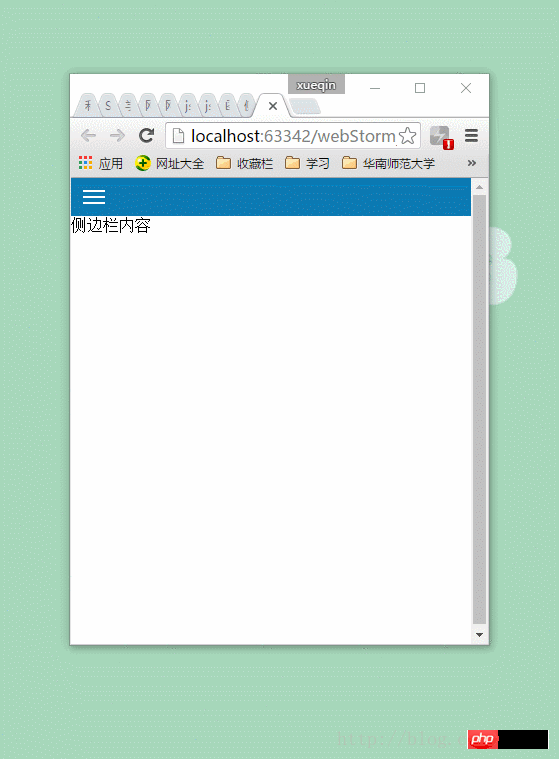
<p class="content">侧边栏内容</p>
<p class="sideBar">
<p class="sideBar-left">
<p class="pider"></p>
<p class="body-content">
<p class="messageWarning item">
<p><i class="message_icon"></i>消息提醒</p>
<ul>
<li class="news">
<i class="circle"></i><a href="javascript:void()">消息1</a>
</li>
<li class="news">
<i class="circle"></i><a href="javascript:void()">消息2</a>
</li>
<li class="news">
<i class="circle"></i><a href="javascript:void()">消息3</a>
</li>
<li class="news">
<i class="circle"></i><a href="javascript:void()">消息4</a>
</li>
</ul>
</p>
<p class="course item">
<p><i class="icon"></i>课程</p>
<ul>
<li class="myInfo">
<i class="circle"></i><a href="javascript:void()">我的课程</a>
</li>
<li class="Dynamic">
<i class="circle"></i><a href="javascript:void()">课程动态</a>
</li>
<li class="question">
<i class="circle"></i><a href="javascript:void()">问题空间</a>
</li>
<li class="homework">
<i class="circle"></i><a href="javascript:void()">课程作业</a>
</li>
</ul>
</p>
<p class="myHome item">
<a href="javascript:void()">
<i class="home_icon"></i>我的主页
</a>
</p>
<p class="exit item">
<a href="javascript:void()">
<i class="exit_icon"></i>退出
</a>
</p>
</p>
</p>
<p class="sideBar-right"></p>
</p>
</p>
</body>
<script src="js/jquery-2.1.4.min.js"></script>
<script src="js/sideBar.js"></script>
</html>
$(function(){

	var windowWidth = $(window).width();
	var windowHeight = $(window).height();
	var sideBarWidth = windowWidth*0.8;
	//设置侧边栏左边宽度与右边高度
	$(".sideBar-left").height(windowHeight);
	$(".sideBar-right").height(windowHeight);
	//侧边栏由左向右滑动
	$(".nav-icon").on("click",function(){
		$(".sideBar").animate({left: "0"},350);
	});
	//点击退出,侧边栏由右向左滑动
	$(".exit").on("click",function(){
		$(".sideBar").animate({left: "-100%"},350);
	});

})
css design:
*{
	margin: 0;
}
a{
	color: #fff;
	text-decoration: none;
}
.container{
	width: 100%;
	height: 100%;
	min-width: 280px;
	position: relative;
}
.header{
	background: #0C7AB3;
	list-style: none;
}
.nav-icon{
	width: 30px;
	background: #0C7AB3;
	padding: 8px;
}
.nav-icon span{
	display: block;
	border: 1px solid #fff;
	margin: 4px;
	width: 20px;
}
.nav-icon:hover{
	cursor: pointer;
}
.sideBar{
	width: 100%;
	position: absolute;
	top: 0px;
	left: -100%;
}
.sideBar-left{
	width: 75%;
	background: #fff;
	float: left;
	background-color: #343A3E;
}
.sideBar-left .pider{
	width: 80%;
	height: 6px;
	margin-top: 30px;
	padding-left: 15px;
	background-color: #3099FF;
}
.sideBar-left .body-content{
	width: 80%;
	margin-top: 15px;
	padding: 15px 0 15px 15px;
	border-top: 2px solid #3099FF;
	color: #EFEFEF;
}
.body-content .item{
	margin: 4px;
}
.item ul{
	list-style: none;
	margin-left: -24px;
}
.item ul li{
	margin:8px;
}
.item .circle{
	width: 10px;
	height: 10px;
	margin-right: 10px;
	border-radius: 50%;
	background-color: #3099FF;
	display: inline-block;
}
.sideBar-right{
	width:25%;
	display: inline-block;
	background-color: rgba(0, 0, 0, 0.5);
}
The above is the detailed content of Use js to write responsive sidebar examples. For more information, please follow other related articles on the PHP Chinese website!


![[Web front-end] Node.js quick start](https://img.php.cn/upload/course/000/000/067/662b5d34ba7c0227.png)


