
 Web Front-end
HTML Tutorial
Web front-end interview question No. 8—Absolute positioning and relative positioning
Web Front-end
HTML Tutorial
Web front-end interview question No. 8—Absolute positioning and relative positioning
Web front-end interview question No. 8—Absolute positioning and relative positioning

Relative positioning (relative):
Let’s talk about relative positioning first: just like its name, relative, there must be a reference object, but this reference is not something else, it is it own position in the original document flow. The object after relative positioning is not completely separated from the document flow. The original position of the object in the document is retained (standing in the latrine without shit), and the offset object will other objects. layer mask.
The relative positioning characteristics are summarized as follows:
①For relatively positioned elements, if the width is not set, the width is the width of the entire browser, or depends on Based on the width of the parent element.
②The relatively positioned block element moves relative to its original position. After moving, it still occupies the position of the document flow and does not affect the layout of other elements
The following is verified through code
Place 5 boxes in the browser, represented by different colors, the code is as follows
HTML code

CSS code


##Absolute positioning(absolute):The absolutely positioned object will be separated from the document flow. The reference position of the absolute positioning is no longer itself. Which one it is depends on whether its superior or superior has been positioned. Use
left, right, top, bottom, etc.Attributesare absolute relative to its closest parent object that has relative or absolute positioning settings. Positioning, if the parent object does not set the positioning attribute, it will be positioned relative to the html root element. After reading some posts, I found that some people think that if the parent object does not set the positioning attribute, it will be positioned relative to the body. This statement is wrong. The characteristics of absolute positioning are summarized as follows:
① When the width of an absolutely positioned block element is not set, the width is determined by the content inside the element②After detaching, the original position is equivalent to empty, and the following elements will occupy the position
③The absolutely positioned object is set relative to the one closest to itself Position the parent object with relative positioning or absolute positioning
④If the parent element is not positioned, position it relative to the html root element
The following still uses these five The offset of each box is used to verify
(1) The block element has no offset value. The five boxes above
only give box5 an absolute positioning and no offset value. At this time, the block element is just floating in its original position. If there is a block element behind it, it will occupy its position in the document flow. Let's add a box6 below box5 to see the effect.
Note: If the width of an absolutely positioned block element is not defined, the width is determined by the content inside the element.

The rendering is as follows

The effect of adding a box6

##As can be seen from the picture, box6 has already occupied The position of box5 in the document flow.
(2) There is an offset value
If the offset value is set and the parent element does not set relative positioning or absolute positioning, the element is positioned relative to the root element (i.e. html element, note that it is relative to the root element, not relative to the body) Use the offset of box5 to verify.
①Give box5 an offset, the parent element has no relative or absolute positioning


##②Give box5 the same offset and give the body element an absolute positioning (body element setting For absolute positioning, the width of an absolutely positioned block element is determined by the longest p, and the width becomes smaller):

The renderings are as follows

Sent from AppIt is obvious from the two renderings above that they are relatively different Positioning relative to the root element is different from positioning relative to the body. The main difference is whether the
marginvalue of the body is included. Next, nest three more parent boxes outside the five boxes, and give these three parent boxes a position to verify whether they are offset based on the most recently positioned parent element.
The code is as follows
HTML code

##CSS code

Picture from App
It is obvious from the above that box5 is positioned relative to the third-layer container, which is the container closest to it. If you are interested, you can give it a try and remove the positioning of the third-layer container to see if it is positioned relative to the second-layer container. I have verified it and will not post the picture.
Some students may ask why the outermost box should be set to absolute positioning and the other two to relative positioning. The difference in this positioning method mainly affects the width of the box and the relative positioning of block elements. When the width is not set, its width is the default browser width. If there is a parent element, its width is determined by the parent element. If the content of this block element is too much, the parent element will also be Hold it big.
, that is to say, the width of the relatively positioned block element depends on the parent element. So what will be the effect if these three containers are set to absolute positioning? Let's take a look at the renderings first
The picture is from App
As can be seen from the picture, the width of the third-layer container no longer depends on the parent element, because it changes from the document Detached from the flow, he is independent on his own, and his width can only be determined by the content. To sum up, the width of an absolutely positioned block element is determined by its own content. When the width of a relatively positioned block element is not set, it defaults to the width of the browser. But regardless of the width, the absolutely positioned element will find the parent element closest to itself (absolute or relative positioning) for positioning.
relative: positioning is relative to its own position (when setting the offset, it will be relative to its own position offset). The element set to relative is still in the document flow, the width and height of the element remain unchanged, and setting the offset will not affect the position of other elements. The outermost container is set to relative positioning. If the width is not set, the width is the width of the entire browser.
absolute: Positioning is determined relative to the parent element closest to the element that is set to absolute or relative positioning. If no parent element is set to absolute or relative positioning, the element is positioned relative to the root element, which is the html element. The element with absolute set is out of the document flow. If the width of the element is not set, the width is determined by the content inside the element. After detaching, the original position is equivalent to being empty, and the following elements will occupy the position.
Note: The experimental results of this article are obtained when the parent element and child elements are not set to a fixed width. If the parent element is set to a fixed width, its child elements will be positioned either absolutely or relatively. No child element can exceed the width of its parent element. The parent element is the big brother and no one can exceed him.
The above is the detailed content of Web front-end interview question No. 8—Absolute positioning and relative positioning. For more information, please follow other related articles on the PHP Chinese website!

Hot AI Tools

Undresser.AI Undress
AI-powered app for creating realistic nude photos

AI Clothes Remover
Online AI tool for removing clothes from photos.

Undress AI Tool
Undress images for free

Clothoff.io
AI clothes remover

Video Face Swap
Swap faces in any video effortlessly with our completely free AI face swap tool!

Hot Article
Hot Tools

Notepad++7.3.1
Easy-to-use and free code editor

SublimeText3 Chinese version
Chinese version, very easy to use

Zend Studio 13.0.1
Powerful PHP integrated development environment

Dreamweaver CS6
Visual web development tools

SublimeText3 Mac version
God-level code editing software (SublimeText3)
Hot Topics
 1392
1392
 52
52

 Does sticky positioning break away from the document flow?
Feb 20, 2024 pm 05:24 PM
Does sticky positioning break away from the document flow?
Feb 20, 2024 pm 05:24 PM
Does sticky positioning break away from the document flow? Specific code examples are needed. In web development, layout is a very important topic. Among them, positioning is one of the commonly used layout techniques. In CSS, there are three common positioning methods: static positioning, relative positioning and absolute positioning. In addition to these three positioning methods, there is also a more special positioning method, namely sticky positioning. So, does sticky positioning break away from the document flow? Let’s discuss it in detail below and provide some code examples to help understand. First, we need to understand what document flow is
 How to put the image in the middle with css
Apr 25, 2024 am 11:51 AM
How to put the image in the middle with css
Apr 25, 2024 am 11:51 AM
There are three main ways to center an image in CSS: using display: block; and margin: 0 auto;. Use flexbox layout or grid layout and set align-items or justify-content to center. Use absolute positioning, set top and left to 50%, and apply transform: translate(-50%, -50%);.
 bottom attribute syntax in CSS
Feb 21, 2024 pm 03:30 PM
bottom attribute syntax in CSS
Feb 21, 2024 pm 03:30 PM
Bottom attribute syntax and code examples in CSS In CSS, the bottom attribute is used to specify the distance between an element and the bottom of the container. It controls the position of an element relative to the bottom of its parent element. The syntax of the bottom attribute is as follows: element{bottom:value;} where element represents the element to which the style is to be applied, and value represents the bottom value to be set. value can be a specific length value, such as pixels
 How to center the box in html5
Apr 05, 2024 pm 12:27 PM
How to center the box in html5
Apr 05, 2024 pm 12:27 PM
To center the box in HTML5, there are the following methods: horizontal centering: text-align: centermargin: autodisplay: flex; justify-content: center; vertical centering: vertical-align: middletransform: translate(-50%, -50%); position: absolute; top: 50%; left: 50%; transform: translate(-50%, -50%);
 How to position elements in css
Apr 26, 2024 am 10:24 AM
How to position elements in css
Apr 26, 2024 am 10:24 AM
There are four methods of CSS element positioning: static, relative, absolute, and fixed positioning. Static positioning is the default and the element is not affected by positioning rules. Relative positioning moves an element relative to itself without affecting document flow. Absolute positioning removes an element from the document flow and positions it relative to its ancestor elements. Fixed positioning positions an element relative to the viewport, always keeping it in the same position on the screen.
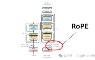 Detailed explanation of rotational position encoding RoPE commonly used in large language models: why is it better than absolute or relative position encoding?
Apr 01, 2024 pm 08:19 PM
Detailed explanation of rotational position encoding RoPE commonly used in large language models: why is it better than absolute or relative position encoding?
Apr 01, 2024 pm 08:19 PM
Since the "AttentionIsAllYouNeed" paper published in 2017, the Transformer architecture has been a cornerstone of the natural language processing (NLP) field. Its design has remained largely unchanged for years, with 2022 marking a major development in the field with the introduction of Rotary Position Encoding (RoPE). Rotated position embedding is the state-of-the-art NLP position embedding technique. Most popular large-scale language models (such as Llama, Llama2, PaLM and CodeGen) already use it. In this article, we’ll take a deep dive into what rotational position encodings are and how they neatly combine the benefits of absolute and relative position embeddings. The need for positional encoding in order to understand Ro
 What is layout layout?
Feb 24, 2024 pm 03:03 PM
What is layout layout?
Feb 24, 2024 pm 03:03 PM
Layout refers to a typesetting method adopted in web design to arrange and display web page elements according to certain rules and structures. Through reasonable layout, the webpage can be made more beautiful and neat, and achieve a good user experience. In front-end development, there are many layout methods to choose from, such as traditional table layout, floating layout, positioning layout, etc. However, with the promotion of HTML5 and CSS3, modern responsive layout technologies, such as Flexbox layout and Grid layout, have become
 A closer look at the advantages and limitations of absolute positioning
Jan 23, 2024 am 10:20 AM
A closer look at the advantages and limitations of absolute positioning
Jan 23, 2024 am 10:20 AM
Absolute Positioning (AbsolutePositioning) is a commonly used positioning method in CSS. It performs layout by specifying the position offset of an element relative to its nearest positioned ancestor element. When using absolute positioning, we need to understand its advantages and limitations, and use concrete code examples to deepen our understanding. First of all, one of the advantages of absolute positioning is that you have complete control over the position of your element. Compared with other layout methods, absolute positioning can accurately position elements anywhere on the page without being restricted by the document.
