High performance parallax animation【translation】
High performance parallaxAnimation
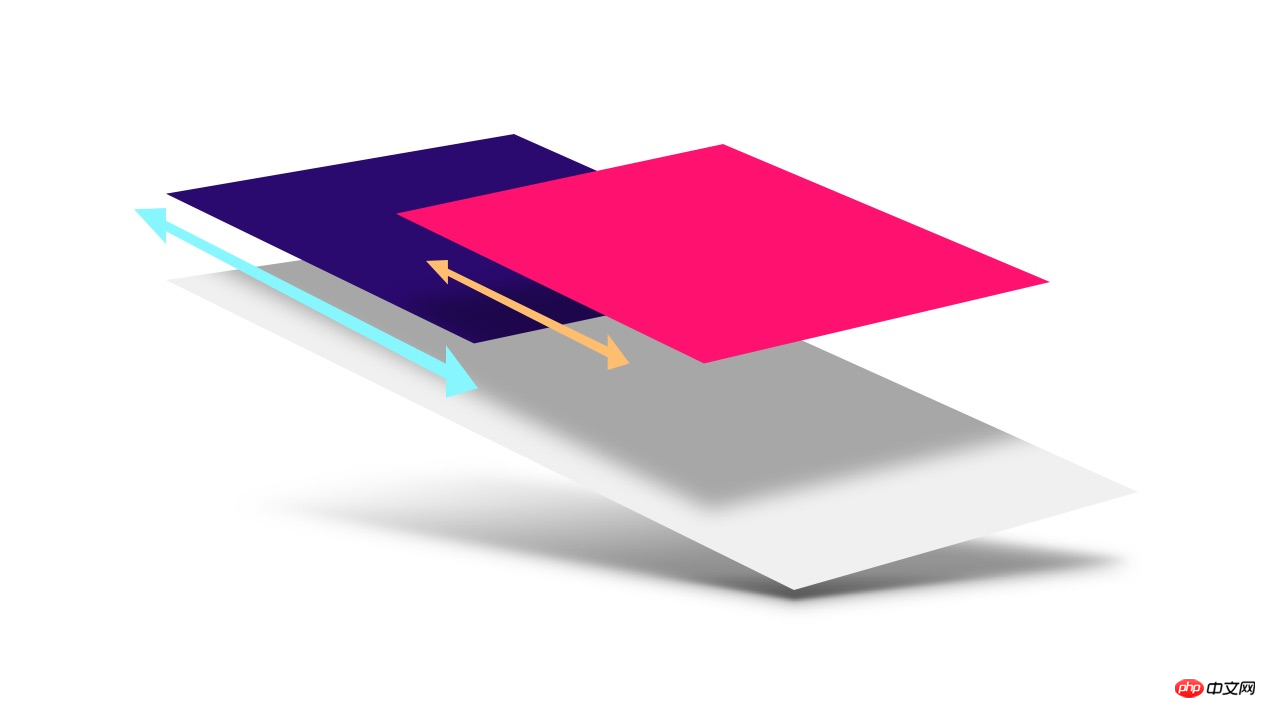
爱也Love it or hate it, parallax effects are everywhere on the web. When used wisely, they can add depth and metaphor to applications, but the problem is that implementing a high-performance parallax effect can be a very challenging task. . In this article, we will discuss how to construct a high-performance parallax effect, and of course, cross-browser parallax effect. Schematic
 Summary
Do not use scroll events(scroll events) or background-position(background-position
) to create parallax animations-
##Use CSS 3D transforms to create a more accurate parallax effect ##For iOS mobile devices. Safari uses position: sticky
to ensure that parallax works -
## If you want an out-of-the-box solution, visit the Parallax helper
JS , here is also a demo demonstration Parallax problem analysis
Before we begin, let’s take a look at two existing common methods of implementing parallax and discuss them. Why they are not suitable for what we are going forBad solution: using scroll events
The key requirement for parallax is that it should be scroll-coupled: for every position change as the page scrolls. , the position of the parallax element should also be updated This seems easy, one of the important mechanisms of modern browsers is that they can handle the work asynchronously. However, in most browsers, scroll events are. It is handled as a "best effort" job, which means: the browser does not
ensure that every frame of's scroll animation is delivered!
This important information is delivered! Tell us why you should avoid
Using Javascriptto move elements based on scroll events:
Javascript does not ensure that parallax will maintain the same pace as the page scrollsOn some older versions of Mobile Safari. The scroll event is even triggered after the scroll is completed, which makes the scrolling effect based on Javascript impossible. In the newer version of Mobile Safari, the scroll event can be triggered during the animation, but it is different from Chr##. Like #ome, it is based on the "as good as possible" principle, so when the main thread is busy with other work, the scroll event will not be triggered immediately, which means the parallax effect is lost. Bad solution: Update background position
Another scenario we want to avoid is drawing every frame. Many solutions try to provide a parallax effect by changing thebackground-position, but this will cause the browser to redraw the affected part when scrolling, which can be quite resource-consuming. This effect will make Animation lags. If we want to provide a high-quality parallax animation, what we want is a property that can be used as an acceleration (here we refer to transform
andopacity
), which does not depend on scroll events.CSS 3D
Create a container element and set overflow-y: scroll
: hidden
).-
, orFor the above element, we will apply a <a href="http://www.php.cn/wiki/926.html" target="_blank">perspective</a> value and then setperspective-originto <a href="http://www.php.cn/wiki/924.html" target="_blank"></a>topleft 0 0 - .
Apply a Z-axis transformation to the child elements of the above element, and then restore them back to achieve the parallax effect without affecting their size on the screen.<a href="http://www.php.cn/wiki/904.html" target="_blank"></a>The CSS for this solution looks like the following:.container { width: 100%; height: 100%; overflow-x: hidden; overflow-y: scroll; perspective: 1px; perspective-origin: 0 0; } .parallax-child { transform-origin: 0 0; transform: translateZ(-2px) scale(3); }Copy after loginOf course we assume that your HTML looks like the following:Adjustment The proportion of perspective<p class="container”> <p class="parallax-child”></p> </p>
Copy after login - Squeezing the child element back will require it to set a smaller proportion relative to
perspective
. You can calculate the required zoom ratio using the following equation:
拿上面的例子来说, perspective 是 1px, 而 parallax-child 在 Z 轴方向是 -2px,这就意味着元素需要被放大3倍,你可以看到我们在 scale 中写入了 3 这个值。
对于任何没有应用 translateZ 的内容,你可以用 0 替代,也就是缩放比为 (perspective - 0) / perspective,结果为 1 ,即既不放大也不缩小。真的是非常方便。
为什么这种方案好用?
弄清楚为什么这种方案好用是非常重要的,因为我们很快就要使用这个知识了。滚动其实本质是一种变换,这是它为什么可以被加速的原因。滚动很大程度上使用GPU参与了图层的变换。一个常见的滚动(没有应用任何 perspective )是这样的:滚动这种情况下是以 1:1 的方式在对待滚动的元素和它的子元素。换人话说,如果你向下滚动一个元素 <a href="http://www.php.cn/code/4221.html" target="_blank">300</a>px,那么它的子元素向上变换了同样的数量: 300px。
但是,如果对这个滚动元素应用 perspective 值会把这个过程“搞乱”:这个值改变了滚动变换的理想路线。现在如果一个 300px 的滚动可能把子元素移动了 150px,当然这取决于你给 perspective 和 translateZ 设置什么值。如果一个 translateZ 设置为0的子元素,它的滚动会一切如常 ( 1:1 ),但是一个被推向 Z 轴向( translateZ 不为 0 )的子元素将以不同的比例滚动!因此出现了视差效果。另外非常重要的一点是:这个过程本身就是浏览器内部的滚动机制的一部分,因此没有必要监听滚动事件或者改变背景位置。
美中不足:Mobile Safari
每种效果都有一些约束,对于变换( transform )来讲,对子元素的 3D 效果的保持就是这样。如果在应用 perspective 的元素和它的“视差”子元素的结构之中有其它元素的存在,那么 3D 的效果会被“拍扁”,也就是说效果将不复存在。
<p class="container”>
  <p class="parallax-container”>
    <p class="parallax-child”></p>
  </p>
</p>
在上面的HTML中 .parallax-container 是一个新添加的元素,而它会"抹平" perspective,从而导致效果丢失。通常情况下,解决方案还是比较符合直觉的:给这个元素添加 transform-style: preserve-3d 以便让它可以把 3D 效果应用到更深层的节点去。
.parallax-container {
  transform-style: preserve-3d;
}对于 Mobile Safari 来说,事情变的有点麻烦。对容器元素应用 overflow-y : 技术上这是没问题的,但是这会让滚动元素的移动过于凶猛。解决方案是加上一个 -webkit-overflow-scrolling: touch ,但这个设置会导致 perspective 被抹平,因此我们会得不到任何视差效果。
从一个发展的角度看,这可能算不上什么问题(因为只在旧版本的 Mobile Safari 出现),即使我们无法在每一个浏览器中展现视差效果,但一个应用的功能还是好用的,但我们最好找出一个方案。
position:sticky 来拯救
事实上,我们可以从 position: sticky 中得到一些帮助,这个设置允许元素固定在 <a href="http://www.php.cn/css/css-rwd-viewport.html" target="_blank">viewport</a> 的顶部或者固定在一个滚动元素的父元素。这个属性的文档,就如同任何其它文档一样,又臭又长,但是还是可以找到一些有用信息:
一个固定的“盒子”非常像一个相对定位的盒子,但是位移是通过引用最近的可滚动的祖先来计算的,或者根据
viewport来计算,如果找不到这样一个祖先的话 -- CSS Positioned Layout Module Level 3
第一眼看上去好像帮助不大,但一个关键点在句中说到如何计算元素的固定位置的那部分:“位移是通过引用最近的可滚动的祖先来计算的”。换句话说,移动固定元素的距离(为了让它看起来是固定在某个元素或者 viewport 上)是在应用其它任何变换之前进行计算的,而不是之后。这就意味着,和我们刚才说的滚动的那个例子很像,如果位移计算的结果是 300px,那么我们就有了一个新的机会去使用 perspective (或者其它任何变换)来在这个 300px 应用到固定元素之前去改变它。
通过给视差元素设置 position: -webkit-sticky,我们可以有效的“翻转”那个由于 -webkit-overflow-scrolling: touch 而产生的“抹平”效果。这样就确保了视差元素引用最近的可滚动的祖先元素,这里就是 .container 。然后,和上文讲的类似,给 .parallax-container 设置一个 perspective 值,这样就改变了计算的滚动位移,创建出了视差效果。
<p class="container”>
  <p class="parallax-container”>
    <p class="parallax-child”></p>
  </p>
</p>

.container {
  overflow-y: scroll;
  -webkit-overflow-scrolling: touch;
}

.parallax-container {
  perspective: 1px;
}

.parallax-child {
  position: -webkit-sticky;
  top: 0px;
  transform: translate(-2px) scale(3);
}这样就为 Mobile Safari 恢复了视差效果,真是一个不错的结果。
固定定位的问题
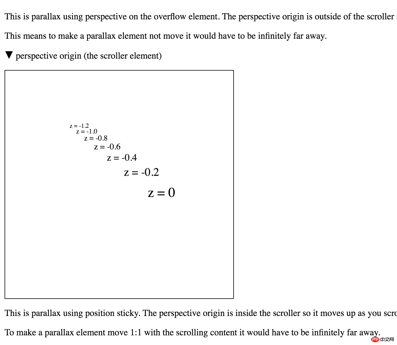
和之前的方案确实还有一个明显区别, position: sticky 改变了视差的机制。固定定位试图固定某个元素在滚动容器顶端,而非固定元素不是。这就意味着固定定位产生的视差和非固定产生的色差是相反的:
使用
position: sticky: 元素离z=0越近,它移动的越少不使用
position: sticky: 元素离z=0越近,它移动的越多
如果你还是感到有些抽象的话,可以看一下Robert Flack的这个demo,这个demo展示了在固定定位和非固定定位的条件下,元素是如何有不同的表现的。要看到这个效果的话,你需要 Chrome Canary (写作本文是,版本为56) 或者 Safari 。

position: sticky 对视差的影响
花式bug和应对
如同任何事情一样,还是有很多的坑需要填。
固定定位的支持是不一致的:当前在 Chrome 中对于这个特性还在开发中,Edge 则完全缺失,FireFox则有绘制的bug。在这种情况下,我们应该增加一点代码来在需要时(这里就是 Mobile Safari )才添加
position: sticky该效果在 Edge 中完全没有作用。Edge试图在OS级别处理滚动,通常情况下这是个好事。但在这个例子中,这种机制会使得我们无法在滚动时去应用
perspective。为了修复这个问题,我们可以为父元素 设置 `translateZ(0px)``。页面内容太大了:在决定页面内容有多大时,很多浏览器负责放缩,但很遗憾 Chrome 和 Safari 不负责。所以假如有一个放大 3 倍的变换应用到某个元素时,你可能会看到滚动条出现了,而且一旦出现后,即使之后你恢复了
1:1的比例,滚动条也不会消失。有一个方法可以避免这种情况:那就是从右下角进行放缩(transform-origin: <a href="http://www.php.cn/wiki/906.html" target="_blank">bottom</a> <a href="http://www.php.cn/wiki/905.html" target="_blank">right</a>)。这种方案背后的原理是它会导致过大的元素进入滚动区域的“负面”(一般是左上),而滚动区域永远不会让你看到“负面”区域。
结论
视差动画如果经过的周全的设计考虑后会是一个非常有趣的效果。而且现在你应该可以了解到我们是可以实现一个高性能的、滚动耦合的、跨浏览器的方案。由于这里面需要一点点数学计算和一些模板化的操作,所以我们封装了一个工具类和例子。
欢迎试用,并提出您的宝贵意见。
The above is the detailed content of High performance parallax animation【translation】. For more information, please follow other related articles on the PHP Chinese website!

Hot AI Tools

Undresser.AI Undress
AI-powered app for creating realistic nude photos

AI Clothes Remover
Online AI tool for removing clothes from photos.

Undress AI Tool
Undress images for free

Clothoff.io
AI clothes remover

AI Hentai Generator
Generate AI Hentai for free.

Hot Article

Hot Tools

Notepad++7.3.1
Easy-to-use and free code editor

SublimeText3 Chinese version
Chinese version, very easy to use

Zend Studio 13.0.1
Powerful PHP integrated development environment

Dreamweaver CS6
Visual web development tools

SublimeText3 Mac version
God-level code editing software (SublimeText3)

Hot Topics
 1378
1378
 52
52
 How to use Swoole to implement a high-performance HTTP reverse proxy server
Nov 07, 2023 am 08:18 AM
How to use Swoole to implement a high-performance HTTP reverse proxy server Swoole is a high-performance, asynchronous, and concurrent network communication framework based on the PHP language. It provides a series of network functions and can be used to implement HTTP servers, WebSocket servers, etc. In this article, we will introduce how to use Swoole to implement a high-performance HTTP reverse proxy server and provide specific code examples. Environment configuration First, we need to install the Swoole extension on the server
 PHP and WebSocket: Building high-performance, real-time applications
Dec 17, 2023 pm 12:58 PM
PHP and WebSocket: Building high-performance real-time applications As the Internet develops and user needs increase, real-time applications are becoming more and more common. The traditional HTTP protocol has some limitations when processing real-time data, such as the need for frequent polling or long polling to obtain the latest data. To solve this problem, WebSocket came into being. WebSocket is an advanced communication protocol that provides two-way communication capabilities, allowing real-time sending and receiving between the browser and the server.
 C++ High-Performance Programming Tips: Optimizing Code for Large-Scale Data Processing
Nov 27, 2023 am 08:29 AM
C++ is a high-performance programming language that provides developers with flexibility and scalability. Especially in large-scale data processing scenarios, the efficiency and fast computing speed of C++ are very important. This article will introduce some techniques for optimizing C++ code to cope with large-scale data processing needs. Using STL containers instead of traditional arrays In C++ programming, arrays are one of the commonly used data structures. However, in large-scale data processing, using STL containers, such as vector, deque, list, set, etc., can be more
 Use Go language to develop and implement high-performance speech recognition applications
Nov 20, 2023 am 08:11 AM
With the continuous development of science and technology, speech recognition technology has also made great progress and application. Speech recognition applications are widely used in voice assistants, smart speakers, virtual reality and other fields, providing people with a more convenient and intelligent way of interaction. How to implement high-performance speech recognition applications has become a question worth exploring. In recent years, Go language, as a high-performance programming language, has attracted much attention in the development of speech recognition applications. The Go language has the characteristics of high concurrency, concise writing, and fast execution speed. It is very suitable for building high-performance
 Use Go language to develop high-performance face recognition applications
Nov 20, 2023 am 09:48 AM
Use Go language to develop high-performance face recognition applications Abstract: Face recognition technology is a very popular application field in today's Internet era. This article introduces the steps and processes for developing high-performance face recognition applications using Go language. By using the concurrency, high performance, and ease-of-use features of the Go language, developers can more easily build high-performance face recognition applications. Introduction: In today's information society, face recognition technology is widely used in security monitoring, face payment, face unlocking and other fields. With the rapid development of the Internet
 Java development: How to use Netty for high-performance network programming
Sep 20, 2023 pm 02:09 PM
Java development: How to use Netty for high-performance network programming Summary: Netty is a high-performance, asynchronous event-driven network programming framework that simplifies the development process of network applications. This article will introduce the main features of Netty and how to use Netty for high-performance network programming. At the same time, we will also provide some specific Java code examples to help readers better understand and apply Netty. 1. Introduction to Netty Netty is a network programming box based on JavaNIO
 Technical practice of Docker and Spring Boot: quickly build high-performance application services
Oct 21, 2023 am 08:18 AM
Technical practice of Docker and SpringBoot: quickly build high-performance application services Introduction: In today's information age, the development and deployment of Internet applications have become increasingly important. With the rapid development of cloud computing and virtualization technology, Docker, as a lightweight container technology, has received widespread attention and application. SpringBoot has also been widely recognized as a framework for rapid development and deployment of Java applications. This article will explore how to combine Docker and SpringB
 Java implementation ideas for high-performance database search algorithms
Sep 18, 2023 pm 01:39 PM
Summary of Java implementation ideas for high-performance database search algorithms: With the advent of the Internet and big data era, the storage and search performance of the database are crucial to the efficiency of data processing. This article will introduce a Java implementation idea for a high-performance database search algorithm and provide specific code examples. Introduction Database search is one of the key operations for fast querying in large-scale data collections. Traditional database search algorithms have the problem of low search efficiency and cannot meet the needs of the big data era. Therefore, high-performance database search algorithms are


