

Pure CSS3 to draw minions and achieve animation effects

Preface
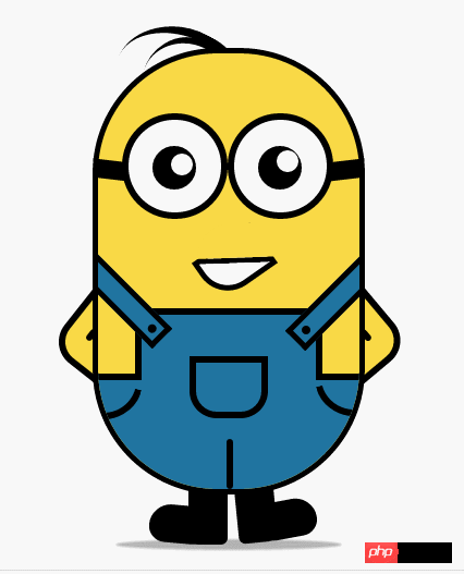
Two days ago I just published a blog about implementing Minion animation using CSS3, but the CSS3 animation implemented was based on a Minion picture I found on Zokuu.com jpg format pictures, and use PS to cut out the parts that need to be animated, and finally complete the animation effect. However, in fact, my original intention was to experience the excitement of using pictures to create animations, but I couldn't find the materials, so I had no choice but to use the stupidest method to meet my needs. I just wanted to be able to watch it. However, I still couldn’t resist the perfection in my heart, so I spent one night using CSS3 to draw the Minions and achieve similar animation effects.
Text
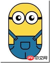
OK, let’s take a look at the difference between the two pictures below:


<p class="wrapper"><!-- 容器 -->
        <p class="littleH"><!-- 小黄人 -->
            <p class="bodyH"><!-- 身体 -->
                <p class="trousers"><!-- 裤子 -->
                    <p class="condoleBelt"><!-- 吊带 -->
                        <p class="left"></p>
                        <p class="right"></p>
                    </p>
                    <p class="trousers_top"></p><!-- 裤子突出的矩形部分 -->
                    <p class="pocket"></p><!-- 裤袋 -->
                    <!-- 三条线 -->
                    <span class="line_left"></span>
                    <span class="line_right"></span>
                    <span class="line_bottom"></span>
                </p>
            </p>
            <p class="hair"><!-- 头发 -->
                <span class="left_hair_one"></span>
                <span class="left_hair_two"></span>
            </p>
            <p class="eyes"><!-- 眼睛 -->
                <p class="leftEye"><!-- 左眼 -->
                    <p class="left_blackEye">
                        <p class="left_white"></p>
                    </p>
                </p>
                <p class="rightEye"><!-- 右眼 -->
                    <p class="right_blackEye">
                        <p class="right_white"></p>
                    </p>
                </p>
            </p>
            <p class="mouse"><!-- 嘴巴 -->
                <p class="mouse_shape"></p>
            </p>
            <p class="hands"><!-- 双手 -->
                <p class="leftHand"></p>
                <p class="rightHand"></p>
            </p>
            <p class="feet"><!-- 双脚 -->
                <p class="left_foot"></p>
                <p class="right_foot"></p>
            </p>
            <p class="groundShadow"></p><!-- 脚底阴影 -->
        </p>
    </p>
body{
    margin: 0;
    padding:0;
}
.wrapper{
    width: 300px;
    margin:100px auto;
}
.litteH{
    position: relative;
}
.bodyH{
    position: absolute;
    width: 240px;
    height: 400px;
    border:5px solid #000;
    border-radius: 115px;
    background: rgb(249,217,70);
    overflow: hidden;
    z-index: 2;
}
.bodyH .condoleBelt{
    position: absolute;
}
.bodyH .trousers{
    position: absolute;
    bottom: 0;
    width: 100%;
    height: 100px;
    border-top: 6px solid #000;
    background: rgb(32,116,160);
}
.trousers_top{
    width: 160px;
    height: 60px;
    border:6px solid #000;
    border-bottom: none;
    border-radius: 0 0 5px 5px;
    background: rgb(32,116,160);
    position: absolute;
    bottom: 100px;
    left:34px;
}
.bodyH .condoleBelt .left,
.bodyH .condoleBelt .right{
    width: 100px;
    height: 16px;
    border:5px solid #000;
    background: rgb(32,116,160);
    position: absolute;
    top:-90px;
    left:-35px;
    z-index: 2;
    -webkit-transform:rotate(45deg);
}
.bodyH .condoleBelt .left{
    top:-88px;
    left:165px;
    -webkit-transform:rotate(-45deg);
}
.bodyH .condoleBelt .left:after,
.bodyH .condoleBelt .right:after{
    content: '';
    width: 8px;
    height: 8px;
    border-radius: 50%;
    background: #000;
    position: absolute;
    top:4px;
    left:88px;
}

.bodyH .condoleBelt .left:after{
    left:5px;
}
.pocket{
    width: 60px;
    height: 45px;
    border:6px solid #000;
    border-radius: 0px 0px 25px 25px;
    position: absolute;
    bottom:65px;
    left:84px;
}
.line_right{
    width: 30px;
    height: 30px;
    border-bottom-left-radius: 100px;
    border-bottom:6px solid #000;
    border-left:6px solid #000;
    position: absolute;
    left: 0;
    bottom:60px;
    -webkit-transform:rotate(-75deg);
}
.line_left{
    width: 30px;
    height: 30px;
    border-bottom-right-radius: 100px;
    border-bottom:6px solid #000;
    border-right:6px solid #000;
    position: absolute;
    right: 0;
    bottom:63px;
    -webkit-transform:rotate(75deg);
}
.line_bottom{
    height: 40px;
    border:3px solid #000;
    border-radius: 3px;
    position: absolute;
    left:118px;
    bottom: 0px;
}
.eyes{
    position: relative;
    z-index: 3;
}
.eyes .leftEye,.eyes .rightEye{
    width: 85px;
    height: 85px;
    border-radius: 50%;
    border:6px solid #000;
    background: #fff;
    position: absolute;
    top:60px;
    left: 27px;
}
.eyes .leftEye{
    left: 124px;
}
.eyes .leftEye .left_blackEye,
.eyes .rightEye .right_blackEye{
    width: 40px;
    height: 40px;
    border-radius: 50%;
    background: #000;
    position: absolute;
    top:24px;
    left:22px;
}
.eyes .leftEye .left_blackEye .left_white,
.eyes .rightEye .right_blackEye .right_white{
    width: 20px;
    height: 20px;
    border-radius: 50%;
    background: #fff;
    position: absolute;
    top:7px;
    left:17px;
}
.eyes .leftEye .left_blackEye .left_white{
    top:4px;
    left:17px;
}
.eyes .leftEye:after,
.eyes .rightEye:after{
    content: '';
    width: 28px;
    height: 18px;
    background: #000;
    position: absolute;
    left:-30px;
    top:37px;
    -webkit-transform:skewX(20deg) rotate(7deg);
}
.eyes .leftEye:after{
    left:89px;
    top:37px;
    -webkit-transform:skewX(-20deg) rotate(-7deg);
}
.mouse{
    position: relative;
}
.mouse .mouse_shape{
    width: 55px;
    height: 35px;
    border:5px solid #000;
    border-bottom-left-radius: 30px;
    background: #fff;
    position: absolute;
    top:175px;
    left:98px;
    z-index: 3;
    -webkit-transform:rotate(-35deg);
}
.mouse .mouse_shape:after{
    content: '';
    width: 70px;
    height: 32px;
    border-bottom:5px solid #000;
    border-radius:35px 26px 5px 5px;
    background: red;
    position: absolute;
    top:-16px;
    left:3px;
    -webkit-transform:rotate(34deg);}
红色部分就是遮罩了,也是一个矩形,设置了底边框,实现和嘴巴下半部分形成闭合效果,现在我们就可以把颜色改成肤色就行了:
.mouse .mouse_shape:after{
    content: '';
    width: 70px;
    height: 32px;
    border-bottom:5px solid #000;
    border-radius:35px 26px 5px 5px;
    background: rgb(249,217,70);
    position: absolute;
    top:-16px;
    left:3px;
    -webkit-transform:rotate(34deg);
    -webkit-animation: mouse_mask 5s ease-in-out infinite;
}效果图如下:

接下来实现双手部分,这一部分不难,就是两个圆角矩形,旋转了角度,然后层级低于身体的层级就行,然后再通过:after伪元素实现胳膊关节处就搞定了。
.hands{
    position: relative;
}
.hands .leftHand,
.hands .rightHand{
    width: 80px;
    height: 80px;
    border:6px solid #000;
    border-radius: 25px;
    background: rgb(249,217,70);
    position: absolute;
    top:220px;
    left:-23px;
    -webkit-transform:rotate(40deg);
}
.hands .leftHand{
    left:182px;
    top:220px;
    -webkit-transform:rotate(-40deg);
}
.hands .leftHand:after,
.hands .rightHand:after{
    content: '';
    width: 6px;
    border:3px solid #000;
    border-radius: 3px;
    position: absolute;
    left:13px;
    top:50px;
    -webkit-transform:rotate(90deg);
}

.hands .leftHand:after{
    left:53px;
    top:50px;
    -webkit-transform:rotate(-90deg);
}效果图如下:

再接下来就是双脚的部分了,主要就是鞋面的设计,我是通过一个矩形,然后设置不同的圆角值,加上一点点的旋转来模拟的,这一块的话,怎么做我都觉得不是很像,所以最后差不多我就妥协了。
.feet{
    position: relative;
}
.feet .left_foot,
.feet .right_foot{
    width: 36px;
    height: 50px;
    border-bottom-right-radius: 6px;
    border-bottom-left-radius: 9px;
    background: #000;
    position: absolute;
    top: 406px;
    left:88px;
    -webkit-transform-origin: right top;
}
.feet .left_foot{
    border-bottom-right-radius: 9px;
    border-bottom-left-radius: 6px;
    left:130px;
    -webkit-transform-origin: left top;
}
.feet .left_foot:after,
.feet .right_foot:after{
    content: '';
    width: 60px;
    height: 35px;
    border-radius: 20px 10px 21px 15px;
    background: #000;
    position: absolute;
    left:-36px;
    top:14.4px;
    -webkit-transform:rotate(5deg);
}
.feet .left_foot:after{
    border-radius: 10px 20px 15px 21px;
    left:13px;
    -webkit-transform:rotate(-5deg);
}效果图如下:
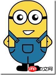
本来是不想画头发的,感觉怪难的,最后尝试了一下,还是能出个样子,那就添加上去吧。原理跟裤子左右两边的实现原理是一样的,只是参数值不一样罢了,大家参考代码琢磨一下:
.hair{
    position: relative;
}
.left_hair_one{
    width: 130px;
    height: 100px;
    border-radius: 50%;
    border-top:8px solid #000;
    position: absolute;
    left:17px;
    top:-17px;
    -webkit-transform:rotate(27deg);
}
.left_hair_two{
    width: 80px;
    height: 80px;
    border-radius: 50%;
    border-top:6px solid #000;
    position: absolute;
    left:45px;
    top:-10px;
    -webkit-transform:rotate(15deg);
}补充脚底阴影部分:
.groundShadow{
    width: 200px;
    height: 2px;
    border-radius: 50%;
    background: rgba(0,0,0,0.3);
    box-shadow: 0 0 2px 4px rgba(0,0,0,0.3);
    position: relative;
    top: 455px;
    left:25px;
}最后就是最初的效果了:

这时大家可能会问:然后呢?不是还会动的吗?
是的,这里我就大概讲一下实现的思路吧:
1.头发:头发我想实现的是被小风轻轻地吹起来,然后很快就塌下去,所以吹起和下塌分配的时间很关键;
2.眼睛:眼睛我设想的场景是小黄人在悠闲地走路,然后不时左右看一下两边的风景,所以眼睛转动很悠哉,所以分配的时间可以稍微长一点点;
3.嘴巴:让嘴巴动起来确实比较难,因为要动的话,遮罩也得实时跟着改变,而且不能露馅,所以最后实现的是当它往左边看了一下之后卖了一下萌;
4.双手和双脚:这部分确实很难逼真,本来脚就不是正常的走路状态,所以只能按卓别林老爷爷的走路方式模拟一下,而且左右脚动作是紧接实现而不是同步实现。双手的话,我是简单模拟人在走路时有摆手的自然惯性,而且是左脚配右手,右脚配左手。考虑到它的双手是放在背后的,所以我的摆动幅度设置为非常小,有效果但不明显。
OK,我就直接把动画代码放上来吧:
.left_hair_one{
    -webkit-animation: lefthair 2s ease-in-out infinite;
}
@-webkit-keyframes lefthair{
    0%,25%,31%,100%{
    }
    30%{
        -webkit-transform: rotate(31deg) translate3d(-3px,-1px,0);
    }
}
.eyes .leftEye .left_blackEye,
.eyes .rightEye .right_blackEye{
    -webkit-animation: blackeye 5s ease-in infinite;
}
@-webkit-keyframes blackeye{
    0%,20%,50%,70%,100%{
        -webkit-transform: translateX(0px);
    }
    30%,40%{
        -webkit-transform: translateX(15px);
    }
    80%,90%{
        -webkit-transform: translateX(-15px);
    }
}
.eyes .leftEye .left_blackEye .left_white,
.eyes .rightEye .right_blackEye .right_white{
    -webkit-animation: whiteeye 5s ease-in-out infinite;
}
@-webkit-keyframes whiteeye{
    0%,20%,50%,70%,100%{
        -webkit-transform: translateX(0px);
    }
    30%,40%{
        -webkit-transform: translate3d(3px,4px,0);
    }
    80%,90%{
        -webkit-transform: translate3d(-15px,4px,0);
    }
}
.mouse .mouse_shape{
    -webkit-animation: mouse 5s ease-in-out infinite;
}
@-webkit-keyframes mouse{
    40%,43%{
        width: 45px;
        height: 25px;
        top:180px;
    }
    0%,35%,48%,100%{
        width: 55px;
        height: 35px;
        top:175px;
        -webkit-transform:rotate(-35deg);
    }
}
.mouse .mouse_shape:after{
    -webkit-animation: mouse_mask 5s ease-in-out infinite;
}
@-webkit-keyframes mouse_mask{
    40%,43%{
        width: 60.5px;
        top:-19.3px;
        left:1.5px;
    }
    0%,35%,48%,100%{
        width: 70px;
        top:-16px;
        left:3px;
        -webkit-transform:rotate(33deg);
    }
}
.hands .rightHand{
    -webkit-animation:rightHand .8s ease-in-out infinite;
}
@-webkit-keyframes rightHand{
    0%,50%,100%{
        -webkit-transform: rotate(40deg);
    }
    30%{
        -webkit-transform: rotate(37deg) translateX(1px);
    }
}
.hands .leftHand{
    -webkit-animation:leftHand .8s ease-in-out infinite;
}
@-webkit-keyframes leftHand{
    0%,50%,100%{
        -webkit-transform: rotate(-40deg);
    }
    80%{
        -webkit-transform: rotate(-37deg) translateX(-1px);
    }
}
.feet .right_foot{
    -webkit-animation: rightfoot .8s ease-in-out infinite;
}
@-webkit-keyframes rightfoot{
    0%,50%,100%{
        -webkit-transform: rotate(0deg);
    }
    80%{
        -webkit-transform: rotate(10deg);
    }
}
.feet .left_foot{
    -webkit-animation: leftfoot .8s ease-in-out infinite;
}
@-webkit-keyframes leftfoot{
    0%,50%,100%{
        -webkit-transform: rotate(0deg);
    }

    30%{
        -webkit-transform: rotate(-10deg);
    }
}篇幅比较大,代码看多了会乱,如果觉得自己懒得整理的话,可以直接到我的github上下载这个简单又好玩的案例吧:https://github.com/JR93/littleHuang
谢谢!
The above is the detailed content of Pure CSS3 to draw minions and achieve animation effects. For more information, please follow other related articles on the PHP Chinese website!

Hot AI Tools

Undresser.AI Undress
AI-powered app for creating realistic nude photos

AI Clothes Remover
Online AI tool for removing clothes from photos.

Undress AI Tool
Undress images for free

Clothoff.io
AI clothes remover

AI Hentai Generator
Generate AI Hentai for free.

Hot Article
Hot Tools

Notepad++7.3.1
Easy-to-use and free code editor

SublimeText3 Chinese version
Chinese version, very easy to use

Zend Studio 13.0.1
Powerful PHP integrated development environment

Dreamweaver CS6
Visual web development tools

SublimeText3 Mac version
God-level code editing software (SublimeText3)
Hot Topics
 1359
1359
 52
52

 How to achieve wave effect with pure CSS3? (code example)
Jun 28, 2022 pm 01:39 PM
How to achieve wave effect with pure CSS3? (code example)
Jun 28, 2022 pm 01:39 PM
How to achieve wave effect with pure CSS3? This article will introduce to you how to use SVG and CSS animation to create wave effects. I hope it will be helpful to you!
 Use CSS skillfully to realize various strange-shaped buttons (with code)
Jul 19, 2022 am 11:28 AM
Use CSS skillfully to realize various strange-shaped buttons (with code)
Jul 19, 2022 am 11:28 AM
This article will show you how to use CSS to easily realize various weird-shaped buttons that appear frequently. I hope it will be helpful to you!
 How to hide elements in css without taking up space
Jun 01, 2022 pm 07:15 PM
How to hide elements in css without taking up space
Jun 01, 2022 pm 07:15 PM
Two methods: 1. Using the display attribute, just add the "display:none;" style to the element. 2. Use the position and top attributes to set the absolute positioning of the element to hide the element. Just add the "position:absolute;top:-9999px;" style to the element.
 How to implement lace borders in css3
Sep 16, 2022 pm 07:11 PM
How to implement lace borders in css3
Sep 16, 2022 pm 07:11 PM
In CSS, you can use the border-image attribute to achieve a lace border. The border-image attribute can use images to create borders, that is, add a background image to the border. You only need to specify the background image as a lace style; the syntax "border-image: url (image path) offsets the image border width inward. Whether outset is repeated;".
 It turns out that text carousel and image carousel can also be realized using pure CSS!
Jun 10, 2022 pm 01:00 PM
It turns out that text carousel and image carousel can also be realized using pure CSS!
Jun 10, 2022 pm 01:00 PM
How to create text carousel and image carousel? The first thing everyone thinks of is whether to use js. In fact, text carousel and image carousel can also be realized using pure CSS. Let’s take a look at the implementation method. I hope it will be helpful to everyone!
 How to enlarge the image by clicking the mouse in css3
Apr 25, 2022 pm 04:52 PM
How to enlarge the image by clicking the mouse in css3
Apr 25, 2022 pm 04:52 PM
Implementation method: 1. Use the ":active" selector to select the state of the mouse click on the picture; 2. Use the transform attribute and scale() function to achieve the picture magnification effect, the syntax "img:active {transform: scale(x-axis magnification, y Axis magnification);}".
 The animated film 'Despicable Me 4' releases the final trailer and will be released in mainland China on July 12
Jul 12, 2024 pm 12:50 PM
The animated film 'Despicable Me 4' releases the final trailer and will be released in mainland China on July 12
Jul 12, 2024 pm 12:50 PM
This website reported on July 5 that "Despicable Me 4" has released the final trailer. The film will be released in mainland China on July 12 (next Friday), and pre-sales are now open. The film continues to be produced by Illumination Entertainment and has been released in North America on July 3. The English version is dubbed by Steve Carell, Kristen Wiig, Pierre Coffin, etc. Dapeng, Zhuang Dafei participated in the Chinese dubbing in mainland theaters. Plot synopsis attached to this site: The Gru (voiced by Steve Carell) and Lucy (voiced by Kristen Wiig) families are about to start a new chapter in their family life and welcome the new member "Mini Gru" , and this little baby will also try his best to torture Gru, a new father. New villain Bully Max (Will Ferrell W
 css3 what is adaptive layout
Jun 02, 2022 pm 12:05 PM
css3 what is adaptive layout
Jun 02, 2022 pm 12:05 PM
Adaptive layout, also known as "responsive layout", refers to a web page layout that can automatically recognize the screen width and make corresponding adjustments; such a web page can be compatible with multiple different terminals instead of making a specific version for each terminal. . Adaptive layout was born to solve the problem of mobile web browsing, and can provide a good user experience for users using different terminals.
