

WeChat Mini Program Flex Layout

WeChat Mini ProgramPage layout adopts Flex Layout. Flex layout is a new solution proposed by W3c in 2009, which can implement various page layouts in a simple, complete and responsive manner. Flex layout provides the alignment, direction and order of elements in the container, and they can even be dynamic or indefinitely sized.
The main feature of Flex layout is the ability to adjust its child elements to be used in different screen sizes. The most suitable method to fill the appropriate space
#flex layout
- Telescopic in any direction, left, right, down, up
- You can change and rearrange the order in the style layer
- Space stretching and filling of child elements
- Align along the container
- WeChat mini program implements
layout. Let’s briefly introduce the use of Flex layout in WeChat mini program . An element whose container
has
display:flex<a href="http://www.php.cn/wiki/927.html" target="_blank"> or </a>display:block is a flex container (flexible container) , the child elements inside are called flex item (flexible items), and the child elements in flex container are laid out using Flex.
- Specifies the block container mode, always starts displaying with a new line, the
- view
container of the WeChat applet (view, scroll-view and swiper ) are
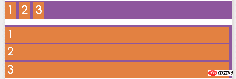
: Specifies the in-line container mode to display child elements in one line. You can use thedispaly:blockby default.##display:flexflex-wrap -
attribute
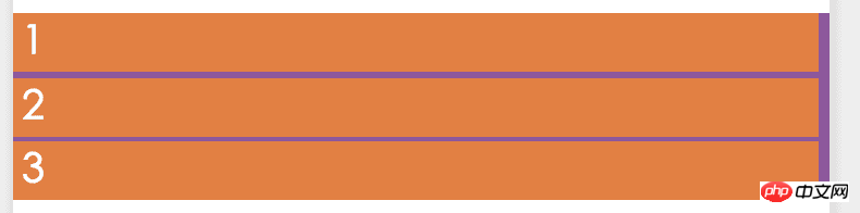
to specify whether it should wrap.flex-wraphas three values:nowrap (no line wrap),wrap(line wrap),wrap-reverse(the first line of wrap is below)Code using display:block(default value):Display effect:<view class="flex-row" style="display: block;"> <view class="flex-view-item">1</view> <view class="flex-view-item">2</view> <view class="flex-view-item">3</view> </view>
Copy after login
Change to
flex
You can see 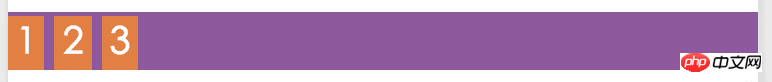 block
block
and
view
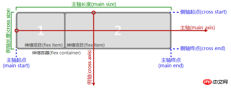
is displayed in a new line (block) or inline (flex). Main axis and cross axisFlexThe flex container of the layout can be laid out in any direction. The container has two axes by default:
main
axis) and cross axis(cross axis).
The starting position of the spindle is spindle starting point(main start), the end position of the spindle isspindle end point(main end), and the length of the spindle is
Spindle length(main size). Similarly, the starting point of the cross axis is the starting point of the cross axis (cross start), the end position is the end point of the cross axis (cross end), and the length is the length of the cross axis(cross size). See the picture below for details:##Flex-direction
 Note,
Note,
spindle
from left to right, similarly side axis
is not necessarilyfrom top to bottom
, the direction of the main axis is flex-directionAttribute control, it has 4 optional values: row: The horizontal direction from left to right is the main axis
- row-reverse
: The horizontal direction from right to left is the main axis
- column
: From top The vertical direction from bottom to top is the main axis
- column-reverse
The vertical direction from bottom to top is the main axis
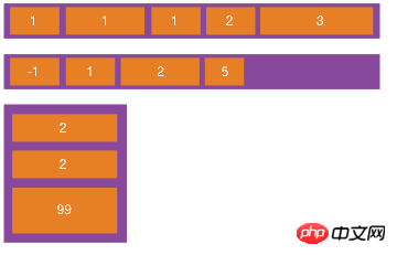
If The horizontal direction is the main axis, the vertical direction is the side axis, and vice versa. - Renderings of four main axis direction settings:
Example diagram
The example in the picture shows the use of different The
value is the difference in the arrangement direction. 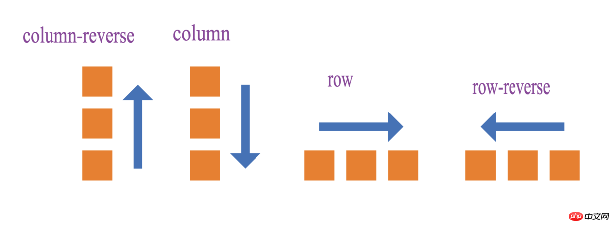 Example code:
<view >
    <view class="flex-row" style="display: flex;flex-direction: row;">
        <view class="flex-view-item">1</view>
        <view class="flex-view-item">2</view>
        <view class="flex-view-item">3</view>
    </view>
    <view class="flex-column" style="display:flex;flex-direction: column;" >
        <view class="flex-view-item">c1</view>
        <view class="flex-view-item">c2</view>
        <view class="flex-view-item">c3</view>
    </view>
</view>
flex-direction
Alignment
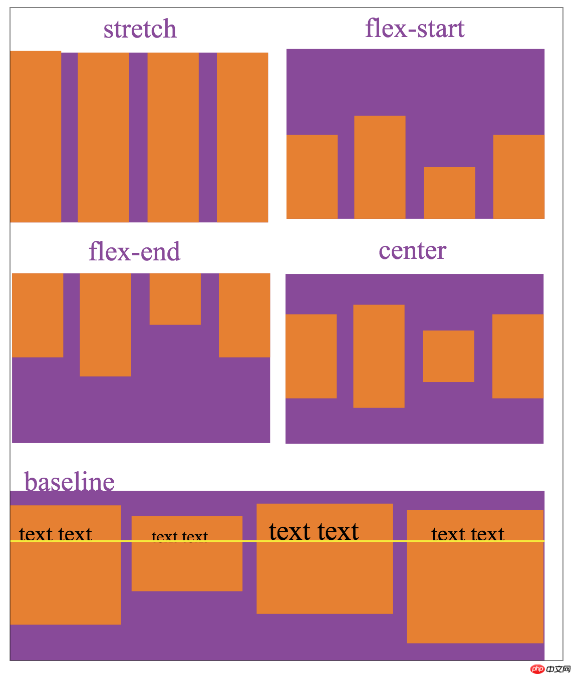
There are two alignment methods for child elements:
just<a href="http://www.php.cn/wiki/109.html" target="_blank">if</a>y-conentDefine the alignment of child elements on the main axisalign-itemsDefine the alignment of child elements on the side axis
justify-contentThere are 5 optional alignment methods:
##flex-start
Spindle starting point alignment (default Value)flex-end
Spindle end point alignmentcenter
Centered in the spindle Alignmentspace-between
Alignment at both ends, except that the child elements at both ends are leaning towards the containers at both ends, the intervals between other child elements are equal-
space-around
The distance between each child element is equal, and the distance between the child elements at both ends of the container is also the same as the distance betweenother child elements The distance is the same. The alignment of
justify-contentis related to the direction of the main axis. In the figure below,flex-directionisrow, and the main axis method isfrom the left. Go to the rightand describe the display effect ofjs<a href="http://www.php.cn/wiki/48.html" target="_blank">tify-content</a>5 values:
justify-content

align-items represents the alignment on the cross axis:
stretch
Fill the entire container (default value)flex-start
Align the starting point of the cross axisflex-end
Align the end of the cross axiscenter
Align the center in the cross axisbaseline
Align the first line of text of the child element
align-tiems The alignment set is related to the direction of the cross-axis. The following figure is flex-direction is row, the side axis direction is from top to bottom, describing the display effect of the 5 values of align-items:
The above is the detailed content of WeChat Mini Program Flex Layout. For more information, please follow other related articles on the PHP Chinese website!

Hot AI Tools

Undresser.AI Undress
AI-powered app for creating realistic nude photos

AI Clothes Remover
Online AI tool for removing clothes from photos.

Undress AI Tool
Undress images for free

Clothoff.io
AI clothes remover

AI Hentai Generator
Generate AI Hentai for free.

Hot Article
Hot Tools

Notepad++7.3.1
Easy-to-use and free code editor

SublimeText3 Chinese version
Chinese version, very easy to use

Zend Studio 13.0.1
Powerful PHP integrated development environment

Dreamweaver CS6
Visual web development tools

SublimeText3 Mac version
God-level code editing software (SublimeText3)
Hot Topics
 1379
1379
 52
52

 Guide to solving misalignment of WordPress web pages
Mar 05, 2024 pm 01:12 PM
Guide to solving misalignment of WordPress web pages
Mar 05, 2024 pm 01:12 PM
Guide to solving misaligned WordPress web pages In WordPress website development, sometimes we encounter web page elements that are misaligned. This may be due to screen sizes on different devices, browser compatibility, or improper CSS style settings. To solve this misalignment, we need to carefully analyze the problem, find possible causes, and debug and repair it step by step. This article will share some common WordPress web page misalignment problems and corresponding solutions, and provide specific code examples to help develop
 How to implement responsive layout using Vue
Nov 07, 2023 am 11:06 AM
How to implement responsive layout using Vue
Nov 07, 2023 am 11:06 AM
Vue is a very excellent front-end development framework. It adopts the MVVM mode and achieves a very good responsive layout through two-way binding of data. In our front-end development, responsive layout is a very important part, because it allows our pages to display the best effects for different devices, thereby improving user experience. In this article, we will introduce how to use Vue to implement responsive layout and provide specific code examples. 1. Use Bootstrap to implement responsive layout. Bootstrap is a
 What are the commonly used Flex layout properties?
Feb 25, 2024 am 10:42 AM
What are the commonly used Flex layout properties?
Feb 25, 2024 am 10:42 AM
What are the common properties of flex layout? Specific code examples are required. Flex layout is a powerful tool for designing responsive web page layouts. It makes it easy to control the arrangement and size of elements in a web page by using a flexible set of properties. In this article, I will introduce the common properties of Flex layout and provide specific code examples. display: Set the display mode of the element to Flex. .container{display:flex;}flex-directi
 How to implement two-column layout through CSS Flex layout
Sep 26, 2023 am 10:54 AM
How to implement two-column layout through CSS Flex layout
Sep 26, 2023 am 10:54 AM
How to implement two-column layout through CSSFlex flexible layout CSSFlex flexible layout is a modern layout technology that can simplify the process of web page layout, allowing designers and developers to easily create layouts that are flexible and adaptable to various screen sizes. Among them, implementing a two-column layout is one of the common requirements in Flex layout. In this article, we will introduce how to use CSSFlex elastic layout to implement a simple two-column layout and provide specific code examples. Using Flex containers and projects
 Solve the problem of flex layout style in Vue
Jun 30, 2023 pm 08:51 PM
Solve the problem of flex layout style in Vue
Jun 30, 2023 pm 08:51 PM
Vue is a popular JavaScript framework that is widely used in front-end development. Its flexibility and powerful features allow developers to easily build interaction-rich web applications. In Vue development, flex layout is almost everywhere. However, when using flex layout, you sometimes encounter some styling issues. This article will introduce some methods to solve the style problems caused by flex layout. First, let us understand the basic concepts of flex layout. Flex layout provides a flexible box model
 How to implement irregular grid layout through CSS Flex layout
Sep 28, 2023 pm 09:49 PM
How to implement irregular grid layout through CSS Flex layout
Sep 28, 2023 pm 09:49 PM
How to implement irregular grid layout through CSSFlex elastic layout. In web design, it is often necessary to use grid layout to achieve page segmentation and layout. Usually grid layout is regular, and each grid is the same size. Sometimes we may need to implement some irregular grid layout. CSSFlex elastic layout is a powerful layout method that can easily implement various grid layouts, including irregular grid layouts. Below we will introduce how to use CSSFlex elastic layout to achieve different
 How to achieve vertical centering of page elements through CSS Flex layout
Sep 27, 2023 pm 03:52 PM
How to achieve vertical centering of page elements through CSS Flex layout
Sep 27, 2023 pm 03:52 PM
How to achieve vertical centering of page elements through CSSFlex elastic layout In web design, we often encounter situations where page elements need to be vertically centered. CSSFlex elastic layout is an elegant, concise and flexible layout method that can easily achieve vertical centering of page elements. This article will introduce in detail how to use CSSFlex layout to achieve vertical centering of page elements and provide specific code examples. 1. Basic Principles To use CSSFlex layout to achieve vertical centering of page elements, the following are required:
 Optimize WordPress layout and eliminate misalignment problems
Mar 05, 2024 pm 05:36 PM
Optimize WordPress layout and eliminate misalignment problems
Mar 05, 2024 pm 05:36 PM
Optimize WordPress layout and eliminate misalignment problems. In the process of building a website using WordPress, layout misalignment is a common problem, which brings trouble to users when browsing the website. Correct layout is a crucial part of website design, which directly affects user experience and page display effects. Therefore, in order to eliminate the misalignment problem, we need to optimize the WordPress layout and implement it through specific code examples. Here are some common layout problems and corresponding solutions: Responsive layout problems:
