As a front-end developer, especially when doing mobile terminal adaptation, rem is a unit we often use. You can search for its benefits. There are many online.
But when we convert the px on the design draft into rem, we have to manually calculate it. This is a very time-consuming and laborious process. Is there any way to "liberate" us? (Forgive my laziness~)
Processors such as Sass, LESS and PostCSS can all handle it.
@function px2em($px, $base-font-size: 16px) {
  @if (unitless($px)) {
    @warn "Assuming #{$px} to be in pixels, attempting to convert it into pixels for you";
    @return px2em($px + 0px); // That may fail.
  } @else if (unit($px) == em) {
    @return $px;
  }
  @return ($px / $base-font-size) * 1em;
}@mixin px2rem($property,$px-values,$baseline-px:16px,$support-for-ie:false){
//Conver the baseline into rems
$baseline-rem: $baseline-px / 1rem * 1;
//Print the first line in pixel values
@if $support-for-ie {
#{$property}: $px-values;
}
//if there is only one (numeric) value, return the property/value line for it.
@if type-of($px-values) == "number"{
#{$property}: $px-values / $baseline-rem;
}
@else {
//Create an empty list that we can dump values into
$rem-values:();
@each $value in $px-values{
// If the value is zero or not a number, return it
@if $value == 0 or type-of($value) != "number"{
$rem-values: append($rem-values, $value / $baseline-rem);
}
}
// Return the property and its list of converted values
#{$property}: $rem-values;
}
}For the above method, we have to learn additional writing rules such as sass, and also need to configure it. Although it is very simple, can it be simpler?
This is a plug-in written by flashlizi for sublime text. It is really convenient to use! We can see it on GitHub.
Let me introduce how to configure it:
我们也可以修改默认配置:
打开cssrem-master文件夹下的cssrem.sublime-settings文件,进行修改
{
    "px_to_rem": 40, //px转rem的单位比例,默认为40
    "max_rem_fraction_length": 6, //px转rem的小数部分的最大长度。默认为6。
    "available_file_types": [".css", ".less", ".sass",".html"]
    //启用此插件的文件类型。默认为:[".css", ".less", ".sass"]
}Actual test:
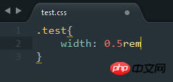
Create a new .css file:

Press the tab key to get the following results:

Isn’t it very convenient? Come and try it~
js to implement mobile device adaptation.
The above is the detailed content of css px automatically converted to rem. For more information, please follow other related articles on the PHP Chinese website!


