

Force the page to horizontal screen

Recently, the company is going to develop a mobile development web game (just click on various buttons and you will find a girlfriend in the end =. =), which requires horizontal screen display, not vertical screen.
If you have experience, you will definitely know that when the user opens the screen vertically, it is very silly to be prompted that you need to turn the phone around. At this time, if the user has not turned on the landscape mode on the phone, the user will be forced to turn it on. At this time, the user has already impatiently turned off your game.
I conducted research first to see if there was any ready-made api. After referring to screen's API and manifest method, the experimental results are of course not good.
The only solution I can think of now is to write a horizontal p in portrait mode and then turn it around.
Okay, my test page structure is as follows:
<body class="webpBack">
  <p id="print">
      <p>lol</p>
   </p>
</body>
It’s very simple, right? The final ideal state is to turn lol horizontally in a very harmonious way.
Okay, let’s take a look at the css that distinguishes horizontal and vertical screens:
@media screen and (orientation: portrait) {
      html{
         width : 100% ;
         height : 100% ;
          background-color: white ;
          overflow : hidden;
      }
      body{
          width : 100% ;
         height : 100% ;
         background-color: red ;
          overflow : hidden;
      }
      #print{
         position : absolute ;
         background-color: yellow ;
      }
}
@media screen and (orientation: landscape) {
       html{
         width : 100% ;
         height : 100% ;
         background-color: white ;
      }
       body{
          width : 100% ;
         height : 100% ;
         background-color: white ;
      }
           #print{
            position : absolute ;
            top : 0 ;
            left : 0 ;
            width : 100% ;
            height : 100% ;
            background-color: yellow ;
         }
}
#print p{
        margin: auto ;
        margin-top : 20px ;
        text-align: center;
}To put it bluntly, the print p should be turned horizontally in portrait mode and unchanged in landscape mode. So under portrait, its width and height are not defined. It will be filled in through the following js.
var width = document.documentElement.clientWidth;
var height = document.documentElement.clientHeight;
if( width < height ){
console.log(width + " " + height);
$print = $('#print');
$print.width(height);
$print.height(width);
$print.css('top', (height-width)/2 );
$print.css('left', 0-(height-width)/2 );
$print.css('transform' , 'rotate(90deg)');
$print.css('transform-origin' , '50% 50%');
}Here we first obtain the width and height of the available area on the screen, and then determine whether it is a horizontal or vertical screen based on the relationship between the width and height. If it is a portrait screen, set the width and height of the print p, align it, and then rotate it.
The final effect is as follows:
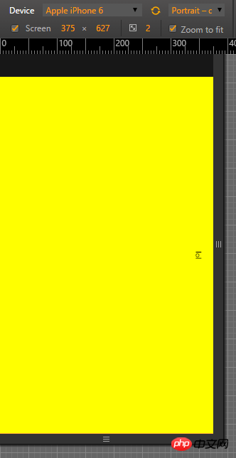
Vertical screen
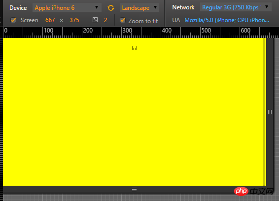
Horizontal screen
Finally, the consequence of this is that if the rotate screen button of the user's phone is turned on, then when the phone is turned sideways, it will cause a certain tragedy. The solution is as follows:
 var evt = "onorientationchange" in window ? "orientationchange" : "resize";

    window.addEventListener(evt, function() {
        console.log(evt);
        var width = document.documentElement.clientWidth;
         var height =  document.documentElement.clientHeight;
          $print =  $('#print');
         if( width > height ){

            $print.width(width);
            $print.height(height);
            $print.css('top',  0 );
            $print.css('left',  0 );
            $print.css('transform' , 'none');
            $print.css('transform-origin' , '50% 50%');
         }
         else{
            $print.width(height);
            $print.height(width);
            $print.css('top',  (height-width)/2 );
            $print.css('left',  0-(height-width)/2 );
            $print.css('transform' , 'rotate(90deg)');
            $print.css('transform-origin' , '50% 50%');
         }

    }, false);
The above is the detailed content of Force the page to horizontal screen. For more information, please follow other related articles on the PHP Chinese website!

Hot AI Tools

Undresser.AI Undress
AI-powered app for creating realistic nude photos

AI Clothes Remover
Online AI tool for removing clothes from photos.

Undress AI Tool
Undress images for free

Clothoff.io
AI clothes remover

Video Face Swap
Swap faces in any video effortlessly with our completely free AI face swap tool!

Hot Article
Hot Tools

Notepad++7.3.1
Easy-to-use and free code editor

SublimeText3 Chinese version
Chinese version, very easy to use

Zend Studio 13.0.1
Powerful PHP integrated development environment

Dreamweaver CS6
Visual web development tools

SublimeText3 Mac version
God-level code editing software (SublimeText3)
Hot Topics
 1392
1392
 52
52

 Vue 3
Apr 02, 2025 pm 06:32 PM
Vue 3
Apr 02, 2025 pm 06:32 PM
It's out! Congrats to the Vue team for getting it done, I know it was a massive effort and a long time coming. All new docs, as well.
 Building an Ethereum app using Redwood.js and Fauna
Mar 28, 2025 am 09:18 AM
Building an Ethereum app using Redwood.js and Fauna
Mar 28, 2025 am 09:18 AM
With the recent climb of Bitcoin’s price over 20k $USD, and to it recently breaking 30k, I thought it’s worth taking a deep dive back into creating Ethereum
 Can you get valid CSS property values from the browser?
Apr 02, 2025 pm 06:17 PM
Can you get valid CSS property values from the browser?
Apr 02, 2025 pm 06:17 PM
I had someone write in with this very legit question. Lea just blogged about how you can get valid CSS properties themselves from the browser. That's like this.
 A bit on ci/cd
Apr 02, 2025 pm 06:21 PM
A bit on ci/cd
Apr 02, 2025 pm 06:21 PM
I'd say "website" fits better than "mobile app" but I like this framing from Max Lynch:
 Stacked Cards with Sticky Positioning and a Dash of Sass
Apr 03, 2025 am 10:30 AM
Stacked Cards with Sticky Positioning and a Dash of Sass
Apr 03, 2025 am 10:30 AM
The other day, I spotted this particularly lovely bit from Corey Ginnivan’s website where a collection of cards stack on top of one another as you scroll.
 Using Markdown and Localization in the WordPress Block Editor
Apr 02, 2025 am 04:27 AM
Using Markdown and Localization in the WordPress Block Editor
Apr 02, 2025 am 04:27 AM
If we need to show documentation to the user directly in the WordPress editor, what is the best way to do it?
 Comparing Browsers for Responsive Design
Apr 02, 2025 pm 06:25 PM
Comparing Browsers for Responsive Design
Apr 02, 2025 pm 06:25 PM
There are a number of these desktop apps where the goal is showing your site at different dimensions all at the same time. So you can, for example, be writing
 Why are the purple slashed areas in the Flex layout mistakenly considered 'overflow space'?
Apr 05, 2025 pm 05:51 PM
Why are the purple slashed areas in the Flex layout mistakenly considered 'overflow space'?
Apr 05, 2025 pm 05:51 PM
Questions about purple slash areas in Flex layouts When using Flex layouts, you may encounter some confusing phenomena, such as in the developer tools (d...
