

3 new CSS features worth learning in 2017 (recommended)

height: 1.76em;">Among the many new CSS features, there are 3 new features adopted this year that make me uncontrollably excited.
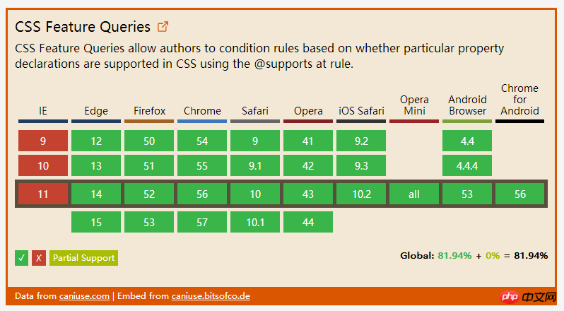
1 . Feature Query
Not long ago, I wrote a CSS feature that I really hoped for, which is about feature query. Now it can basically be said that it already exists! It supports mainstream browsers except Internet Explorer ( Including Opera Mini)
Feature query, using the @supports rule, allows us to include CSS in a conditional block that checks whether the current user agent supports a CSS property Key-value pairs, the content will only take effect if supported. Here is a simple example that only applies display when the browser supports Flexbox: flex -
@supports ( display: flex ) {
  .foo { display: flex; }
}In addition, use like and and not. With this operator, we can even create more complex feature queries. For example, we can detect whether the browser only supports the old Flexbox syntax -
@supports ( display: flexbox )
          and
          ( not ( display: flex ) ) {
  .foo { display: flexbox; }
}Support status
##.
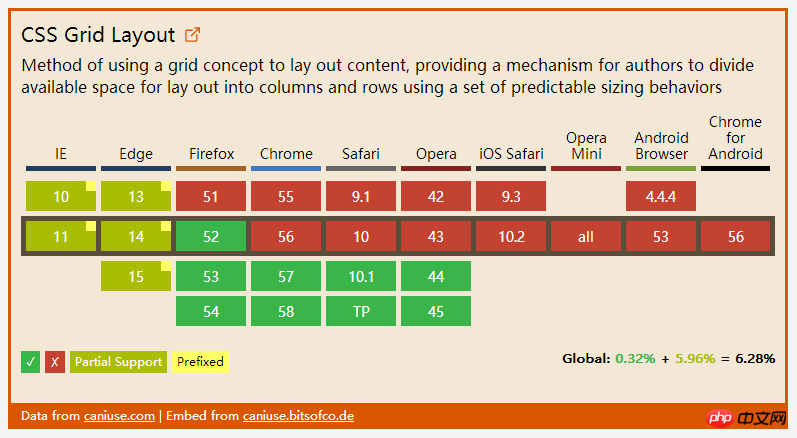
TableLayout
The CSS table layout module defines a system for creating table-based layouts. It is similar to the flexbox layout module. But it is more explicitly designed forpage layouts , and there are many different features between them
Explicit item positioning Grids are represented by table containers (via display: grid creation) and table items (child components). In our CSS, we can clearly organize the position and order of table items, regardless of their markup (referring to HTML markup). For example. , I wrote an article about using CSS tables for holy layout. This article shows how to create the famous "Holy Grail Layout" through this module.
.hgheader { grid-area: header; }
.hgfooter { grid-area: footer; }
.hgmain { grid-area: main; }
.hgleft { grid-area: navigation; }
.hgright { grid-area: ads; }

.hg {
    display: grid;
    grid-template-areas: "header header header"
                         "navigation main ads"
                         "footer footer footer";
    grid-template-columns: 150px 1fr 150px;
    grid-template-rows: 100px
                        1fr
                        30px;
    min-height: 100vh;
}

@media screen and (max-width: 600px) {
    .hg {
        grid-template-areas: "header"
                             "navigation"
                             "main"
                             "ads"
                             "footer";
        grid-template-columns: 100%;
        grid-template-rows: 100px
                            50px
                            1fr
                            50px
                            30px;
    }
}#. ##It makes it possible for us to allocate height and width to table items according to the available space in the table container. For example, in the Holy Grail Layout, I want the main partition to occupy all the space except the two sidebars. A simple piece of code to do this -
.hg {
    grid-template-columns: 150px 1fr 150px;
}Gap
We can use the grid-row-gap, grid-column-gap and grid-gap attributes to explicitly define the spacing. The value of these properties is
Data type, which is a percentage of the content area size. For example, if you need a spacing of %5, you can write like this -
.hg {
    display: grid;
    grid-column-gap: 5%;
}Support status
The CSS Grid module was first supported by browsers in March this year.
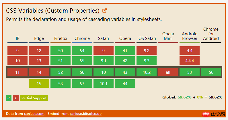
 3. Native
The last thing to talk about is native CSS variables. This module introduces a way for the author to define a variable that can be assigned a value like a CSS property.
For example, if a theme color is used in many places in our style sheet, we can abstract it and save it in a variable, and then reference the variable, instead of writing the actual value directly multiple times. :root {
--theme-colour: cornflowerblue;
}
h1 { color: var(--theme-colour); }
a { color: var(--theme-colour); }
strong { color: var(--theme-colour); }
in real time. For example, to change the value of the --theme-color attribute in the above example, we only need to do this -
const rootEl = document.documentElement;
rootEl.style.setProperty('--theme-colour', 'plum');
 As you can see, no feature is currently supported by all browsers, so what should we do to use it in production with peace of mind? The answer is: progressive enhancement! Last year I spoke at the Fronteers Conference about doing progressive enhancement related to CSS. Now I put it here -

The above is the detailed content of 3 new CSS features worth learning in 2017 (recommended). For more information, please follow other related articles on the PHP Chinese website!

Hot AI Tools

Undresser.AI Undress
AI-powered app for creating realistic nude photos

AI Clothes Remover
Online AI tool for removing clothes from photos.

Undress AI Tool
Undress images for free

Clothoff.io
AI clothes remover

AI Hentai Generator
Generate AI Hentai for free.

Hot Article
Hot Tools

Notepad++7.3.1
Easy-to-use and free code editor

SublimeText3 Chinese version
Chinese version, very easy to use

Zend Studio 13.0.1
Powerful PHP integrated development environment

Dreamweaver CS6
Visual web development tools

SublimeText3 Mac version
God-level code editing software (SublimeText3)
Hot Topics
 1371
1371
 52
52

 How to use bootstrap button
Apr 07, 2025 pm 03:09 PM
How to use bootstrap button
Apr 07, 2025 pm 03:09 PM
How to use the Bootstrap button? Introduce Bootstrap CSS to create button elements and add Bootstrap button class to add button text
 How to resize bootstrap
Apr 07, 2025 pm 03:18 PM
How to resize bootstrap
Apr 07, 2025 pm 03:18 PM
To adjust the size of elements in Bootstrap, you can use the dimension class, which includes: adjusting width: .col-, .w-, .mw-adjust height: .h-, .min-h-, .max-h-
 How to insert pictures on bootstrap
Apr 07, 2025 pm 03:30 PM
How to insert pictures on bootstrap
Apr 07, 2025 pm 03:30 PM
There are several ways to insert images in Bootstrap: insert images directly, using the HTML img tag. With the Bootstrap image component, you can provide responsive images and more styles. Set the image size, use the img-fluid class to make the image adaptable. Set the border, using the img-bordered class. Set the rounded corners and use the img-rounded class. Set the shadow, use the shadow class. Resize and position the image, using CSS style. Using the background image, use the background-image CSS property.
 How to upload files on bootstrap
Apr 07, 2025 pm 01:09 PM
How to upload files on bootstrap
Apr 07, 2025 pm 01:09 PM
The file upload function can be implemented through Bootstrap. The steps are as follows: introduce Bootstrap CSS and JavaScript files; create file input fields; create file upload buttons; handle file uploads (using FormData to collect data and then send to the server); custom style (optional).
 How to remove the default style in Bootstrap list?
Apr 07, 2025 am 10:18 AM
How to remove the default style in Bootstrap list?
Apr 07, 2025 am 10:18 AM
The default style of the Bootstrap list can be removed with CSS override. Use more specific CSS rules and selectors, follow the "proximity principle" and "weight principle", overriding the Bootstrap default style. To avoid style conflicts, more targeted selectors can be used. If the override is unsuccessful, adjust the weight of the custom CSS. At the same time, pay attention to performance optimization, avoid overuse of !important, and write concise and efficient CSS code.
 How to change the size of a Bootstrap list?
Apr 07, 2025 am 10:45 AM
How to change the size of a Bootstrap list?
Apr 07, 2025 am 10:45 AM
The size of a Bootstrap list depends on the size of the container that contains the list, not the list itself. Using Bootstrap's grid system or Flexbox can control the size of the container, thereby indirectly resizing the list items.
 How to verify bootstrap date
Apr 07, 2025 pm 03:06 PM
How to verify bootstrap date
Apr 07, 2025 pm 03:06 PM
To verify dates in Bootstrap, follow these steps: Introduce the required scripts and styles; initialize the date selector component; set the data-bv-date attribute to enable verification; configure verification rules (such as date formats, error messages, etc.); integrate the Bootstrap verification framework and automatically verify date input when form is submitted.
 How to layout bootstrap
Apr 07, 2025 pm 02:24 PM
How to layout bootstrap
Apr 07, 2025 pm 02:24 PM
To use Bootstrap to layout a website, you need to use a grid system to divide the page into containers, rows, and columns. First add the container, then add the rows in it, add the columns within the row, and finally add the content in the column. Bootstrap's responsive layout function automatically adjusts the layout according to breakpoints (xs, sm, md, lg, xl). Different layouts under different screen sizes can be achieved by using responsive classes.
