

7 steps to implement ellipses display in CSS multi-line text
Apr 07, 2017 am 09:49 AMline-height: 1.76em;">It is not easy to truncate multi-line text reasonably. We usually use several methods to solve it:
overflow: hidden directly hides excess text
text-overflow: ellipsis is only applicable to single-line text processing
Each A relatively fragile javascript implementation. The reason why this implementation is relatively fragile is that it requires the layout information after reflow (relayout) when the text length changes, such as the width
The original writing time was 2012.9.18, a more meaningful day. However, the author ignored an extension provided by WebKit -webkit-line-clamp, which is not an attribute in the CSS specification. To use this attribute to realize the ellipsis display of multi-line text, you need to cooperate with three other attributes: display: -webkit-box, -webkit-box-orient, text-overflow: ellipsis; Among them, the -webkit-line-clamp setting block element contains. The number of text lines; display: -webkit-box sets the layout of the block element to a telescopic layout; -webkit-box-orient sets the layout direction of the telescopic items; text-overflow: ellipsis; means that the part beyond the box is represented by ellipsis
#However, the method to be introduced in this article is completed by using the properties in the CSS specification and combining it with special implementation techniques. This means that it is compatible with browsers that implement the CSS2.1 specification, and will not only be used. It's purely mobile, and it's still feasible in traditional PC browsers (you know which browsers I'm referring to). Okay, let's see how CSS implements multi-line text. Overflow ellipsis display We divide the implementation details into 7 steps. In this implementation process, the simplest one isTruncation of text, and the most difficult part is to let an element In the lower right corner when its parent containing block overflows, and when the parent element does not overflow, the element disappears and becomes invisible. In order to avoid the difficulty, let's start from a simpler place - when the parent containing box is smaller, the child element will be removed. Layout to the lower right corner of the parent containing box
1st introduction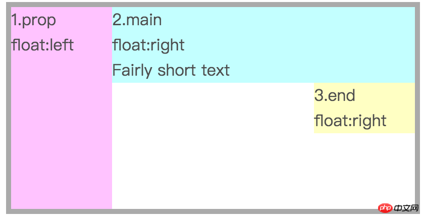
 ##In fact, this implementation fully utilizes the elements
. Basic rules. I won’t explain the several situations in the CSS2.1 specification in detail. Readers who don’t understand can check it out by themselves. The implementation of this code is very simple, which is the height and floating settings of the three sub-elements and the containing block: <p class="wrap">
<p class="prop">1.prop<br>float:left</p>
<p class="main">2.main<br>float:right<br>Fairly short text</p>
<p class="end">3.end<br>float:right</p>
</p>
.wrap {
width: 400px; height: 200px;
margin: 20px 20px 50px;
border: 5px solid #AAA;
line-height: 25px;
}
.prop {
float: left;
width: 100px; height: 200px;
background: #FAF; }
.main {
float: right;
width: 300px;
background: #AFF; }
.end {
float: right;
width: 100px;
background: #FFA; }
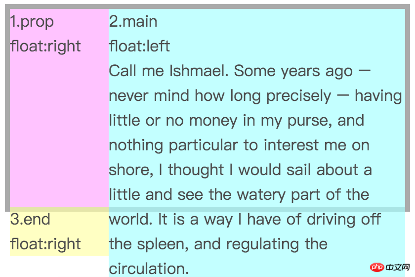
We create a child element to replace the ellipsis that will be displayed. When the text overflows, the element is displayed in the correct position. In the next implementation, we create a realend element and use the floating position of the end element in the previous section to position the realend element.
<p class="wrap">
  <p class="prop">
   1.prop<br>
   float:right</p>
  <p class="main">
   2.main<br>
   float:left<br>
   Fairly short text</p>
  <p class="end">
   <p class="realend">
     4.realend<br>
     position:absolute</p>
  3.end<br>float:right
  </p>
</p>

.end {
    float: right; position: relative;
    width: 100px;
    background: #FFA; }
.realend {
    position: absolute;
    width: 100%;
    top: -50px;
    left: 300px;
background: #FAA; font-size: 13px; }In this step, our main concern is the positioning of the realend element. Set the offset based on the floated end element. When the end element floats to the position of the picture in Chapter 1 of Chapter 2 (that is, in prop element). At this time, the realend element is exactly 50px above the end element and 300px-100px=200px to the right. This position is the lower right corner of the parent containing box wrap element. This is the result we expect. :
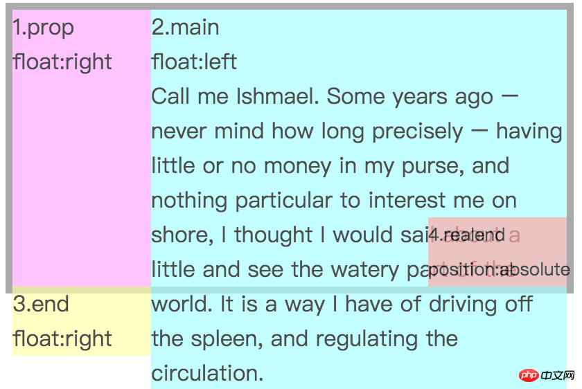 If the parent element does not overflow, then the realend element will appear on the right side of it
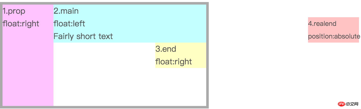 This situation The solution is very simple, please see Section 7 below, this is just an example.
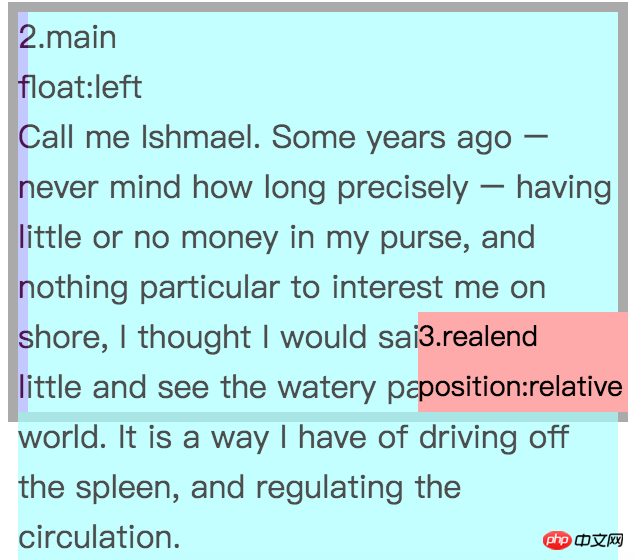
3rd Optimizing positioning model
In the second section, we set relative positioning for the end element and
absolute positioning for the realend element. But we can implement it with simpler code, that is, just using relative positioning. Students familiar with the positioning model should know that relatively positioned elements still occupy the text flow, and offsets can still be set for the elements. In this way, you can remove the end element and set relative positioning only for the realend element. <p class="wrap">
<p class="prop">1.prop<br>float:right</p>
<p class="main">2.main<br>float:left<br>Fairly short text</p>
<p class="realend">
3.realend<br>position:relative</p>
</p>
.realend {
float: right;
position: relative;
width: 100px;
top: -50px; left: 300px;
background: #FAA; font-size: 14px; }
4th Narrowing the prop element
Currently, the function of the leftmost prop element is to make the realend element directly below it when the text overflows. In the sample code in the previous sections, in order Intuitive demonstration, set the width of the prop element to 100px, so now in order to better simulate the actual effect, we gradually reduce the width of the prop element.
<p class="wrap">
  <p class="prop">1.prop<br>float:right</p>
  <p class="main">2.main<br>float:left<br>Fairly short text</p>
  <p class="realend">
  3.realend<br>position:relative</p>
</p>


.prop {
  float: left;
  width: 5px;
  height: 200px;
  background: #F0F; }
.main {
    float: right;
    width: 300px;
    margin-left: -5px;
    background: #AFF; }
.realend {
    float: right;
        position: relative;
    top: -50px;
        left: 300px;
    width: 100px;
        margin-left: -100px;
    padding-right: 5px;
background: #FAA; font-size: 14px; }For the prop element, reduce the width to 5px, and keep the other attributes unchanged;
For the main element, set margin-left:5px, so that the main element moves left by 5px, so that the main element is within the width The parent element is completely occupied;
对于realend元素,top、left和width的值不变。而设置 margin-left: -100px 、 padding-right: 5px 则是为了让realend元素的盒模型的最终宽度计算为5px。
BoxWidth = ChildMarginLeft + ChildBorderLeftWidth + ChildPaddingLeft + ChildWidth + ChildPaddingLeft + ChildBorderRightWidth + ChildMarginRightWidth;
由于CSS规范规定padding的值不可以为负数,因此只有设置margind-left为负值,且等于其宽度。这样做的最终目的就是 保证realend元素处在prop元素的下方,保证在文本溢出的情况下定位准确性 :
5th 继续优化:流式布局+伪元素
目前,realend元素的相关属性仍采用 px 度量,为了更好的扩展性,可以改用 % 替代。
同时,prop元素和realend元素可以采用伪元素来实现,减少额外标签的使用。
<p class="ellipsis">
  <p>2.main<br>float:left<br>Fairly short text
  </p>
</p>

/*相当于之前的prop元素*/
.ellipsis:before {
    content: "";
    float: left;
    width: 5px; height: 200px;
    background: #F0F; }
/*相当于之前的main元素*/
.ellipsis > *:first-child {
    float: right;
    width: 100%;
    margin-left: -5px;
    background: #AFF; }
/*相当于之前的realend元素*/
.ellipsis:after {
    content: "realend";
    float: right; position: relative;
    top: -25px; left: 100%;
    width: 100px; margin-left: -100px;
    padding-right: 5px;
background: #FAA; font-size: 14px; }效果图和上节一样。
6th 隐藏
之前的实现中在文本未溢出的情况下,realend元素会出现在父元素的右侧,正如 。解决此问题很简单,急需要设置:
.ellipsis{
  overflow:hidden;
}即可解决问题。
7th 大功告成
现在我们离结完就差一步了,即去掉各元素的背景色,并且用“...”替换文本。最后为了优化体验,采用渐变来隐藏“...”覆盖的文本,并设置了一些兼容性的属性。
到了此处,相信现在关心的只是CSS的代码了:
.ellipsis {
  overflow: hidden;
  height: 200px;
    line-height: 25px;
    margin: 20px;
    border: 5px solid #AAA; }

.ellipsis:before {
    content:"";
    float: left;
    width: 5px; height: 200px; }

.ellipsis > *:first-child {
    float: right;
    width: 100%;
    margin-left: -5px; }

.ellipsis:after {
    content: "\02026";

    box-sizing: content-box;
    -webkit-box-sizing: content-box;
    -moz-box-sizing: content-box;

    float: right; position: relative;
    top: -25px; left: 100%;
    width: 3em; margin-left: -3em;
    padding-right: 5px;

    text-align: right;


        background-size: 100% 100%;
  /* 512x1 image, gradient for IE9. Transparent at 0% -> white at 50% -> white at 100%.*/
background-image: url(data:image/png;base64,iVBORw0KGgoAAAANSUhEUgAAAgAAAAABCAMAAACfZeZEAAAABGdBTUEAALGPC/xhBQAAAwBQTFRF////////////////////////////////////////////////////////////////////////////////////////////////////////////////////////////////////////////////////////////////////////////////////////////////////////////////////////////////////////////////////////////////////////////////////////////////////////////////////////////////////////////////////////////////////////////////////////////////////////////////////////////////////////////////////////////////////////////////////////////////////////////////////////////AAAA////////////////////////////////////////////////////////////////////////////////////////////////////////////////////////////////////////////////////////////////////////////////////////////////////////////////////////////////////////////////////////////////////////////////////////////////////////////////////////////////////////////////////////////////////////////////////////////////////////////////////////////////////////////////////////////////////////////////////////////////////////////////////////////////wDWRdwAAAP90Uk5TgsRjMZXhS30YrvDUP3Emow1YibnM9+ggOZxrBtpRRo94gxItwLOoX/vsHdA2yGgL8+TdKUK8VFufmHSGgAQWJNc9tk+rb5KMCA8aM0iwpWV6dwP9+fXuFerm3yMs0jDOysY8wr5FTldeoWKabgEJ8RATG+IeIdsn2NUqLjQ3OgBDumC3SbRMsVKsValZplydZpZpbJOQco2KdYeEe36BDAL8/vgHBfr2CvTyDu8R7esU6RcZ5ecc4+Af3iLcJSjZ1ivT0S/PMs3LNck4x8U7wz7Bv0G9RLtHuEq1TbJQr1OtVqqnWqRdoqBhnmSbZ5mXapRtcJGOc4t2eYiFfH9AS7qYlgAAARlJREFUKM9jqK9fEGS7VNrDI2+F/nyB1Z4Fa5UKN4TbbeLY7FW0Tatkp3jp7mj7vXzl+4yrDsYoVx+JYz7mXXNSp/a0RN25JMcLPP8umzRcTZW77tNyk63tdprzXdmO+2ZdD9MFe56Y9z3LUG96mcX02n/CW71JH6Qmf8px/cw77ZvVzB+BCj8D5vxhn/vXZh6D4uzf1rN+Cc347j79q/zUL25TPrJMfG/5LvuNZP8rixeZz/mf+vU+Vut+5NL5gPOeb/sd1dZbTs03hBuvmV5JuaRyMfk849nEM7qnEk6IHI8/qn049hB35QGHiv0yZXuMdkXtYC3ebrglcqvYxoj1muvC1nDlrzJYGbpcdHHIMo2FwYv+j3QAAOBSfkZYITwUAAAAAElFTkSuQmCC);

    background: -webkit-gradient(linear, left top, right top,
        from(rgba(255, 255, 255, 0)), to(white), color-stop(50%, white));
    background: -moz-linear-gradient(to right, rgba(255, 255, 255, 0), white 50%, white);
    background: -o-linear-gradient(to right, rgba(255, 255, 255, 0), white 50%, white);
    background: -ms-linear-gradient(to right, rgba(255, 255, 255, 0), white 50%, white);
    background: linear-gradient(to right, rgba(255, 255, 255, 0), white 50%, white);
}
总结之兼容性
从上文的实现细节来看,我们利用的技巧完全是CSS规范中的浮动+定位+盒模型宽度计算,唯一存在兼容性问题的在于无关痛痒的渐变实现,因此可以在大多数浏览器下进行尝试。
The above is the detailed content of 7 steps to implement ellipses display in CSS multi-line text. For more information, please follow other related articles on the PHP Chinese website!

Hot Article

Hot tools Tags

Hot Article

Hot Article Tags

Notepad++7.3.1
Easy-to-use and free code editor

SublimeText3 Chinese version
Chinese version, very easy to use

Zend Studio 13.0.1
Powerful PHP integrated development environment

Dreamweaver CS6
Visual web development tools

SublimeText3 Mac version
God-level code editing software (SublimeText3)
Hot Topics


 What language is the browser plug-in written in?
May 08, 2024 pm 09:36 PM
What language is the browser plug-in written in?
May 08, 2024 pm 09:36 PM
What language is the browser plug-in written in?
