
 Web Front-end
CSS Tutorial
Detailed explanation of implementation examples of CSS translucent borders (picture)
Web Front-end
CSS Tutorial
Detailed explanation of implementation examples of CSS translucent borders (picture)
Detailed explanation of implementation examples of CSS translucent borders (picture)

Detailed implementation example of CSS translucent border (picture)
1. Translucent border
Question:
If we want to set a red background and a black translucent border for a container, we might write like this:
border: 20px solid rgba(0,0,0,0.5);
background: red;
But the effect is like this (picture 1-1.png); Why does our translucent color not implement a translucent border?
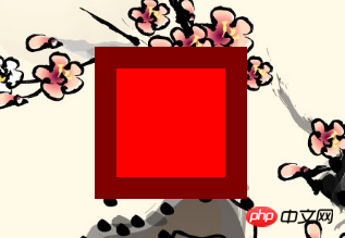
Figure 1-1.png
Solution:
We can pass background-clipAttribute To adjust the default behavior above, set its value to padding-box, and then the effect we want will appear (Figure 1-2.png);
border: 20px solid rgba(0,0,0,0.5);
background: red;
background-clip: padding-box;
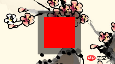
Figure 1-2.png
2.background-clip
Since the background-clip attribute is used, let's take a look at this attribute;
background-clip:
Set the background of the element (backgroundPicture or color) extends below the border.
| Values (values) | Description |
|---|---|
| border-box | Default initial value, the background extends to the outer edge of the border (but under the border) |
| padding-box | Nothing under the border Background, that is, the background extends to the inner margin outer edge |
| content-box | The background is cropped to the outer edge of the content area (content-box) |
| text | ExperimentAPI, the background is cropped into the foreground text. |
示例
CSS content
span {
   border: 10px blue;
   border-style: dotted double;
   margin: 1em;
   padding: 2em;
   background: #F8D575;
}
.border-box { background-clip: border-box; }
.padding-box { background-clip: padding-box; }
.content-box { background-clip: content-box; }
.text { background-clip: text; }
HTML content
<span class="border-box">border-box</span>
<span class="padding-box">padding-box</span>
<span class="content-box">content-box</span>
<span class="text">text</span>
效果:(图2-1.png)
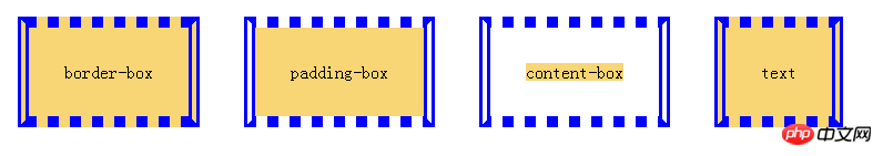
图2-1.png
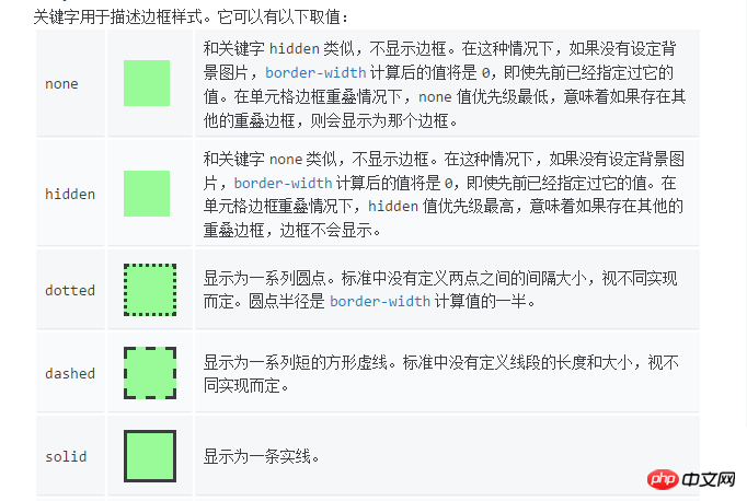
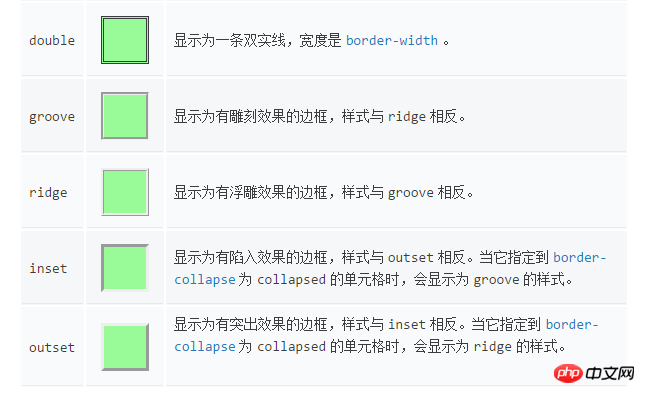
3.border-style
4.border-image
初始值:
border-image-source: none
border-image-slice: 100%
border-image-width: 1
border-image-outset: 0s
border-image-repeat: stretch
4.1 border-image-source: none |
where
where
Gradient示例:
CSS content
.gradient {
    border: 30px solid;
    border-image-source: linear-gradient(to right, red, green, blue);
    /*border-image-source: linear-gradient(90deg, red, green, blue);*/
    border-image-slice: 10;
    padding: 20px;
}
HTML content
<p class="gradient">The image is stretched to fill the area.</p>
效果:(图4-1.png)
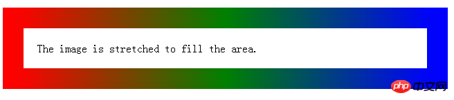
图4-1.png
4.2 border-image-slice: [
这个 border-imge-slice 属性传入1~4个参数(number没有单位专指像素或百分比值)将图片分割成9个部分,1,2,3,4四个区块是不会拉伸,不会平铺,称之为盲区,5,6,7,8四个区块可以通过 border-image-repeat 来控制拉伸平铺和重复( stretch:默认值,拉伸; repeat:平铺; round:整数次平铺; ),第9区块不显示,传入参数 fill 则显示第9区块,分割情况如下图(图4-2.png && 图2-3.png):
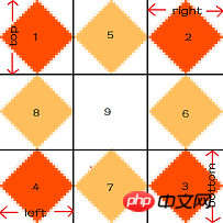
图4-2.png
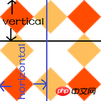
图4-3.png
我们通过上面这张图片(81px^81px)来看传入不同个数的参数是如何分割这张图片的;
1个参数
/* border-image-slice: slice */
border-image-slice: 27;
border: 30px solid transparent;
padding: 20px;
border-image-source:url([https://mdn.mozillademos.org/files/4127/border.png](https://mdn.mozillademos.org/files/4127/border.png));
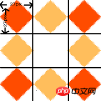
图4-4.png

图4-5.png(效果图)
2个参数(参考图4-3.png)
/* border-image-slice: vertical horizontal */
border-image-slice: 40 40.5;
border: 30px solid transparent;
padding: 20px;
border-image-source:url([https://mdn.mozillademos.org/files/4127/border.png](https://mdn.mozillademos.org/files/4127/border.png));
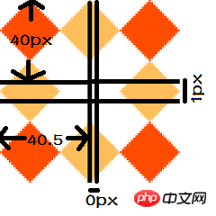
图4-6.png

图4-7.png(效果图)
3个参数
/* border-image-slice: top horizontal bottom */
border-image-slice: 27 40 27;
border: 30px solid transparent;
padding: 20px;
border-image-source:url([https://mdn.mozillademos.org/files/4127/border.png](https://mdn.mozillademos.org/files/4127/border.png));
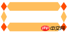
图4-8.png(效果图)
4个参数(参考图4-2.png)
/* border-image-slice: top right bottom left */
border-image-slice: 27 40 27 27;
border: 30px solid transparent;
padding: 20px;
border-image-source:url([https://mdn.mozillademos.org/files/4127/border.png](https://mdn.mozillademos.org/files/4127/border.png));

图4-9.png(效果图)
4.3 border-image-width: [
语法:
border-image-width: all                        /* One-value syntax */
E.g. border-image-width: 3;
border-image-width: vertical horizontal        /* Two-value syntax */
E.g. border-image-width: 2em 3em;
border-image-width: top horizontal bottom      /* Three-value syntax */
E.g. border-image-width: 5% 15% 10%;
border-image-width: top right bottom left      /* Four-value syntax */
E.g. border-image-width: 5% 2em 10% auto;
设置边框图片的width,如果超出了设置的border-width,会向内扩展;查看下方示例,比较(图4-10.png && 图4-11.png);
示例:
border: 30px solid transparent;
padding: 20px;
border-image-source: url("https://mdn.mozillademos.org/files/4127/border.png");
border-image-slice: 27;
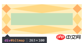
图4-10.png
border: 30px solid transparent;
padding: 20px;
border-image-source:url([https://mdn.mozillademos.org/files/4127/border.png](https://mdn.mozillademos.org/files/4127/border.png));
border-image-slice: 27;
border-image-width: 1 2 1 1;
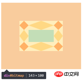
图4-11.png
4.4 border-image-outset: [
语法:
/* border-image-outset: sides */
border-image-outset: 30%;
/* border-image-outset:vertical horizontal */
border-image-outset: 10% 30%;
/* border-image-outset: top horizontal bottom */
border-image-outset: 30px 30% 45px;
/* border-image-outset:top right bottom left  */
border-image-outset: 7px 12px 14px 5px;
效果是将边框图片延伸到盒子外面,查看下放示例,比较(图4-12.png && 图4-13.png);
示例:
border: 30px solid transparent;
 padding: 20px;
 border-image-source:url([https://mdn.mozillademos.org/files/4127/border.png](https://mdn.mozillademos.org/files/4127/border.png));
 border-image-slice: 27;
 margin: 60px;
图4-12.png
border: 30px solid transparent;
padding: 20px;
border-image-source:url([https://mdn.mozillademos.org/files/4127/border.png](https://mdn.mozillademos.org/files/4127/border.png));
border-image-slice: 27;
margin: 60px;
border-image-outset: 2 1 1 1;
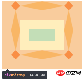
图4-13.png
4.4 border-image-repeat: [ stretch | repeat | round ]{1,2}
| 值(value) | 说明 |
|---|---|
| stretch | 默认初始值 ,;拉伸 |
| repeat | 平铺 |
| round | 整数次平铺 |
语法:
border-image-repeat: type                      /* One-value syntax */
E.g. border-image-value: stretch;
border-image-repeat: horizontal vertical       /* Two-value syntax */
E.g. border-image-width: round space;
The above is the detailed content of Detailed explanation of implementation examples of CSS translucent borders (picture). For more information, please follow other related articles on the PHP Chinese website!

Hot AI Tools

Undresser.AI Undress
AI-powered app for creating realistic nude photos

AI Clothes Remover
Online AI tool for removing clothes from photos.

Undress AI Tool
Undress images for free

Clothoff.io
AI clothes remover

Video Face Swap
Swap faces in any video effortlessly with our completely free AI face swap tool!

Hot Article
Hot Tools

Notepad++7.3.1
Easy-to-use and free code editor

SublimeText3 Chinese version
Chinese version, very easy to use

Zend Studio 13.0.1
Powerful PHP integrated development environment

Dreamweaver CS6
Visual web development tools

SublimeText3 Mac version
God-level code editing software (SublimeText3)
Hot Topics
 1387
1387
 52
52

 How to use bootstrap in vue
Apr 07, 2025 pm 11:33 PM
How to use bootstrap in vue
Apr 07, 2025 pm 11:33 PM
Using Bootstrap in Vue.js is divided into five steps: Install Bootstrap. Import Bootstrap in main.js. Use the Bootstrap component directly in the template. Optional: Custom style. Optional: Use plug-ins.
 The Roles of HTML, CSS, and JavaScript: Core Responsibilities
Apr 08, 2025 pm 07:05 PM
The Roles of HTML, CSS, and JavaScript: Core Responsibilities
Apr 08, 2025 pm 07:05 PM
HTML defines the web structure, CSS is responsible for style and layout, and JavaScript gives dynamic interaction. The three perform their duties in web development and jointly build a colorful website.
 How to write split lines on bootstrap
Apr 07, 2025 pm 03:12 PM
How to write split lines on bootstrap
Apr 07, 2025 pm 03:12 PM
There are two ways to create a Bootstrap split line: using the tag, which creates a horizontal split line. Use the CSS border property to create custom style split lines.
 Understanding HTML, CSS, and JavaScript: A Beginner's Guide
Apr 12, 2025 am 12:02 AM
Understanding HTML, CSS, and JavaScript: A Beginner's Guide
Apr 12, 2025 am 12:02 AM
WebdevelopmentreliesonHTML,CSS,andJavaScript:1)HTMLstructurescontent,2)CSSstylesit,and3)JavaScriptaddsinteractivity,formingthebasisofmodernwebexperiences.
 How to resize bootstrap
Apr 07, 2025 pm 03:18 PM
How to resize bootstrap
Apr 07, 2025 pm 03:18 PM
To adjust the size of elements in Bootstrap, you can use the dimension class, which includes: adjusting width: .col-, .w-, .mw-adjust height: .h-, .min-h-, .max-h-
 How to use bootstrap button
Apr 07, 2025 pm 03:09 PM
How to use bootstrap button
Apr 07, 2025 pm 03:09 PM
How to use the Bootstrap button? Introduce Bootstrap CSS to create button elements and add Bootstrap button class to add button text
 How to set up the framework for bootstrap
Apr 07, 2025 pm 03:27 PM
How to set up the framework for bootstrap
Apr 07, 2025 pm 03:27 PM
To set up the Bootstrap framework, you need to follow these steps: 1. Reference the Bootstrap file via CDN; 2. Download and host the file on your own server; 3. Include the Bootstrap file in HTML; 4. Compile Sass/Less as needed; 5. Import a custom file (optional). Once setup is complete, you can use Bootstrap's grid systems, components, and styles to create responsive websites and applications.
 How to insert pictures on bootstrap
Apr 07, 2025 pm 03:30 PM
How to insert pictures on bootstrap
Apr 07, 2025 pm 03:30 PM
There are several ways to insert images in Bootstrap: insert images directly, using the HTML img tag. With the Bootstrap image component, you can provide responsive images and more styles. Set the image size, use the img-fluid class to make the image adaptable. Set the border, using the img-bordered class. Set the rounded corners and use the img-rounded class. Set the shadow, use the shadow class. Resize and position the image, using CSS style. Using the background image, use the background-image CSS property.
