 Backend Development
 PHP Tutorial
 Use the GD2 function to add row and column labels to the chart (Typical Application Tutorial of PHP Graphics and Images 5)
Use the GD2 function to add row and column labels to the chart (Typical Application Tutorial of PHP Graphics and Images 5)
Use the GD2 function to add row and column labels to charts (Typical application tutorial of PHP graphics images 5)
Charts are widely used in data , is also very useful. Complex data can be displayed visually through data charts. So our article mainly explains how to add rows and columns to charts!
Let's continue to review the previous article "Using the GD2 function to draw geometric figures (PHP graphics and images typical application tutorial 4)", the use we introduced in the previous article The GD2 function draws geometric figures and also introduces several common functions for our image processing. So today we will introduce adding row and column labels to the chart!
Technical points of this article:
We still need to apply GD2 functions to add row and column labels to the chart, some of which we use The previous articles have introduced it to you in detail, now we introduce a few functions!
(1)imagecreatefrompng() function
This function is used to obtain png Format image files, the syntax of this function is as follows:
resource imagecreatefrompng ( string $filename )
imagecreatefrompng() Returns an image identifier, representing the image obtained from the given file name.
(2)imageline() function
This function is used to draw a solid line. The syntax format of the function is as follows:
bool imageline ( resource $image , int $x1 , int $y1 , int $x2 , int $y2 , int $color )
This function uses color color draws a solid line in the image from coordinates (x1, y1) to (x2, y2), with the origin (0,0) being the upper left corner of the image.
(3)imagestring() function
This function is used to draw a line of string horizontally on the image. The specific syntax format is as follows:
bool imagestring ( resource $image , int $font , int $x , int $y , string $s , int $col )
The parameter font is the font, and setting it from 1 to 5 means using the default font; the parameters x and y are the starting point coordinates of the string, the content of the string is placed in the parameter s, and the parameter col represents the color of the string!
Implementation process
<?php
header("Content-Type:text/html; charset=utf-8");
$im = imagecreatefrompng("upfile/2.png"); //载入一张 png 格式图片
$black = imagecolorallocate($im,255,0,0); //设置颜色值,
imageline($im,0,20,0,532,$black); //设置Y轴纵坐标
imageline($im,0,437,585,437,$black); //设置X轴纵坐标
imagestring($im,10,0,5,"Y",$black); //输出字符Y
imagestring($im,10,560,422,"X",$black); //输出字符X
imagepng($im,"a.png");
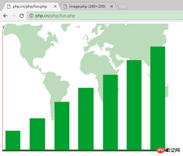
echo "<img src="/static/imghw/default1.png" data-src="https://img.php.cn//upload/image/298/568/203/1493025012720239.png" class="lazy" src='a.png' alt="Use the GD2 function to add row and column labels to the chart (Typical Application Tutorial of PHP Graphics and Images 5)" >"; //输出图像
imagedestroy($im); //释放图像资源
?>The output results are as follows:

Note: The
imagepng() function outputs content in png format and sends it to the browser. If the user requires output in a different format, it should be called. The corresponding function, if you want to send in GIF format, should call the imagegif() function.
That’s it for adding row and column labels to charts. Isn’t it very simple? Next, we will continue to introduce charts to analyze product data. For details, please read "Use GD2 function to implement Chart analysis of product data (Typical application tutorial of PHP graphics and images 6) 》!
The above is the detailed content of Use the GD2 function to add row and column labels to the chart (Typical Application Tutorial of PHP Graphics and Images 5). For more information, please follow other related articles on the PHP Chinese website!

Hot AI Tools

Undresser.AI Undress
AI-powered app for creating realistic nude photos

AI Clothes Remover
Online AI tool for removing clothes from photos.

Undress AI Tool
Undress images for free

Clothoff.io
AI clothes remover

AI Hentai Generator
Generate AI Hentai for free.

Hot Article

Hot Tools

Notepad++7.3.1
Easy-to-use and free code editor

SublimeText3 Chinese version
Chinese version, very easy to use

Zend Studio 13.0.1
Powerful PHP integrated development environment

Dreamweaver CS6
Visual web development tools

SublimeText3 Mac version
God-level code editing software (SublimeText3)

Hot Topics
 How to add labels to legend in Google Sheet
Feb 19, 2024 am 11:03 AM
This article will demonstrate how to add labels to legends in Google Sheet that focus on a single thing, providing a name or identity. A legend explains a system or group of things, giving you relevant contextual information. How to Add Labels to a Legend in GoogleSheet Sometimes, when working with charts, we want to make them easier to understand. This can be achieved by adding appropriate labels and legends. Next, we’ll show you how to add labels to legends in Google Sheets to make your data clearer. Create the chart Edit the text of the legend label Let's get started. 1] Create a chart To label the legend, first, we have to create a chart: First, enter in the columns or rows of GoogleSheets
 How to use PHP arrays to generate and display charts and statistical graphs
Jul 15, 2023 pm 12:24 PM
How to use PHP arrays to generate and display charts and statistical graphs. PHP is a widely used server-side scripting language with powerful data processing and graphic generation capabilities. In web development, we often need to display charts and statistical graphs of data. Through PHP arrays, we can easily implement these functions. This article will introduce how to use PHP arrays to generate and display charts and statistical graphs, and provide relevant code examples. Introducing the necessary library files and style sheets Before starting, we need to introduce some necessary library files into the PHP file
 How to quickly build a statistical chart system under the Vue framework
Aug 21, 2023 pm 05:48 PM
How to quickly build a statistical chart system under the Vue framework. In modern web applications, statistical charts are an essential component. As a popular front-end framework, Vue.js provides many convenient tools and components that can help us quickly build a statistical chart system. This article will introduce how to use the Vue framework and some plug-ins to build a simple statistical chart system. First, we need to prepare a Vue.js development environment, including installing Vue scaffolding and some related plug-ins. Execute the following command in the command line
 Implementation of linear and pie chart functions in Vue statistical charts
Aug 19, 2023 pm 06:13 PM
The linear and pie chart functions of Vue statistical charts are implemented in the field of data analysis and visualization. Statistical charts are a very commonly used tool. As a popular JavaScript framework, Vue provides convenient methods to implement various functions, including the display and interaction of statistical charts. This article will introduce how to use Vue to implement linear and pie chart functions, and provide corresponding code examples. Linear graph function implementation A linear graph is a type of chart used to display trends and changes in data. In Vue, we can use some excellent
 How to insert a chart in word
Mar 20, 2024 pm 03:41 PM
Sometimes in order to display the data more intuitively, we need to use charts to display it. But when it comes to charts, many people think that they can only be operated on Excel. In fact, this is not the case. Word can also directly insert charts. How to do it? Just take a look and you'll find out. 1. First we open a word document. 2. Next we find the "Chart" tool button in the "Insert" menu and click it. 3. Click the "Chart" button and select a suitable chart. Here we can select a chart type at will and click "OK". 4. After selecting the chart, the system will automatically open the excel chart, and inside The data has been entered, we just need to change the data. If you have already prepared the form here,
 Learning Excel Charts: How to Make Charts Move Like Web Pages
Aug 16, 2022 am 10:30 AM
In the previous article "Excel chart learning through cases, let's talk about how to draw a graduated cylinder column chart", we learned about the method of drawing a graduated cylinder column chart. Today we will share another Excel chart tutorial and talk about a method to make Excel charts move like a web page. As long as you enter keywords, the table data and charts will automatically change. Especially when the company's data needs to be divided into departments, it is simply too confusing. Convenient!
 Detailed explanation of PHP real-time chart generation technology
Jun 28, 2023 am 08:55 AM
In today's web application development, real-time data display is a very important part, and many applications require real-time visual presentation of data. In today's big data era, data analysis and visualization have become indispensable tools. From stock quotes, weather forecasts, network traffic monitoring in daily life to industrial production quality, census, customer growth rate, etc., real-time visualization has important application scenarios. This article will introduce in detail a PHP real-time chart generation technology. 1. Introduction to real-time chart generation technology Real-time chart generation refers to when data
 How to use PHP and Vue.js to implement data filtering and sorting functions on charts
Aug 27, 2023 am 11:51 AM
How to use PHP and Vue.js to implement data filtering and sorting functions on charts. In web development, charts are a very common way of displaying data. Using PHP and Vue.js, you can easily implement data filtering and sorting functions on charts, allowing users to customize the viewing of data on charts, improving data visualization and user experience. First, we need to prepare a set of data for the chart to use. Suppose we have a data table that contains three columns: name, age, and grades. The data is as follows: Name, Age, Grades Zhang San 1890 Li


