

Share a sample code for a breadcrumb navigation bar with arrows

This article mainly introduces the sample code for making a beautiful and beautiful breadcrumb navigation bar with arrows. Has very good reference value. Let’s take a look at it with the editor
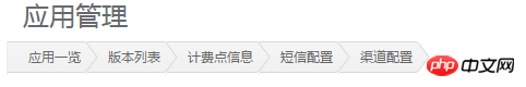
Create a beautiful and beautiful breadcrumb navigation bar
Before starting, I want to give you a popular science as usual about what a breadcrumb navigation bar is
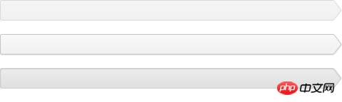
Similar to the following ones
Homepage>Column page>Article page
Homepage/Column page/Article page
Can tell visitors that they are currently on The location in the site and how to return the DOM is called the breadcrumb bar
but. . . . . .
Don’t you think this looks good?
If one day, your company's UI gives you a picture, the breadcrumb navigation bar in the picture looks like this
Like this

Or other patterned breadcrumb navigation bars, what should I do at this time?
Some friends may say that this is so easy, just find a pattern and add a background to the navigation bar.
But is it really that simple? Okay, without further ado, let’s start practicing directly and see how to complete this kind of high-looking bread-shaped navigation bar
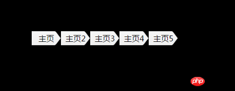
1. First use an unordered list to make a navigation bar , the code is as follows
<ul>
    <li>
        <a href="#">主页</a>
    </li>
    <li>
        <a href="#">主页2</a>
    </li>
    <li>
        <a href="#">主页3</a>
    </li>
    <li>
        <a href="#">主页4</a>
    </li>
    <li>
        <a href="#">主页5</a>
    </li>
</ul>The next is the css code
body{background:#000}
ul{ list-style: none;}
li{
width: 60px;
height: 50px;
line-height: 50px;
float: left;
background: #6cf;
text-align: center;
}
a{
color: #000;
text-decoration: none;
}The css code is nothing special, just like usual It's almost the same as doing nav. Next, we start to put the background image we selected, which is the picture below
Add a background image to the li in the navigation bar
body{
                background: #000;
            }
            ul{
                list-style: none;
                margin: 100px 100px;
            }
            li{
                width: 60px;
                height: 30px;
                line-height: 30px;
                float: left;
                background: #6cf;
                text-align: center;
                background: url(img/bg.png) no-repeat 100% 0;
            }
            a{
                color: #000;
                text-decoration: none;
}This The page effect at that time was like this
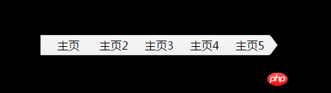
Nani? Is there something wrong with this? Director, there's something wrong with this script!
There is indeed a problem, but where is the problem?
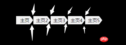

Comparing the upper and lower pictures, it is immediately clear where the problem lies. The > of each navigation (except the last one) is piled on the next navigation, then at this time, we only need to add a margin-left:-15px; to the li tag. The specific code is as follows
li{
                width: 80px;
                height: 30px;
                line-height: 30px;
                float: left;
                background: #6cf;
                text-align: center;
                background: url(img/bg.png) no-repeat 100% 0;
                margin-left: -15px;
}Since the initial width was not enough, I slightly increased the width of li here. After adding it, our breadcrumb navigation bar became like this
Huh? Where are our arrows?
Where is the arrow you promised?
Where are the arrows 1-4?
Let’s go back to the previous step again. Our last step was to add margin-left to the li tag: -15px;
The front-end stuff has a characteristic, and the attributes written later will usually Overwrite the previous attributes, and the dom structure will not be overwritten, but when the two positions overlap, before the z-index attribute is added, or when the attribute values are equal, the dom structure written later will be on top
This is exactly the case here, so we only need to add different z-index separately to the li tag (if you want the z-index attribute to take effect, you must first add positioning, position: relative)
There are no restrictions on the value of z-index here, but there is only one thing, that is, the last li tag is the smallest, and so on, gradually increasing, and the first one is the largest.
The final code looks like this
<!DOCTYPE html>
<html>
    <head>
        <meta charset="UTF-8">
        <title></title>
        <style>
            *{
                margin: 0;
                padding: 0;
            }
            body{
                background: #000;
            }
            ul{
                list-style: none;
                margin: 100px 100px;
            }
            li{
                width: 80px;
                height: 30px;
                line-height: 30px;
                float: left;
                background: #6cf;
                text-align: center;
                background: url(img/bg.png) no-repeat 100% 0;
                margin-left: -15px;
                position: relative;/*保证z-index有效*/
            }
            a{
                color: #000;
                text-decoration: none;
            }
        </style>
    </head>
    <body>
        <ul>
            <li style="z-index: 5;">
                <a href="#">主页</a>
            </li>
            <li style="z-index: 4;">
                <a href="#">主页2</a>
            </li>
            <li style="z-index: 3;">
                <a href="#">主页3</a>
            </li>
            <li style="z-index: 2;">
                <a href="#">主页4</a>
            </li>
            <li style="z-index: 1;">
                <a href="#">主页5</a>
            </li>
        </ul>
    </body>
</html>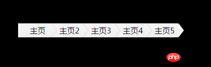
The above is the detailed content of Share a sample code for a breadcrumb navigation bar with arrows. For more information, please follow other related articles on the PHP Chinese website!

Hot AI Tools

Undresser.AI Undress
AI-powered app for creating realistic nude photos

AI Clothes Remover
Online AI tool for removing clothes from photos.

Undress AI Tool
Undress images for free

Clothoff.io
AI clothes remover

Video Face Swap
Swap faces in any video effortlessly with our completely free AI face swap tool!

Hot Article
Hot Tools

Notepad++7.3.1
Easy-to-use and free code editor

SublimeText3 Chinese version
Chinese version, very easy to use

Zend Studio 13.0.1
Powerful PHP integrated development environment

Dreamweaver CS6
Visual web development tools

SublimeText3 Mac version
God-level code editing software (SublimeText3)
Hot Topics
 1386
1386
 52
52

 How to use bootstrap in vue
Apr 07, 2025 pm 11:33 PM
How to use bootstrap in vue
Apr 07, 2025 pm 11:33 PM
Using Bootstrap in Vue.js is divided into five steps: Install Bootstrap. Import Bootstrap in main.js. Use the Bootstrap component directly in the template. Optional: Custom style. Optional: Use plug-ins.
 The Roles of HTML, CSS, and JavaScript: Core Responsibilities
Apr 08, 2025 pm 07:05 PM
The Roles of HTML, CSS, and JavaScript: Core Responsibilities
Apr 08, 2025 pm 07:05 PM
HTML defines the web structure, CSS is responsible for style and layout, and JavaScript gives dynamic interaction. The three perform their duties in web development and jointly build a colorful website.
 How to write split lines on bootstrap
Apr 07, 2025 pm 03:12 PM
How to write split lines on bootstrap
Apr 07, 2025 pm 03:12 PM
There are two ways to create a Bootstrap split line: using the tag, which creates a horizontal split line. Use the CSS border property to create custom style split lines.
 Understanding HTML, CSS, and JavaScript: A Beginner's Guide
Apr 12, 2025 am 12:02 AM
Understanding HTML, CSS, and JavaScript: A Beginner's Guide
Apr 12, 2025 am 12:02 AM
WebdevelopmentreliesonHTML,CSS,andJavaScript:1)HTMLstructurescontent,2)CSSstylesit,and3)JavaScriptaddsinteractivity,formingthebasisofmodernwebexperiences.
 How to insert pictures on bootstrap
Apr 07, 2025 pm 03:30 PM
How to insert pictures on bootstrap
Apr 07, 2025 pm 03:30 PM
There are several ways to insert images in Bootstrap: insert images directly, using the HTML img tag. With the Bootstrap image component, you can provide responsive images and more styles. Set the image size, use the img-fluid class to make the image adaptable. Set the border, using the img-bordered class. Set the rounded corners and use the img-rounded class. Set the shadow, use the shadow class. Resize and position the image, using CSS style. Using the background image, use the background-image CSS property.
 How to set up the framework for bootstrap
Apr 07, 2025 pm 03:27 PM
How to set up the framework for bootstrap
Apr 07, 2025 pm 03:27 PM
To set up the Bootstrap framework, you need to follow these steps: 1. Reference the Bootstrap file via CDN; 2. Download and host the file on your own server; 3. Include the Bootstrap file in HTML; 4. Compile Sass/Less as needed; 5. Import a custom file (optional). Once setup is complete, you can use Bootstrap's grid systems, components, and styles to create responsive websites and applications.
 How to use bootstrap button
Apr 07, 2025 pm 03:09 PM
How to use bootstrap button
Apr 07, 2025 pm 03:09 PM
How to use the Bootstrap button? Introduce Bootstrap CSS to create button elements and add Bootstrap button class to add button text
 How to resize bootstrap
Apr 07, 2025 pm 03:18 PM
How to resize bootstrap
Apr 07, 2025 pm 03:18 PM
To adjust the size of elements in Bootstrap, you can use the dimension class, which includes: adjusting width: .col-, .w-, .mw-adjust height: .h-, .min-h-, .max-h-
