
 WeChat Applet
Mini Program Development
Flex layout mode is indispensable for small program development
WeChat Applet
Mini Program Development
Flex layout mode is indispensable for small program development
Flex layout mode is indispensable for small program development

wxflex
Flex layout demo of WeChat applet - 4 essential and commonly used Flex layout modes
Code library
github address: github.com/icindy/wxflex
Officially recommended Flex layout
Flex layout is compared with the traditional float In terms of layout, it is simple, fast and convenient. Mastering the flex layout can reduce wxss code when making WeChat mini programs, and it also conforms to the document requirements for WeChat mini program development
This code involves four Flex layouts Method, using different properties of different flexes respectively.
It is recommended to read the learning reference at the end of this article to learn related attributes
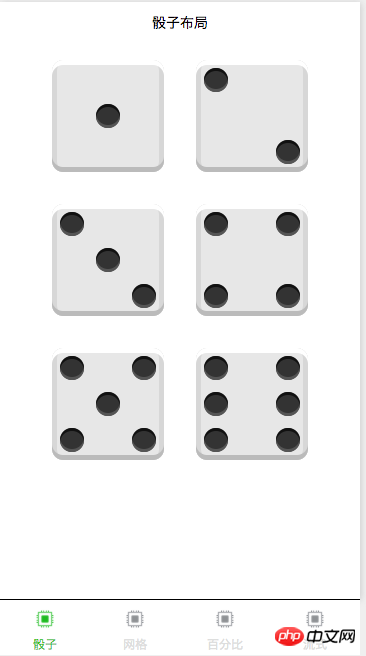
dice layout
The dice layout mainly emphasizes the use of several attributes
displayjustify-contentalign-itemsalign-selfetc
.first-face {
  display: flex;
  justify-content: center;
  align-items: center;
}

.second-face {
  display: flex;
  justify-content: space-between;
}

.second-pip-2 {
  align-self: flex-end;
}
Grid layout
Mainly relies on flex properties
.Grid {
  display: flex;
}
.Grid-cell {
  flex: 1;
}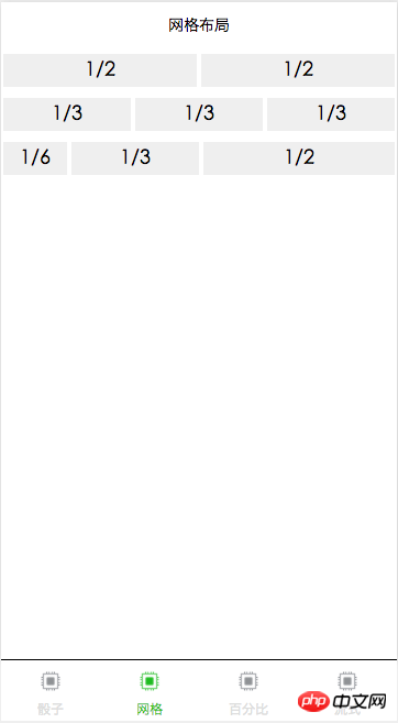
.Grid {
  display: flex;
}

.cell-u-full {
  flex: 0 0 100%;
}
Copy after login
.Grid {
display: flex;
}
.cell-u-full {
flex: 0 0 100%;
}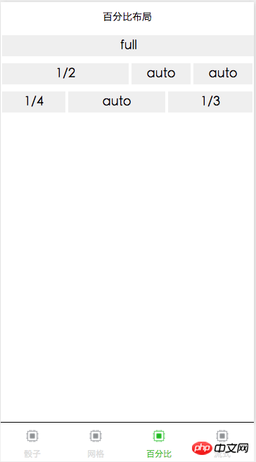
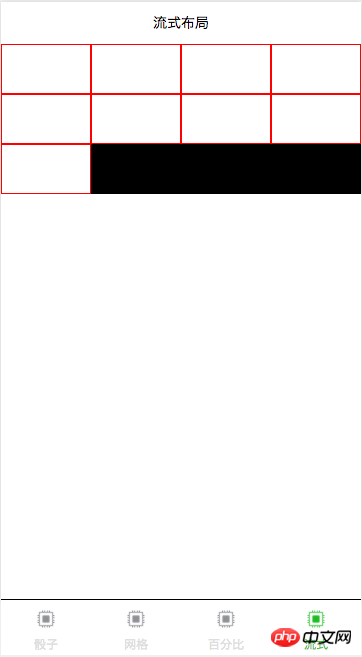
The production of nine-square grid, waterfall flow and other effects.parent { width: 100%; background-color: black; display: flex; flex-flow: row wrap; align-content: flex-start; } .child { box-sizing: border-box; background-color: white; flex: 0 0 25%; height: 50px; border: 1px solid red; }Copy after login【Related recommendations】1.
Complete source code download of WeChat mini program
2.Chasing WeChat Mini program application store source code
The above is the detailed content of Flex layout mode is indispensable for small program development. For more information, please follow other related articles on the PHP Chinese website!

Hot AI Tools

Undresser.AI Undress
AI-powered app for creating realistic nude photos

AI Clothes Remover
Online AI tool for removing clothes from photos.

Undress AI Tool
Undress images for free

Clothoff.io
AI clothes remover

Video Face Swap
Swap faces in any video effortlessly with our completely free AI face swap tool!

Hot Article
Hot Tools

Notepad++7.3.1
Easy-to-use and free code editor

SublimeText3 Chinese version
Chinese version, very easy to use

Zend Studio 13.0.1
Powerful PHP integrated development environment

Dreamweaver CS6
Visual web development tools

SublimeText3 Mac version
God-level code editing software (SublimeText3)
Hot Topics
 1387
1387
 52
52

 The Roles of HTML, CSS, and JavaScript: Core Responsibilities
Apr 08, 2025 pm 07:05 PM
The Roles of HTML, CSS, and JavaScript: Core Responsibilities
Apr 08, 2025 pm 07:05 PM
HTML defines the web structure, CSS is responsible for style and layout, and JavaScript gives dynamic interaction. The three perform their duties in web development and jointly build a colorful website.
 How to use bootstrap in vue
Apr 07, 2025 pm 11:33 PM
How to use bootstrap in vue
Apr 07, 2025 pm 11:33 PM
Using Bootstrap in Vue.js is divided into five steps: Install Bootstrap. Import Bootstrap in main.js. Use the Bootstrap component directly in the template. Optional: Custom style. Optional: Use plug-ins.
 How to write split lines on bootstrap
Apr 07, 2025 pm 03:12 PM
How to write split lines on bootstrap
Apr 07, 2025 pm 03:12 PM
There are two ways to create a Bootstrap split line: using the tag, which creates a horizontal split line. Use the CSS border property to create custom style split lines.
 Understanding HTML, CSS, and JavaScript: A Beginner's Guide
Apr 12, 2025 am 12:02 AM
Understanding HTML, CSS, and JavaScript: A Beginner's Guide
Apr 12, 2025 am 12:02 AM
WebdevelopmentreliesonHTML,CSS,andJavaScript:1)HTMLstructurescontent,2)CSSstylesit,and3)JavaScriptaddsinteractivity,formingthebasisofmodernwebexperiences.
 How to resize bootstrap
Apr 07, 2025 pm 03:18 PM
How to resize bootstrap
Apr 07, 2025 pm 03:18 PM
To adjust the size of elements in Bootstrap, you can use the dimension class, which includes: adjusting width: .col-, .w-, .mw-adjust height: .h-, .min-h-, .max-h-
 How to use bootstrap button
Apr 07, 2025 pm 03:09 PM
How to use bootstrap button
Apr 07, 2025 pm 03:09 PM
How to use the Bootstrap button? Introduce Bootstrap CSS to create button elements and add Bootstrap button class to add button text
 How to set up the framework for bootstrap
Apr 07, 2025 pm 03:27 PM
How to set up the framework for bootstrap
Apr 07, 2025 pm 03:27 PM
To set up the Bootstrap framework, you need to follow these steps: 1. Reference the Bootstrap file via CDN; 2. Download and host the file on your own server; 3. Include the Bootstrap file in HTML; 4. Compile Sass/Less as needed; 5. Import a custom file (optional). Once setup is complete, you can use Bootstrap's grid systems, components, and styles to create responsive websites and applications.
 How to insert pictures on bootstrap
Apr 07, 2025 pm 03:30 PM
How to insert pictures on bootstrap
Apr 07, 2025 pm 03:30 PM
There are several ways to insert images in Bootstrap: insert images directly, using the HTML img tag. With the Bootstrap image component, you can provide responsive images and more styles. Set the image size, use the img-fluid class to make the image adaptable. Set the border, using the img-bordered class. Set the rounded corners and use the img-rounded class. Set the shadow, use the shadow class. Resize and position the image, using CSS style. Using the background image, use the background-image CSS property.
