This is the second article designed by CSS Loading. In fact, a lot of content is included in the first article, so there will be relatively little introduction to properties in this article. If you encounter attributes you don’t understand, please refer to the content in the previous article.
CSS Loading Design (1)

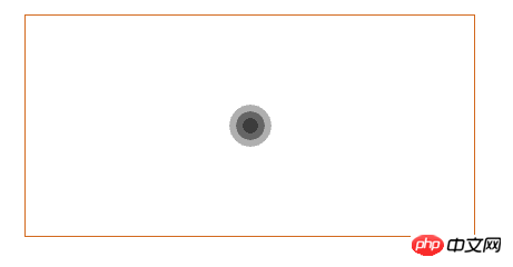
animation effect, if I show it here, I would also use the screen to record the video, and then convert it into picture. It feels too troublesome. I don’t know if there is any simple method. If so, please give me some advice. I. Okay, let's see how to do this animation effect. First, let's take a look at the Html code
  <p class="box">
        <p class="loader">
            <i></i>
            <i></i>
            <i></i>
      </p>
</p>p tags. Set, very simple, let’s take a look at the CSS code
    .box {
        width: 100%;
        padding: 3%;
    }

    .loader {
        width: 30%;
        height: 200px;
        margin: 50px auto;
        border: 1px solid chocolate;
        box-sizing: border-box;
        display: flex;
        align-items: center;
        justify-content: center;
        position: relative;
    }

    .loader i {
        width: 60px;
        height: 60px;
        border-radius: 50%;
        background-color: #333333;
        position: absolute;
        opacity:0;

} @-webkit-keyframes loading {
0%{
transform: scale(0);
opacity: 0;
}
5%{
opacity: 1;
}
100%{
transform: scale(1);
opacity:0;
}
}1. 0% : 这个时候将我们画的圆形缩放为 0%,透明度也是 0 2. 5% : 这个时候将透明度设置为 1 ,也就是图形是出于可见的状态, 但是这个时候图形已经被缩放为 0,所以还是什么东西都看不到。 3. 100% : 注意在 100 % 的状态下,图形被缩放为原始状态,但是透明度为0,这说明了什么? 这说明在 5% - 100% 过程中,图形逐渐出现,但是透明度逐渐降低,这样就会出现一个动画效果。
i tag.
    .loader i:nth-child(1){
        -webkit-animation: loading 1s linear 0s infinite;
    }
    .loader i:nth-child(2){
        -webkit-animation: loading 1s linear 0.2s infinite;
    }
    .loader i:nth-child(3){
        -webkit-animation: loading 1s linear 0.4s infinite;
    }
##Paste_Image.png
To be honest, this is my favorite animation effect, it is very interesting . Look at the
Html code<div class="code" style="position:relative; padding:0px; margin:0px;"><pre class='brush:php;toolbar:false;'><p class="box">
<p class="loader">
<p class="loader-child">
<i></i>
<i></i>
</p>
</p>
</p></pre><div class="contentsignin">Copy after login</div></div>The
code here is a little different from the above, let me analyze it below<div class="code" style="position:relative; padding:0px; margin:0px;"><pre class='brush:php;toolbar:false;'> .box {
width: 100%;
padding: 3%;
}
.loader {
width: 30%;
height: 200px;
margin: 50px auto;
border: 1px solid chocolate;
box-sizing: border-box;
display: flex;
align-items: center;
justify-content: center;
}
.loader-child {
width: 40px;
height: 40px;
position: relative;
}
.loader-child i {
display: block;
border: 2px solid #333333;
border-color: transparent #333333;
border-radius: 50%;
position: absolute;
}
.loader-child i:first-child {
width: 35px;
height: 35px;
top: 0;
left: 0;
-webkit-animation: loading 1s ease-in-out 0s infinite;
}
.loader-child i:last-child {
width: 15px;
height: 15px;
top: 10px;
left: 10px;
-webkit-animation: loading 1s ease-in-out 0.5s infinite reverse;
}</pre><div class="contentsignin">Copy after login</div></div>It can be seen in the fourth There is such a line of code in this block
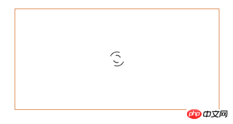
Originally we set it to draw a circle, because what we need is not a circle, after setting this line of properties, The color attribute will be changed every 1/4 arc, that is, the transparency and #333333 will be changed to achieve the graphic effect we want. Also, we set the
attributes for each i tag. These two attributes need to be used in conjunction with position. We also introduced the specific use in the previous article. After setting these two attributes, the effect achieved is a large circle containing a small circle, which is the effect in the picture. Pay attention to the
animation effect. We added a reverse at the end, which means counterclockwise execution. Okay, let’s take a look at the animation
    @-webkit-keyframes loading {

        0% {
            transform: rotate(0deg) scale(1);
        }
        50% {
            transform: rotate(180deg) scale(0.6);
        }
        100% {
            transform: rotate(360deg) scale(1);
        }
}What the effect of the animation is. Combined with my execution analysis of the animation above, you may have been able to simulate the effect of this animation. Yes, it's a very cool effect.
Loading three
 ##Paste_Image.png
CSS
It’s only been a few days, and I don’t understand the settings of many attributes. I have been searching for various information on the Internet, and I still don’t understand them very thoroughly. I will share what I know below. As for those, I don’t know. I know my attributes too well, and I hope all the great immortals can teach me. It’s still the same, let’s take a look at theHTML code first
<p class="box">
    <p class="loader">
        <p class="loader-child">
            <i></i>
            <i></i>
            <i></i>
            <i></i>
            <i></i>
        </p>
    </p>
</p>It can be clearly seen that there is an extra layer of p tags, mainly for coordinationposition Use of attributes.
    .box{
        width: 100%;
        padding: 3%;
    }

    .loader{
        width:30%;
        height: 200px;
        border: 1px solid chocolate;
        box-sizing: border-box;
        margin: 50px auto;
        display: flex;
        align-items: center;
        justify-content: center;
    }

    .loader-child{
        width: 80px;
        height: 20px;
        position: relative;
    }

    .loader-child i{
        display: block;
        width: 20px;
        height: 20px;
        border-radius: 50%;
        background-color: #333333;
        margin-right: 10px;
        position: absolute;
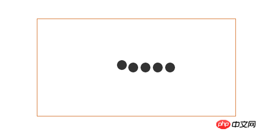
}At this time, although we have 5 i tags, we can only see one circle, not the expected 5. Is this what is going on? I'm not so sure either. Let’s take a look at the animation effect
    @-webkit-keyframes loading {
        0%{
            left: 100px;
            top: 0;
        }
        80%{
            left:0;
            top:0;
        }
        85%{
            left:0px;
            top:-20px;
            width: 20px;
            height: 20px;
        }
        90%{
            width: 40px;
            height: 20px;
        }
        95%{
            left: 100px;
            top: -20px;
            width: 20px;
            height: 20px;
        }
        100%{
            left: 100px;
            top:0;
        }
}1. 0% - 80% : 图形从距离父元素左边距为 100 px 的位置移动到 0 px,上边距不变,也就是水平移动。 2. 80% - 85% : 图形的左边距不变,但是上移 20 px,而且图形的宽高设置为 20px 3. 85% - 90% : 图形的位置不变化,但是此时图形的宽拓宽到 40px 4. 90% - 95% : 图形开始向右移动,移动100 px并且将宽复原为 20px 5. 95% - 100% : 图形回到起始位置。
    .loader-child i:nth-child(1){
        -webkit-animation: loading 2s linear 0s infinite;
    }
    .loader-child i:nth-child(2){
        -webkit-animation: loading 2s linear -0.4s infinite;
    }
    .loader-child i:nth-child(3){
        -webkit-animation: loading 2s linear -0.8s infinite;
    }
    .loader-child i:nth-child(4){
        -webkit-animation: loading 2s linear -1.2s infinite;
    }
    .loader-child i:nth-child(5){
        -webkit-animation: loading 2s linear -1.6s infinite;
}Free css online video tutorial
2. css online manual
3. php.cn Dugu Jiujian (2)-css video tutorial
The above is the detailed content of Share the example codes of three Loading designs in CSS3 (2). For more information, please follow other related articles on the PHP Chinese website!


