 Web Front-end
 CSS Tutorial
 Detailed introduction to an example of carousel effect achieved using pure CSS3
Detailed introduction to an example of carousel effect achieved using pure CSS3
May 06, 2017 pm 03:54 PMThis article mainly introduces the example of realizing the carousel effect using pure CSS3. The editor thinks it is quite good, so I will share it with you now and give it as a reference. Let’s follow the editor to have a look.
First of all, let’s watch the demo, click to view the demo
1. Just say a few words
The power of css3 animation effects is self-evident. Its popularity has not diminished since its emergence. Its advantages and disadvantages compared with js animation have also been a topic of debate in the front-end community. It is undeniable that the emergence of css3 animation has reduced the impact to a certain extent. It reduces the difficulty of realizing animation effects and is conducive to front-end learning. Its streamlined code size liberates us from annoying js debugging. Of course, CSS animation effects have their limitations. We cannot just use CSS3 to simulate all animations. Another issue is browser compatibility. This time we use CSS3 to implement a carousel effect and experience the power of CSS3. First of all, we have only implemented automatic carousel, and the effect is also the most common fade-in and fade-out. We have not implemented the click rotation effect. At least at my current level, I can only choose one of automatic carousel and click rotation using pure CSS3. , if there is a way to achieve both effects at the same time, please tell me.
2. Layout
<section class="slider-contaner">
    <ul class="slider">
        <li class="slider-item slider-item1"></li>
        <li class="slider-item slider-item2"></li>
        <li class="slider-item slider-item3"></li>
        <li class="slider-item slider-item4"></li>
        <li class="slider-item slider-item5"></li>
    </ul>
</section>There is nothing to say about the html code. In terms of style, first of all, the big box of the slider must be relatively positioned. In addition, We use background-image in the li tag, because in this way it is possible to use pure css to achieve responsiveness. In addition, in order to see the full picture clearly in responsiveness, the background image must use background-size:100%. Another problem is the height. , obviously the slider-container must be consistent with the height of li, because the height cannot be fixed in the responsive style, so using the height attribute is obviously not possible. The padding attribute can solve this problem. First, the background-image can be displayed in the padding. Second, The unit of % in padding is based on the width of the parent element.
*{
      margin:0;
      padding:0;
}
ul,li{
      list-style: none;
}
.floatfix {
      *zoom: 1;
}
.floatfix:after {
      content: "";
      display: table;
      clear: both;
}
.slider-contaner{
      width:100%;
      position:relative;
}
.slider,.slider-item{
      padding-bottom:40%;
}
.slider-item{
      width:100%;
      position:absolute;
      background-size:100%;
}
.slider-item1{
      background-image:url(imgs/1.jpg);
}
.slider-item2{
      background-image:url(imgs/2.jpg);
}
.slider-item3{
      background-image:url(imgs/3.jpg);
}
.slider-item4{
      background-image:url(imgs/4.jpg);
}
.slider-item5{
      background-image:url(imgs/5.jpg);
}3. Design animation
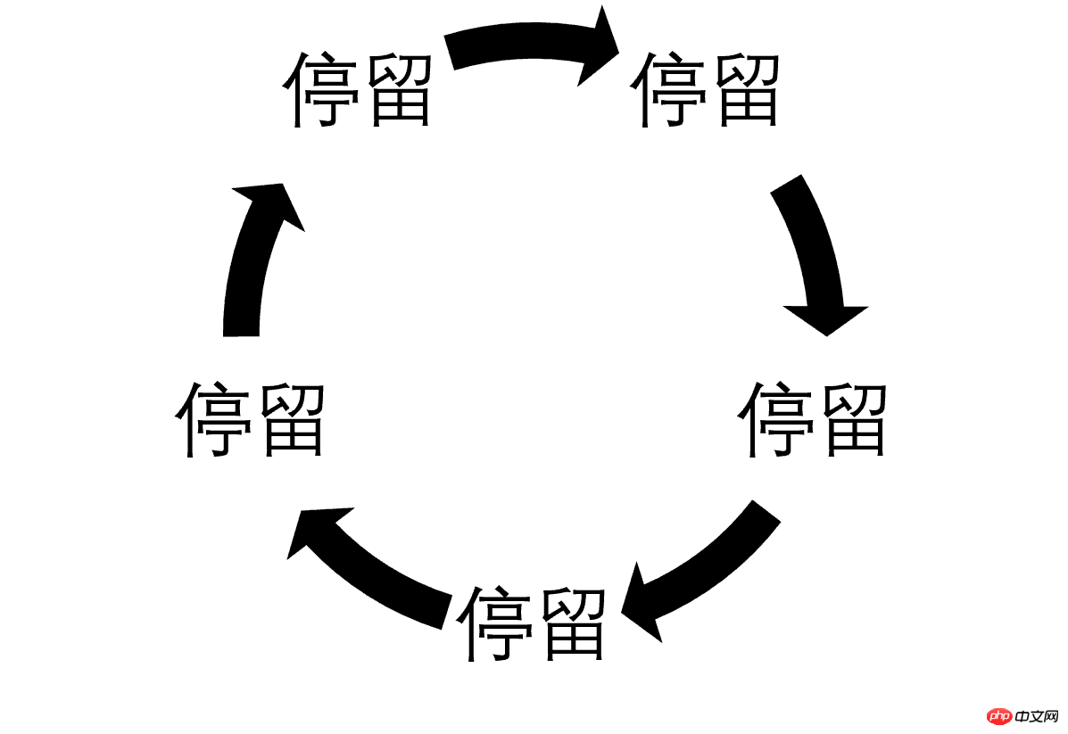
The fade-in and fade-out effect must use opacity. First of all, the fade-in and fade-out of all pictures are the same overall. The animation is just different in time. This must be controlled by animation-delay. The infinite rotation of animation must be controlled by animation-iteration-count: infinite. We have 5 pictures this time. The entire animation is divided into two effects: picture stay and fade-in and fade-out. , represented by the figure below, the arrow indicates the fade-in and fade-out process.

Because there is no attribute in CSS3 that specifies the time interval between two animations, so we must write the effect of the picture when other pictures fade in and out into the animation. Obviously At this time, it is opacity: 0; for the convenience of writing animation, we use linear function for animation, that is, animation-timing-function: linear; the whole process takes 20s, a stay takes 3 seconds, and a fade-in and fade-out takes 1s, which is converted into a percentage. That is 15% and 5%;
@keyframes fade{
0%{
      opacity:0;
      z-index:2;
}
5%{
      opacity:1;
      z-index: 1;
}
20%{
      opacity:1;
      z-index:1;
}
25%{
      opacity:0;
      z-index:0;
}
100%{
      opacity:0;
      z-index:0;
}
}The next step is to add animation-delay to each picture, because the first picture must be displayed at the front, so the other pictures must be displayed at the front. The neighbor selector uses opacity:0. The first picture does not need to fade in and out. It jumps directly to the stop, which is 5%, so the animation-delay is -1s. The second chapter picture is 20% apart from the first picture, that is 4s, animation-delay is 3s, and so on
.slider-item + .slider-item{
      opacity:0;
}
.slider-item1{
      animation-delay: -1s;
}
.slider-item2{
      animation-delay: 3s;
}
.slider-item3{
      animation-delay: 7s;
}
.slider-item4{
      animation-delay: 11s;
}
.slider-item5{
      animation-delay: 15s;
}At this time our carousel image can be moved
four , Add carousel focus
Adding carousel focus is of course not for clicks, but to tell visitors how many pictures there are and the location of the current picture. At least for me personally, carousel focus Focus is very important, because if I don’t know how many pictures are in the carousel and I can’t click on it, I will be very uneasy and feel that I have not seen the entire page. So let’s add the carousel focus. First of all, it is very clear that the above animation can still be used. In addition, the layout must use position: absolute. In addition, it is obvious that we must write the focus twice, once for the style of the current picture, and once for the style of the non-current picture
<p class="focus-container">
<ul class="floatfix">
<li><p class="focus-item focus-item1"></p></li>
<li><p class="focus-item focus-item2"></p></li>
<li><p class="focus-item focus-item3"></p></li>
<li><p class="focus-item focus-item4"></p></li>
<li><p class="focus-item focus-item5"></p></li>
</ul>
</p>
.focus-container{
      position:absolute;
      bottom:2%;
      z-index:7;
      margin:0 auto;
      left:0;
      right:0;
}
.focus-container ul{
      margin-left:46%;
}
.focus-container li{
      width:10px;
      height:10px;
      border-radius:50%;
      float:left;
      margin-right:10px;
      background:#fff;
}
.focus-item{
      width:100%;
      height:100%;
      background:#51B1D9;
      border-radius:inherit;
      animation-duration: 20s;
      animation-timing-function: linear;
      animation-name:fade;
      animation-iteration-count: infinite;
}
.focus-item1{
      animation-delay: -1s;
}
.focus-item2{
      animation-delay: 3s;
}
.focus-item3{
      animation-delay: 7s;
}
.focus-item4{
      animation-delay: 11s;
}
.focus-item5{
      animation-delay: 15s;
}5. Combing the code
If you have maintained other people’s code, you will know that code combing is very important for later maintenance. It’s important. Without sorting out the css code, you can write it wherever you want. It is simply a disaster for later maintenance. When sorting out the css code, I personally think that you must first add necessary comments, partition the css code, and try to reduce the number of css codes. The places that need to be modified later are mainly a matter of code refactoring. I have already considered this issue when writing the code, so the main task is to add comments and tell the maintainers where the code is most frequently modified. We follow the most frequently modified The principle of putting the code at the end.
我们来分析一下我们的代码如果给别人用可能需要修改的地方,首先肯定是图片路径,所以我们把这个样式放在最后,然后是图片高度,轮播焦点的颜色,动画时间的设置(这里还涉及图片个数),轮播焦点的位置,当然轮播焦点大小也可能修改。重构后代码如下:
<section class="slider-contaner"> <ul class="slider"> <li class="slider-item slider-item1"></li> <li class="slider-item slider-item2"></li> <li class="slider-item slider-item3"></li> <li class="slider-item slider-item4"></li> <li class="slider-item slider-item5"></li> </ul> <p class="focus-container"> <ul class="floatfix"> <li><p class="focus-item focus-item1"></p></li> <li><p class="focus-item focus-item2"></p></li> <li><p class="focus-item focus-item3"></p></li> <li><p class="focus-item focus-item4"></p></li> <li><p class="focus-item focus-item5"></p></li> </ul> </p> </section>
/*css reset start*/
*{
margin:0;
padding:0;
}
ul,li{
list-style: none;
}
/*css reset end*/

/*css public start*/
.floatfix {
*zoom: 1;
}
.floatfix:after {
content: "";
display: table;
clear: both;
}
/*css public end*/

/*slider start*/
.slider-contaner{
width:100%;
position:relative;
}
.slider-item + .slider-item{
opacity:0;
}
.slider-item{
width:100%;
position:absolute;
animation-timing-function: linear;
animation-name:fade;
animation-iteration-count: infinite;
background-size:100%;
}
.focus-container{
position:absolute;
z-index:7;
margin:0 auto;
left:0;
right:0;
}
.focus-container li{
width:10px;
height:10px;
border-radius:50%;
float:left;
margin-right:10px;
background:#fff;
}
.focus-item{
width:100%;
height:100%;
border-radius:inherit;
animation-timing-function: linear;
animation-name:fade;
animation-iteration-count: infinite;
}
.focus-item2,.focus-item3,.focus-item4,.focus-item5{
opacity:0;
}
.focus-container ul{
margin-left:46%;
}
/*设置轮播焦点的位置*/
.focus-container{
bottom:2%;
}
/*设置当前图片焦点的颜色*/
.focus-item{
background:#51B1D9;
}
/*设置动画,请根据实际需要修改秒数*/
.slider-item,.focus-item{
animation-duration: 20s;
}
.slider-item1,.focus-item1{
animation-delay: -1s;
}
.slider-item2,.focus-item2{
animation-delay: 3s;
}
.slider-item3,.focus-item3{
animation-delay: 7s;
}
.slider-item4,.focus-item4{
animation-delay: 11s;
}
.slider-item5,.focus-item5{
animation-delay: 15s;
}
@keyframes fade{
0%{
opacity:0;
z-index:2;
}
5%{
opacity:1;
z-index: 1;
}
20%{
opacity:1;
z-index:1;
}
25%{
opacity:0;
z-index:0;
}
100%{
opacity:0;
z-index:0;
}
}
/*设置背景,响应式请利用媒体查询根据断点修改路径*/
.slider-item1{
background-image:url(imgs/1.jpg);
}
.slider-item2{
background-image:url(imgs/2.jpg);
}
.slider-item3{
background-image:url(imgs/3.jpg);
}
.slider-item4{
background-image:url(imgs/4.jpg);
}
.slider-item5{
background-image:url(imgs/5.jpg);
}
/*设置图片的高度,请根据具体需要修改百分比,响应式及时修改此值*/
.slider,.slider-item{
padding-bottom:40%;
}六、最后扯两句
这种css3实现的轮播图,缺点也是不言而喻,点击轮换和自动轮换两者只能选其一,不过自动轮换可以用在手机端,这是一个不错的选择,另外,现在的网站大都是通栏设计,网页文字很少,尤其是网站首页更是如此,有时候比的不是网站设计的优劣,反而是谁选的图片好看,谁就有可能受到青睐,这种情况我们其实可以考虑将轮播图变为背景的轮换,这时候轮播焦点也就可以不使用了,相信你的博客首页或者产品首页使用背景轮换,效果会非常不错的。
【相关推荐】
1. 免费css在线视频教程
2. css在线手册
The above is the detailed content of Detailed introduction to an example of carousel effect achieved using pure CSS3. For more information, please follow other related articles on the PHP Chinese website!

Hot Article

Hot tools Tags

Hot Article

Hot Article Tags

Notepad++7.3.1
Easy-to-use and free code editor

SublimeText3 Chinese version
Chinese version, very easy to use

Zend Studio 13.0.1
Powerful PHP integrated development environment

Dreamweaver CS6
Visual web development tools

SublimeText3 Mac version
God-level code editing software (SublimeText3)

Hot Topics
 Users encounter rare glitches: Samsung Watch smartwatches suddenly experience white screen issues
Apr 03, 2024 am 08:13 AM
Users encounter rare glitches: Samsung Watch smartwatches suddenly experience white screen issues
 How to achieve wave effect with pure CSS3? (code example)
Jun 28, 2022 pm 01:39 PM
How to achieve wave effect with pure CSS3? (code example)
 Use CSS skillfully to realize various strange-shaped buttons (with code)
Jul 19, 2022 am 11:28 AM
Use CSS skillfully to realize various strange-shaped buttons (with code)
 Kyushu Fengshen Assassin 4S Radiator Review Air-cooled 'Assassin Master' Style
Mar 28, 2024 am 11:11 AM
Kyushu Fengshen Assassin 4S Radiator Review Air-cooled 'Assassin Master' Style
 Exquisite light and shadow art in spring, Haqu H2 is the cost-effective choice
Apr 17, 2024 pm 05:07 PM
Exquisite light and shadow art in spring, Haqu H2 is the cost-effective choice
 Huntkey MX750P full module power supply review: 750W of concentrated platinum strength
Mar 28, 2024 pm 03:20 PM
Huntkey MX750P full module power supply review: 750W of concentrated platinum strength
 Colorful Hidden Star P15 24 Review: A hard-core all-round gaming laptop with both good looks and performance
Mar 06, 2024 pm 04:40 PM
Colorful Hidden Star P15 24 Review: A hard-core all-round gaming laptop with both good looks and performance
 Easily understand 4K HD images! This large multi-modal model automatically analyzes the content of web posters, making it very convenient for workers.
Apr 23, 2024 am 08:04 AM
Easily understand 4K HD images! This large multi-modal model automatically analyzes the content of web posters, making it very convenient for workers.


