

Adaptive width means that when the width of the container is not explicitly set (or Margins is set to auto), the width of the container will automatically change according to the situation under certain circumstances. Settings, and the results of setting are often not what we want.
replaced elements & non-replaced elements
:
:
After understanding the concept, let’s return to the topic. There are many situations of shrink-to-fit. Here is the most common situation, that is, adaptive width when non-replaceable elements are floating (Floating, non-replaced elements). It sounds a bit abstract, but you may encounter it often. . Let’s look at an example first:
html&css
<!DOCTYPE html>
<html>
    <style type="text/css">
        .outer {
            width: 800px;
            background: black;
            overflow: hidden;
        }
        .inner {
            float: left;
            background: red;
        }
        .sub1 {
            width: 26%;
            background: blue;
        }
        .sub2 {
            width: 50%;
            background: green;
        }
    </style>
<head>
</head>
<body>
    <p class="outer">
        <p class="inner">
            <p class="sub1">
                this is 1th line this is 2th line this is 3th line this is 4th line
            </p>
            <p class="sub2">
                sub2 block
            </p>

        </p>
    </p>
</body>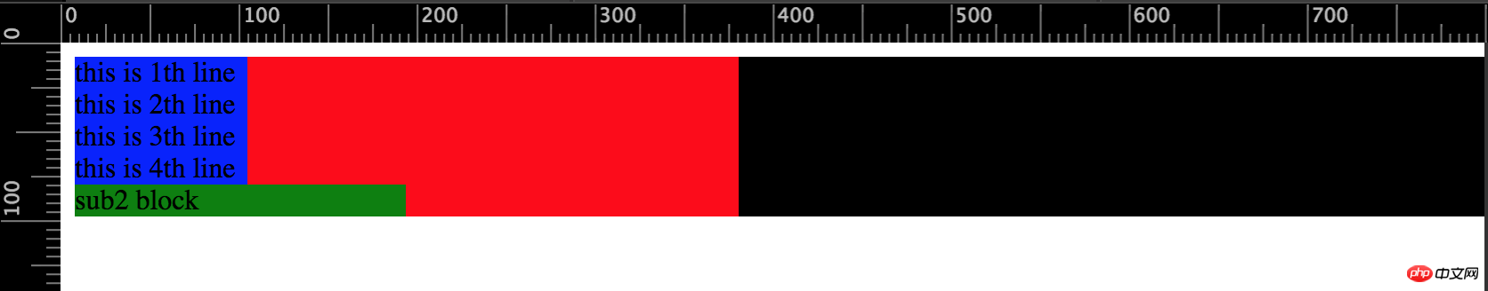
</html>This style defines an outer container with a black background and a width of 800px. It also has an inner container inner, which has no width and floats left. , there are two small blocks sub1 and sub2 in the inner.
Then the question comes, what is the specific width of inner, sub1, sub2?Look at the renderings first and then answer:
inheritedThe result should be beyond your expectation: inner The width of the (red background) is not the width of the outer (black background) (under normal circumstances it should be
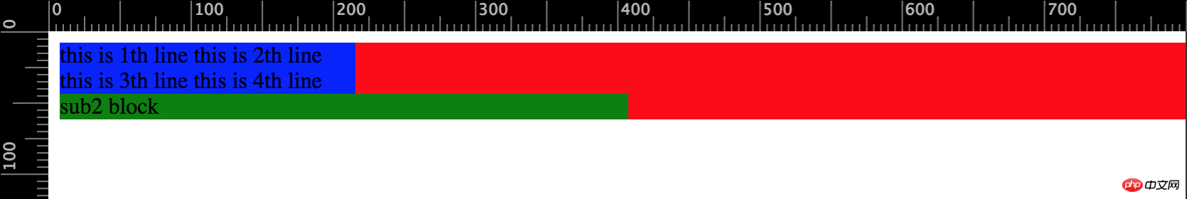
the width of the parent container), so sub1 and sub2 are much smaller than we expected. Before answering this question, let’s try to modify it first to see if we can find the cause of this problem. After
debugging, I found two simplest solutions to solve this problem:
This is indeed what we want Yes, but this cleverly avoids the situation of floating non-replaceable elements. To be honest, I have encountered this scenario many times, but I just tried using the above two solutions, but I didn’t know the real reason, so I took a look at the W3C specifications in this regard. The description of the specifications is as follows:
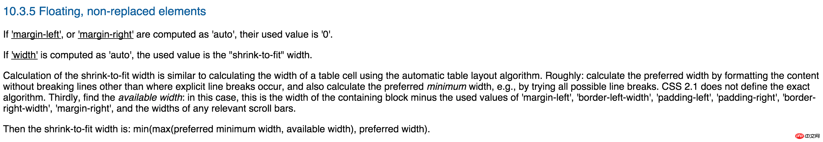
min(max(preferred minimum width, available width), preferred width)First of all, the problem of not speaking in English, simply 'Roughly' and 'CSS 2.1 does not define the exact algorithm' It makes people laugh and cry, and then gives a shrink-to-fit formula:
Hehe, but they are not the same. God knows how to calculate these three values.
I googled online and found that many people have encountered this problem, but they can’t understand the specifications. Some people have translated the above paragraph. You can take a look:
CSS2.1 does not provide the exact algorithm for preferred minimum width, available width and preferred width. Usually, the preferred width is calculated by forcing other parts of the content except for explicit line breaks to not wrap; on the contrary, try to wrap the content as much as possible. To get the preferred minimum width; available width is the width of the element's containing block minus 'margin-left', 'border-left-width', 'padding-left', 'padding-right', 'border-right-width ', the value of 'margin-right' and the width of any vertical scrollbar that exists.Please raise your hands if you are confused by this translation. . . . . . . . . . . . .
Returning to the topic again, after nearly an hour of groping, I finally smoothed out this difficult English:
There are three parameters here, namely: preferred minimum width, available width, preferred width. You only need to care about the calculation method of preferred width. The calculation method of preferred width is as follows:
Let the element The maximum width after the content is forced not to wrap is the width after shrink-to-fit
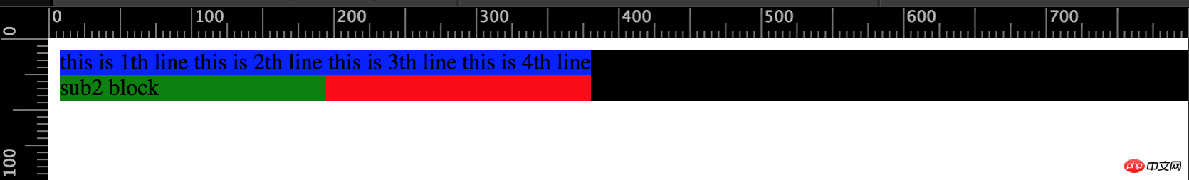
Take the above example specifically, the content of sub1 in the inner is wrapped due to insufficient width, so it is forced not to wrap. The calculated width of the line break is the adaptive width of the inner (the inner itself does not have a set width~). How to force no line break is also very simple. Slowly increase the width of sub1, and you will find that when it is adjusted to 100%, it is just enough to use one line. To realize the content, the width of the content is the width after inner adaptation. Directly above the picture:
#Summary:
For floating or special positioning methods, It is recommended to explicitly set the container width to avoid unexpected results
php.cnDugujiujian (2)-css video tutorial
The above is the detailed content of Share the usage and example tutorials of Shrinktofit (adaptive width). For more information, please follow other related articles on the PHP Chinese website!


![[Web front-end] Node.js quick start](https://img.php.cn/upload/course/000/000/067/662b5d34ba7c0227.png)


