Example code for sibling selector to implement vertical margins
How the sibling selector can keep CSS readable while completing complex design requirements
This is one of the examples in the web front-end development process that starts simple and gradually becomes more complicated: converting an article Vertical margins (vertical margins) should be applied to all elements in the document, such as blog posts compiled from complex markdown.
In most cases, you have to deal with a lot of exceptions and correlations, such as: titles and images usually require more white space above and below, but if two images are next to each other, then the two images will The white space will change less. The direct distance between the h2 tag and the h3 tag is smaller than the distance between the two h2 tags.
When the original author first started doing front-end a few years ago, all these exceptions and dependencies always resulted in complex code, visual inconsistencies and unexpected behavior. I googled many times why margin-top doesn’t work.
Step 1
The simple html is as follows:
<article class="article">
  <h1>Hello World</h1>
  <p>Lorem ipsum dolor sit amet</p>
  <p>Lorem ipsum dolor sit amet</p>
  <img src="…" alt="…">
  <p>Lorem ipsum dolor sit amet</p>
  <ul>
    <li>Lorem</li>
    <li>Ipsum</li>
    <li>Dolor</li>
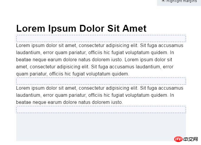
</ul>Usually take out two paragraphs to adjust the vertical margin between them to achieve After the desired effect, use this value as the base margin for all elements.
.article > * + * {
    margin-top: 1.5rem;
}The above css code adds margin-top to all child elements in .article that have adjacent sibling elements. Only adding margin-topattribute to direct elements avoids unwanted effects. For example, margin-top will be added to ul in the above html instead of li.

The second step
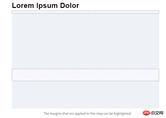
In this step, more specific css rules will be added, such as:
.article > img + * {
    margin-top: 3rem;
}Any element after img will receive a specific margin-top, the effect is similar to applying margin-bottom directly to img. But using adjacent sibling selectors and margin-top has two advantages:
1. Not having to removemargin-bottom
from the last child 2. And Avoid collapsing margins.

Step 3
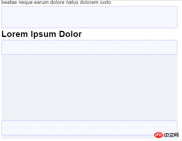
In this step, add the rule to a specific element, for example:
.article > * + h2 {
    margin-top: 4rem;
}
.article > * + img {
    margin-top: 3rem;
}h2 and img that have adjacent siblings will receive a specific margin-top.

Step 4
In this last step, handle styles with special correlation
.article > img + img {
    margin-top: 1rem;
}Change the distance between adjacent images

If necessary, you can also add a precise css selector, such as:
.article > img + img + img + h2 {
    margin-top: 5rem;
}If an h2 is arranged in three consecutive Image, it will receive a specific margin-top. Fortunately, this is just a special case, but it's nice to know that adjacent sibling selectors can solve this complex dependency problem.
Advanced Usage
To improve readability, use (SCSS) nesting and write each rule on one line. There is no need to group selectors with the same value, as CSSO will handle this later in the build task.
.article {
    > * + * { margin-top: 1.5rem }
    > h2 + * { margin-top: 1rem }
    > img + * { margin-top: 3rem }
    > * + h2 { margin-top: 4rem }
    > * + h3 { margin-top: 3.5rem }
    > * + img { margin-top: 3rem }
    > img + img { margin-top: 1rem }
    > h2 + h3 { margin-top: 4.5rem }
}This technique also works with SASS or CSS, such as the baseline grid. If all margins are calculated from a specified marginvariable, you only need to change the variable to increase or decrease the overall margin.
Conclusion
Generally when developing a website, you will encounter very complex articles, which usually include elements such as category titles, Introduction text or nested layouts. Using adjacent sibling selectors and a unique margin-top can solve complex design requirements while keeping CSS understandable, making it easier to add or adjust rules later.
【Related recommendations】
1. Free css online video tutorial
3. php.cn Dugu Jiujian (2)-css video tutorial
The above is the detailed content of Example code for sibling selector to implement vertical margins. For more information, please follow other related articles on the PHP Chinese website!

Hot AI Tools

Undresser.AI Undress
AI-powered app for creating realistic nude photos

AI Clothes Remover
Online AI tool for removing clothes from photos.

Undress AI Tool
Undress images for free

Clothoff.io
AI clothes remover

Video Face Swap
Swap faces in any video effortlessly with our completely free AI face swap tool!

Hot Article

Hot Tools

Notepad++7.3.1
Easy-to-use and free code editor

SublimeText3 Chinese version
Chinese version, very easy to use

Zend Studio 13.0.1
Powerful PHP integrated development environment

Dreamweaver CS6
Visual web development tools

SublimeText3 Mac version
God-level code editing software (SublimeText3)

Hot Topics
 1392
1392
 52
52
 What is the identifier of the id selector in css
Sep 22, 2022 pm 03:57 PM
In CSS, the identifier of the id selector is "#". You can specify a specific style for the HTML element marked with a specific id attribute value. The syntax structure is "#ID value {attribute: attribute value;}". The ID attribute is unique and non-repeatable in the entire page; the ID attribute value should not start with a number. IDs starting with numbers will not work in Mozilla/Firefox browsers.
 Use the :nth-child(n+3) pseudo-class selector to select the style of child elements whose position is greater than or equal to 3
Nov 20, 2023 am 11:20 AM
Use the :nth-child(n+3) pseudo-class selector to select the style of child elements whose position is greater than or equal to 3. The specific code example is as follows: HTML code: <divid="container"><divclass="item"> ;First child element</div><divclass="item"&
 What to do if the javascript selector fails
Feb 10, 2023 am 10:15 AM
The JavaScript selector fails because the code is not standardized. The solution is: 1. Remove the imported JS code and the ID selector method will be effective; 2. Just introduce the specified JS code before introducing "jquery.js".
 css pseudo-selector learning pseudo-class selector analysis
Aug 03, 2022 am 11:26 AM
In the previous article "Css Pseudo-Selector Learning - Pseudo-Element Selector Analysis", we learned about pseudo-element selectors, and today we take a closer look at pseudo-class selectors. I hope it will be helpful to everyone!
 Do selectors in css include hypertext tag selectors?
Sep 01, 2022 pm 05:25 PM
Not included. CSS selectors include: 1. Tag selector, which locates specific HTML elements through the element name of the HTML page; 2. Class selector, which locates specific HTML elements through the value of the class attribute of the HTML element; 3. ID selector, which Locate specific HTML elements through the value of the id attribute of the HTML element; 4. The wildcard selector "*" can refer to all types of tag elements, including custom elements; 5. The attribute selector uses the existing attribute name of the HTML element or attribute value to locate a specific HTML element.
 In-depth analysis of is and where selectors: improving CSS programming level
Sep 08, 2023 pm 08:22 PM
In-depth analysis of is and where selectors: improving the level of CSS programming Introduction: In the process of CSS programming, selectors are an essential element. They allow us to select and style elements in an HTML document based on specific criteria. In this article, we will take a deep dive into two commonly used selectors namely: is selector and where selector. By understanding their working principles and usage scenarios, we can greatly improve the level of CSS programming. 1. is selector is selector is a very powerful choice
 Learn about the selectors supported by lxml in one article
Jan 13, 2024 pm 02:08 PM
lxml is a powerful Python library for processing XML and HTML documents. As a parsing tool, it provides a variety of selectors to help users easily extract the required data from documents. This article will introduce the selectors supported by lxml in detail. lxml supports the following selectors: Tag selector (ElementTagSelector): Select elements by tag name. For example, select elements with a specific tag name by using <tagname>
 From beginner to proficient: Master the skills of using is and where selectors
Sep 08, 2023 am 09:15 AM
From beginner to proficient: Master the skills of using is and where selectors Introduction: In the process of data processing and analysis, the selector is a very important tool. Through selectors, we can extract the required data from the data set according to specific conditions. This article will introduce the usage skills of is and where selectors to help readers quickly master the powerful functions of these two selectors. 1. Use of the is selector The is selector is a basic selector that allows us to select the data set based on given conditions.


