
 Backend Development
Python Tutorial
Introduction to the method of drawing using the drawing library in python
Backend Development
Python Tutorial
Introduction to the method of drawing using the drawing library in python
Introduction to the method of drawing using the drawing library in python

Matplotlib is Python's most famous drawing library. This article shares with you examples of how to use matplotlib+numpy to draw a variety of drawings, including filled plots, scatter plots, and bar plots. , contour plots, bitmaps and 3D diagrams, friends in need can refer to them. Let’s take a look together.
Preface
matplotlib is Python’s most famous drawing library. It provides a set of commands similar to matlabAPI, very suitable for interactive mapping. This article will analyze several graphs supported in matplot and commonly used in analysis in the form of examples. These include fill plots, scatter plots, bar plots, contour plots, dot plots and 3D plots. Let’s take a look at the detailed introduction:
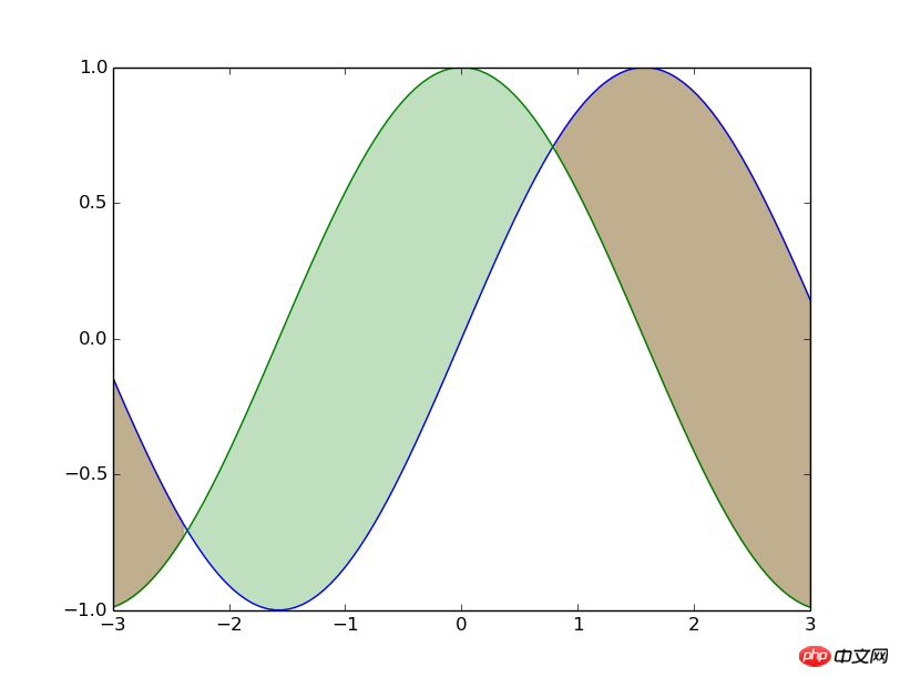
1. Filling diagram
Reference code
from matplotlib.pyplot import * x=linspace(-3,3,100) y1=np.sin(x) y2=np.cos(x) fill_between(x,y1,y2,where=(y1>=y2),color='red',alpha=0.25) fill_between(x,y1,y2,where=(y<>y2),color='green',alpha=0.25) plot(x,y1) plot(x,y2) show()
Brief analysis
The fill_betweenfunction is mainly used here. This function is easy to understand. It is to pass in the array of the x-axis and the two y-axis arrays that need to be filled; then pass in the filled range and use where= to determine the filled area. ; Finally, you can add fill color, transparency and other modified parameters.
Of course the fill_between function has more advanced usage, see fill_between usage or help documentation for details.
Rendering
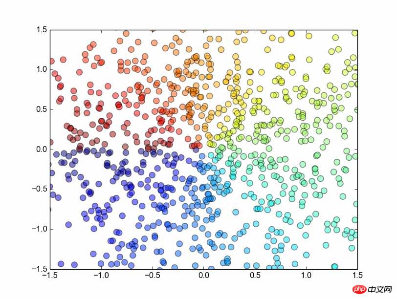
## 2. Scatter plots
Reference code
from matplotlib.pyplot import *
n = 1024
X = np.random.normal(0,1,n)
Y = np.random.normal(0,1,n)
T = np.arctan2(Y,X)
scatter(X,Y, s=75, c=T, alpha=.5)
xlim(-1.5,1.5)
ylim(-1.5,1.5)
show()
Brief analysis
First introduce Numpy'snormal function, obviously, this is a function that generates a normal distribution. This function accepts three parameters, which represent the mean, standard deviation, and length of the generated array respectively. Very easy to remember.
arctan2 function. This function accepts two parameters, representing the y array and the x array respectively, and then returns the corresponding arctan(y/x) value. , the result is in radians.
scatter method of drawing a scatter plot is used. First, of course, the x and y arrays are passed in, and then the s parameter represents scale, which is the size of the scatter points; the c parameter represents color , what I passed him was an array divided according to the angle, which corresponds to the color of each point (although I don’t know how it corresponds, but it seems to be a relative conversion based on other elements in the array, which is not important here. , anyway, just assign the same value to the same color); the last is the alpha parameter, which represents the transparency of the point.
scatter function, please refer to the official document scatter function or help document.
Rendering
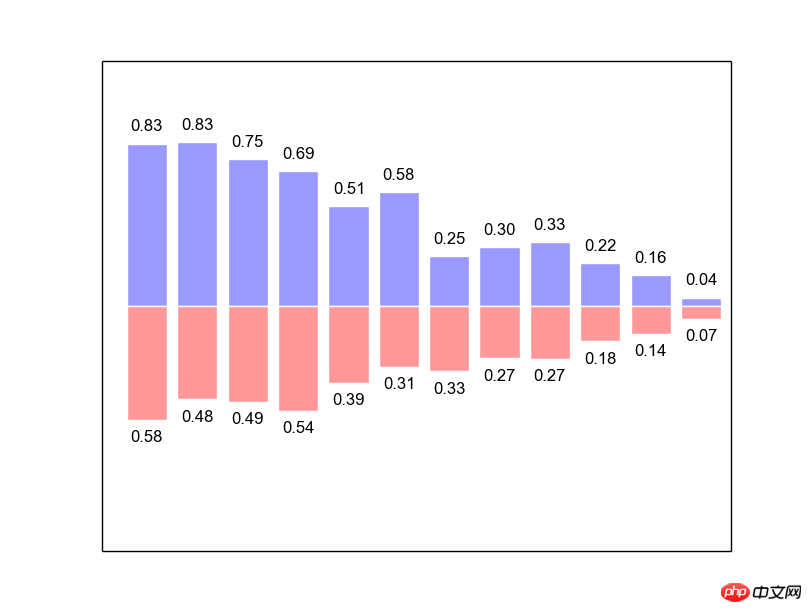
##3. Bar plots
from matplotlib.pyplot import *
n = 12
X = np.arange(n)
Y1 = (1-X/float(n)) * np.random.uniform(0.5,1.0,n)
Y2 = (1-X/float(n)) * np.random.uniform(0.5,1.0,n)
bar(X, +Y1, facecolor='#9999ff', edgecolor='white')
bar(X, -Y2, facecolor='#ff9999', edgecolor='white')
for x,y in zip(X,Y1):
 text(x+0.4, y+0.05, '%.2f' % y, ha='center', va= 'bottom')
for x,y in zip(X,Y2):
 text(x+0.4, -y-0.05, '%.2f' % y, ha='center', va= 'top')
xlim(-.5,n)
xticks([])
ylim(-1.25,+1.25)
yticks([])
show()
Brief analysis
Be careful to do it manually Import the pylab package, otherwise bar will not be found. . .
First use numpy's
arange function to generate an array of [0,1,2,…,n]. (You can also use linspace) Secondly, use numpy's
function to generate a uniformly distributed array, passing in three parameters representing the lower bound, upper bound and array length respectively. And use this array to generate the data that needs to be displayed. Then comes the use of the bar function. The basic usage is similar to the previous plot and scatter. The horizontal and vertical coordinates and some decorative parameters are passed in.
Then we need to use
forloop to display numbers for the histogram: use python's zip function to pair X and Y1 and merge them Loop through to get the position of each data, and then use the text function to display a string at that position (pay attention to the detailed adjustment of the position). text passes in the horizontal and vertical coordinates, the string to be displayed, the ha parameter specifies the horizontal alignment, and the va parameter specifies the vertical alignment. Finally adjust the coordinate range and cancel the scale on the horizontal and vertical coordinates to keep it beautiful.
As for the specific usage of the
bar function, please refer to the bar function usage or the help document.
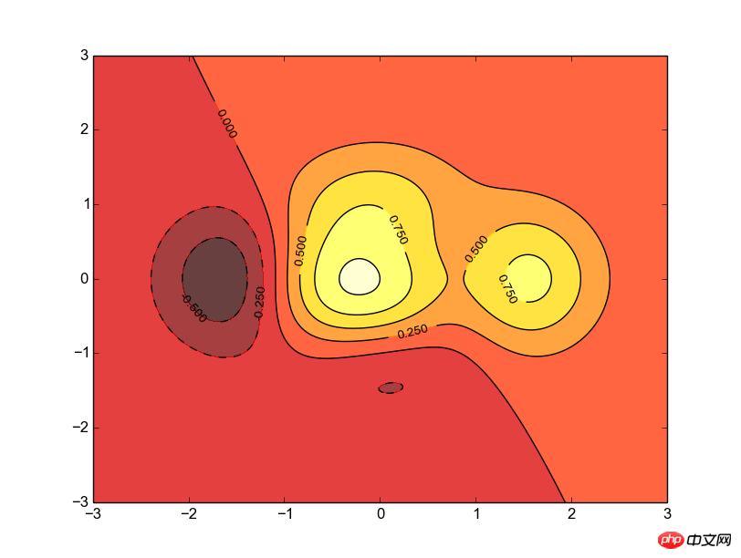
Reference Code
from matplotlib.pyplot import *
def f(x,y):
 return (1-x/2+x**5+y**3)*np.exp(-x**2-y**2)
n = 256
x = np.linspace(-3,3,n)
y = np.linspace(-3,3,n)
X,Y = np.meshgrid(x,y)
contourf(X, Y, f(X,Y), 8, alpha=.75, cmap=cm.hot)
C = contour(X, Y, f(X,Y), 8, colors='black', linewidth=.5)
clabel(C, inline=1, fontsize=10)
show()
简要分析
首先要明确等高线图是一个三维立体图,所以我们要建立一个二元函数f,值由两个参数控制,(注意,这两个参数都应该是矩阵)。
然后我们需要用numpy的meshgrid函数生成一个三维网格,即,x轴由第一个参数指定,y轴由第二个参数指定。并返回两个增维后的矩阵,今后就用这两个矩阵来生成图像。
接着就用到coutourf函数了,所谓contourf,大概就是contour fill的意思吧,只填充,不描边;这个函数主要是接受三个参数,分别是之前生成的x、y矩阵和函数值;接着是一个整数,大概就是表示等高线的密度了,有默认值;然后就是透明度和配色问题了,cmap的配色方案这里不多研究。
随后就是contour函数了,很明显,这个函数是用来描线的。用法可以类似的推出来,不解释了,需要注意的是他返回一个对象,这个对象一般要保留下来个供后续的加工细化。
最后就是用clabel函数来在等高线图上表示高度了,传入之前的那个contour对象;然后是inline属性,这个表示是否清除数字下面的那条线,为了美观当然是清除了,而且默认的也是1;再就是指定线的宽度了,不解释,。
效果图
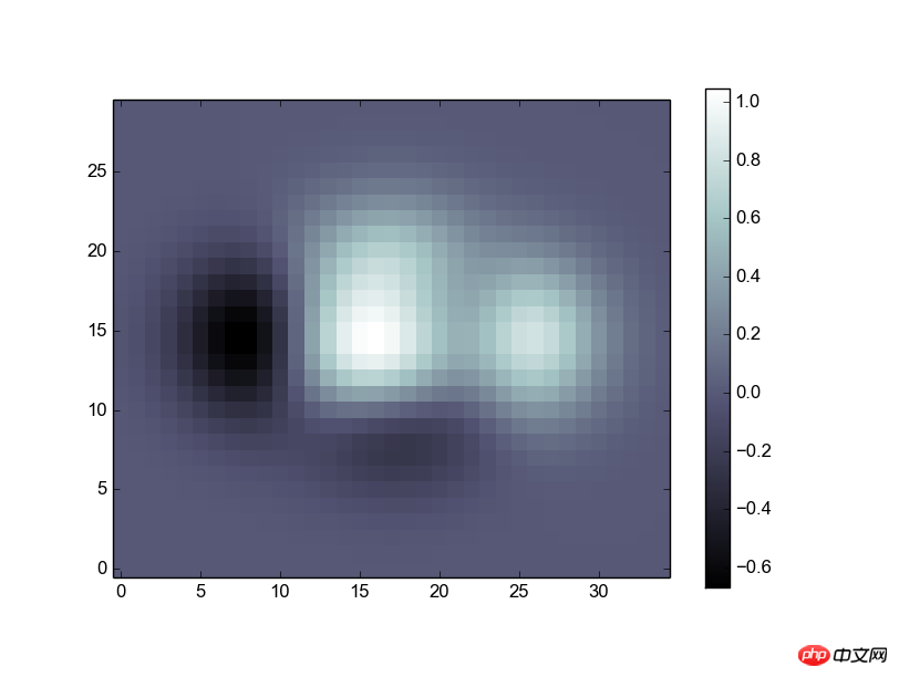
五、点阵图
参考代码
from matplotlib.pyplot import *
def f(x,y):
 return (1-x/2+x**5+y**3)*np.exp(-x**2-y**2)
n = 10
x = np.linspace(-3,3,3.5*n)
y = np.linspace(-3,3,3.0*n)
X,Y = np.meshgrid(x,y)
Z = f(X,Y)
imshow(Z,interpolation='nearest', cmap='bone', origin='lower')
colorbar(shrink=.92)
show()
简要分析
这段代码的目的就是将一个矩阵直接转换为一张像照片一样的图,完整的进行显示。
前面的代码就是生成一个矩阵Z,不作解释。
接着用到了imshow函数,传人Z就可以显示出一个二维的图像了,图像的颜色是根据元素的值进行的自适应调整,后面接了一些修饰性的参数,比如配色方案(cmap),零点位置(origin)。
最后用colorbar显示一个色条,可以不传参数,这里传进去shrink参数用来调节他的长度。
效果图
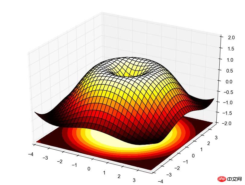
六、3D图
参考代码
import numpy as np
from pylab import *
from mpl_toolkits.mplot3d import Axes3D
fig = figure()
ax = Axes3D(fig)
X = np.arange(-4, 4, 0.25)
Y = np.arange(-4, 4, 0.25)
X, Y = np.meshgrid(X, Y)
R = np.sqrt(X**2 + Y**2)
Z = np.sin(R)
ax.plot_surface(X, Y, Z, rstride=1, cstride=1, cmap=plt.cm.hot)
ax.contourf(X, Y, Z, zdir='z', offset=-2, cmap=plt.cm.hot)
ax.set_zlim(-2,2)
show()
简要分析
有点麻烦,需要用到的时候再说吧,不过原理也很简单,跟等高线图类似,先画图再描线,最后设置高度,都是一回事。
效果图
总结
【相关推荐】
1. Python免费视频教程
2. Python基础入门教程
The above is the detailed content of Introduction to the method of drawing using the drawing library in python. For more information, please follow other related articles on the PHP Chinese website!

Hot AI Tools

Undresser.AI Undress
AI-powered app for creating realistic nude photos

AI Clothes Remover
Online AI tool for removing clothes from photos.

Undress AI Tool
Undress images for free

Clothoff.io
AI clothes remover

Video Face Swap
Swap faces in any video effortlessly with our completely free AI face swap tool!

Hot Article
Hot Tools

Notepad++7.3.1
Easy-to-use and free code editor

SublimeText3 Chinese version
Chinese version, very easy to use

Zend Studio 13.0.1
Powerful PHP integrated development environment

Dreamweaver CS6
Visual web development tools

SublimeText3 Mac version
God-level code editing software (SublimeText3)
Hot Topics
 1389
1389
 52
52

 Choosing Between PHP and Python: A Guide
Apr 18, 2025 am 12:24 AM
Choosing Between PHP and Python: A Guide
Apr 18, 2025 am 12:24 AM
PHP is suitable for web development and rapid prototyping, and Python is suitable for data science and machine learning. 1.PHP is used for dynamic web development, with simple syntax and suitable for rapid development. 2. Python has concise syntax, is suitable for multiple fields, and has a strong library ecosystem.
 PHP and Python: Different Paradigms Explained
Apr 18, 2025 am 12:26 AM
PHP and Python: Different Paradigms Explained
Apr 18, 2025 am 12:26 AM
PHP is mainly procedural programming, but also supports object-oriented programming (OOP); Python supports a variety of paradigms, including OOP, functional and procedural programming. PHP is suitable for web development, and Python is suitable for a variety of applications such as data analysis and machine learning.
 Can vs code run in Windows 8
Apr 15, 2025 pm 07:24 PM
Can vs code run in Windows 8
Apr 15, 2025 pm 07:24 PM
VS Code can run on Windows 8, but the experience may not be great. First make sure the system has been updated to the latest patch, then download the VS Code installation package that matches the system architecture and install it as prompted. After installation, be aware that some extensions may be incompatible with Windows 8 and need to look for alternative extensions or use newer Windows systems in a virtual machine. Install the necessary extensions to check whether they work properly. Although VS Code is feasible on Windows 8, it is recommended to upgrade to a newer Windows system for a better development experience and security.
 Is the vscode extension malicious?
Apr 15, 2025 pm 07:57 PM
Is the vscode extension malicious?
Apr 15, 2025 pm 07:57 PM
VS Code extensions pose malicious risks, such as hiding malicious code, exploiting vulnerabilities, and masturbating as legitimate extensions. Methods to identify malicious extensions include: checking publishers, reading comments, checking code, and installing with caution. Security measures also include: security awareness, good habits, regular updates and antivirus software.
 How to run programs in terminal vscode
Apr 15, 2025 pm 06:42 PM
How to run programs in terminal vscode
Apr 15, 2025 pm 06:42 PM
In VS Code, you can run the program in the terminal through the following steps: Prepare the code and open the integrated terminal to ensure that the code directory is consistent with the terminal working directory. Select the run command according to the programming language (such as Python's python your_file_name.py) to check whether it runs successfully and resolve errors. Use the debugger to improve debugging efficiency.
 Can visual studio code be used in python
Apr 15, 2025 pm 08:18 PM
Can visual studio code be used in python
Apr 15, 2025 pm 08:18 PM
VS Code can be used to write Python and provides many features that make it an ideal tool for developing Python applications. It allows users to: install Python extensions to get functions such as code completion, syntax highlighting, and debugging. Use the debugger to track code step by step, find and fix errors. Integrate Git for version control. Use code formatting tools to maintain code consistency. Use the Linting tool to spot potential problems ahead of time.
 Can vscode be used for mac
Apr 15, 2025 pm 07:36 PM
Can vscode be used for mac
Apr 15, 2025 pm 07:36 PM
VS Code is available on Mac. It has powerful extensions, Git integration, terminal and debugger, and also offers a wealth of setup options. However, for particularly large projects or highly professional development, VS Code may have performance or functional limitations.
 Can vscode run ipynb
Apr 15, 2025 pm 07:30 PM
Can vscode run ipynb
Apr 15, 2025 pm 07:30 PM
The key to running Jupyter Notebook in VS Code is to ensure that the Python environment is properly configured, understand that the code execution order is consistent with the cell order, and be aware of large files or external libraries that may affect performance. The code completion and debugging functions provided by VS Code can greatly improve coding efficiency and reduce errors.
