

CSS3 implements a cool lowpoly animation example

This article mainly introduces CSS3 to achieve any picturelowpolyanimation effect example. This is a combination of lowpoly (low polygon style) effect, mainly using the rotate rotation, translate movement, scale scaling of CSS3 transform attributeThis is a combination of lowpoly (low polygon) achieved by using the animation property of CSS3 Style) effect, mainly using the rotate rotation, translate movement, and scale scaling of the CSS3 transform attribute. The CSS code part is very simple. The only interesting thing is the use of the nth-of-type selector. UI designers don’t have to be deterred here. The CSS part can be reused and the parameters can be changed at will according to your own requirements (all SVG animation codes that cannot be reused are just hooligans). Then, the UI designer can use the AI tools he is familiar with to achieve the following perfectly. The effect is gone.
Step-by-step disassembly:
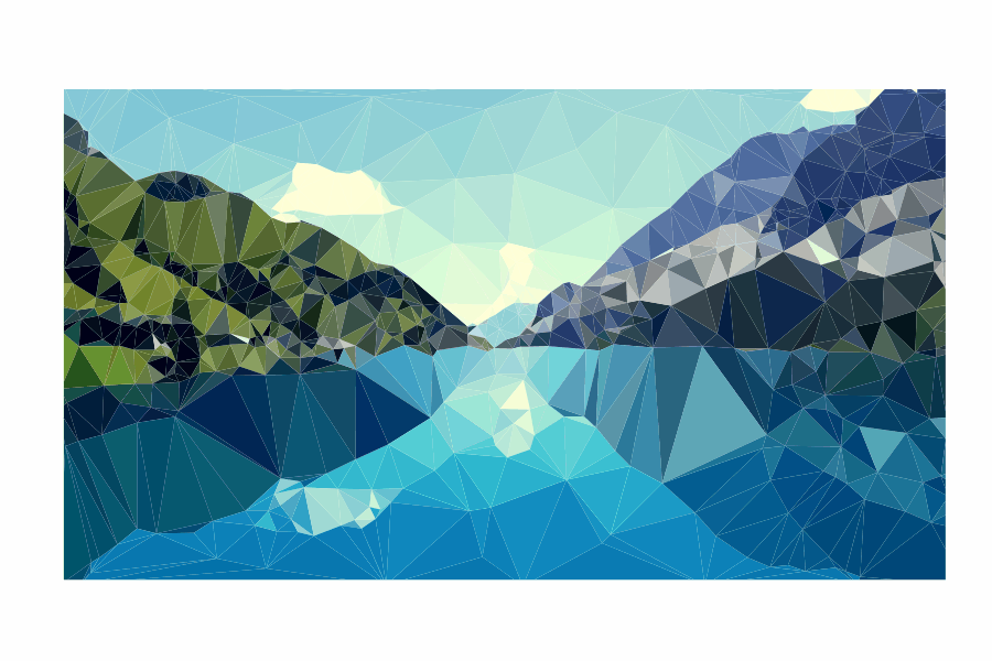
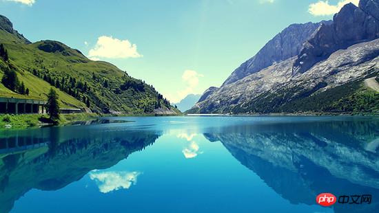
1. Production of low-polygon style picturesMy original picture is as follows:
 I randomly found a background picture from the computer, and then used an artifact Image Triangulator , I have to sigh, this tool is so easy to use, all the designers need to do is to add dots on the picture (for testing, I added vertices very roughly. If you need to get a very brilliant effect, you need to separate the light and dark areas. Edges are finely added).
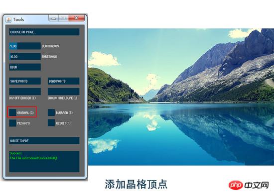
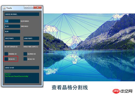
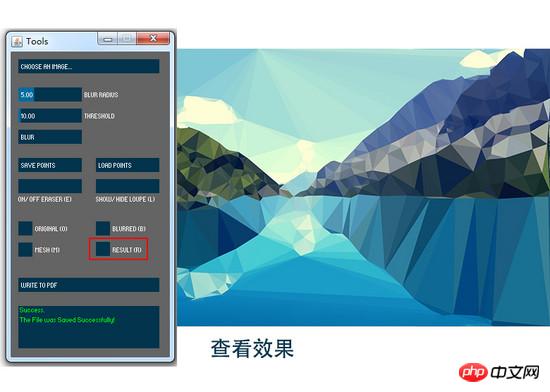 Then the exported pdf format file can be opened with AI.
An important operation is required here in AI, "Release Clipping Mask". If this operation is not performed, the generated There will be a large number of path clipping mask tags
<clipPath><a href="http://www.php.cn/wiki/921.html" target="_blank"> in the SVG code as well as the clip-path attribute of polygon. </a> <p style="text-align: center"><img src="/static/imghw/default1.png" data-src="https://img.php.cn/upload/article/000/001/506/25034086c418412e9ccaf407ab9556fd-5.jpg" class="lazy" alt="">After releasing the clipping path and selecting the graphic, you can see that the picture is now composed of triangular color blocks. </p>
<p>Export the SVG code and you can see the densely packed polygon tags </p><polygon fill="" points=""/> <p>. <code>Image Triangulator generates lowpoly-style images; AI processing, releasing clipping masks
It should be noted here that the PDF generated by this software has an unprocessed base map, and the SVG file There is an tag, so you can add a few more points on the edge, or cut off part of it to prevent hollowing out on the edge.
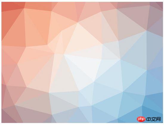
If you only need a background image, it is recommended to use the website qrohlf.com/trianglify-generator/, You can customize the size, color and lattice size, and support generating SVG format. For example:
 If the image generated using this
is not processed, it will have a
CSS3 animation Let’s first talk about the preliminary idea of animation implementation. I want these generated polygonal fragments to change in rotation, displacement and size. This is also an effect that is easy to achieve with CSS, but what I need is different effects of scattering, different directions of displacement, different distances, and scaling. Different, but I am a JavaScript scumbag who can’t write random functions. Fortunately, CSS3 provides a powerful selector nth-of-type(an+b), using With it, I can give different animation property values to different polygon fragments. A brief introduction to nth-of-type(an+b), n starts from 0 and adds 1 in sequence, so you will get the a+b, 2a+b, 3a+b ……element. For example, I want my This is the order 6n+1 ( That is, the animation effect of polygons 1,7,13,19...). Similarly, the next group is polygon:nth-of-type(6n+2), that is, the 2nd, 8th, 14th, 20th... Polygons, push backwards one by one until polygon:nth-of-type(6n+6) Now attach all the codes and comments Combined with all the codes below: Since SVG breaks into full screen after executing the animation effect, if our animation is to be set to break when the mouse moves in and restore when the mouse moves out, an area is needed to trigger the action. This is how we define cover. meaning, and the hierarchical attributes are higher than the SVG attributes. Regarding the triggering of animation effects, I use :hover when the mouse passes. If you need other triggers events, you can ask for help from the front-end siege lion. The overflow attribute of svg must be defined as visible to ensure that the part beyond the svg size is visible after the animation effect. Regarding the setting of polygon animation attributes, this transition: all 1s ease means that all animation times are 1s and the easing effect is. transform-origin: 50% 50% defines the origin of the transformation as the center of each element. Regarding 6 different sets of animation effects, I set the displacement translate, scaling scale, selection rotate and transparency opacity changes. For the displacement of the X-axis and Y-axis, it is recommended to define a range yourself. The larger the value, the higher the diffusion. For example, my X and Y directions are both -800%~800%. In addition, regarding the angle of rotation, rotate(), in order to comply with the laws of physics, the farther the offset path is, the greater the angle of rotation, and vice versa. If you want to set more different effects, you only need to change the coefficient a of n in nth-of-type (an+b). If you are too lazy to modify and try, when the UI designer applies this template, he only needs to replace the Summary of knowledge points 1. About the production of low polygon lowpoly style pictures (focus on making arbitrary graphics for yourself) 2.CSS3 selector nth-of- The use of type (an+b) [Related recommendations] 1. Special recommendation:"php program Download version V0.1 of "Employee Toolbox" polygon:nth-of-type(6n+1){transform: translate(x , y) scale() rotate();}<html>
<head>
<style>
/*以下为可复用的CSS代码部分*/
.cover{
position: absolute;
width: 800px;
height: 445px;
top: 20%;
left: 20%;
z-index: 2;
}
/*cover和svg的宽高位置都重合,唯一不同的是z-index属性*/
svg {
position: absolute;
width: 800px;
height: 445px;
top: 20%;
left: 20%;
overflow: visible;
z-index: 1;
}
polygon{
transition:all 1s ease;
transform-origin: 50% 50%;
}
/*以下为设定的6组动画效果*/
.cover:hover + svg #lowpoly polygon:nth-of-type(6n+1){
transform: translate(-400% , -400%) scale(1.5) rotate(100deg);
opacity: .3
}
.cover:hover + svg #lowpoly polygon:nth-of-type(6n+2){
transform: translate(800% , -400%) scale(1.1) rotate(200deg);
opacity: .4;
}
.cover:hover + svg #lowpoly polygon:nth-of-type(6n+3){
transform: translate(-800% , 400%) scale(1.2) rotate(200deg);
opacity: .3;
}
.cover:hover + svg #lowpoly polygon:nth-of-type(6n+4){
transform: translate(-400% , 800%) scale(1.4) rotate(200deg);
opacity: .4
}
.cover:hover + svg #lowpoly polygon:nth-of-type(6n+5){
transform: translate(400% , 400%) scale(1.3) rotate(100deg);
opacity: .3
}
.cover:hover + svg #lowpoly polygon:nth-of-type(6n+6){
transform: translate(800% , 400%) scale(1.2) rotate(200deg);
opacity: .3
}
</style></head>
<body><p class="cover"></p><!--定义的触发区域-->
<svg>
<g id="lowpoly">
……此处为若干<polygon>标签 即需要自行替换的部分
</g>
</svg></body></html>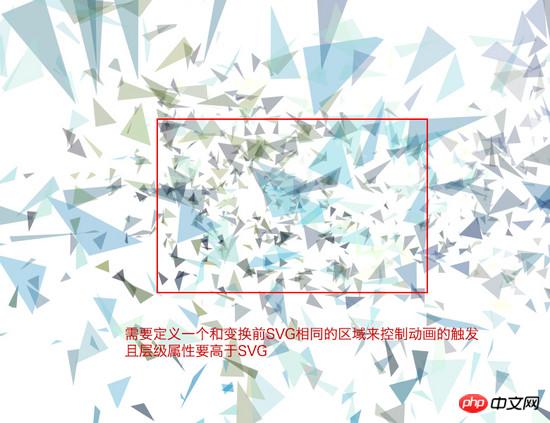
The above is the detailed content of CSS3 implements a cool lowpoly animation example. For more information, please follow other related articles on the PHP Chinese website!

Hot AI Tools

Undresser.AI Undress
AI-powered app for creating realistic nude photos

AI Clothes Remover
Online AI tool for removing clothes from photos.

Undress AI Tool
Undress images for free

Clothoff.io
AI clothes remover

AI Hentai Generator
Generate AI Hentai for free.

Hot Article
Hot Tools

Notepad++7.3.1
Easy-to-use and free code editor

SublimeText3 Chinese version
Chinese version, very easy to use

Zend Studio 13.0.1
Powerful PHP integrated development environment

Dreamweaver CS6
Visual web development tools

SublimeText3 Mac version
God-level code editing software (SublimeText3)
Hot Topics
 1386
1386
 52
52

 How to speed up animation effects in Windows 11: 2 methods explained
Apr 24, 2023 pm 04:55 PM
How to speed up animation effects in Windows 11: 2 methods explained
Apr 24, 2023 pm 04:55 PM
When Microsoft launched Windows 11, it brought a lot of changes. One of the changes is an increase in the number of user interface animations. Some users want to change the way things appear, and they have to find a way to do it. Having animations makes it feel better and more user-friendly. Animation uses visual effects to make the computer look more attractive and responsive. Some of them include sliding menus after a few seconds or minutes. There are many animations on your computer that can affect PC performance, slow it down, and interfere with your work. In this case you have to turn off animation. This article will introduce several ways that users can improve the speed of their animations on PC. You can apply the changes using Registry Editor or a custom file you run. How to improve animations in Windows 11
 CSS Animation: How to Achieve the Flash Effect of Elements
Nov 21, 2023 am 10:56 AM
CSS Animation: How to Achieve the Flash Effect of Elements
Nov 21, 2023 am 10:56 AM
CSS animation: How to achieve the flash effect of elements, specific code examples are needed. In web design, animation effects can sometimes bring a good user experience to the page. The glitter effect is a common animation effect that can make elements more eye-catching. The following will introduce how to use CSS to achieve the flash effect of elements. 1. Basic implementation of flash First, we need to use the animation property of CSS to achieve the flash effect. The value of the animation attribute needs to specify the animation name, animation execution time, and animation delay time
![Animation not working in PowerPoint [Fixed]](https://img.php.cn/upload/article/000/887/227/170831232982910.jpg?x-oss-process=image/resize,m_fill,h_207,w_330) Animation not working in PowerPoint [Fixed]
Feb 19, 2024 am 11:12 AM
Animation not working in PowerPoint [Fixed]
Feb 19, 2024 am 11:12 AM
Are you trying to create a presentation but can't add animation? If animations are not working in PowerPoint on your Windows PC, then this article will help you. This is a common problem that many people complain about. For example, animations may stop working during presentations in Microsoft Teams or during screen recordings. In this guide, we will explore various troubleshooting techniques to help you fix animations not working in PowerPoint on Windows. Why aren't my PowerPoint animations working? We have noticed that some possible reasons that may cause the animation in PowerPoint not working issue on Windows are as follows: Due to personal
 How to set up ppt animation to enter first and then exit
Mar 20, 2024 am 09:30 AM
How to set up ppt animation to enter first and then exit
Mar 20, 2024 am 09:30 AM
We often use ppt in our daily work, so are you familiar with every operating function in ppt? For example: How to set animation effects in ppt, how to set switching effects, and what is the effect duration of each animation? Can each slide play automatically, enter and then exit the ppt animation, etc. In this issue, I will first share with you the specific steps of entering and then exiting the ppt animation. It is below. Friends, come and take a look. Look! 1. First, we open ppt on the computer, click outside the text box to select the text box (as shown in the red circle in the figure below). 2. Then, click [Animation] in the menu bar and select the [Erase] effect (as shown in the red circle in the figure). 3. Next, click [
 How to disable animations in Windows 11
Apr 16, 2023 pm 11:34 PM
How to disable animations in Windows 11
Apr 16, 2023 pm 11:34 PM
Microsoft Windows 11 includes many new features and functions. The user interface has been updated and the company has also introduced some new effects. By default, animation effects are applied to controls and other objects. Should I disable these animations? Although Windows 11 features visually appealing animations and fade effects, they can cause your computer to feel sluggish to some users as they add a bit of lag to certain tasks. It's easy to turn off animations for a more responsive user experience. After we see what other changes have been made to the operating system, we'll walk you through how to turn animation effects on or off in Windows 11. We also have an article on how to
 How to use Vue to implement typewriter animation effects
Sep 19, 2023 am 09:33 AM
How to use Vue to implement typewriter animation effects
Sep 19, 2023 am 09:33 AM
How to use Vue to implement typewriter animation special effects Typewriter animation is a common and eye-catching special effect that is often used in website titles, slogans and other text displays. In Vue, we can achieve typewriter animation effects by using Vue custom instructions. This article will introduce in detail how to use Vue to achieve this special effect and provide specific code examples. Step 1: Create a Vue project First, we need to create a Vue project. You can use VueCLI to quickly create a new Vue project, or manually
 After a two-year delay, the domestic 3D animated film 'Er Lang Shen: The Deep Sea Dragon' is scheduled to be released on July 13
Jan 26, 2024 am 09:42 AM
After a two-year delay, the domestic 3D animated film 'Er Lang Shen: The Deep Sea Dragon' is scheduled to be released on July 13
Jan 26, 2024 am 09:42 AM
This website reported on January 26 that the domestic 3D animated film "Er Lang Shen: The Deep Sea Dragon" released a set of latest stills and officially announced that it will be released on July 13. It is understood that "Er Lang Shen: The Deep Sea Dragon" is produced by Mihuxing (Beijing) Animation Co., Ltd., Horgos Zhonghe Qiancheng Film Co., Ltd., Zhejiang Hengdian Film Co., Ltd., Zhejiang Gongying Film Co., Ltd., Chengdu The animated film produced by Tianhuo Technology Co., Ltd. and Huawen Image (Beijing) Film Co., Ltd. and directed by Wang Jun was originally scheduled to be released in mainland China on July 22, 2022. Synopsis of the plot of this site: After the Battle of the Conferred Gods, Jiang Ziya took the "Conferred Gods List" to divide the gods, and then the Conferred Gods List was sealed by the Heavenly Court under the deep sea of Kyushu Secret Realm. In fact, in addition to conferring divine positions, there are also many powerful evil spirits sealed in the Conferred Gods List.
 Hayao Miyazaki's animated film 'Porco Rosso' has been extended to January 16 next year, with a Douban score of 8.6
Dec 18, 2023 am 08:07 AM
Hayao Miyazaki's animated film 'Porco Rosso' has been extended to January 16 next year, with a Douban score of 8.6
Dec 18, 2023 am 08:07 AM
According to news from this site, Miyazaki Hayao's animated film "Porco Rosso" has announced that it will extend the release date to January 16, 2024. This site previously reported that "Porco Rosso" has been launched in the National Art Federation Special Line Cinema on November 17, with a cumulative box office of over 2,000 10,000, with a Douban score of 8.6, and 85.8% of 4 and 5 star reviews. "Porco Rosso" was produced by Studio Ghibli and directed by Hayao Miyazaki. Moriyama Moriyama, Tokiko Kato, Otsuka Akio, Okamura Akemi and others participated in the dubbing. It was originally released in Japan in 1992. The film is adapted from Hayao Miyazaki's comic book "The Age of Airships" and tells the story of the Italian Air Force's ace pilot Pollock Rosen who was magically turned into a pig. After that, he became a bounty hunter, fighting against air robbers and protecting those around him. Plot synopsis: Rosen is a soldier in World War I
