 Web Front-end
 PS Tutorial
 Tutorial on how to design a super cool battle scene game website homepage using Photoshop
Tutorial on how to design a super cool battle scene game website homepage using Photoshop
This tutorial teaches PS enthusiasts from Script House how to use Photoshop to design the homepage of a super cool Brawl scene game website. There are many forms of sharing on the market, and there are various ways to create them. However, there is no such detailed tutorial on creating the scene atmosphere of the game. If you are interested, let’s take a look.
Final effect:

Main process:
1. Find materials.

#2. According to the visual reference, the Brawl is a picture that radiates from the center to the surroundings, so the scene selection is also symmetrical and divergent graphics.


#3. In order to ensure the balance of the picture, it is a relatively safe method to keep the movements of the surrounding characters basically symmetrical, so I chose this 3 characters are designed based on their actions. The two characters of the female gun and the raccoon are used on the left because they are relatively thin and small, in order to maintain a balance with the strong male knight on the right.

#4. Fixed light source (the light source is divided into two types: 1. Warm light source 2. Cold light source).

5. The main purpose here is to set the light source for the scene (brighten the middle and darken the surroundings). Use the warm yellow main light source to brighten the middle, and use blue cold light for contrast on the sides. , the reason why this is done is to make the central theme picture more prominent.

#6. Duplicate the scene and apply Gaussian blur to the original painting on the new layer. Select Filter ColorAttribute for the layer, add a filter mask to the blurred layer to erase it, and use a brush to erase the areas that don’t need to be blurred. This method can increase the depth of field effect in the scene.

#7. Use "Levels" (shortcut key Ctrl+L) to deepen the dark parts of the scene, raise the bright parts, and enhance the contrast.

#8. The atmosphere of the scene is now in place, as shown below.

#9. Use the "color levels" adjustment (shortcut key Ctrl+L) to make the character's light and dark contrast and texture stronger. Use "Burn and Dodge" to brighten the light-receiving side of the character and darken the backlit side of the character. Strengthen the lighting effect of the light source, making the characters more three-dimensional and the picture more spacious.

#10. According to the light source, add a shape selection to the character and fill it with black.

#11. Adjust the layer transparency so that the lightness and darkness of the characters and the background are in the same environment level. Add a mask layer and erase the highlights according to the direction of the light source.
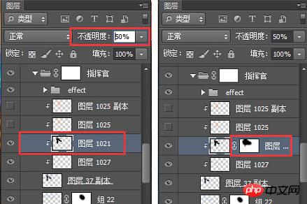
#12. Other heroes are processed in the same way to get the final picture.

13. Color search is an adjustment layer, its location is as shown below. After adding the color search, find the 3DLUT file in the color search panel. Pull down and you can see many styles with built-in special effects, including cold, warm, heavy, and fresh. You can try them one by one and use them directly if you find one that suits you. Not much to say here.

#14. Create a new layer and use soft light or overlay layer blending mode. Use the brush to absorb the warm yellow, and then use the brush to add a warm light source to the main light source.


15. Use "Color Balance", "Hue Saturation", "Levels", etc. to adjust the layers! Very useful You can quickly get the atmosphere and tone of the picture you want.


16. Create a new layer and set the soft light layer blending mode. Use a black brush to darken the surrounding areas of the image and highlight the center image again.

#17. Create a new layer, fill it with gray, and use it as the background of the content module to create a gradient effect with the scene.
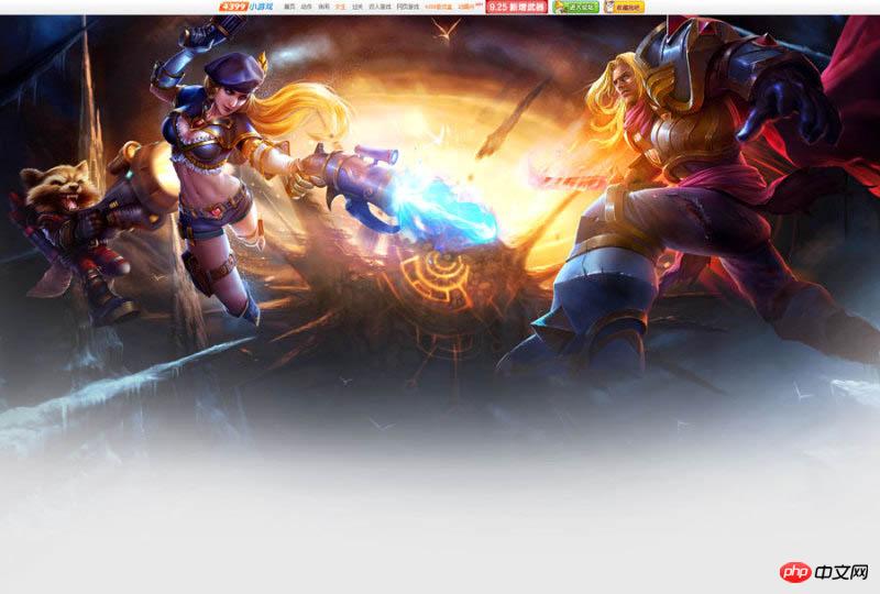
18. Font design.

19. Floating objects can appear in many forms. Adding floating snowflakes, star light effects, etc. according to the needs of the picture will make the picture very detailed and improve the texture of the picture. .

20. Add some splashing gravel under the feet of the characters in the picture to enhance the power of the picture and make the picture instantly shocking! Reasonable addition of floating objects can add atmosphere to the picture, and Creating a sense of space is an epic tool for showing off.

#21. The screen is almost created. Next, design the interface design of the header login registration box.

final effect:

The above is the detailed content of Tutorial on how to design a super cool battle scene game website homepage using Photoshop. For more information, please follow other related articles on the PHP Chinese website!

Hot AI Tools

Undresser.AI Undress
AI-powered app for creating realistic nude photos

AI Clothes Remover
Online AI tool for removing clothes from photos.

Undress AI Tool
Undress images for free

Clothoff.io
AI clothes remover

Video Face Swap
Swap faces in any video effortlessly with our completely free AI face swap tool!

Hot Article

Hot Tools

Notepad++7.3.1
Easy-to-use and free code editor

SublimeText3 Chinese version
Chinese version, very easy to use

Zend Studio 13.0.1
Powerful PHP integrated development environment

Dreamweaver CS6
Visual web development tools

SublimeText3 Mac version
God-level code editing software (SublimeText3)

Hot Topics
 1386
1386
 52
52
 What is the reason why PS keeps showing loading?
Apr 06, 2025 pm 06:39 PM
PS "Loading" problems are caused by resource access or processing problems: hard disk reading speed is slow or bad: Use CrystalDiskInfo to check the hard disk health and replace the problematic hard disk. Insufficient memory: Upgrade memory to meet PS's needs for high-resolution images and complex layer processing. Graphics card drivers are outdated or corrupted: Update the drivers to optimize communication between the PS and the graphics card. File paths are too long or file names have special characters: use short paths and avoid special characters. PS's own problem: Reinstall or repair the PS installer.
 How to solve the problem of loading when PS is always showing that it is loading?
Apr 06, 2025 pm 06:30 PM
PS card is "Loading"? Solutions include: checking the computer configuration (memory, hard disk, processor), cleaning hard disk fragmentation, updating the graphics card driver, adjusting PS settings, reinstalling PS, and developing good programming habits.
 What are the common questions about exporting PDF on PS
Apr 06, 2025 pm 04:51 PM
Frequently Asked Questions and Solutions when Exporting PS as PDF: Font Embedding Problems: Check the "Font" option, select "Embed" or convert the font into a curve (path). Color deviation problem: convert the file into CMYK mode and adjust the color; directly exporting it with RGB requires psychological preparation for preview and color deviation. Resolution and file size issues: Choose resolution according to actual conditions, or use the compression option to optimize file size. Special effects issue: Merge (flatten) layers before exporting, or weigh the pros and cons.
 How to set password protection for export PDF on PS
Apr 06, 2025 pm 04:45 PM
Export password-protected PDF in Photoshop: Open the image file. Click "File"> "Export"> "Export as PDF". Set the "Security" option and enter the same password twice. Click "Export" to generate a PDF file.
 How to speed up the loading speed of PS?
Apr 06, 2025 pm 06:27 PM
Solving the problem of slow Photoshop startup requires a multi-pronged approach, including: upgrading hardware (memory, solid-state drive, CPU); uninstalling outdated or incompatible plug-ins; cleaning up system garbage and excessive background programs regularly; closing irrelevant programs with caution; avoiding opening a large number of files during startup.
 How to use PS Pen Tool
Apr 06, 2025 pm 10:15 PM
The Pen Tool is a tool that creates precise paths and shapes, and is used by: Select the Pen Tool (P). Sets Path, Fill, Stroke, and Shape options. Click Create anchor point, drag the curve to release the Create anchor point. Press Ctrl/Cmd Alt/Opt to delete the anchor point, drag and move the anchor point, and click Adjust curve. Click the first anchor to close the path to create a shape, and double-click the last anchor to create an open path.
 How to solve the problem of loading when the PS opens the file?
Apr 06, 2025 pm 06:33 PM
"Loading" stuttering occurs when opening a file on PS. The reasons may include: too large or corrupted file, insufficient memory, slow hard disk speed, graphics card driver problems, PS version or plug-in conflicts. The solutions are: check file size and integrity, increase memory, upgrade hard disk, update graphics card driver, uninstall or disable suspicious plug-ins, and reinstall PS. This problem can be effectively solved by gradually checking and making good use of PS performance settings and developing good file management habits.
 How to pull the vertical reference line of PS
Apr 06, 2025 pm 08:18 PM
Pull vertical guides in Photoshop: Enable ruler view (View > ruler). Hover the mouse over the vertical edge of the ruler, and then the cursor becomes a vertical line with double arrows and hold and drag the mouse to pull out the reference line. Click Delete by dragging the guide, or hovering it into a cross.


