

How to implement lowpoly animation effect on any image with CSS3

This article mainly introduces CSS3 to achieve any picturelowpolyanimation effect example. This is a combination of lowpoly (low polygon style) effect, mainly using the rotate rotation, translate movement, scale scaling of CSS3 transform attributeThis is a combination of lowpoly (low polygon) achieved by using the animation property of CSS3 Style) effect, mainly using the rotate rotation, translate movement, and scale scaling of the CSS3 transform attribute. The CSS code part is very simple. The only interesting thing is the use of the nth-of-type selector. UI designers don’t have to be deterred here. The CSS part can be reused and the parameters can be changed at will according to your own requirements (all SVG animation codes that cannot be reused are just hooligans). Then, the UI designer can use the AI tools he is familiar with to achieve the following perfectly. The effect is gone.
Step-by-step disassembly:
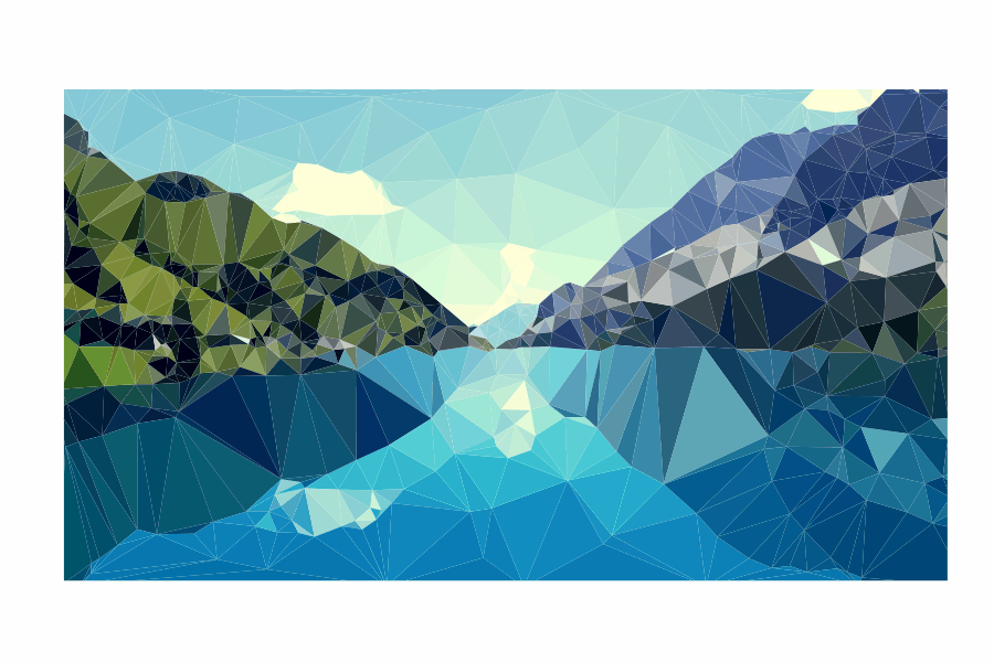
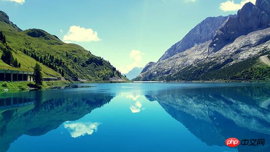
1. Production of low-polygon style picturesMy original picture is as follows:
 I randomly found a background picture from the computer, and then used an artifact Image Triangulator , I have to sigh, this tool is so easy to use, all the designers need to do is to add dots on the picture (for testing, I added vertices very roughly. If you need to get a very brilliant effect, you need to separate the light and dark areas. Edges are finely added).
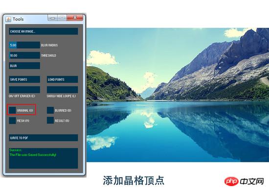
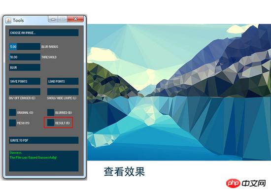 Then the exported pdf format file can be opened with AI.
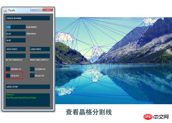
An important operation is required here in AI, "Release Clipping Mask". If this operation is not performed, the generated There will be a large number of path clipping mask tags
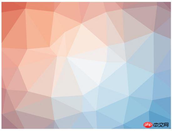
<clipPath><a href="http://www.php.cn/wiki/921.html" target="_blank"> in the SVG code as well as the clip-path attribute of polygon. </a> <p style="text-align: center"><img src="/static/imghw/default1.png" data-src="https://img.php.cn/upload/article/000/000/194/dd2be2f9b0be803434699407309413f8-5.jpg" class="lazy" alt="">After releasing the clipping path and selecting the graphic, you can see that the picture is now composed of triangular color blocks. </p>
<p>Export the SVG code and you can see the densely packed polygon tags </p><polygon fill="" points=""/> <p>. <code>Image Triangulator generates lowpoly-style images; AI processing, releasing clipping masks
It should be noted here that the PDF generated by this software has an unprocessed base map, and the SVG file There is an tag, so you can add a few more points on the edge, or cut off part of it to prevent hollowing out on the edge.
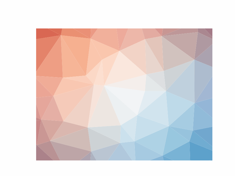
If you only need a background image, you can customize the size, color and lattice size, support Generate SVG format. For example:
 If the image generated using this
is not processed, it will have a
CSS3 animation Let me first talk about the preliminary idea of animation implementation. I want these generated polygonal fragments to change in rotation, displacement and size. This is also an effect that is easy to achieve with CSS, but what I need is different effects of scattering, different directions of displacement, different distances, and scaling. Different, but I am a
JavaScript scumbag who can’t write random functions. Fortunately, CSS3 provides a powerful selector nth-of-type(an+b), using With it, I can give different animation property values to different polygon fragments. Briefly understand nth-of-type(an+b), n starts from 0 and adds 1 in sequence, so you will get the a+b, 2a+b, 3a+b... elements . For example, I want my This is the order 6n+1 ( That is, the animation effect of polygons 1,7,13,19...). Similarly, the next group is polygon:nth-of-type(6n+2), that is, the 2nd, 8th, 14th, 20th... Polygons, push backwards one by one until polygon:nth-of-type(6n+6) Now attach all the codes and comments Combined with the following Let’s talk about the whole code: Since SVG breaks into full screen after executing the animation effect, if our animation is set to have the effect of breaking when the mouse moves in and restoring when the mouse moves out, an area is needed to trigger the action. This is the meaning of our definition of cover, and the hierarchical attributes are higher than the SVG attributes. Regarding the triggering of animation effects, I use :hover when the mouse passes. If you need other triggers events, you can ask for help from the front-end siege lion. The overflow attribute of svg must be defined as visible to ensure that the part beyond the svg size is visible after the animation effect. Regarding the setting of polygon animation attributes, this transition: all 1s ease means that all animation times are 1s and the easing effect is. transform-origin: 50% 50% defines the origin of the transformation as the center of each element. Regarding 6 different sets of animation effects, I set the displacement translate, scaling scale, selection rotate and transparency opacity changes. For the displacement of the X-axis and Y-axis, it is recommended to define a range yourself. The larger the value, the higher the diffusion. For example, my X and Y directions are both -800%~800%. In addition, regarding the angle of rotation, rotate(), in order to comply with the laws of physics, the farther the offset path is, the greater the angle of rotation, and vice versa. If you want to set more different effects, you only need to change the coefficient a of n in nth-of-type (an+b). If you are too lazy to modify it, the UI designer only needs to replace the ##Summary of knowledge pointspolygon:nth-of-type(6n+1){transform: translate(x , y) scale() rotate();}<html>
<head>
<style>
/*以下为可复用的CSS代码部分*/
.cover{
position: absolute;
width: 800px;
height: 445px;
top: 20%;
left: 20%;
z-index: 2;
}
/*cover和svg的宽高位置都重合,唯一不同的是z-index属性*/
svg {
position: absolute;
width: 800px;
height: 445px;
top: 20%;
left: 20%;
overflow: visible;
z-index: 1;
}
polygon{
transition:all 1s ease;
transform-origin: 50% 50%;
}
/*以下为设定的6组动画效果*/
.cover:hover + svg #lowpoly polygon:nth-of-type(6n+1){
transform: translate(-400% , -400%) scale(1.5) rotate(100deg);
opacity: .3
}
.cover:hover + svg #lowpoly polygon:nth-of-type(6n+2){
transform: translate(800% , -400%) scale(1.1) rotate(200deg);
opacity: .4;
}
.cover:hover + svg #lowpoly polygon:nth-of-type(6n+3){
transform: translate(-800% , 400%) scale(1.2) rotate(200deg);
opacity: .3;
}
.cover:hover + svg #lowpoly polygon:nth-of-type(6n+4){
transform: translate(-400% , 800%) scale(1.4) rotate(200deg);
opacity: .4
}
.cover:hover + svg #lowpoly polygon:nth-of-type(6n+5){
transform: translate(400% , 400%) scale(1.3) rotate(100deg);
opacity: .3
}
.cover:hover + svg #lowpoly polygon:nth-of-type(6n+6){
transform: translate(800% , 400%) scale(1.2) rotate(200deg);
opacity: .3
}
</style></head>
<body><p class="cover"></p><!--定义的触发区域-->
<svg>
<g id="lowpoly">
……此处为若干<polygon>标签 即需要自行替换的部分
</g>
</svg></body></html>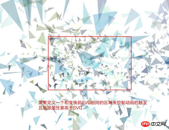
The above is the detailed content of How to implement lowpoly animation effect on any image with CSS3. For more information, please follow other related articles on the PHP Chinese website!

Hot AI Tools

Undresser.AI Undress
AI-powered app for creating realistic nude photos

AI Clothes Remover
Online AI tool for removing clothes from photos.

Undress AI Tool
Undress images for free

Clothoff.io
AI clothes remover

Video Face Swap
Swap faces in any video effortlessly with our completely free AI face swap tool!

Hot Article
Hot Tools

Notepad++7.3.1
Easy-to-use and free code editor

SublimeText3 Chinese version
Chinese version, very easy to use

Zend Studio 13.0.1
Powerful PHP integrated development environment

Dreamweaver CS6
Visual web development tools

SublimeText3 Mac version
God-level code editing software (SublimeText3)
Hot Topics
 1387
1387
 52
52

 How to achieve wave effect with pure CSS3? (code example)
Jun 28, 2022 pm 01:39 PM
How to achieve wave effect with pure CSS3? (code example)
Jun 28, 2022 pm 01:39 PM
How to achieve wave effect with pure CSS3? This article will introduce to you how to use SVG and CSS animation to create wave effects. I hope it will be helpful to you!
 Use CSS skillfully to realize various strange-shaped buttons (with code)
Jul 19, 2022 am 11:28 AM
Use CSS skillfully to realize various strange-shaped buttons (with code)
Jul 19, 2022 am 11:28 AM
This article will show you how to use CSS to easily realize various weird-shaped buttons that appear frequently. I hope it will be helpful to you!
 How to hide elements in css without taking up space
Jun 01, 2022 pm 07:15 PM
How to hide elements in css without taking up space
Jun 01, 2022 pm 07:15 PM
Two methods: 1. Using the display attribute, just add the "display:none;" style to the element. 2. Use the position and top attributes to set the absolute positioning of the element to hide the element. Just add the "position:absolute;top:-9999px;" style to the element.
 How to implement lace borders in css3
Sep 16, 2022 pm 07:11 PM
How to implement lace borders in css3
Sep 16, 2022 pm 07:11 PM
In CSS, you can use the border-image attribute to achieve a lace border. The border-image attribute can use images to create borders, that is, add a background image to the border. You only need to specify the background image as a lace style; the syntax "border-image: url (image path) offsets the image border width inward. Whether outset is repeated;".
 How to enlarge the image by clicking the mouse in css3
Apr 25, 2022 pm 04:52 PM
How to enlarge the image by clicking the mouse in css3
Apr 25, 2022 pm 04:52 PM
Implementation method: 1. Use the ":active" selector to select the state of the mouse click on the picture; 2. Use the transform attribute and scale() function to achieve the picture magnification effect, the syntax "img:active {transform: scale(x-axis magnification, y Axis magnification);}".
 It turns out that text carousel and image carousel can also be realized using pure CSS!
Jun 10, 2022 pm 01:00 PM
It turns out that text carousel and image carousel can also be realized using pure CSS!
Jun 10, 2022 pm 01:00 PM
How to create text carousel and image carousel? The first thing everyone thinks of is whether to use js. In fact, text carousel and image carousel can also be realized using pure CSS. Let’s take a look at the implementation method. I hope it will be helpful to everyone!
 How to set animation rotation speed in css3
Apr 28, 2022 pm 04:32 PM
How to set animation rotation speed in css3
Apr 28, 2022 pm 04:32 PM
In CSS3, you can use the "animation-timing-function" attribute to set the animation rotation speed. This attribute is used to specify how the animation will complete a cycle and set the speed curve of the animation. The syntax is "element {animation-timing-function: speed attribute value;}".
 Does css3 animation effect have deformation?
Apr 28, 2022 pm 02:20 PM
Does css3 animation effect have deformation?
Apr 28, 2022 pm 02:20 PM
The animation effect in css3 has deformation; you can use "animation: animation attribute @keyframes ..{..{transform: transformation attribute}}" to achieve deformation animation effect. The animation attribute is used to set the animation style, and the transform attribute is used to set the deformation style. .
