

There are some cool things you don't know about CSS3

Maybe when we look at the source code of some web pages
we will find attributes or usages that we have never seen before
I will summarize them today
Cold knowledge of CSS3
Style calculation
Simple calculations can also be performed in CSS
It can be achieved through the calcfunction
This can also make our elements adaptive
Of course the calculated value should be a legal value
.demo {    ...
width: calc(100% - 500px); height: 200px;}In this demo, the width value of the element is the width of the parent element minus 500 pixels
If the parent element It's the body
Change the size of the window, and its width will also change accordingly
Blurred text
Two simple lines of code can achieve the effect of blurred text
.demo {    ...
color: transparent; text-shadow: black 0 0 2px;}In fact, we use the familiar text-shadow with the foreground color transparency
to achieve a filter-like effect 
Multiple borders
Maybe we use b order and outline can achieve two layers of borders
In fact, we can use box shadow to achieve the effect of multiple borders
.demo {    ...
    box-shadow: 0 0 0 10px rgba(0, 0, 0, 0.2),
                0 0 0 20px rgba(0, 0, 0, 0.2),
                0 0 0 30px rgba(0, 0, 0, 0.2),
                0 0 0 40px rgba(0, 0, 0, 0.2),                0 0 0 50px rgba(0, 0, 0, 0.2),                0 0 0 60px rgba(0, 0, 0, 0.2),                0 0 0 70px rgba(0, 0, 0, 0.2),                0 0 0 80px rgba(0, 0, 0, 0.2);}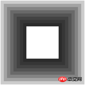
PointerEvents
The pointer-events attribute allows us to control the behavior of the cursor in mouse click, drag and other events
a { pointer-events: none;}After adding this style, The link will become invalid
Even if the mouse is hovering over this link, it will not change to the pointer cursor style
Writing mode
writing-modeAttribute is used to specify Writing mode
This attribute is to solve the problem that not all languages are written from left to right.
For example, I want to specify the writing mode vertical direction from right to left
.demo { width: 100px; height: 100px; writing-mode: vertical-rl; border: 1px solid black;}
Element clipping
Maybe we have used the attribute of clipping picturebackground-clip
But in fact, css can clip the element
That’s it Use the clip attribute
But it seems that it is not commonly used
This attribute is very delicate
It only takes effect when positioned in absolute or fixed
This attribute is used like this
.demo {    ...
position: absolute; clip: rect(20px,140px,140px,20px);}But I am chrWhen using this attribute on the ome browser
I found that it is not the same as the background image cropping
Although the four pixel values also correspond to the top, right, bottom and left respectively
But only the first One value (top) and the last value (left) specify the size to be cropped
while the second value (right) and the third value (bottom) are more like the size to retain
Since there is no Commonly used, I won’t go into details here
Interested students can Debug on the browser
Write these for now
Think of anything later
Organized here
The above is the detailed content of There are some cool things you don't know about CSS3. For more information, please follow other related articles on the PHP Chinese website!

Hot AI Tools

Undresser.AI Undress
AI-powered app for creating realistic nude photos

AI Clothes Remover
Online AI tool for removing clothes from photos.

Undress AI Tool
Undress images for free

Clothoff.io
AI clothes remover

AI Hentai Generator
Generate AI Hentai for free.

Hot Article
Hot Tools

Notepad++7.3.1
Easy-to-use and free code editor

SublimeText3 Chinese version
Chinese version, very easy to use

Zend Studio 13.0.1
Powerful PHP integrated development environment

Dreamweaver CS6
Visual web development tools

SublimeText3 Mac version
God-level code editing software (SublimeText3)
Hot Topics
 1378
1378
 52
52

 How to achieve wave effect with pure CSS3? (code example)
Jun 28, 2022 pm 01:39 PM
How to achieve wave effect with pure CSS3? (code example)
Jun 28, 2022 pm 01:39 PM
How to achieve wave effect with pure CSS3? This article will introduce to you how to use SVG and CSS animation to create wave effects. I hope it will be helpful to you!
 Use CSS skillfully to realize various strange-shaped buttons (with code)
Jul 19, 2022 am 11:28 AM
Use CSS skillfully to realize various strange-shaped buttons (with code)
Jul 19, 2022 am 11:28 AM
This article will show you how to use CSS to easily realize various weird-shaped buttons that appear frequently. I hope it will be helpful to you!
 How to hide elements in css without taking up space
Jun 01, 2022 pm 07:15 PM
How to hide elements in css without taking up space
Jun 01, 2022 pm 07:15 PM
Two methods: 1. Using the display attribute, just add the "display:none;" style to the element. 2. Use the position and top attributes to set the absolute positioning of the element to hide the element. Just add the "position:absolute;top:-9999px;" style to the element.
 How to implement lace borders in css3
Sep 16, 2022 pm 07:11 PM
How to implement lace borders in css3
Sep 16, 2022 pm 07:11 PM
In CSS, you can use the border-image attribute to achieve a lace border. The border-image attribute can use images to create borders, that is, add a background image to the border. You only need to specify the background image as a lace style; the syntax "border-image: url (image path) offsets the image border width inward. Whether outset is repeated;".
 It turns out that text carousel and image carousel can also be realized using pure CSS!
Jun 10, 2022 pm 01:00 PM
It turns out that text carousel and image carousel can also be realized using pure CSS!
Jun 10, 2022 pm 01:00 PM
How to create text carousel and image carousel? The first thing everyone thinks of is whether to use js. In fact, text carousel and image carousel can also be realized using pure CSS. Let’s take a look at the implementation method. I hope it will be helpful to everyone!
 How to enlarge the image by clicking the mouse in css3
Apr 25, 2022 pm 04:52 PM
How to enlarge the image by clicking the mouse in css3
Apr 25, 2022 pm 04:52 PM
Implementation method: 1. Use the ":active" selector to select the state of the mouse click on the picture; 2. Use the transform attribute and scale() function to achieve the picture magnification effect, the syntax "img:active {transform: scale(x-axis magnification, y Axis magnification);}".
 How to set animation rotation speed in css3
Apr 28, 2022 pm 04:32 PM
How to set animation rotation speed in css3
Apr 28, 2022 pm 04:32 PM
In CSS3, you can use the "animation-timing-function" attribute to set the animation rotation speed. This attribute is used to specify how the animation will complete a cycle and set the speed curve of the animation. The syntax is "element {animation-timing-function: speed attribute value;}".
 Does css3 animation effect have deformation?
Apr 28, 2022 pm 02:20 PM
Does css3 animation effect have deformation?
Apr 28, 2022 pm 02:20 PM
The animation effect in css3 has deformation; you can use "animation: animation attribute @keyframes ..{..{transform: transformation attribute}}" to achieve deformation animation effect. The animation attribute is used to set the animation style, and the transform attribute is used to set the deformation style. .
