 WeChat Applet
 Mini Program Development
 How should the applet set the rpx unit on different mobile devices?
How should the applet set the rpx unit on different mobile devices?
Abstract: When we are developing WeChat applets, we often encounter situations where we find that the effect of using PX is not ideal when writing style sheets. In daily development, we often use rem and em as pixel units for responsive layout. They are both relative units. rem is relative to the root element of the document and em is relative to the parent element. But when...
|
When we are developing WeChat mini programs, we often encounter problems when writing style sheets. The effect of using PX is not ideal. In daily development, we often use rem and em as pixel units for responsive layout. They are both relative units. rem is relative to the root element of the document and em is relative to the parent element. But in the official document of the WeChat applet, rpx is used as a responsive layout unit! So what is RPX and how to set it up? Let’s take a closer look today.
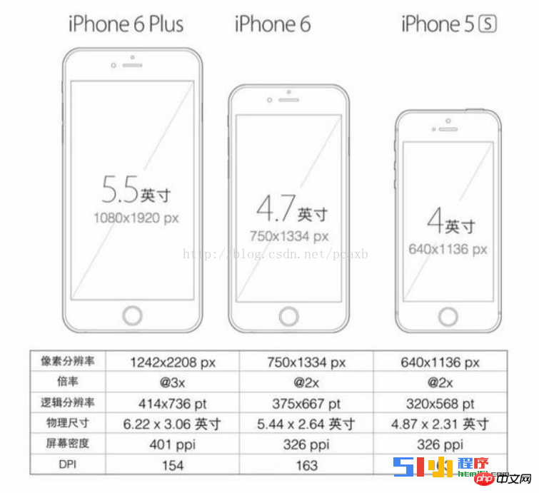
#[color=rgb(44,] rpx (responsive pixel): can be adapted according to the screen width. The specified screen width is 750rpx. For example, on iPhone6, the screen width is 375px and there are 750 physical pixels, then 750rpx = 375px = 750 physical pixels. , 1rpx = 0.5px = 1 physical pixel.
# Before we start, let’s talk about pixels, physical length, device-independent pixels, and device-independent pixel ratio. [Pixel]: It is not a physical length in nature, it refers to the basic encoding of basic original pigments and their grayscales ##[ Physical pixel]: It is the smallest physical display unit of a monitor (computer, mobile phone screen). Each physical pixel is composed of a color value and a brightness value. Does it look familiar? We need to remember that physical pixels refer to the smallest point on the monitor. . [Device-independent pixel]: It is also called density-independent pixel, the emphasis is - density-independent, it is a virtual pixel actually processed by the computer program (such as css) px), converted into device pixels from the correlation relationship. This correlation refers to the following introduction - device pixel ratio ##[Device pixel ratio]: Device pixel ratio = physical pixels / device independent pixels, the unit is dpr! ## Still don’t understand? It doesn’t matter, let’s take a look at the resolution and resolution of the mobile device from the picture The relationship between rpx: ## Take iPhone6 as an example: It is known that 1. The device width and height are 375 * 667, which we can regard as px (density independent pixel) in CSS; 2. The dpr of the retina screen is 2. #What are the physical pixels of iPhone6? #Send me some sub-questions, students! According to the formula, we calculated that the physical pixels of iPhone 6 are 750 * 1334 Conclusion: On different screens (normal screen vs retina screen), the size (physical size) presented by css pixels is consistent and different The number of physical pixels corresponding to one css pixel is inconsistent. On a normal screen, 1 css pixel corresponds to 1 physical pixel (1:1). Under retina screen, 1 css pixel corresponds to 2*2 physical pixels (1:4). [Bitmap pixel]: A bitmap pixel is the smallest data unit of a raster image (such as png, jpg, gif, etc.). Each bitmap pixel contains some of its own display information (such as display position, color value, transparency, etc.). Feel complicated? You just need to remember that 1px represents the smallest point of an image. Do not believe? Let's use PS to enlarge a picture. You can see that the picture is split into countless points, but no matter how you enlarge those small points, they cannot be split again because they are already pixel-level points. It's the smallest one. Theoretically, 1 bitmap pixel corresponds to 1 physical pixel, so that the picture can be displayed perfectly and clearly. So, to perfectly display the 200*300 (css pixel) img tag on an iPhone 6 with a width and height of 375 * 667 and a dpr of 2, the image size should be For how much? The answer is: 400 * 600. #This is the purpose of designing the size of our design draft for iPhone 6 based on 750*1334. Back to the topic... What is rpx? With the above foreshadowing, we know that for iPhone6, 1rpx = 1 physical pixel, 1rpx = 0.5px; What if it’s not iPhone 6? 1rpx = window.innerWidth/750. 1px = 1rpx * dpr. 2. Style import ## ##[AppleScript] Plain text view Copy code <span style="color:rgb(44, 62, 80)"><span style="background-color:rgb(249, 249, 245)"><span style="font-family:""><span style="font-size:16px">@import "common.wxss"; <br/>@import "temp/loadBottomTemp/loadBottomTemp.wxss"; </span></span></span></span> Copy after login 3. Inline styleFramework components support the use of style and class attributes to control the style of the component.
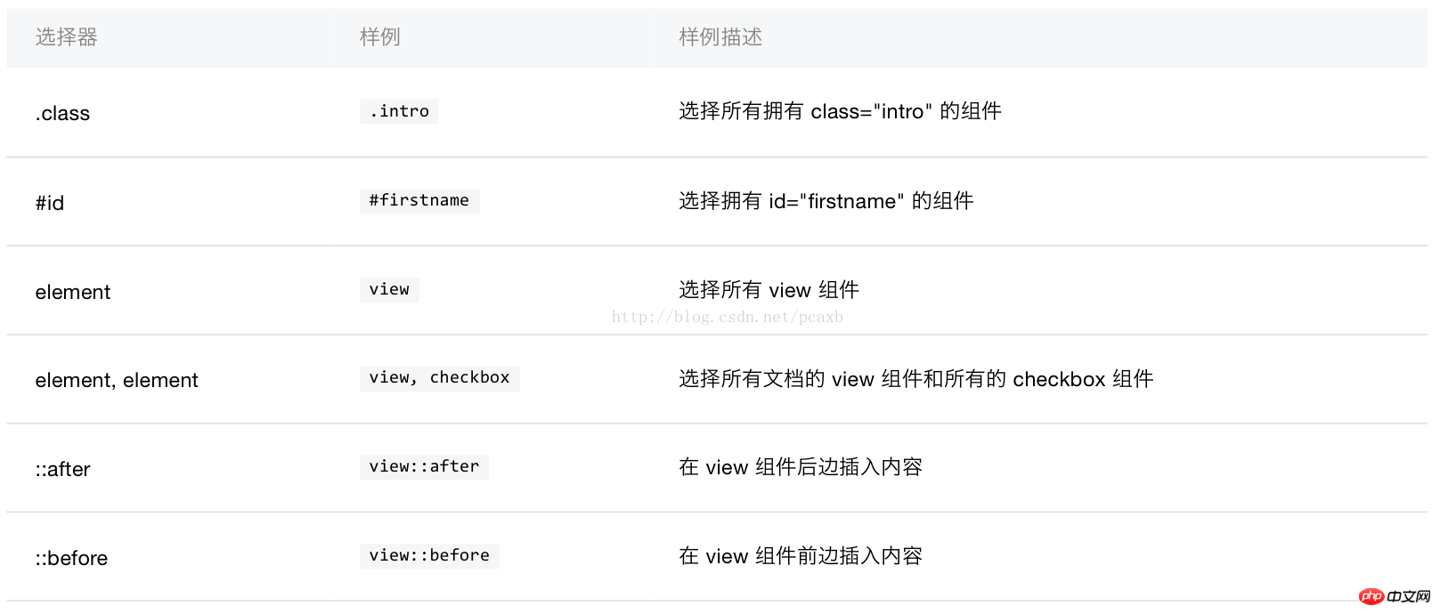
#[AppleScript] Plain text view Copy code## (2)class: used to specify style rules, its attribute value is a collection of class selector names (style class names) in style rules, The style class name does not need to include ., and the style class names should be separated by spaces. <span style="color:rgb(44, 62, 80)"><span style="background-color:rgb(249, 249, 245)"><span style="font-family:""><span style="font-size:16px"><view class="normal_view" /> <br/>class="container-row buydes-center-des-select" </span></span></span></span> Copy after login 4. SelectorCurrently supported The selectors are:
#5. Global styles and local stylesThe styles defined in app.wxss are global styles, which apply to every page. The styles defined in the wxss file of page are local styles, which only apply to the corresponding page and will override the same selector in app.wxss. 1. Conceptual understanding and knowledge accumulation of viewport (visual area size) (1) The viewport on a mobile device is the screen that can be used to display it The area of the web page is the area used to display the web page on the browser (2) The viewport is not necessarily the size of the visible area of the browser or device screen. It may be larger than the visible area, or it may be smaller than the visible area. The viewing area is small, because the size of the viewport can be set (3) The default viewport of most mobile devices is 980px, which is larger than device-width in most cases, so the viewport generally needs to be reset on the mobile side so that width=device-width (4) How to get viewport through JavaScript: document.documentElement.clientWidth, how to get device-width window.innerWidth, get device pixel ratio window.devicePixelRatio 2.移动端的HTML5开发META的常用设置 第一个meta标签表示:强制让文档的宽度(viewport宽度)与设备的宽度保持1:1,并且文档最大的宽度比例是1.0,且不允许用户点击屏幕放大浏览; initial-scale - 初始的缩放比例 HTML5 META标签常用设置参考资料点击打开链接点击打开链接 点击打开链接 3.设备物理像素(设备像素),设备逻辑像素(设备独立像素),代码CSS像素,设备像素比 设备逻辑分辨率(device independent pixels):人对于物体真实尺寸的认知(屏幕大小),设计使用逻辑像素来思考界面 代码CSS像素:CSS像素是Web编程的概念,独立于设备的用于逻辑上衡量像素的单位,也就是说我们在做网页时用到的CSS像素单位是抽象的,而不是实际存在的 iphone 6为例(设备像素比是2): **案例:**iphone 6s 的物理像素是750x1334,JS中window.innerWidth就是获取设备的物理像素,为什么window.innerWidth获取的值是375而不是750呢? 在1倍率的屏幕上: 1 CSS PX = 1 设备的物理像素 以iPhone 5s为例,屏幕的分辨率是640×1136,倍率是2。浏览器会认为屏幕的分辨率是320×568,仍然是基准倍率的尺寸。 |
The above is the detailed content of How should the applet set the rpx unit on different mobile devices?. For more information, please follow other related articles on the PHP Chinese website!

Hot AI Tools

Undresser.AI Undress
AI-powered app for creating realistic nude photos

AI Clothes Remover
Online AI tool for removing clothes from photos.

Undress AI Tool
Undress images for free

Clothoff.io
AI clothes remover

AI Hentai Generator
Generate AI Hentai for free.

Hot Article

Hot Tools

Notepad++7.3.1
Easy-to-use and free code editor

SublimeText3 Chinese version
Chinese version, very easy to use

Zend Studio 13.0.1
Powerful PHP integrated development environment

Dreamweaver CS6
Visual web development tools

SublimeText3 Mac version
God-level code editing software (SublimeText3)


