
 Web Front-end
CSS Tutorial
Detailed introduction to CSS3 animation animation related properties and keyframe rules keyframes
Web Front-end
CSS Tutorial
Detailed introduction to CSS3 animation animation related properties and keyframe rules keyframes
Detailed introduction to CSS3 animation animation related properties and keyframe rules keyframes

When I wrote the three-dimensional cube yesterday, I used the syntax of animation
Come to the system todayReview
Transition has Its limitation
is simple, but it can only change between two states
and it requires the driver of the event to be able to
Cannot move by itself
So in order to solve this problem
We need animation animation
Animation
If you want to achieve animation effects
Only animationAttributes is not enough
We also need@keyframes rules
Let’s look at an example first
p class="demo"></p>
.demo {    width: 100px;    height: 100px;    background-color: gold;}.demo:hover {    animation: change 2s linear;}@keyframes change {
    0% {        background-color: red;    }
    50% {        background-color: purple;    }
100% { background-color: lime; }}When the mouse is hovered, the element first turns red and then transitions There is a transition from purple to green
Let’s take a look at @keyframes rules first
keyframes
In @keyframes, we define animation keyframes
Then the animation will perform transition execution according to the frame state we specify in the keyframes keyframes
0% - 100% represents the time transition of the animation
0% and 100% in the rules,
can be replaced by from and to keywords
@keyframes xxx {    from {        ......
    }
    to {
        ......
    }
}If we omit the starting frame, the browser will transition according to its original style
@keyframes change {
    100% {        background-color: lime;    }}
In addition, we can also write the same frames together like this
@keyframes change {    from,to {        background-color: red;    }
50% { background-color: blue; }}animation
animation is a composite attribute with the following sub-attributes
animation-name
Specify the name of the keyframes animationanimation-duration
Specify the animation execution timeanimation-timing-function
Specify the speed curve of the animation, the default is "ease" easinganimation-delay
Specify animation delay time, default "0" no delayanimation-iteration-count
Specify the number of times the animation is played, the default is "1" to execute onceanimation-direction
Specifies the animation Execution direction, the default is "normal"
This composite attribute is more complicated than our transition
The first four attributes will not be explained much, they are similar to our transition
For those who have forgotten, click here -> Portal
animation-iteration-count In addition to filling in the number
, we can also use a commonly used keyword infiniteloop
animation-direction has the following attribute values in addition to normal
reverse
Reverse animationalternate
Play animation in turn##alternate-reverse Play animation in reverse turn
.demo { width: 100px; height: 100px; background-color: gold;}.demo:hover { animation: change 1s 2 linear;}@keyframes change { to { width: 200px; }}normal: 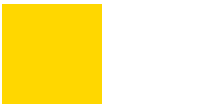 Two test animations:
100px -> 200px
100px -> 200px
.demo:hover { animation: change 1s 2 linear reverse; /*改*/}reverse: 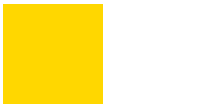 Two test animations:
200px -> ; 100px
200px -> 100px
.demo:hover { animation: change 1s 2 linear alternate; /*改*/}alternate: 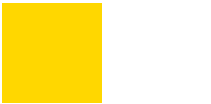 Two test animations:
100px -> 200px
200px -> 100px
.demo:hover { animation: change 1s 2 linear alternate-reverse; /*改*/}alternate-reverse: 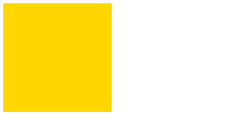 Two test animations:
200px -> 100px
100px -> 200px
So they cannot be written in animation
the state of the object outside the animation time, the default is "none" In addition to none, there are the following attribute values
forwards After the animation is completed, keep the last property (defined in the last frame)
backwards
在animation-delay指定时间内、动画显示之前,应用起始属性(定义在第一帧)both
应用forwards和backwards两种模式
forwards
这个属性还是蛮有用的
还是我们上面的例子
.demo:hover {    animation: change 1s linear; /*改*/
    animation-fill-mode: forwards; /*改*/}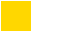
我们发现1s之后,元素并没有回到最初的100px,而是保持了我们最后一帧的200px状态
backwards
理解这个属性,我们需要先加一个延时
.demo:hover {    animation: change 1s linear 1s; /*改*/
    /*animation-fill-mode: backwards;*/ /*待增*/}@keyframes change {    from {  /*增*/
        width: 150px;    }
to { width: 200px; }}我就不配图了
我们发现鼠标悬浮后,1s后瞬间变为150px,然后再过渡到200px
hover-0s -> 1s -> 2s
100px ->瞬变150px –> 过渡到200px
现在增加backwards
.demo:hover {    animation: change 1s linear 1s; /*改*/
animation-fill-mode: backwards; /*增*/}这回我们发现鼠标悬浮的一瞬间就变为15px,然后1s后过渡到200px
hover-0s -> 1s -> 2s
瞬变150px ->150px –> 过渡到200px
这就是backwards的作用,延迟前就应用第一帧动画的样式,然后准备过渡
animation-play-state
animation-play-state 指定动画的运行或暂停。默认 “running”
除了running还有paused
利用这个属性再配合js我们可以控制动画的暂停和运行
demo.style.animationPlayState = "paused";
今天的动画就先写这么多,感觉写了很长时间
日后再总结动画相关的性能问题
The above is the detailed content of Detailed introduction to CSS3 animation animation related properties and keyframe rules keyframes. For more information, please follow other related articles on the PHP Chinese website!

Hot AI Tools

Undresser.AI Undress
AI-powered app for creating realistic nude photos

AI Clothes Remover
Online AI tool for removing clothes from photos.

Undress AI Tool
Undress images for free

Clothoff.io
AI clothes remover

AI Hentai Generator
Generate AI Hentai for free.

Hot Article
Hot Tools

Notepad++7.3.1
Easy-to-use and free code editor

SublimeText3 Chinese version
Chinese version, very easy to use

Zend Studio 13.0.1
Powerful PHP integrated development environment

Dreamweaver CS6
Visual web development tools

SublimeText3 Mac version
God-level code editing software (SublimeText3)
Hot Topics
 1376
1376
 52
52

 How to achieve wave effect with pure CSS3? (code example)
Jun 28, 2022 pm 01:39 PM
How to achieve wave effect with pure CSS3? (code example)
Jun 28, 2022 pm 01:39 PM
How to achieve wave effect with pure CSS3? This article will introduce to you how to use SVG and CSS animation to create wave effects. I hope it will be helpful to you!
 How to speed up animation effects in Windows 11: 2 methods explained
Apr 24, 2023 pm 04:55 PM
How to speed up animation effects in Windows 11: 2 methods explained
Apr 24, 2023 pm 04:55 PM
When Microsoft launched Windows 11, it brought a lot of changes. One of the changes is an increase in the number of user interface animations. Some users want to change the way things appear, and they have to find a way to do it. Having animations makes it feel better and more user-friendly. Animation uses visual effects to make the computer look more attractive and responsive. Some of them include sliding menus after a few seconds or minutes. There are many animations on your computer that can affect PC performance, slow it down, and interfere with your work. In this case you have to turn off animation. This article will introduce several ways that users can improve the speed of their animations on PC. You can apply the changes using Registry Editor or a custom file you run. How to improve animations in Windows 11
 How to use CSS to achieve the rotating background animation effect of elements
Nov 21, 2023 am 09:05 AM
How to use CSS to achieve the rotating background animation effect of elements
Nov 21, 2023 am 09:05 AM
How to use CSS to implement rotating background image animation effects of elements. Background image animation effects can increase the visual appeal and user experience of web pages. This article will introduce how to use CSS to achieve the rotating background animation effect of elements, and provide specific code examples. First, we need to prepare a background image, which can be any picture you like, such as a picture of the sun or an electric fan. Save the image and name it "bg.png". Next, create an HTML file and add a div element in the file, setting it to
 Use CSS skillfully to realize various strange-shaped buttons (with code)
Jul 19, 2022 am 11:28 AM
Use CSS skillfully to realize various strange-shaped buttons (with code)
Jul 19, 2022 am 11:28 AM
This article will show you how to use CSS to easily realize various weird-shaped buttons that appear frequently. I hope it will be helpful to you!
 How to hide elements in css without taking up space
Jun 01, 2022 pm 07:15 PM
How to hide elements in css without taking up space
Jun 01, 2022 pm 07:15 PM
Two methods: 1. Using the display attribute, just add the "display:none;" style to the element. 2. Use the position and top attributes to set the absolute positioning of the element to hide the element. Just add the "position:absolute;top:-9999px;" style to the element.
 What does keyframes mean in css
Feb 25, 2021 am 10:51 AM
What does keyframes mean in css
Feb 25, 2021 am 10:51 AM
In CSS, keyframes means "key frames" and is a CSS rule for creating animations. It can define the behavior of a cycle of a CSS animation; the middle of the animation sequence cycle can be specified by establishing key frames along the animation sequence. Step, syntax "@keyframes animation-name {keyframes-selector {css-styles;}}".
 How to implement lace borders in css3
Sep 16, 2022 pm 07:11 PM
How to implement lace borders in css3
Sep 16, 2022 pm 07:11 PM
In CSS, you can use the border-image attribute to achieve a lace border. The border-image attribute can use images to create borders, that is, add a background image to the border. You only need to specify the background image as a lace style; the syntax "border-image: url (image path) offsets the image border width inward. Whether outset is repeated;".
 It turns out that text carousel and image carousel can also be realized using pure CSS!
Jun 10, 2022 pm 01:00 PM
It turns out that text carousel and image carousel can also be realized using pure CSS!
Jun 10, 2022 pm 01:00 PM
How to create text carousel and image carousel? The first thing everyone thinks of is whether to use js. In fact, text carousel and image carousel can also be realized using pure CSS. Let’s take a look at the implementation method. I hope it will be helpful to everyone!
