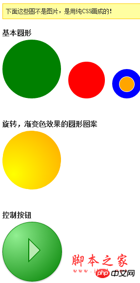
Teach you how to draw a standard circular pattern with CSS
I once shared with you a very clever technique for drawing triangles using pure CSS (please see related articles). Over the past year, I have found this technique of drawing triangles with CSS to be very useful and efficient, especially for creating tooltips/prompts and similar web effects.
Another shape that can also be easily implemented using CSS is the circle. Using border-radius, you can draw various beautiful circular patterns.

CSS code
Just change the border-radius of each side of your web element to even 50%, you You can get a circle of any size:
The code is as follows:
.circle {
 border-radius: 50%;
 width: 200px;
 height: 200px;
 /* 宽度和高度需要相等 */
}This is indeed very simple, but we can’t resist using CSS gradient colors and basic rotationAnimationtemptation::
The code is as follows:
/* animation definition*/
@
key
frames spin {
 from { trans
form: rotate(0deg); }
 to { transform: rotate(360deg); }
}</p>
<p>/* 旋转,渐变色 */
#advanced {
 width: 200px;
 height: 200px;</p>
<p>
background-image: -moz-radial-gradient(45px 45px 45deg, circle cover, yellow 0%, orange 100%, red 95%);
 background-image: -webkit-radial-gradient(45px 45px, circle cover, yellow, orange);
 background-image: radial-gradient(45px 45px 45deg, circle cover, yellow 0%, orange 100%, red 95%);</p>
<p> animation-name: spin;
 animation-duration: 3s; /* 3 seconds */
 animation-iteration-count: infinite;
 animation-timing-function: linear;
}
Wow, this is this beautiful one CSS is rounded!
The technique of drawing circles with CSS may not seem as useful as the technique of drawing triangles with CSS at first glance, but it still has its value in page design. You can use animated circles to represent loading... when the page is loading. How to use it depends on your creativity. Do you have any good ideas?
【Related Recommendations】
2. CSS3 code tutorial to complete a square box rounded corner effect
3. Teach you how to write CSS styles in a standardized way
4. Tutorial on the use of H5 and CSS3 form validation
5. Detailed code explanation of the gradually glowing border through CSS3 pseudo-elements
The above is the detailed content of Teach you how to draw a standard circular pattern with CSS. For more information, please follow other related articles on the PHP Chinese website!

Hot AI Tools

Undresser.AI Undress
AI-powered app for creating realistic nude photos

AI Clothes Remover
Online AI tool for removing clothes from photos.

Undress AI Tool
Undress images for free

Clothoff.io
AI clothes remover

AI Hentai Generator
Generate AI Hentai for free.

Hot Article

Hot Tools

Notepad++7.3.1
Easy-to-use and free code editor

SublimeText3 Chinese version
Chinese version, very easy to use

Zend Studio 13.0.1
Powerful PHP integrated development environment

Dreamweaver CS6
Visual web development tools

SublimeText3 Mac version
God-level code editing software (SublimeText3)

Hot Topics
 How to make round pictures and text in ppt
Mar 26, 2024 am 10:23 AM
First, draw a circle in PPT, then insert a text box and enter text content. Finally, set the fill and outline of the text box to None to complete the production of circular pictures and text.
 How to make a round picture in ppt
Mar 25, 2024 pm 03:54 PM
How to make a circular picture in ppt: 1. Use the crop function; 2. Use the shape tool; 3. Use shortcut keys and control points to adjust.
 Methods and techniques on how to achieve smooth transition of images through pure CSS
Oct 18, 2023 am 08:15 AM
Methods and techniques on how to achieve smooth transition of images through pure CSS Introduction: In web design, the use of images is very common. How to make images show a smooth transition effect during switching and loading, making the user experience smoother, is Something every designer and developer should consider. This article will introduce some methods and techniques to achieve smooth transition of images through pure CSS, and provide specific code examples. 1. Zoom transition effect You can use the transform attribute of CSS to achieve the zoom transition effect of images. By setting
 What is the area of the circular sector?
Aug 30, 2023 am 08:33 AM
A circular sector, also known as a circular sector/sector of a circle, is a portion of a circle bounded by an arc between two radii. This area is bounded by two radii and an arc. To find the area inscribed, we need to find the angle between the two radii. The total area is equal to 360 degrees of angle. To find the area of an angle, we multiply the area by θ/360. This gives the area of the inscribed part. where θ is the angle (in degrees) between the two radii. The area of the circular sector = π*r*r*(θ/360). For example, the area of a circular sector with a radius of 5 and an angle of 60 degrees is 13.083. Area=(3.14*5*5)*(60/360)=13.03Example codeDemo#incl
 CSS Layout Tips: Best Practices for Implementing Circular Grid Icon Layout
Oct 20, 2023 am 10:46 AM
CSS Layout Tips: Best Practices for Implementing Circular Grid Icon Layout Grid layout is a common and powerful layout technique in modern web design. The circular grid icon layout is a more unique and interesting design choice. This article will introduce some best practices and specific code examples to help you implement a circular grid icon layout. HTML structure First, we need to set up a container element and place the icon in this container. We can use an unordered list (<ul>) as a container, and the list items (<l
 Steps to implement the drop-down tab menu effect of a responsive navigation bar using pure CSS
Oct 28, 2023 am 09:58 AM
Steps to implement the drop-down tab menu effect of a responsive navigation bar using pure CSS. The navigation bar is one of the common elements in web pages, and the drop-down tab menu is an effect often used in the navigation bar, which can provide more navigation. options. This article will introduce how to use pure CSS to implement a responsive navigation bar drop-down tab menu effect. Step 1: Build a basic HTML structure. We first need to build a basic HTML structure for demonstration and add some styles to the navigation bar. Below is a simple HTML structure
 Methods and techniques on how to achieve the cube rotation effect of images through pure CSS
Oct 21, 2023 am 09:36 AM
Methods and techniques on how to achieve the cube rotation effect of images through pure CSS. In modern web design, it is very important to add some cool effects, and using CSS to achieve the cube rotation effect is a very interesting and challenging task. This article will introduce a method and technique to achieve the cube rotation effect of images through pure CSS, and provide some specific code examples. First, we need a basic HTML structure, consisting of a container element and six face elements, each of which contains an image. <d
 Methods and techniques on how to achieve the enlargement and reduction effect of images through pure CSS
Oct 24, 2023 am 10:13 AM
Methods and techniques on how to achieve the enlargement and reduction effect of images through pure CSS. In modern web design, the display and processing of images are a very important part. The zooming-in effect of images can add interest and interactivity to the visual presentation of the website. In this article, we will introduce how to achieve the zoom effect of images through pure CSS, and provide specific code examples. Use the transition attribute to achieve a smooth transition effect. To achieve the effect of zooming in and out of the image, we can use the transition attribute to


