Briefly describe how web designers can use CSS3 technology well
In this article, we will examine the advantages of CSS3 and look at how some web designers use them. Finally, we will learn what we can get from CSS3 and how we can use its new features in our projects.
I saw a good article about the new technology of CSS3 in SmashingMagazine a few days ago. It introduced in detail the new features of CSS3 and how to use it, including: browser-specific attributes, selectors (attributes Selector, hyphen, pseudo-class, pseudo-element), RGBA and transparency attributes, multi-column layout, multiple background images, Word Wrap, text shadow, CSS rounded corners, border image, box shadow, box size, media query, voice, and details which browsers each new technology is currently compatible with. Script House originally wanted to translate this article into a Chinese version and share it with everyone, but found that a Chinese person had already completed the translation, so I was lazy and reproduced someone else’s translation. I would like to thank the bloggers of Front-end Observation for their hard work in translating this article for everyone. Contributed such valuable learning materials.
If you love front-end development and are interested in CSS, then you must not miss this article.
Cascading style sheets were introduced 13 years ago, and the widely used CSS 2.1 standard was created 11 years ago, so we are obviously a long way from where we were back then. It’s quite remarkable how much website development has advanced in that time—in fact, we couldn’t have imagined it.
Why is it that, when it comes to CSS, we have been so reluctant and afraid to try it in the past? Why do we still use nasty hacks and techniques that rely on JavaScript to write styles? Why can't we take advantage of the rich CSS3 features and tools available in modern browsers and take our design quality to the next level?
It’s time to introduce CSS3 features into our projects without fear of problems as we gradually add css3 features and selectors to our stylesheets. Making our customers aware of the benefits of CSS3 (and making old browsers disappear faster) is something we can do - and we should, especially if it makes websites more flexible and requires less development and maintenance costs.
In this article, we’ll examine the benefits of CSS3 and take a look at how some web designers use them. Finally, we will learn what we can get from CSS3 and how we can use its new features in our projects.
Using browser-specific properties
In order to use most CSS3 features, we have to use Manufacturer-specific extensions along with the original properties. The reason is that until now, most browsers only support some CSS3 properties. And unfortunately, some properties may not even end up being recommended by W3C, so it's important to distinguish them from standard properties by specifying browser-specific properties (and then in case they are redundant Use standards-compliant styles to override them).
Of course, the disadvantage of this approach is that it will result in a messy style sheet and inconsistent performance of the website between browsers. After all, we don't want to reintroduce the need for private browser hacks in our stylesheets. Internet Explorer's infamous marquee, blink, and other tags were used in numerous style sheets and became a legend in the 1990s; they still make many existing websites (in other browsers) ) behave inconsistently and can even be difficult to read. And we don’t want to put ourselves in the same situation now, right?
However, a website does not need to look strictly consistent across all browsers. Sometimes it is possible to use private properties in a browser to achieve specific effects.
The most common private properties are for Webkit core browsers (e.g., Safari), which start with -webkit-, and Gecko core browsers (e.g., Firefox), Starting with -moz-, Konqueror (-khtml-), Opera (-o-) and Internet Explorer (-ms-) all have their own attribute extensions (currently only IE8 supports the -ms- prefix)
As professional designers, we have to pay attention:Using these private properties will make our style sheet fail to pass verification. So putting them into the final version of the style is currently rare. But in some cases, such as experimentation or learning, we can at least consider writing them into a style sheet together with standard CSS properties.
Extended readingVendor-specific extensions and W3C
- ##Vendor-specific extensions to CSS3
- Vendor-specific properties
1. Selectors
CSS selectors are incredibly powerful tools: they allow us to specify specific ## in a tag #HTML elements without having to use redundant class, IDs or JavaScripts. And most of them are not newly added to CSS3, but have not been widely used as they should be. Advanced selectors are very useful if you are trying to achieve a clean, lightweight tag and better separation of structure and performance. They can reduce the number of classes and IDs in tags and make it easier for designers to maintain style sheets.
Attribute SelectorsThree new attribute selectors were added to CSS3:<span class="css">[<span class="br0">att</span>^=<span class="sy0"></span><span class="st0">"value"<span style="color:#036a07"></span></span>]<span class="br0"></span></span>
Matches elements containing attributes that begin with a specific value<span class="css">[<span class="br0">att$</span>=<span class="sy0"></span><span class="st0">"value"<span style="color:#036a07"></span></span>]<span class="br0"></span></span>
Matches elements containing attributes that end with a specific value<span class="css">[<span class="br0">att</span>*=<span class="sy0"></span><span class="st0">"value"<span style="color:#036a07"></span></span>]<span class="br0"></span></span>
Matches elements containing an attribute with a specific value
An element containing an attribute with a specific value
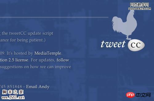
tweetCC Use an attribute selector to specify links that have a title attribute and end with the characters "tweetCC":
| 1 2 |
a [title$="tweetCC"] { |
| 2 3 | { border |
All major browsers support this universal sibling selector except our favorite IE6
! Pseudo-Classes
- Lets you specify an element based on its position in the list of children of the parent node. You can use numbers, numeric expressions, or the odd and even keywords (perfect for zebra-style lists). So if you want to match a
- group
of 3 elements after the fourth element, you can simply use:
:nth-last-child(n):nth-child(3n+4) { background-color: #ccc; }/*匹配第4,7,10,13,16,19...个元素*/Copy after loginThe idea is the same as the previous selector, but it matches elements from the back (in reverse order). For example, in order to specify the last two paragraphs in a p, we can use the following selection Device: -
p p:nth-last-child(-n+2)
Copy after login
:last-child Matches the last child element under a parent node, which is equivalent to:nth-last-child(1) -
:checked
checkbox
matches the selected element, such as
:emptymatches Empty element (no child elements).:not(s)
Matches all elements that do not match the specified statement(s). For example, if you want all paragraphs that do not use the "lead" class to be displayed in black, you can write like this:-
in his Use:last-child on the website to specify the last paragraph of each blog post for the selector, and set its outer spacing (
p
:not(<span class="css">[<span class="sy0">class</span>*=<span class="br0"></span><span class="br0">"lead"</span><span class="sy0"></span>]<span class="st0"><span style="color:#036a07">)</span> </span>{<span class="br0"> </span><span class="br0">color</span><span class="br0"></span>:<span class="kw1"> <span style="color:#0000ff"></span>black</span><span class="sy0"></span>;<span class="kw1"> <span style="color:#0000ff">}</span></span><span class="sy0"></span><span class="br0"></span></span>.
Andrea Gandino margin
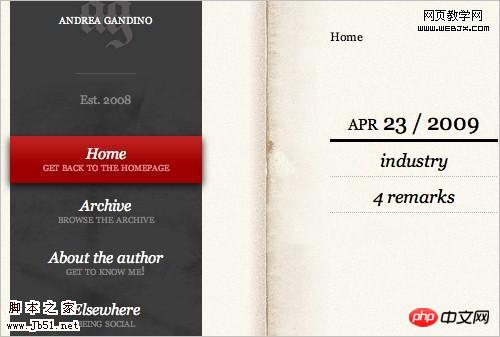
##1
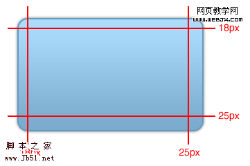
| .text p:last-child { margin: Browser support: Webkit core and Opera browsers support all new CSS3 pseudo-classes, Firefox 2 and 3 (Gecko core) only support:not(s), :last-child, :o nly-child, :root, :empty, :target, :checked, :enabled and :disabled, but Firefox 3.5 will widely support CSS3 selectors. The Trident core browser (Internet Explorer) actually does not support these pseudo-selectors. The only pseudo-element introduced in CSS3 is ::selection. It allows you to specify the elements that are highlighted (selected) by the user. Browser support: Currently, no Internet Explorer or Firefox browser supports the ::selection pseudo-element. Safari, Opera and Chrome are all supported. Selectors Level 3: W3C Working Draft ##CSS3: Attribute selectors: CSS3.info Compatibility table: CSS3 Selectors CSS selectors and pseudo selectors browser compatibility CSS3 Attribute Selectors ::selection
2. RGBA and transparency Tim Van Damme uses RGBA on the hover effect of the link
li a:hover,#networks Here is an example showing how we add 80% transparency to a p: 0.8 Browser support: RGBA is supported by Webkit kernel browsers. Not supported by all versions of IE. Firefox 2 doesn't support it either, but Firefox 3 and Opera 9.5 both support it. Opacity is supported by Opera, Webkit core and Gecko core browsers. All versions of IE are also not supported. IE only supports its own damn filter CSS Color Module Level 3: W3C Working Draft RGBA colors: CSS3.info ##RGBA color space Is CSS3 RGBa ready to rock? displays the introduction text on its homepage For four columns. These four columns are not floating; instead, the designer uses the following CSS3 multi-column layout: 1px The above attribute will not have any effect in the browser because it does not have columns. It can be used with the above example. Related properties: column-break-after, column-break-before, column-span, column-fill. Browser support: Multi-column layout is currently supported by Safari 3+, chrome, and Firefox 1.5+. CSS3 module: Multi-column layout: W3C Working Draft Columns CSS3 – Multi-Column Layout Demonstration CSS3 Columns Designing tweetCC ##Introduction to CSS3 – Part 5: Multiple Columns background-image, background-repeat, background-size, background-position, background-originand background-clip etc. add multiple layers of background images to an element. 3 The first image will be the one "closest" to the user. A more complex version of this property could look like this: 1 p { Browser support: Currently, multiple background images are only available in Safari/chrome and Konqueror Layering multiple background images
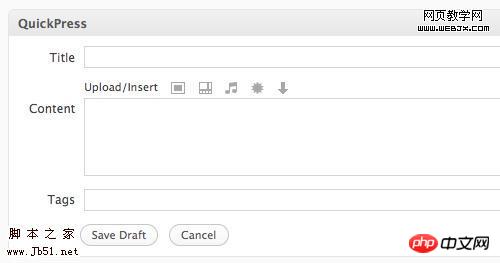
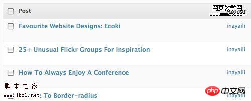
attribute is used to prevent it from being too long The string overflowed. Two attribute values normal and break-word are available. The normal value (default) only truncates text at allowed breakpoints, such as hyphens. If break-word is used, the text can be truncated wherever necessary to fit the allocated space and prevent overflow. In the control panel, the word-wrap attribute is used for elements in tables; for example, in lists of posts and pages: 3 * { word-wrap: break-word Browser support: word-wrap is supported by Internet Explorer and Safari/chrome. Firefox will support it in version 3.5. Force Wrapping: the 'word-wrap' property — CSS Text Level 3: W3C Working Draft ##word-wrap: CSS3.info CSS word-wrap ##word-wrap: Mozilla Developer Center is not widely used CSS properties. But it will be widely adopted in CSS3. This property gives designers a new cross-browser tool to add a dimension to designs to make text stand out. Despite this, you need to make sure that the text in your design is readable in case the user's browser does not support CSS3 advanced properties. Give the text and background color enough contrast to prevent the text-shadow attribute from being rendered or understood correctly by the browser. uses the text-shadow property for the content area to add depth and dimension to the text and make it stand out - rather than using some kind of image replacement technique. This property is currently only available in Safari and Chrome. The main menu of this website uses the following CSS: p { text- shadow text-shadow Browser support: Webkit core browser and Opera 9.5 support text-shadow. Internet Explorer does not support it, Firefox will support it in the upcoming 3.5 version. Text Shadows: the 'text-shadow' property — W3C Working Draft Text shadows: Web Style Sheets CSS tips and tricks ##Text-shadow, Photoshop like effects using CSS — CSS3.info
TypeKit
4 and italic). Make sure to only use fonts that are licensed for use on the website and give the font designer some credit when needed. After defining the @font-face rule, you can reference the font using the ordinary font-family attribute: font-family If a browser does not support @font-face, it will use the next font specified in the font-family (CSS font library) property. For supported browsers, this may be feasible for some websites if the @font-face font is a luxury item (used by only a few elements); however, if the font plays a major role in the design or is corporate part of the visual features, you may want to use other solutions, such as sIFR or Cufón. Still, keep in mind that these tools are better suited for headlines or shorter text, as copying and pasting such content is difficult and not user-friendly. Browser support: @font-face is supported by Safari 3.1+ and chrome. Internet Explorer supports fonts. Opera 10 and Firefox 3.5 will support it. Font. Opera 10 and Firefox 3.5 will support it. Font Descriptions and @font-face — W3C Working Draft Web fonts with @font-face @font-face — Sitepoint Fonts available for @font-face embedding ##@font-face beautiful fonts with @font-face Introducing Typekit in the title, category and link Sam Brown uses the border-radius attribute extensively in the titles, categories, links and p of his blog. Using images to achieve this effect will be more time-consuming, which is one of the reasons why using CSS3 properties in the project is an important step to improve development efficiency 3 We can go one step further and add original CSS3 properties and Konqueror property extensions, as follows: 1 { 2 -moz-border-radius- topright: Browser support: border-radius is only supported by all versions of IE browser and Opera, but is supported by Webkit and Gecko core browsers. border-radius: W3C Working Draft Border-radius: create rounded corners with CSS! — CSS3.info ##Introduction to CSS3, Part 2: Borders An Ode to border-radius SpoonGraphis blog, border-image is used for the picture border, as shown below: 3 #content .post img { To define border-image, we must specify the image address, which part of the image will be clipped and used on each side of the element, and whether the image will be scaled or tiled. To make a p that uses the image below as a border, we should use the following code (we will add Opera and Konqueror support for this example): 4 (...) We can specify each corner individually, if we want to use a different image for each corner: 1 p { If the browser does not support the border-image attribute, it will ignore these attributes and only apply other defined border attributes, such as border-width and border-color. Browse Browser support: border-image is currently only supported by Webkit core browsers. Not sure if the next version of Firefox will support it. The 'border-image' property: W3C Working Draft Border-image: using images for your border — CSS3.info ##border-image in Firefox border-image demonstration page Replicating iPhone Buttons the “webkit” way! 3 #navigation { -webkit-box-shadow: The box-shadow property can use multiple values: horizontal offset, vertical offset, blur radius, stretch radius and shadow color. Horizontal and vertical offsets and shadow colors are used the most. To apply a red shadow on a p with the right and bottom offset 4px and no blur, we can use the following code: 1 { -moz-box-shadow The 'box-shadow' property — W3C Working Draft Box-shadow, one of CSS3's best new features — CSS3.info Apple's Navigation bar using only CSS Box Shadow — Surfin' Safari blog WordPress The background area uses this attribute on all its input tags and textarea tags of type text: 2 [type="text"], textarea The third attribute (-ms-box-sizing) is only valid under Internet Explorer 8. Through other selectors, the WordPress stylesheet also adds the Konqueror attribute: -khtml-box-sizing. The box-sizing property can have one of two values: border-box and content-box. Content-box renders width as defined in CSS 2.1. Border-box subtracts padding and borders from the set width and height (as in older browsers.) Browser support: box-sizing is supported by IE8, Opera, Gecko core and Webkit core browsers. 'box-sizing' property: W3C Candidate Recommendation ##Box-sizing, box-model fixes for the simple people: CSS3.info CSS3 box-sizing attribute
7 : The potential is unlimited. This attribute is useful because you no longer have to write separate stylesheets for different devices, and you don't need to use JS to determine the properties and capabilities of each user's browser. One of the more popular JavaScript-based solutions for implementing a flexible layout is to use Smart Fluid Layout, making the layout more flexible to the user's browser resolution. Browser support: Media queries are supported by webkit core-based browsers and Opera. Firefox will support it in version 3.5. IE does not currently support these properties and there are no plans to support them in future versions. Media Inquiries: W3C Candidate Recommendations Extended to CSS 3 media queries ##Media queries: CSS3.info The bleeding edge of web: media queries Secure Media Queries Media Type Use a number from 0 to 100 (0 is silent), a percentage or a keyword (silent,x- soft, soft, medium, loud and x-loud, etc.) to set the volume. Control which channel the sound comes from (if the user's speaker system supports stereo). Instructs the screen reader to read related text, numbers, or punctuation. Available keywords are none, normal, spell-out, di Set a pause or stop before or after an element is read. You can use time units (for example, "2s" for 2 seconds) or keywords (none, x-weak, weak, medium, strong and x-strong). Use sounds to limit specific elements and Set specific voice types and voice synthesis (just like font-family). Control the speed of reading. Can be set as a percentage or keywords: x-slow, slow, medium, fast and x-fast. indicates any stress that should be used , use different keywords: none, moderate, strong and reduced. 3 voice-family Unfortunately, this property has very little support right now, but it's clearly worth paying attention to as we can improve the usability of our sites in the future. Browser support: Currently, only the Opera browser (Windows XP and 2000) supports some properties of the voice module. To use them, use the -xv- prefix, for example -xv-voice-balance: right. CSS3 Speech Module - W3C Working Draft CSS3 Speech — CSS3.info Auditory CSS: Supports CSS 2 Auditory Stylesheet/CSS 3 Speech Module CSS3 properties can greatly improve your workflow, making some of the most time-consuming CSS tasks cost-effective It takes a little effort and allows for better, cleaner and lighter code tags. Some properties are not yet widely supported by even the latest browsers, but that doesn't mean we can't experiment with them or provide more advanced features and CSS styling for users using advanced browsers. At this point, please remember that nurturing our users is also useful and necessary: the website does not need to look the same in every browser, and If a difference does not (negatively) affect the aesthetics and usability of the website, it should be considered. If we continue to waste tons of time and money trying to make every detail absolutely consistent (instead of adopting a more flexible and future-oriented approach), users will not have any need/incentive to upgrade their browsers, So we have to wait a long time before old browsers become antique browsers and powerful modern browsers become standard The sooner we experiment and use new CSS3 properties, the sooner they will be The earlier popular browsers support them, the earlier we can use them widely. CSS3 Previews: CSS3.info ##CSS 3: Exciting Function and Features: 30 Useful Tutorials 5 CSS3 Techniques For Major Browsers using the Power of jQuery ##Introduction to CSS3 – Part 1: What is it?
##Progressive Enhancement with CSS CSS support in Opera 9.5 About the original author is a Portuguese web designer. She is really interested in web design and front-end coding, and loves beautiful and clean websites. She lives in London. You can see more of her articles on Web Designer Notebook, and follow her on Twitter.【Related recommendations】 1. CSS3 free video tutorial Detailed explanation of examples of selectors in CSS3 Detailed explanation of examples of content attributes in CSS3 |
The above is the detailed content of Briefly describe how web designers can use CSS3 technology well. For more information, please follow other related articles on the PHP Chinese website!

Hot AI Tools

Undresser.AI Undress
AI-powered app for creating realistic nude photos

AI Clothes Remover
Online AI tool for removing clothes from photos.

Undress AI Tool
Undress images for free

Clothoff.io
AI clothes remover

AI Hentai Generator
Generate AI Hentai for free.

Hot Article

Hot Tools

Notepad++7.3.1
Easy-to-use and free code editor

SublimeText3 Chinese version
Chinese version, very easy to use

Zend Studio 13.0.1
Powerful PHP integrated development environment

Dreamweaver CS6
Visual web development tools

SublimeText3 Mac version
God-level code editing software (SublimeText3)

Hot Topics
 iBatis and MyBatis: Comparison and Advantage Analysis
Feb 18, 2024 pm 01:53 PM
iBatis and MyBatis: Differences and Advantages Analysis Introduction: In Java development, persistence is a common requirement, and iBatis and MyBatis are two widely used persistence frameworks. While they have many similarities, there are also some key differences and advantages. This article will provide readers with a more comprehensive understanding through a detailed analysis of the features, usage, and sample code of these two frameworks. 1. iBatis features: iBatis is an older persistence framework that uses SQL mapping files.
 Analysis of the characteristics and advantages of Go language
Apr 03, 2024 pm 10:06 PM
Features of Go language: High concurrency (goroutine) Automatic garbage collection Cross-platform simplicity Modularity Advantages of Go language: High performance Security Scalability Community support
 Golang's single-threaded features and advantages
Mar 18, 2024 am 11:51 AM
Golang's single-threaded features and advantages With the booming development of the Internet and mobile applications, the demand for high-performance, high-concurrency programming languages is increasing. Against this background, the Go language (Golang for short) was developed by Google and first released in 2009, and quickly became popular among developers. Golang is an open source programming language that uses static typing and concurrent design. One of its biggest advantages is its single-threaded feature. Golang adopts Goroutine’s concurrency model.
 What are the advantages and disadvantages of deploying PHP applications using serverless architecture?
May 06, 2024 pm 09:15 PM
Deploying PHP applications using Serverless architecture has the following advantages: maintenance-free, pay-as-you-go, highly scalable, simplified development and support for multiple services. Disadvantages include: cold start time, debugging difficulties, vendor lock-in, feature limitations, and cost optimization challenges.
 In-depth analysis: jQuery's advantages and disadvantages
Feb 27, 2024 pm 05:18 PM
jQuery is a fast, small, feature-rich JavaScript library widely used in front-end development. Since its release in 2006, jQuery has become one of the tools of choice for many developers, but in practical applications, it also has some advantages and disadvantages. This article will deeply analyze the advantages and disadvantages of jQuery and illustrate it with specific code examples. Advantages: 1. Concise syntax jQuery's syntax design is concise and clear, which can greatly improve the readability and writing efficiency of the code. for example,
 Detailed explanation of the advantages and utility of Golang server
Mar 20, 2024 pm 01:51 PM
Golang is an open source programming language developed by Google. It is efficient, fast and powerful and is widely used in cloud computing, network programming, big data processing and other fields. As a strongly typed, static language, Golang has many advantages when building server-side applications. This article will analyze the advantages and utility of Golang server in detail, and illustrate its power through specific code examples. 1. The high-performance Golang compiler can compile the code into local code
 In-depth exploration of the advantages and value of Go language
Mar 27, 2024 pm 10:18 PM
The Go language (also known as Golang) is a programming language developed by Google that has attracted much attention since its first release. It is designed to increase programmer productivity and address increasingly complex software development needs. The Go language has many outstanding advantages and values. This article will explore these advantages in depth and provide specific code examples to demonstrate its power. 1. Advantages of concurrent programming As a modern programming language, Go has built-in powerful concurrent programming capabilities. It goes through goroutines and channels
 Explore the advantages and application scenarios of Go language
Mar 27, 2024 pm 03:48 PM
The Go language is an open source programming language developed by Google and first released in 2007. It is designed to be a simple, easy-to-learn, efficient, and highly concurrency language, and is favored by more and more developers. This article will explore the advantages of Go language, introduce some application scenarios suitable for Go language, and give specific code examples. Advantages: Strong concurrency: Go language has built-in support for lightweight threads-goroutine, which can easily implement concurrent programming. Goroutin can be started by using the go keyword


 On this website,
 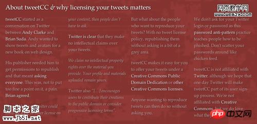 tweetCC uses the CSS3 multi-column selector on its homepage

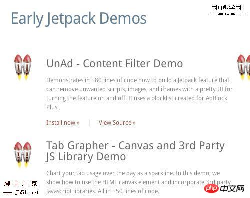 The Mozilla Labs JetPack website uses the font-face rule to use the DroidSans font.
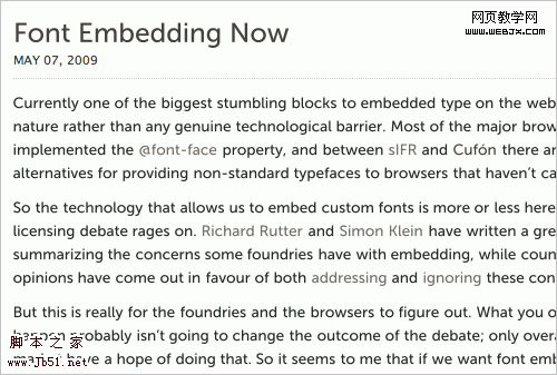

 The SpoonGraphics blog uses the border-image attribute for its image borders.