
WeChat Mini Program View supports two layout methods: Block and Flex
All Views are block by default
If you want to use flex layout, you need to display Style statement:
display:flex;
Let’s introduce the Flex layout of the WeChat applet
Let’s make a simple demo first
  <view class="main">
    <view class="item item1">1</view>
    <view class="item item2">2</view>
    <view class="item item3">3</view>
</view>Add the background color to see it more clearly Some
.main {
  width: 100%;
  background-color: antiquewhite;
}

.item {
  height: 100rpx;
  width: 100rpx;
}

.item1 {
  background-color: red;
}

.item2 {
  background-color: dodgerblue;
}

.item3 {
  background-color: greenyellow;
}then probably look like this:
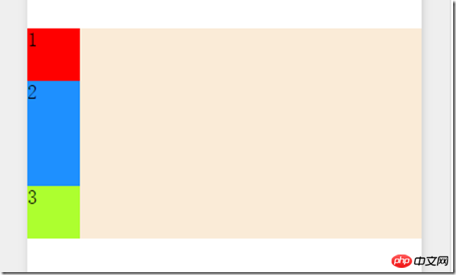
Then we first add display: flex
so that we can use flex layout, Idea, it seems that view will not automatically inherit , you need to add it in every view you want to use.
The first is horizontal layout and vertical layout. To set the attribute flex-direction, it has 4 optional values:
row: horizontal from left to right The direction is the main axis
row-reverse: the horizontal direction from right to left is the main axis
column: the vertical direction from top to bottom is Main axis
column-reverse: The vertical direction from bottom to top is the main axis
Let’s take a look at the difference between setting row and row-reverse:
row:

row-reverse:

Then we have to set For the layout direction of elements in the horizontal direction, you need to set the justify-content attribute. It has 5 optional values:
flex-start: align the starting point of the main axis (default value )


other child elements

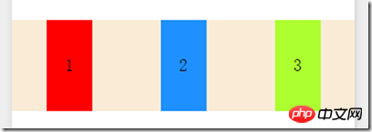
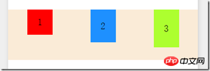
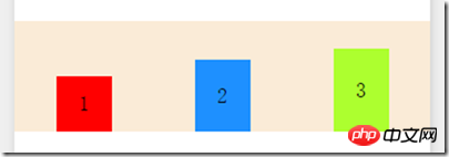

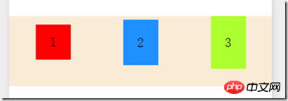

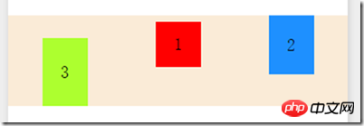
ord## The #er attribute can control the order of sub-elements, and the default is 0. For example, in the above example, if we set item3 to order:-1; we can put item3 in front
flex Commonly used layouts are just these
Those who write WeChat mini programs can try it
Finally, if there is a mini program when It would be even better if it can directly support bootstrap
[Related recommendations]
1. HTML5 mobile application development-detailed introduction to the role of viewport (picture Text)
2. A brief discussion of html5 responsive layout
4. An example tutorial on using co to handle asynchronous processes in small program development
The above is the detailed content of WeChat applet View: flex layout example. For more information, please follow other related articles on the PHP Chinese website!
 Mechanical energy conservation law formula
 what is dandelion
 The function of intermediate relay
 How to pay with WeChat on Douyin
 All uses of cloud servers
 How to apply for a business email
 Can Douyin short videos be restored after being deleted?
 formatter function usage
 How to use months_between in SQL


