
 Web Front-end
CSS Tutorial
How to achieve the effect of pie-shaped Loading waiting chart with CSS (picture)
Web Front-end
CSS Tutorial
How to achieve the effect of pie-shaped Loading waiting chart with CSS (picture)
How to achieve the effect of pie-shaped Loading waiting chart with CSS (picture)

This article mainly introduces the use of pure CSS to achieve the pie-shaped Loading waiting chart effect, which has certain reference value. Interested friends can refer to it
Written in front
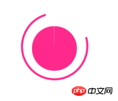
I came across a small exercise before, which is to use pure CSS3 to write a pie-shaped loading effect. I have never written this thing before. Xiaohua has no clue at all, and then I referred to Teacher Zhang Xinxu The CSS3 implements the loading of the egg pie pie chart, and there are other things. The same effect is achieved in a way that looks a little similar but seems different. The question requires something like this:
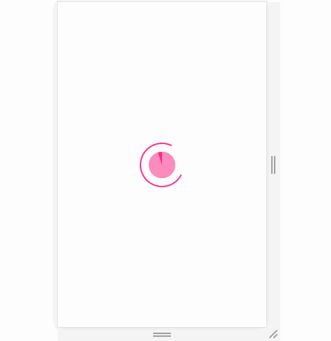
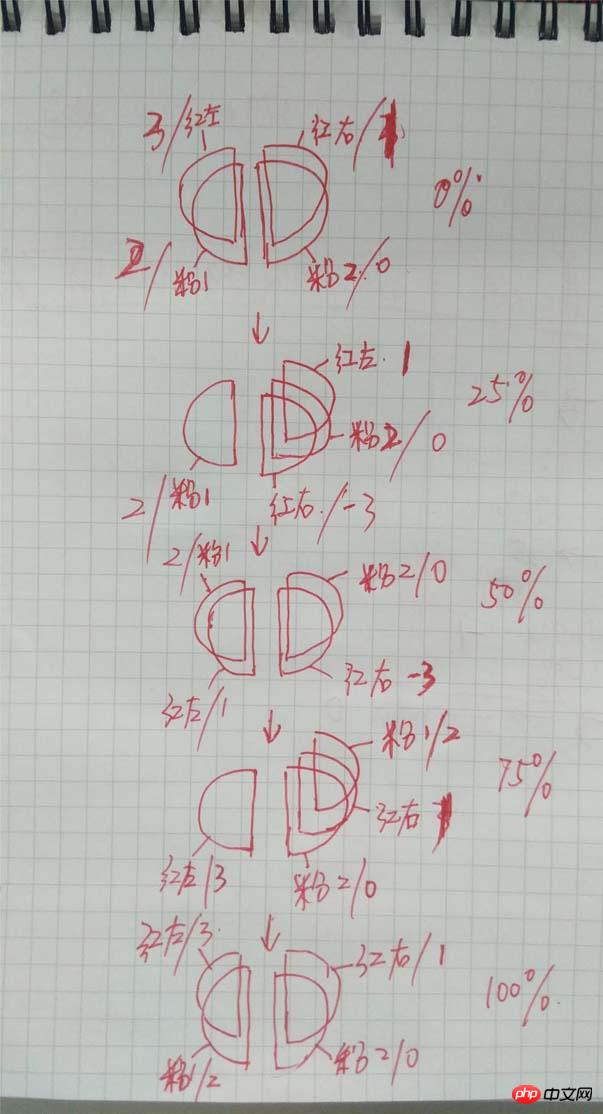
## It’s hard to understand, it doesn’t matter, Xiaohua will explain it bit by bit later~ (Red and pink represent colors, and the slash is the value of
z-index
)
animation time is set randomly. Anyway, it looks a bit weird when I turn it around.
1 2 3 4 5 6 7 8 9 10 11 12 13 |
|
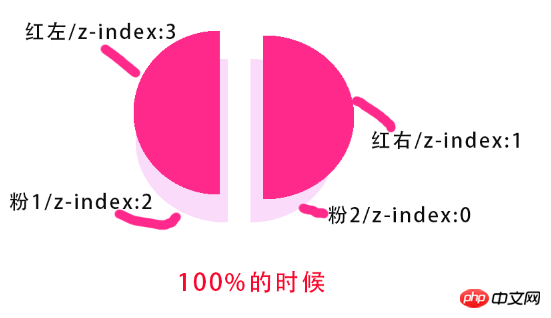
. In essence, after the outer circle has rotated 2 times, the inner circle will The red and pink circles have only completed one rotation each (the entire inner circle includes red from 1 to 0 and pink from 1 to 0), so the animation time of the inner circle should be twice as long as that of the outer circle! ! !
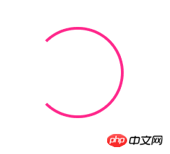
order-radius:50% to draw a circle, and then set Three borders are red and the other is transparent, that is, three-quarters of the circle border (ie, the outer circle) is drawn.
1 2 3 4 5 6 7 8 9 |
|
The next step is the animation of the outer circle. The animation set for it is to rotate in one circle, infinite means unlimited times
1 2 3 4 5 6 7 8 |
|
rotate(120deg)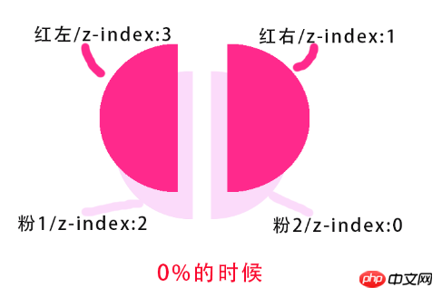 is the starting position of rotation, which can be adjusted according to the actual situation.
The outer circle is now complete. The inner circle below is more troublesome, but it should be imaginable according to the diagram.
 2. Inner circle
z-index
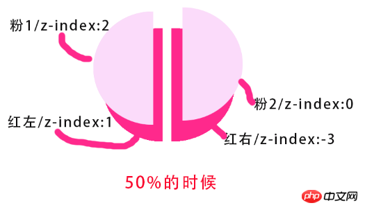
value of the two red semicircles controls the display priority of each semicircle. The css implementation part of the inner circle is:
1 2 3 4 5 6 7 8 9 10 11 12 13 14 15 16 17 |
|
z-index value to change the displayed
, so as to achieve the effect of display and hiding to complement the left half of the circle):
1. Initial settings:
1 2 3 4 5 |
|
Picture: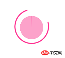
Visual effect diagram (ignore the white line in the middle) :
2. When the red on the left rotates 180 degrees (counterclockwise rotation, so it is 360→180→0)
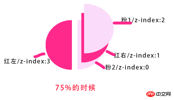
###Model diagram: #### ###########Visual renderings: ###############3. When the red on the left turns to 0 degrees (at this time, the red semicircles on the left and right are replaced by pink Coverage) ###### Model drawing: ######### ######Visual effect drawing: ###############4. Pink semicircle repeat The previous animation of the red semicircle (i.e. pink 360→180→0 on the left)######Model picture:###############Visual effect picture:###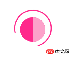
5.当左边粉色旋转到0度时,全部半圆回到了最初始的状态,整个动画即完成(在相同时间下外圈完成了2次的动画)。
模型图:
视觉效果图:
动画代码部分
1、前半程为左边红色旋转一周,后半程为粉色旋转一周。动画实现如下:
1 2 3 4 5 6 7 8 9 10 11 12 13 14 15 16 17 18 19 20 21 22 23 24 25 26 27 28 29 30 31 32 33 34 35 36 37 38 39 40 41 42 43 44 45 46 47 48 49 50 51 |
|
2.在全部代码未完成时,可以将动画时间设大一点,这样便于观察,搞完了再设回去就OK了。
3.由于动画是匀速变化的,但是z-index的值不能匀速变化,所以只能在某个很短时间内去改变z-index的值。这样才能达到效果(突然感觉这种实现好像也不是很好)
小结
没做兼容,在chrome中无异常,别的我就不太知道了
The above is the detailed content of How to achieve the effect of pie-shaped Loading waiting chart with CSS (picture). For more information, please follow other related articles on the PHP Chinese website!

Hot AI Tools

Undresser.AI Undress
AI-powered app for creating realistic nude photos

AI Clothes Remover
Online AI tool for removing clothes from photos.

Undress AI Tool
Undress images for free

Clothoff.io
AI clothes remover

Video Face Swap
Swap faces in any video effortlessly with our completely free AI face swap tool!
Hot Article
Hot Tools

Notepad++7.3.1
Easy-to-use and free code editor

SublimeText3 Chinese version
Chinese version, very easy to use

Zend Studio 13.0.1
Powerful PHP integrated development environment

Dreamweaver CS6
Visual web development tools

SublimeText3 Mac version
God-level code editing software (SublimeText3)
Hot Topics


 How to use bootstrap in vue
Apr 07, 2025 pm 11:33 PM
How to use bootstrap in vue
Apr 07, 2025 pm 11:33 PM
Using Bootstrap in Vue.js is divided into five steps: Install Bootstrap. Import Bootstrap in main.js. Use the Bootstrap component directly in the template. Optional: Custom style. Optional: Use plug-ins.
 The Roles of HTML, CSS, and JavaScript: Core Responsibilities
Apr 08, 2025 pm 07:05 PM
The Roles of HTML, CSS, and JavaScript: Core Responsibilities
Apr 08, 2025 pm 07:05 PM
HTML defines the web structure, CSS is responsible for style and layout, and JavaScript gives dynamic interaction. The three perform their duties in web development and jointly build a colorful website.
 How to write split lines on bootstrap
Apr 07, 2025 pm 03:12 PM
How to write split lines on bootstrap
Apr 07, 2025 pm 03:12 PM
There are two ways to create a Bootstrap split line: using the tag, which creates a horizontal split line. Use the CSS border property to create custom style split lines.
 Understanding HTML, CSS, and JavaScript: A Beginner's Guide
Apr 12, 2025 am 12:02 AM
Understanding HTML, CSS, and JavaScript: A Beginner's Guide
Apr 12, 2025 am 12:02 AM
WebdevelopmentreliesonHTML,CSS,andJavaScript:1)HTMLstructurescontent,2)CSSstylesit,and3)JavaScriptaddsinteractivity,formingthebasisofmodernwebexperiences.
 How to insert pictures on bootstrap
Apr 07, 2025 pm 03:30 PM
How to insert pictures on bootstrap
Apr 07, 2025 pm 03:30 PM
There are several ways to insert images in Bootstrap: insert images directly, using the HTML img tag. With the Bootstrap image component, you can provide responsive images and more styles. Set the image size, use the img-fluid class to make the image adaptable. Set the border, using the img-bordered class. Set the rounded corners and use the img-rounded class. Set the shadow, use the shadow class. Resize and position the image, using CSS style. Using the background image, use the background-image CSS property.
 How to use bootstrap button
Apr 07, 2025 pm 03:09 PM
How to use bootstrap button
Apr 07, 2025 pm 03:09 PM
How to use the Bootstrap button? Introduce Bootstrap CSS to create button elements and add Bootstrap button class to add button text
 How to set up the framework for bootstrap
Apr 07, 2025 pm 03:27 PM
How to set up the framework for bootstrap
Apr 07, 2025 pm 03:27 PM
To set up the Bootstrap framework, you need to follow these steps: 1. Reference the Bootstrap file via CDN; 2. Download and host the file on your own server; 3. Include the Bootstrap file in HTML; 4. Compile Sass/Less as needed; 5. Import a custom file (optional). Once setup is complete, you can use Bootstrap's grid systems, components, and styles to create responsive websites and applications.
 How to resize bootstrap
Apr 07, 2025 pm 03:18 PM
How to resize bootstrap
Apr 07, 2025 pm 03:18 PM
To adjust the size of elements in Bootstrap, you can use the dimension class, which includes: adjusting width: .col-, .w-, .mw-adjust height: .h-, .min-h-, .max-h-
