
 Web Front-end
CSS Tutorial
Detailed introduction to the case of using pure CSS to implement adaptive squares
Web Front-end
CSS Tutorial
Detailed introduction to the case of using pure CSS to implement adaptive squares
Detailed introduction to the case of using pure CSS to implement adaptive squares

When dealing with mobile pages, we sometimes need to make the banner image into a square with the same width as the screen to obtain the best experience, such as the mobile page of Flipbord: 
So how to use pure CSS to create a square that can adapt to the size?
Option 1: CSS3 vw unit
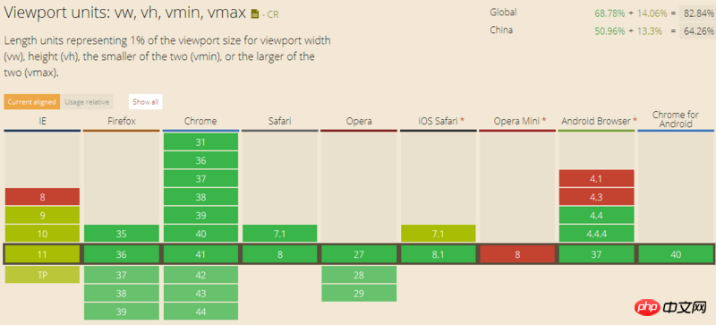
CSS3 addeda set of length unitsvw relative to the visual areapercentage , vh, vmin, vmax. where vw is the unit relative to the percentage of the viewport width, 1vw = 1% <a href="http://www.php.cn/css/css-rwd-viewport.html" target="_blank">viewport</a> <a href="http://www.php.cn/wiki/835.html" target="_blank">width</a>, vh is relative to the viewport height The unit of percentage, 1vh = 1% viewport <a href="http://www.php.cn/wiki/836.html" target="_blank">height</a>; vmin is the percentage unit of the smaller one relative to the current viewport width and height, similarly vmax is relative The percentage unit of the larger of the current viewport width and center. The browser compatibility of this unit is as follows:
Using the vw unit, we can easily make adaptive squares:
<p class="placeholder"></p>

.placeholder {
  width: 100%;
  height: 100vw;
}Realize the effect
Advantages: simple and convenient
Disadvantages: poor browser compatibility
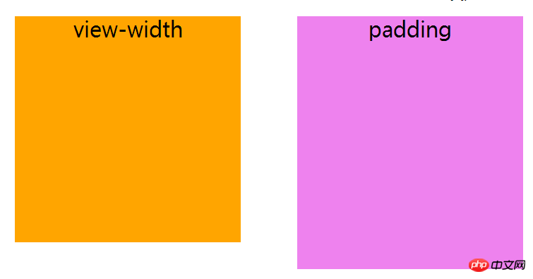
Option 2: Set vertical directionpadding Open the container
In CSS box model, one thing that is easily overlooked is the calculation of the percentage value of <a href="http://www.php.cn/wiki/931.html" target="_blank">margin</a>, padding. According to the regulations, the percentage values of margin and padding are calculated relative to the width of the parent element width. From this, we can find that we only need to set a padding value in the vertical direction of the element to the same percentage as width to create an adaptive square:
.placeholder {
  width: 100%;
  padding-bottom: 100%;
}Implementation Effect
Everything looks normal at this time. We try to add content to the container:
Eh? Why did the height overflow? Let's look at the box model at this time:
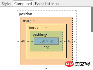
As shown in the picture, the content area occupies a height of 38px. In order to solve this problem, we can set the height of the container to 0:
.placeholder {
  height: 0;
} This solution is simple and clear, and has good compatibility; however, in addition to problems after filling the content, there is also the possibility of <a href="http://www.php.cn/wiki/908.html" target="_blank">max-height</a> No shrinkage: DEMO, so here comes the third option:
Option 3: Using margin (padding) of pseudo elements-top Open the container
In option 2, we use the padding-bottom attribute of the percentage value to open the internal space of the container, but doing so will result in setting the The max-height attribute is invalid:
The reason for the failure is that the max-height attribute is only limited to height, that is Will only work on the content height of the element. So can we use a child element to expand the height of the content part, so that the max-height attribute takes effect? Let’s try:
.placeholder {
  width: 100%;
}

.placeholder:after {
  content: '';
  display: block;
  margin-top: 100%; /* margin 百分比相对父元素宽度计算 */
}Refresh the page, huh? Why is there nothing?
This involves the concept of margin collapse. Since the container and pseudo-element have marginscollapsed in the vertical direction, the height of the parent element that we imagined did not appear. The solution is to trigger BFC on the parent element:
.placeholder {
  overflow: hidden;
}Note: If you use padding in the vertical direction to expand the parent element, you do not need to trigger BFC
Achieve the effect
OK, the parent element is propped up, let’s try setting max-height again:
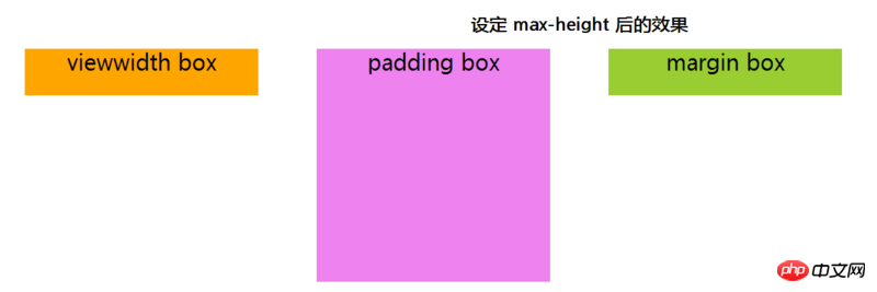
Perfect! What? Are you saying that the height will overflow when content is added inside the element? Someone, drag this traitor out and feed it to the dogs! For such a situation, you can put the content into an independent content block and use absolute positioning to eliminate space occupation.
Conclusion
The above are the three ways to make adaptive squares that I currently think of. Throw away the relative units of the viewport in CSS3 and mainly use the percentage values of margin and padding relative to the width of the parent element. To create a square with equal width and height and adaptive relative to the viewport width. If the requirement is to make a square that is highly adaptive relative to the viewport, I guess you can only use the vh unit~
The above is the detailed content of Detailed introduction to the case of using pure CSS to implement adaptive squares. For more information, please follow other related articles on the PHP Chinese website!

Hot AI Tools

Undresser.AI Undress
AI-powered app for creating realistic nude photos

AI Clothes Remover
Online AI tool for removing clothes from photos.

Undress AI Tool
Undress images for free

Clothoff.io
AI clothes remover

Video Face Swap
Swap faces in any video effortlessly with our completely free AI face swap tool!

Hot Article
Hot Tools

Notepad++7.3.1
Easy-to-use and free code editor

SublimeText3 Chinese version
Chinese version, very easy to use

Zend Studio 13.0.1
Powerful PHP integrated development environment

Dreamweaver CS6
Visual web development tools

SublimeText3 Mac version
God-level code editing software (SublimeText3)
Hot Topics
 1386
1386
 52
52

 How to use bootstrap in vue
Apr 07, 2025 pm 11:33 PM
How to use bootstrap in vue
Apr 07, 2025 pm 11:33 PM
Using Bootstrap in Vue.js is divided into five steps: Install Bootstrap. Import Bootstrap in main.js. Use the Bootstrap component directly in the template. Optional: Custom style. Optional: Use plug-ins.
 The Roles of HTML, CSS, and JavaScript: Core Responsibilities
Apr 08, 2025 pm 07:05 PM
The Roles of HTML, CSS, and JavaScript: Core Responsibilities
Apr 08, 2025 pm 07:05 PM
HTML defines the web structure, CSS is responsible for style and layout, and JavaScript gives dynamic interaction. The three perform their duties in web development and jointly build a colorful website.
 How to write split lines on bootstrap
Apr 07, 2025 pm 03:12 PM
How to write split lines on bootstrap
Apr 07, 2025 pm 03:12 PM
There are two ways to create a Bootstrap split line: using the tag, which creates a horizontal split line. Use the CSS border property to create custom style split lines.
 Understanding HTML, CSS, and JavaScript: A Beginner's Guide
Apr 12, 2025 am 12:02 AM
Understanding HTML, CSS, and JavaScript: A Beginner's Guide
Apr 12, 2025 am 12:02 AM
WebdevelopmentreliesonHTML,CSS,andJavaScript:1)HTMLstructurescontent,2)CSSstylesit,and3)JavaScriptaddsinteractivity,formingthebasisofmodernwebexperiences.
 How to insert pictures on bootstrap
Apr 07, 2025 pm 03:30 PM
How to insert pictures on bootstrap
Apr 07, 2025 pm 03:30 PM
There are several ways to insert images in Bootstrap: insert images directly, using the HTML img tag. With the Bootstrap image component, you can provide responsive images and more styles. Set the image size, use the img-fluid class to make the image adaptable. Set the border, using the img-bordered class. Set the rounded corners and use the img-rounded class. Set the shadow, use the shadow class. Resize and position the image, using CSS style. Using the background image, use the background-image CSS property.
 How to resize bootstrap
Apr 07, 2025 pm 03:18 PM
How to resize bootstrap
Apr 07, 2025 pm 03:18 PM
To adjust the size of elements in Bootstrap, you can use the dimension class, which includes: adjusting width: .col-, .w-, .mw-adjust height: .h-, .min-h-, .max-h-
 How to set up the framework for bootstrap
Apr 07, 2025 pm 03:27 PM
How to set up the framework for bootstrap
Apr 07, 2025 pm 03:27 PM
To set up the Bootstrap framework, you need to follow these steps: 1. Reference the Bootstrap file via CDN; 2. Download and host the file on your own server; 3. Include the Bootstrap file in HTML; 4. Compile Sass/Less as needed; 5. Import a custom file (optional). Once setup is complete, you can use Bootstrap's grid systems, components, and styles to create responsive websites and applications.
 How to use bootstrap button
Apr 07, 2025 pm 03:09 PM
How to use bootstrap button
Apr 07, 2025 pm 03:09 PM
How to use the Bootstrap button? Introduce Bootstrap CSS to create button elements and add Bootstrap button class to add button text
