
 Web Front-end
CSS Tutorial
Detailed explanation of rounded corners and shadows as well as border images and box subtraction in CSS3
Web Front-end
CSS Tutorial
Detailed explanation of rounded corners and shadows as well as border images and box subtraction in CSS3
Detailed explanation of rounded corners and shadows as well as border images and box subtraction in CSS3

Rounded corners: border-radius
Shadow: box-shadow
BorderPicture: border-image
Box-sizing: border-box;
Rounded corners: border-radius: pixels/percentage
A value sets the horizontal and vertical radii of the four corners of the box. Each corner can be set independently. The value order is upper left, upper right, lower right, lower left, clockwise setting, which can be abbreviated. The logic is the same as padding and margin. The units support pixels and percentages (referring to width and height)
You can use the horizontal radius/vertical radius to control the radius independently, and each radius can be controlled independently
p:nth-child(5){
    border-radius: 0px 200px;
}
p:nth-child(7){
    width: 400px;
    /* 如果中间有斜杠,控制的是水平方向和垂直方向的半径大小 */
    border-radius: 200px/100px;
}Capsule production: The value is greater than or equal to half of the short side, and more than half will not Change.
p {
        width: 200px;
        height: 100px;
        background-color: palevioletred;
        border-radius: 50px;
}Shadow: box-shadow: value
Value description:
First value: Npx Shadow offsets N pixels horizontally Second value: Npx The shadow is offset by N pixels in the vertical direction. The third value: feather size. The fourth value: shadow size. The fifth value: color (default black). The sixth parameter: inner and outer shadow (default is outer shadow, inner shadow is in set) You can write multiple shadows, separated by commas
The shadow can be abbreviated, but you need to note that some values need to be filled in. 0
p:nth-child(8):hover{
    /* 阴影可以写多个 */
    background-color: #000;
    box-shadow: 10px 10px 10px 2px red, 20px 20px 10px 4px green,30px 30px 2px 6px blue;
}Text shadow
Syntax: text-shadow: horizontal offset vertical offset feather size color
Border image: border-image: value
Follows the Jiugong format cut Picture, cut the top, bottom, left and right respectively.
Value description:
border-image-source:url('border.png'); Picture path border-image-slice:26; Picture cutting, Do not bring units, follow the nine-square format cutting method (one cut each for top, bottom, left and right) border-image-repeat: round or stretch or repeat; round has no defects, stretch defaults to stretching, repeat tiles (may have defects)
Abbreviation: border-image:url('border.png') 26 round;
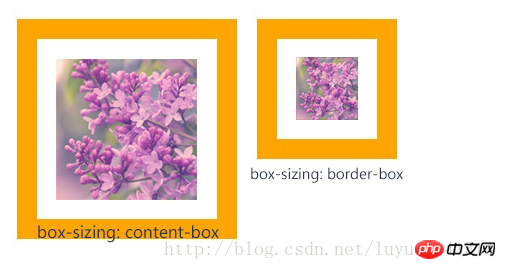
Box-sizing:border-box
content-box: padding and border are not included in the defined width and height. The actual width of the object is equal to the sum of the set width value, border and padding, that is (Element width = width + border + padding)
This attribute behaves as in standard mode Box model.
border-box: padding and border are included within the defined width and height. The actual width of the object is equal to the set width value. Even if border and padding are defined, the actual width of the object will not be changed, that is (Element width = width)
This attribute behaves like a box model in weird mode.
 vcq91q7SuzwvcD4NCjxwcmUgY2xhc3M9"brush:sql;">
/*bootstrapSet this style globally*/
*,
*::before,
*:after{
border-sizing:border-box;
}
vcq91q7SuzwvcD4NCjxwcmUgY2xhc3M9"brush:sql;">
/*bootstrapSet this style globally*/
*,
*::before,
*:after{
border-sizing:border-box;
}
Small example: Implement a two-column layout, always maintaining a 10px spacing in the middle
<style type="text/css">* {
    padding: 0;
    margin: 0;
}
.left {
    width: 50%;
    float: left;
    height: 300px;
    padding-right: 5px;
    box-sizing: border-box;
}
.right {
    width: 50%;
    float: left;
    height: 300px;
    padding-left: 5px;
    box-sizing: border-box;
}
.info {
    width: 100%;
    height: 100%;
background-color: pink;The above is the detailed content of Detailed explanation of rounded corners and shadows as well as border images and box subtraction in CSS3. For more information, please follow other related articles on the PHP Chinese website!

Hot AI Tools

Undresser.AI Undress
AI-powered app for creating realistic nude photos

AI Clothes Remover
Online AI tool for removing clothes from photos.

Undress AI Tool
Undress images for free

Clothoff.io
AI clothes remover

AI Hentai Generator
Generate AI Hentai for free.

Hot Article
Hot Tools

Notepad++7.3.1
Easy-to-use and free code editor

SublimeText3 Chinese version
Chinese version, very easy to use

Zend Studio 13.0.1
Powerful PHP integrated development environment

Dreamweaver CS6
Visual web development tools

SublimeText3 Mac version
God-level code editing software (SublimeText3)
Hot Topics


 How to achieve wave effect with pure CSS3? (code example)
Jun 28, 2022 pm 01:39 PM
How to achieve wave effect with pure CSS3? (code example)
Jun 28, 2022 pm 01:39 PM
How to achieve wave effect with pure CSS3? This article will introduce to you how to use SVG and CSS animation to create wave effects. I hope it will be helpful to you!
 Use CSS skillfully to realize various strange-shaped buttons (with code)
Jul 19, 2022 am 11:28 AM
Use CSS skillfully to realize various strange-shaped buttons (with code)
Jul 19, 2022 am 11:28 AM
This article will show you how to use CSS to easily realize various weird-shaped buttons that appear frequently. I hope it will be helpful to you!
 Guide to modifying win11 window corners to rounded corners
Dec 31, 2023 pm 08:35 PM
Guide to modifying win11 window corners to rounded corners
Dec 31, 2023 pm 08:35 PM
After updating the win11 system, many friends found that the win11 interface window adopts a new rounded corner design. But some people don’t like this rounded corner design and want to modify it to the previous interface, but they don’t know how to modify it. Let’s take a look below. How to modify rounded corners in win11 1. The rounded corner design of win11 is a built-in system setting that cannot be modified at present. 2. So if you don’t like using the rounded corner design of win11, you can wait for Microsoft to provide a modification method. 3. If you are really not used to it, you can also choose to return to the previous win10 system. 4. If you don’t know how to roll back, you can check out the tutorials provided on this site. 5. If you cannot go back using the tutorial above, you can still
 How to hide elements in css without taking up space
Jun 01, 2022 pm 07:15 PM
How to hide elements in css without taking up space
Jun 01, 2022 pm 07:15 PM
Two methods: 1. Using the display attribute, just add the "display:none;" style to the element. 2. Use the position and top attributes to set the absolute positioning of the element to hide the element. Just add the "position:absolute;top:-9999px;" style to the element.
 How to implement lace borders in css3
Sep 16, 2022 pm 07:11 PM
How to implement lace borders in css3
Sep 16, 2022 pm 07:11 PM
In CSS, you can use the border-image attribute to achieve a lace border. The border-image attribute can use images to create borders, that is, add a background image to the border. You only need to specify the background image as a lace style; the syntax "border-image: url (image path) offsets the image border width inward. Whether outset is repeated;".
 It turns out that text carousel and image carousel can also be realized using pure CSS!
Jun 10, 2022 pm 01:00 PM
It turns out that text carousel and image carousel can also be realized using pure CSS!
Jun 10, 2022 pm 01:00 PM
How to create text carousel and image carousel? The first thing everyone thinks of is whether to use js. In fact, text carousel and image carousel can also be realized using pure CSS. Let’s take a look at the implementation method. I hope it will be helpful to everyone!
 How to enlarge the image by clicking the mouse in css3
Apr 25, 2022 pm 04:52 PM
How to enlarge the image by clicking the mouse in css3
Apr 25, 2022 pm 04:52 PM
Implementation method: 1. Use the ":active" selector to select the state of the mouse click on the picture; 2. Use the transform attribute and scale() function to achieve the picture magnification effect, the syntax "img:active {transform: scale(x-axis magnification, y Axis magnification);}".
 How to adjust the rounded corners of win10 search box
Jan 15, 2024 pm 03:12 PM
How to adjust the rounded corners of win10 search box
Jan 15, 2024 pm 03:12 PM
There has been news about the rounded corners of the win10 search box for a long time, but it has never been implemented. We can generally use the registry to experience the rounded corners of the win10 search box. So let's take a look at the tutorial on the rounded corners of the win10 search box. Bar. Win10 search box variable rounded corners: 1. Open the search box, enter regedit, and enter the registry. 2. Find this path in Computer\HKEY_CURRENT_USER\Software\Microsoft\Windows\CurrentVersion\Search. 3. In the blank space, select New - DWORD (32-bit) value - Name the new key ImmersiveSearch - Number
