

A detailed analysis of the positioning of the CSS box model

cssBox model Positioning
1, Static Positioning
## The default value for #HTML elements is that there is no positioning and the element appears in the normal flow.
Static positioned elements will not be affected by top, bottom, left, right.
2. Fixed positioning
The position of the element is a fixed position relative to the browser window. It does not move even if the window is scrolled:
Fixed positioned elements overlap with other elements.
3. Relative positioning
The positioning of a relatively positioned element is relative to its normal position. The content of relatively positioned elements that can be moved and elements that overlap each other will not change the space they originally occupy. Relatively positioned elements are often used as container blocks forabsolutely positioned elements.
4. Absolute positioning
The position of an absolutely positioned element is relative to the nearest positioned parent element. If the element has no positioned parent element, then its position is Relative to:Absolutely positioning positions the element independently of the document flow, so it doesn't take up space.Absolutely positioned elements overlap with other elements.
Elements are positioned independently of the document flow, so they can cover
other elements on the page
z-index Attribute specifies the stacking order of an element (which element should be in front, or behind) An element can have a positive or negative stacking order:
Elements with a higher stacking order are always in The front of lower stacking order elements.
Note: If two positioned elements overlap and z-index is not specified, the element last positioned in the HTML code will be displayed first.
The difference between relative and absolute positioning
Absolute positioning (absolute):1. The
object that will be assigned this positioning methodfrom Drag it out of the document flow and use left, right, top, bottom and other attributes to perform absolute positioning relative to its closest parent object with the most positioning settings. If the object's parent does not set positioning attributes, it still follows HTML positioning. If it is regular, it will be positioned based on the upper left corner of the body object as a reference. 2. Absolutely positioned objects can be stacked, and the stacking order can be controlled through the z-index attribute. The z-index value is a unitless
integer, with the larger one on top and can have negative values. Relative to the nearest non-standard stream positioning, the original position disappears and is replaced by the subsequent position
Relative to the original position, but the original position is still retained .
Objects cannot be stacked, and their positions are offset in the normal document flow according to left, right, top, bottom and other attributes.
You can also use z-index hierarchical design.
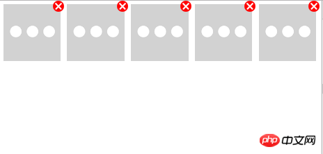
Example: <meta charset="UTF-8" />
<title></title>
<style type="text/css">
/*多个标签同时设置,使用逗号分隔*/
body, p, ul, li, img, a {
margin: 0;
padding: 0;
}
/*给定图片尺寸:否则会超出父容器,堆叠在一起*/
img {
width: 100%;
height: 100%
}
/*让a标签绝对于li标签,li要设置relative*/
li {
list-style: none;
position: relative;
float: left;
padding: 1%;
width: 18%;
}
/*让删除红叉处于li的右上角,且需给定大小*/
a {
background: url(images/close.png);
width: 16px;
height: 16px;
position: absolute;
top: 0;
right: 0;
}</style>Copy after login
Rendering: <meta charset="UTF-8" />
<title></title>
<style type="text/css">
/*多个标签同时设置,使用逗号分隔*/
body, p, ul, li, img, a {
margin: 0;
padding: 0;
}
/*给定图片尺寸:否则会超出父容器,堆叠在一起*/
img {
width: 100%;
height: 100%
}
/*让a标签绝对于li标签,li要设置relative*/
li {
list-style: none;
position: relative;
float: left;
padding: 1%;
width: 18%;
}
/*让删除红叉处于li的右上角,且需给定大小*/
a {
background: url(images/close.png);
width: 16px;
height: 16px;
position: absolute;
top: 0;
right: 0;
}</style>
The above is the detailed content of A detailed analysis of the positioning of the CSS box model. For more information, please follow other related articles on the PHP Chinese website!

Hot AI Tools

Undresser.AI Undress
AI-powered app for creating realistic nude photos

AI Clothes Remover
Online AI tool for removing clothes from photos.

Undress AI Tool
Undress images for free

Clothoff.io
AI clothes remover

Video Face Swap
Swap faces in any video effortlessly with our completely free AI face swap tool!

Hot Article
Hot Tools

Notepad++7.3.1
Easy-to-use and free code editor

SublimeText3 Chinese version
Chinese version, very easy to use

Zend Studio 13.0.1
Powerful PHP integrated development environment

Dreamweaver CS6
Visual web development tools

SublimeText3 Mac version
God-level code editing software (SublimeText3)
Hot Topics


 How to use bootstrap in vue
Apr 07, 2025 pm 11:33 PM
How to use bootstrap in vue
Apr 07, 2025 pm 11:33 PM
Using Bootstrap in Vue.js is divided into five steps: Install Bootstrap. Import Bootstrap in main.js. Use the Bootstrap component directly in the template. Optional: Custom style. Optional: Use plug-ins.
 The Roles of HTML, CSS, and JavaScript: Core Responsibilities
Apr 08, 2025 pm 07:05 PM
The Roles of HTML, CSS, and JavaScript: Core Responsibilities
Apr 08, 2025 pm 07:05 PM
HTML defines the web structure, CSS is responsible for style and layout, and JavaScript gives dynamic interaction. The three perform their duties in web development and jointly build a colorful website.
 How to write split lines on bootstrap
Apr 07, 2025 pm 03:12 PM
How to write split lines on bootstrap
Apr 07, 2025 pm 03:12 PM
There are two ways to create a Bootstrap split line: using the tag, which creates a horizontal split line. Use the CSS border property to create custom style split lines.
 Understanding HTML, CSS, and JavaScript: A Beginner's Guide
Apr 12, 2025 am 12:02 AM
Understanding HTML, CSS, and JavaScript: A Beginner's Guide
Apr 12, 2025 am 12:02 AM
WebdevelopmentreliesonHTML,CSS,andJavaScript:1)HTMLstructurescontent,2)CSSstylesit,and3)JavaScriptaddsinteractivity,formingthebasisofmodernwebexperiences.
 How to insert pictures on bootstrap
Apr 07, 2025 pm 03:30 PM
How to insert pictures on bootstrap
Apr 07, 2025 pm 03:30 PM
There are several ways to insert images in Bootstrap: insert images directly, using the HTML img tag. With the Bootstrap image component, you can provide responsive images and more styles. Set the image size, use the img-fluid class to make the image adaptable. Set the border, using the img-bordered class. Set the rounded corners and use the img-rounded class. Set the shadow, use the shadow class. Resize and position the image, using CSS style. Using the background image, use the background-image CSS property.
 How to set up the framework for bootstrap
Apr 07, 2025 pm 03:27 PM
How to set up the framework for bootstrap
Apr 07, 2025 pm 03:27 PM
To set up the Bootstrap framework, you need to follow these steps: 1. Reference the Bootstrap file via CDN; 2. Download and host the file on your own server; 3. Include the Bootstrap file in HTML; 4. Compile Sass/Less as needed; 5. Import a custom file (optional). Once setup is complete, you can use Bootstrap's grid systems, components, and styles to create responsive websites and applications.
 How to use bootstrap button
Apr 07, 2025 pm 03:09 PM
How to use bootstrap button
Apr 07, 2025 pm 03:09 PM
How to use the Bootstrap button? Introduce Bootstrap CSS to create button elements and add Bootstrap button class to add button text
 How to resize bootstrap
Apr 07, 2025 pm 03:18 PM
How to resize bootstrap
Apr 07, 2025 pm 03:18 PM
To adjust the size of elements in Bootstrap, you can use the dimension class, which includes: adjusting width: .col-, .w-, .mw-adjust height: .h-, .min-h-, .max-h-
