
 Web Front-end
CSS Tutorial
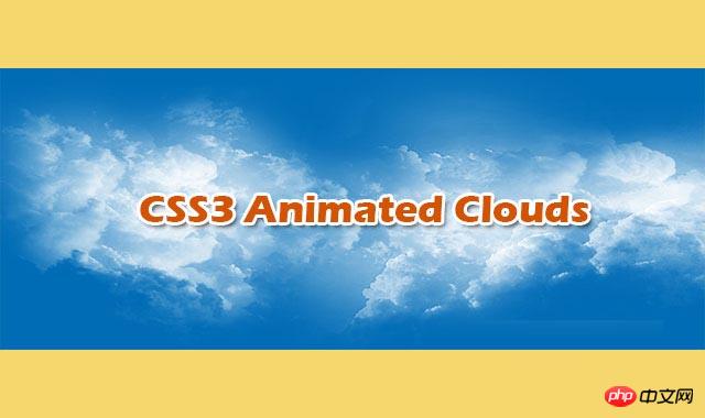
Pure CSS3 creates realistic multi-layered cloud animation special effects
Web Front-end
CSS Tutorial
Pure CSS3 creates realistic multi-layered cloud animation special effects
Pure CSS3 creates realistic multi-layered cloud animation special effects
Brief Tutorial
This is a very cool pure CSS3 realistic multi-layered cloud animation special effect. This special effect uses multiple transparent cloud PNG images as background images, and uses CSS animation to create the horizontal floating animation effect of clouds.
##View source Download plug-in
How to use
HTML structure
The HTML structure of this multi-layered cloud animation effect is very simple: use a p.sky as the background layer of the antenna, and place multiple subtitles inside it.
As a cloud container.
<p class="sky">
    <p class="clouds_one"></p>
    <p class="clouds_two"></p>
    <p class="clouds_three"></p>
</p>## CSS style
As the sky background, the .sky element sets a fixed height, uses relative positioning, and uses overflow: hidden; to hide out-of-range elements. element. Start by setting the sky color to a lighter blue #007fd5. Then a sky_background CSS3 animation is set for the sky background. This animation transitions the color of the sky background from light blue to dark blue within 50 seconds. The animation-timing-function of the animation is ease-out, and the iteration of the animation The number of times animation-iteration-count is an infinite loop.
In this special effect, each element is set with the transform: translate3d(0, 0, 0) attribute. Used to turn on the 3D effect of the GPU and improve display performance.
.sky {
    height: 480px;
    background: #007fd5;
    position: relative;
    overflow: hidden;
    -webkit-animation: sky_background 50s ease-out infinite;
    -moz-animation: sky_background 50s ease-out infinite;
    -o-animation: sky_background 50s ease-out infinite;
    animation: sky_background 50s ease-out infinite;
    -webkit-transform: translate3d(0, 0, 0);
    -ms-transform: translate3d(0, 0, 0);
    -o-transform: translate3d(0, 0, 0);
    transform: translate3d(0, 0, 0);
  }
  @keyframes sky_background {
    0% {
      background: #007fd5;
      color: #007fd5
    }
    50% {
      background: #000;
      color: #a3d9ff
    }
    100% {
      background: #007fd5;
      color: #007fd5
    }
}Cloud layer 1 uses the first cloud PNG image as the background image. Use absolute positioning, aligned left relative to the sky container. The height is equal to the sky and the width is 3 times the sky container. and perform cloud_one CSS3 animation. This animation modifies the left property of the cloud layer so that the clouds move horizontally.
.clouds_one {
    background: url("img/cloud_one.png");
    position: absolute;
    left: 0;
    top: 0;
    height: 100%;
    width: 300%;
    -webkit-animation: cloud_one 50s linear infinite;
    -moz-animation: cloud_one 50s linear infinite;
    -o-animation: cloud_one 50s linear infinite;
    animation: cloud_one 50s linear infinite;
    -webkit-transform: translate3d(0, 0, 0);
    -ms-transform: translate3d(0, 0, 0);
    -o-transform: translate3d(0, 0, 0);
    transform: translate3d(0, 0, 0);
  }
  @keyframes cloud_one {
    0% {
      left: 0
    }
    100% {
      left: -200%
    }
  }
The above is the detailed content of Pure CSS3 creates realistic multi-layered cloud animation special effects. For more information, please follow other related articles on the PHP Chinese website!

Hot AI Tools

Undresser.AI Undress
AI-powered app for creating realistic nude photos

AI Clothes Remover
Online AI tool for removing clothes from photos.

Undress AI Tool
Undress images for free

Clothoff.io
AI clothes remover

Video Face Swap
Swap faces in any video effortlessly with our completely free AI face swap tool!

Hot Article
Hot Tools

Notepad++7.3.1
Easy-to-use and free code editor

SublimeText3 Chinese version
Chinese version, very easy to use

Zend Studio 13.0.1
Powerful PHP integrated development environment

Dreamweaver CS6
Visual web development tools

SublimeText3 Mac version
God-level code editing software (SublimeText3)
Hot Topics
 1386
1386
 52
52

 How to achieve wave effect with pure CSS3? (code example)
Jun 28, 2022 pm 01:39 PM
How to achieve wave effect with pure CSS3? (code example)
Jun 28, 2022 pm 01:39 PM
How to achieve wave effect with pure CSS3? This article will introduce to you how to use SVG and CSS animation to create wave effects. I hope it will be helpful to you!
 Use CSS skillfully to realize various strange-shaped buttons (with code)
Jul 19, 2022 am 11:28 AM
Use CSS skillfully to realize various strange-shaped buttons (with code)
Jul 19, 2022 am 11:28 AM
This article will show you how to use CSS to easily realize various weird-shaped buttons that appear frequently. I hope it will be helpful to you!
 How to hide elements in css without taking up space
Jun 01, 2022 pm 07:15 PM
How to hide elements in css without taking up space
Jun 01, 2022 pm 07:15 PM
Two methods: 1. Using the display attribute, just add the "display:none;" style to the element. 2. Use the position and top attributes to set the absolute positioning of the element to hide the element. Just add the "position:absolute;top:-9999px;" style to the element.
 How to implement lace borders in css3
Sep 16, 2022 pm 07:11 PM
How to implement lace borders in css3
Sep 16, 2022 pm 07:11 PM
In CSS, you can use the border-image attribute to achieve a lace border. The border-image attribute can use images to create borders, that is, add a background image to the border. You only need to specify the background image as a lace style; the syntax "border-image: url (image path) offsets the image border width inward. Whether outset is repeated;".
 It turns out that text carousel and image carousel can also be realized using pure CSS!
Jun 10, 2022 pm 01:00 PM
It turns out that text carousel and image carousel can also be realized using pure CSS!
Jun 10, 2022 pm 01:00 PM
How to create text carousel and image carousel? The first thing everyone thinks of is whether to use js. In fact, text carousel and image carousel can also be realized using pure CSS. Let’s take a look at the implementation method. I hope it will be helpful to everyone!
 How to enlarge the image by clicking the mouse in css3
Apr 25, 2022 pm 04:52 PM
How to enlarge the image by clicking the mouse in css3
Apr 25, 2022 pm 04:52 PM
Implementation method: 1. Use the ":active" selector to select the state of the mouse click on the picture; 2. Use the transform attribute and scale() function to achieve the picture magnification effect, the syntax "img:active {transform: scale(x-axis magnification, y Axis magnification);}".
 How to set animation rotation speed in css3
Apr 28, 2022 pm 04:32 PM
How to set animation rotation speed in css3
Apr 28, 2022 pm 04:32 PM
In CSS3, you can use the "animation-timing-function" attribute to set the animation rotation speed. This attribute is used to specify how the animation will complete a cycle and set the speed curve of the animation. The syntax is "element {animation-timing-function: speed attribute value;}".
 Does css3 animation effect have deformation?
Apr 28, 2022 pm 02:20 PM
Does css3 animation effect have deformation?
Apr 28, 2022 pm 02:20 PM
The animation effect in css3 has deformation; you can use "animation: animation attribute @keyframes ..{..{transform: transformation attribute}}" to achieve deformation animation effect. The animation attribute is used to set the animation style, and the transform attribute is used to set the deformation style. .
