 Web Front-end
 CSS Tutorial
 Summarize the four common positioning attributes in css (left right top bottom)
Summarize the four common positioning attributes in css (left right top bottom)
DIV CSS left right top bottom positioning These four CSS attribute styles are used to position the object box, and the position attribute value must be defined as absolute or relative.
Left The distance value between the left side of the current element and the left side of the parent element (which is the original default position).
Right The distance value between the right side of the current element and the right side of the parent element.
Top The distance between the top of the current object and the top of the original position.
Bottom The distance between the bottom of the current object and the original position.
1. The left attribute in CSS
1. Detailed introduction to the left attribute in CSS
Definition and Usage
The left attribute specifies the left edge of an element. This property defines the offset between the left margin edge of the positioned element and the left edge of its containing block.
Note: If the value of the "position" attribute is "static", then setting the "left" attribute will have no effect.

2. Detailed introduction to the example of CSS three-column layout (picture)
Through float left and relative width Achieve

Absolute positioning, separate it from the document flow through absolute positioning, and you can adaptively define the three-column width

Use self-floating, float left and float right

3. The difference between offsetLeft and style.left in div
clientX event property returns the horizontal coordinate of the mouse pointer to the browser page (or client area) when the event is triggered.
The client area refers to the current window.
If the position of the parent p is defined as relative and the position of the child p is defined as absolute, then the value of style.left of the child p is relative to the value of the parent p, which is the same as offsetLeft
4 . The difference between the float:left of div and the span tag
is that p? is a block-level element, and the elements it surrounds will automatically wrap. Span is just an inline element, and there will be no line breaks before and after it. There is no structural meaning, it is purely for applying styles, and can be used when other inline elements are not suitable. It should be noted that the tag can be included in the tag and become its child element, but the reverse is not true
2. The right attribute in CSS
1. CSS border-right-style property sets the right border style of the element
CSS border-right-style property sets the right border style of the element
The style of the border refers to the line attribute of the border, which refers to whether the border uses a solid line effect, a short line effect, or other line effects.
The border-right-style attribute sets the style of the right border of an element.
2. margin-right doesn’t work? _html/css_WEB-ITnose
The browser renders elements from left to right by default. It is useless to set margin-right if the width of the child container can be accommodated without exceeding the width of the parent container.
3. Summary of how to use css margin-left and margin-right
Generally in css styles, use the margin attribute to set the outer margin. If you only need margins on one side, you can use the one-sided margin property to set a value for the margin on one side of the element. Use the margin-left property to set the left margin of an element. Use the margin-right attribute to set the right margin of an element. Their default value is 0. In specific actual use, a specific unit value can be set, or it can be set in the form of a percentage. This article will summarize the usage of margin-left and margin-right.
3. Bottom attribute in CSS
1. Introduction to five ways to use CSS to implement Footer at the bottom
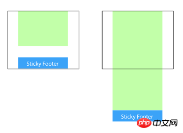
Sticky footer is to keep the footer part of the web page always at the bottom of the browser window.
When the content of the web page is long enough to exceed the visual height of the browser, the footer will be pushed to the bottom of the web page along with the content; but if the content of the web page is not long enough, the bottom footer will remain in the browser bottom of window.

2. css border-bottom (specify the style, width and color of the bottom border)
border-bottom attribute is used Specify the style, width and color of the bottom line. The values are separated by half-width spaces in no order.
Regarding the value of the style of the border-bottom attribute, please refer to the style of the edge for details. For the value of the width of the edge, please refer to the width of the edge
But In IE6, the bottom border of the current tab will not cover the bottom border of the parent element. It is said on the Internet that the parent element haslaytout, but it doesn't work even after trying it. Finally, set margin-bottom:-1px; position in the tab element at the same time. :relative; This solves the problem.
What should be noted here is that the height of the tab element must be 1px greater than the height of the parent element.
4. Top attribute in CSS
1. Summary of problems often encountered in the use of css margin-top

In CSS styles, the margin-top attribute sets the top margin of an element. It can allow negative values. The default value for defining fixed top margin is 0. All major browsers support the margin-top attribute. Through this article, we will specifically talk about some problems often encountered when using the margin-top attribute in front-end pages. What should I do if the setting affects the parent element? What should I do if the margin-top attribute does not work? Wait
2. Exploring the use of the border-top attribute in CSS
This section will make it easier to learn the usage of the CSS border-top attribute, border-top The shorthand property sets all properties of the top border into one statement.
This article describes the usage of the CSS border-top attribute. The border-top abbreviation attribute sets all the attributes of the top border into one statement. I believe this article will definitely help you gain something.
3. CSS3 border-top-left-radius property
Mainly adds rounded borders to the four corners of the div element:
Note: border- The two length or percentage values of the top-left-radius property define the shape of the edge corners of one quarter of the ellipse's outer border. The first value is the horizontal radius and the second is the vertical radius. Omit the second value, it is copied from the first. If either length is zero, the corners are square and not rounded. The percentage of the horizontal radius refers to the width of the bounding box, while the percentage of the vertical radius refers to the height of the bounding box.
Questions and answers related to positioning properties (left right top bottom):
2. css - About offsetLeft and offsetTop
4. html - Ask about margin-top issues
[Related recommendations]:
1. Video tutorial on how to learn CSS at your fingertips
2. A css, please explain; I don’t understand left :900em and left:auto_html/css_WEB-ITnos
3. Summary of common methods of positioning background images using CSS
The above is the detailed content of Summarize the four common positioning attributes in css (left right top bottom). For more information, please follow other related articles on the PHP Chinese website!

Hot AI Tools

Undresser.AI Undress
AI-powered app for creating realistic nude photos

AI Clothes Remover
Online AI tool for removing clothes from photos.

Undress AI Tool
Undress images for free

Clothoff.io
AI clothes remover

AI Hentai Generator
Generate AI Hentai for free.

Hot Article

Hot Tools

Notepad++7.3.1
Easy-to-use and free code editor

SublimeText3 Chinese version
Chinese version, very easy to use

Zend Studio 13.0.1
Powerful PHP integrated development environment

Dreamweaver CS6
Visual web development tools

SublimeText3 Mac version
God-level code editing software (SublimeText3)

Hot Topics
 1359
1359
 52
52
 How to remove the default style in Bootstrap list?
Apr 07, 2025 am 10:18 AM
The default style of the Bootstrap list can be removed with CSS override. Use more specific CSS rules and selectors, follow the "proximity principle" and "weight principle", overriding the Bootstrap default style. To avoid style conflicts, more targeted selectors can be used. If the override is unsuccessful, adjust the weight of the custom CSS. At the same time, pay attention to performance optimization, avoid overuse of !important, and write concise and efficient CSS code.
 How to build a bootstrap framework
Apr 07, 2025 pm 12:57 PM
To create a Bootstrap framework, follow these steps: Install Bootstrap via CDN or install a local copy. Create an HTML document and link Bootstrap CSS to the <head> section. Add Bootstrap JavaScript file to the <body> section. Use the Bootstrap component and customize the stylesheet to suit your needs.
 How to use bootstrap button
Apr 07, 2025 pm 03:09 PM
How to use the Bootstrap button? Introduce Bootstrap CSS to create button elements and add Bootstrap button class to add button text
 How to insert pictures on bootstrap
Apr 07, 2025 pm 03:30 PM
There are several ways to insert images in Bootstrap: insert images directly, using the HTML img tag. With the Bootstrap image component, you can provide responsive images and more styles. Set the image size, use the img-fluid class to make the image adaptable. Set the border, using the img-bordered class. Set the rounded corners and use the img-rounded class. Set the shadow, use the shadow class. Resize and position the image, using CSS style. Using the background image, use the background-image CSS property.
 How to resize bootstrap
Apr 07, 2025 pm 03:18 PM
To adjust the size of elements in Bootstrap, you can use the dimension class, which includes: adjusting width: .col-, .w-, .mw-adjust height: .h-, .min-h-, .max-h-
 How to upload files on bootstrap
Apr 07, 2025 pm 01:09 PM
The file upload function can be implemented through Bootstrap. The steps are as follows: introduce Bootstrap CSS and JavaScript files; create file input fields; create file upload buttons; handle file uploads (using FormData to collect data and then send to the server); custom style (optional).
 How to layout bootstrap
Apr 07, 2025 pm 02:24 PM
To use Bootstrap to layout a website, you need to use a grid system to divide the page into containers, rows, and columns. First add the container, then add the rows in it, add the columns within the row, and finally add the content in the column. Bootstrap's responsive layout function automatically adjusts the layout according to breakpoints (xs, sm, md, lg, xl). Different layouts under different screen sizes can be achieved by using responsive classes.
 How to verify bootstrap date
Apr 07, 2025 pm 03:06 PM
To verify dates in Bootstrap, follow these steps: Introduce the required scripts and styles; initialize the date selector component; set the data-bv-date attribute to enable verification; configure verification rules (such as date formats, error messages, etc.); integrate the Bootstrap verification framework and automatically verify date input when form is submitted.


