

Summarize several common div+css layout examples

The most important thing in learning front-end HTML and CSS technology is practice. No matter how many tutorials, video courses or related books your friends have read, you will have a new understanding of these only by practicing them yourself. Sometimes I can understand other people's code at a glance, but I can't start writing it myself; sometimes I can't understand technical knowledge and problems, no matter how much I think about it, I can't figure it out, etc. This article will introduce to friends various common div+css layout methods and practical skills.
DIV + CSS layout related content
1. DIV+CSS layout style detailed explanation
a Complies with W3C standards, and Microsoft and other companies are W3C supporters.
b It can achieve more precise control over the layout, fonts, colors, backgrounds and other graphics and text effects of web pages, making adjustments more convenient. Many websites now use the p+CSS framework mode, which further confirms that p+CSS is the general trend.
c Separating the format and structure is conducive to the reuse of the format and the modification and maintenance of the web page. It is easier to divide the work and cooperate in team development and reduce the interdependence.
d The great advantages of CSS The code in the introduction is smaller in size, downloads faster, saves a lot of bandwidth, and as we all know, search engines like concise code.
e Using CSS style sheets, all web pages on the site can point to the same CSS file, allowing many web pages to be updated at the same time.
2. Code sharing of Html+CSS layout techniques
We all know that everyone has different hobbies, some people like to eat sweets, and some people like to eat sweets. Some people like to eat spicy food, some people don't like to eat celery, some people don't like to eat mutton, etc. The same is true for some elements in CSS. Some of them are only interested in milk, and some only like to eat nuts and jelly but hate milk. And vertical-align is a rather picky eater. It only likes to eat jelly. It has grown up eating jelly. Without jelly, it will lose its temper and ignore you. I call it "jelly-dependent elements", also called "inline-block dependent elements", that is to say, only one element belongs to inline or inline-block (table-cell can also be understood as inline-block level ) level, the vertical-align attribute on it will take effect.
3. Solution to adaptive height in DIV+CSS layout
To switch from a fixed, pixel-based design method to a flexible, relative design method It's not easy. But if used correctly, it can be a natural choice for increasing accessibility and ease of use without making design sacrifices.
It may be easier to use a printed fixed design, because if the size does not change, there are relatively few things to consider. However, if you adopt a flexible design approach, you can make full use of your computer monitor and browser.
4. Detailed explanation of the Holy Grail layout and double flying wing layout example of CSS layout
In the html code, the middle part must first be placed at the front part of the container, and then the left. right
1) Set float:left, position:relative for all three (because relative positioning will be used later)
2) Set width: 100% for middle to fill one line
3) At this time, middle occupies One line is full, so you need to pull left to the far left of the line where middle is located, use margin-left:-100%
4) At this time, left is pulled back to the far left of the line where middle is located, but it will cover the left end of the middle content. To pull out the middle content, add padding: 0 210px to the outer container
5) The middle content is pulled out, but the left also comes out, so to restore it, use relative positioning for left left:-210px
6) In the same way, right should be moved to the far right of the row where middle is located, using margin-left:-210px, right:-210px
5. Must-see css layout tips sharing
When the left and right width of the page is reduced, in order to avoid the bad experience of left and right scroll bars, you can use max-width! If the page is smaller than the width, it will automatically shrink~
After setting box-sizing:border-box on the element, set the padding and border after determining the width, and the width will not change. You can set the size of
border adaptive content globally, and there will be no overflow.
CSS page layout is the most basic skill in web front-end development. This article will introduce some common layout methods, including box layout, column layout, flex layout, etc. In this article, you can see some horizontal and vertical centering methods, fixed width on the left, and adaptive methods on the right.
Related Questions and Answers
1. css layout table cellspacing
2. Foot layout and CSS layout issues
[Related recommendations]
1. DIV+CSS layout introductory tutorial: 5 div+css zero-based introductory tutorial recommendations
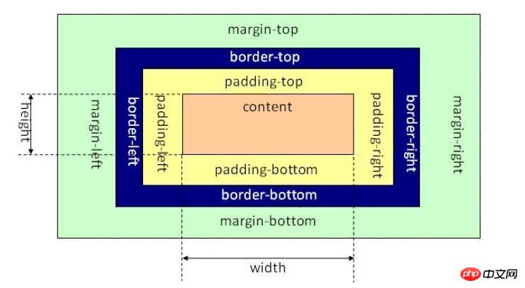
2. DIV+CSS box model knowledge summary, easily master div+css layout
The above is the detailed content of Summarize several common div+css layout examples. For more information, please follow other related articles on the PHP Chinese website!

Hot AI Tools

Undresser.AI Undress
AI-powered app for creating realistic nude photos

AI Clothes Remover
Online AI tool for removing clothes from photos.

Undress AI Tool
Undress images for free

Clothoff.io
AI clothes remover

Video Face Swap
Swap faces in any video effortlessly with our completely free AI face swap tool!

Hot Article
Hot Tools

Notepad++7.3.1
Easy-to-use and free code editor

SublimeText3 Chinese version
Chinese version, very easy to use

Zend Studio 13.0.1
Powerful PHP integrated development environment

Dreamweaver CS6
Visual web development tools

SublimeText3 Mac version
God-level code editing software (SublimeText3)
Hot Topics
 1386
1386
 52
52

 How to use bootstrap in vue
Apr 07, 2025 pm 11:33 PM
How to use bootstrap in vue
Apr 07, 2025 pm 11:33 PM
Using Bootstrap in Vue.js is divided into five steps: Install Bootstrap. Import Bootstrap in main.js. Use the Bootstrap component directly in the template. Optional: Custom style. Optional: Use plug-ins.
 The Roles of HTML, CSS, and JavaScript: Core Responsibilities
Apr 08, 2025 pm 07:05 PM
The Roles of HTML, CSS, and JavaScript: Core Responsibilities
Apr 08, 2025 pm 07:05 PM
HTML defines the web structure, CSS is responsible for style and layout, and JavaScript gives dynamic interaction. The three perform their duties in web development and jointly build a colorful website.
 How to write split lines on bootstrap
Apr 07, 2025 pm 03:12 PM
How to write split lines on bootstrap
Apr 07, 2025 pm 03:12 PM
There are two ways to create a Bootstrap split line: using the tag, which creates a horizontal split line. Use the CSS border property to create custom style split lines.
 Understanding HTML, CSS, and JavaScript: A Beginner's Guide
Apr 12, 2025 am 12:02 AM
Understanding HTML, CSS, and JavaScript: A Beginner's Guide
Apr 12, 2025 am 12:02 AM
WebdevelopmentreliesonHTML,CSS,andJavaScript:1)HTMLstructurescontent,2)CSSstylesit,and3)JavaScriptaddsinteractivity,formingthebasisofmodernwebexperiences.
 How to set up the framework for bootstrap
Apr 07, 2025 pm 03:27 PM
How to set up the framework for bootstrap
Apr 07, 2025 pm 03:27 PM
To set up the Bootstrap framework, you need to follow these steps: 1. Reference the Bootstrap file via CDN; 2. Download and host the file on your own server; 3. Include the Bootstrap file in HTML; 4. Compile Sass/Less as needed; 5. Import a custom file (optional). Once setup is complete, you can use Bootstrap's grid systems, components, and styles to create responsive websites and applications.
 How to resize bootstrap
Apr 07, 2025 pm 03:18 PM
How to resize bootstrap
Apr 07, 2025 pm 03:18 PM
To adjust the size of elements in Bootstrap, you can use the dimension class, which includes: adjusting width: .col-, .w-, .mw-adjust height: .h-, .min-h-, .max-h-
 How to insert pictures on bootstrap
Apr 07, 2025 pm 03:30 PM
How to insert pictures on bootstrap
Apr 07, 2025 pm 03:30 PM
There are several ways to insert images in Bootstrap: insert images directly, using the HTML img tag. With the Bootstrap image component, you can provide responsive images and more styles. Set the image size, use the img-fluid class to make the image adaptable. Set the border, using the img-bordered class. Set the rounded corners and use the img-rounded class. Set the shadow, use the shadow class. Resize and position the image, using CSS style. Using the background image, use the background-image CSS property.
 How to use bootstrap button
Apr 07, 2025 pm 03:09 PM
How to use bootstrap button
Apr 07, 2025 pm 03:09 PM
How to use the Bootstrap button? Introduce Bootstrap CSS to create button elements and add Bootstrap button class to add button text
