
 Web Front-end
CSS Tutorial
Detailed explanation of sample code for creating frosted glass effect with css3
Web Front-end
CSS Tutorial
Detailed explanation of sample code for creating frosted glass effect with css3
Detailed explanation of sample code for creating frosted glass effect with css3

Taking a break from my busy schedule, I’ve been looking at a lot of cool effects recently. There are many plug-ins based on jquery now, but the compatibility of many plug-ins is not very good, so native ones are the way to go. In daily life, frosted glass is no longer common. It was a thing from a long time ago. No, the following is the frosted glass:
Haha, let’s stop chatting, let’s get to the point. Let’s take a look at the final effect first:
Well, okay, let’s start our steps:
Step 1: Basic construction of the page:
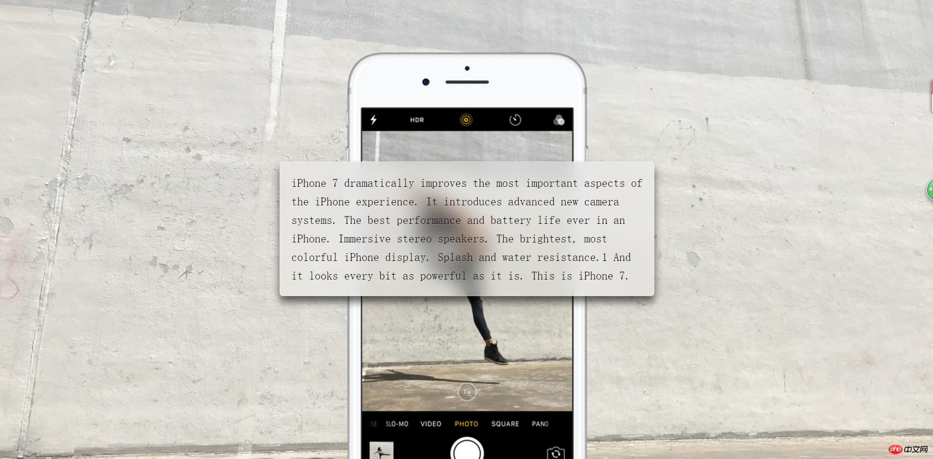
I set a large background image on the body , and then the middle part is a p, the html code is as follows:
<body>
<p >
    iPhone 7 dramatically improves the most important aspects of the iPhone experience. It introduces advanced new camera systems. The best performance and battery life ever in an iPhone. Immersive stereo speakers. The brightest, most colorful iPhone display. Splash and water resistance.1 And it looks every bit as powerful as it is. This is iPhone 7.
</p>
</body>Most of the text is to expand the p to make the effect more obvious
The css code is as follows:
   body {
            min-height: 100vh;
            box-sizing: border-box;
            margin: 0;
            padding-top: calc(50vh - 6em);
            font: 150%/1.6 serif;
            background: url("http://www.jackzxl.net/wp-content/MyFile/2016/09/iphone.jpg") fixed 0 center;
            background-size: cover;
        }
        p {
            margin: 0 auto;
            padding: 1em;
            max-width: 30em;
            border-radius: 0.3em;
            box-shadow: 0 0 0 1px hsla(0,0%,100%,.3) inset,
            0 .5em 1em rgba(0, 0, 0, 0.6);
            text-shadow: 0 1px 1px hsla(0,0%,100%,.3);
            background: hsla(0,0%,100%,.3);
}Look In the above style code, in the body, vh is the viewport size, 100 is 100%, and the background is set to a fixed position, covering the entire element; in p, set the background color in the center and then set its box style; then it looks like this :
The bright small transparent glass just came out, so let’s start our frosted glass processing
Step 2: Background blurred frosted glass settings
In CSS, there is the same blur setting, which is
filter: blur(20px);
The value after
is the size of the blur. The larger the value, the blurrier it is. Ah, but currently only px is supported, not percentage; It is not possible to directly add this style to p, because this will make even the sub-object blurry. At this time, we can use pseudo elements, that is:
:before;Before we use pseudo elements, we need to add a relative positioning to p. Since the blur of pseudo elements will overflow the entire p box, in order to be beautiful and classy, we need Add
overflow:hidden to p; that is:
  overflow: hidden;
  position: relative;
Pseudo element of p:
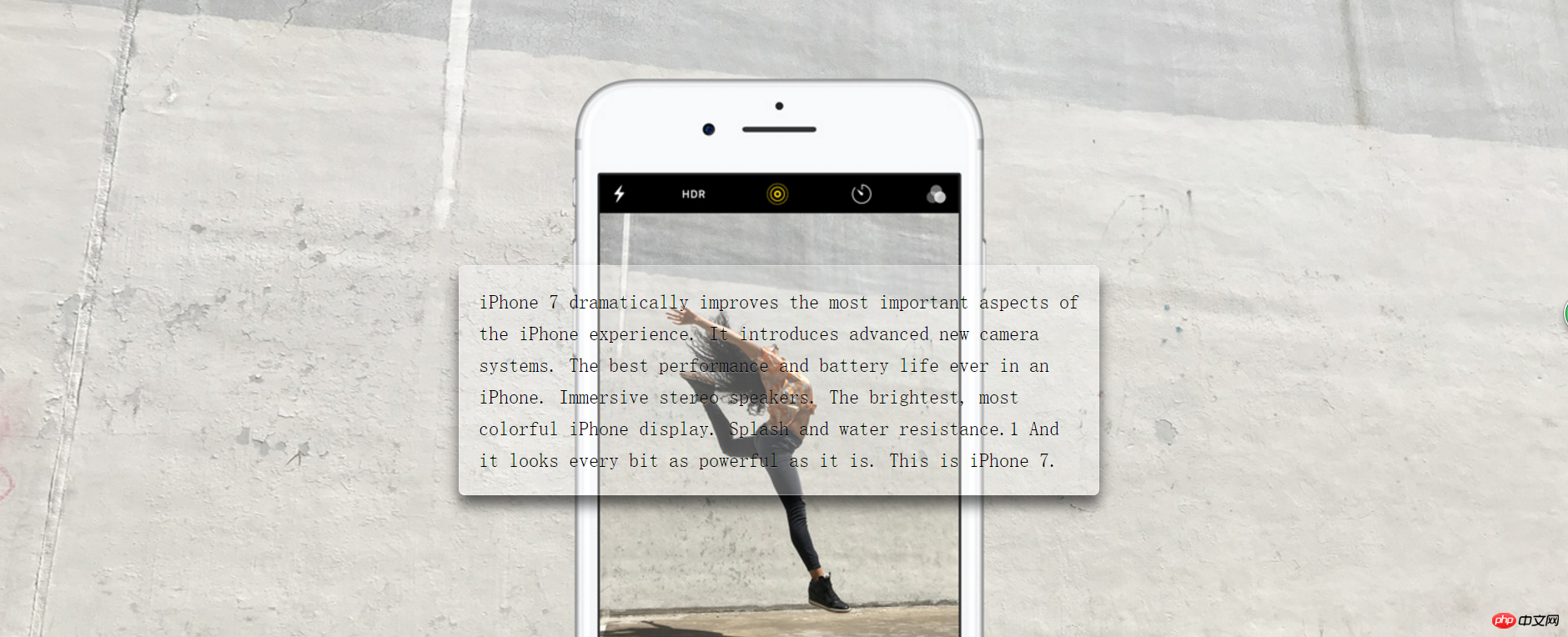
   p::before{
            content: '';
            position: absolute;
            top: 0; right: 0; bottom: 0; left: 0;
            z-index: -1;
            filter: blur(20px);
            margin: -20px;
            background: url("http://www.jackzxl.net/wp-content/MyFile/2016/09/iphone.jpg") fixed 0 center;
            background-size: cover;
}In the above css code we It can be seen that the set blur overlaps with p, and the background image is the same as the body. The final effect is as follows:
The above is the detailed content of Detailed explanation of sample code for creating frosted glass effect with css3. For more information, please follow other related articles on the PHP Chinese website!

Hot AI Tools

Undresser.AI Undress
AI-powered app for creating realistic nude photos

AI Clothes Remover
Online AI tool for removing clothes from photos.

Undress AI Tool
Undress images for free

Clothoff.io
AI clothes remover

Video Face Swap
Swap faces in any video effortlessly with our completely free AI face swap tool!

Hot Article
Hot Tools

Notepad++7.3.1
Easy-to-use and free code editor

SublimeText3 Chinese version
Chinese version, very easy to use

Zend Studio 13.0.1
Powerful PHP integrated development environment

Dreamweaver CS6
Visual web development tools

SublimeText3 Mac version
God-level code editing software (SublimeText3)
Hot Topics
 1387
1387
 52
52

 How to achieve wave effect with pure CSS3? (code example)
Jun 28, 2022 pm 01:39 PM
How to achieve wave effect with pure CSS3? (code example)
Jun 28, 2022 pm 01:39 PM
How to achieve wave effect with pure CSS3? This article will introduce to you how to use SVG and CSS animation to create wave effects. I hope it will be helpful to you!
 Use CSS skillfully to realize various strange-shaped buttons (with code)
Jul 19, 2022 am 11:28 AM
Use CSS skillfully to realize various strange-shaped buttons (with code)
Jul 19, 2022 am 11:28 AM
This article will show you how to use CSS to easily realize various weird-shaped buttons that appear frequently. I hope it will be helpful to you!
 How to hide elements in css without taking up space
Jun 01, 2022 pm 07:15 PM
How to hide elements in css without taking up space
Jun 01, 2022 pm 07:15 PM
Two methods: 1. Using the display attribute, just add the "display:none;" style to the element. 2. Use the position and top attributes to set the absolute positioning of the element to hide the element. Just add the "position:absolute;top:-9999px;" style to the element.
 How to implement lace borders in css3
Sep 16, 2022 pm 07:11 PM
How to implement lace borders in css3
Sep 16, 2022 pm 07:11 PM
In CSS, you can use the border-image attribute to achieve a lace border. The border-image attribute can use images to create borders, that is, add a background image to the border. You only need to specify the background image as a lace style; the syntax "border-image: url (image path) offsets the image border width inward. Whether outset is repeated;".
 How to enlarge the image by clicking the mouse in css3
Apr 25, 2022 pm 04:52 PM
How to enlarge the image by clicking the mouse in css3
Apr 25, 2022 pm 04:52 PM
Implementation method: 1. Use the ":active" selector to select the state of the mouse click on the picture; 2. Use the transform attribute and scale() function to achieve the picture magnification effect, the syntax "img:active {transform: scale(x-axis magnification, y Axis magnification);}".
 It turns out that text carousel and image carousel can also be realized using pure CSS!
Jun 10, 2022 pm 01:00 PM
It turns out that text carousel and image carousel can also be realized using pure CSS!
Jun 10, 2022 pm 01:00 PM
How to create text carousel and image carousel? The first thing everyone thinks of is whether to use js. In fact, text carousel and image carousel can also be realized using pure CSS. Let’s take a look at the implementation method. I hope it will be helpful to everyone!
 How to set animation rotation speed in css3
Apr 28, 2022 pm 04:32 PM
How to set animation rotation speed in css3
Apr 28, 2022 pm 04:32 PM
In CSS3, you can use the "animation-timing-function" attribute to set the animation rotation speed. This attribute is used to specify how the animation will complete a cycle and set the speed curve of the animation. The syntax is "element {animation-timing-function: speed attribute value;}".
 CSS frosted glass property optimization tips: filter and backdrop-filter
Oct 20, 2023 am 08:34 AM
CSS frosted glass property optimization tips: filter and backdrop-filter
Oct 20, 2023 am 08:34 AM
CSS frosted glass attribute optimization skills: filter and background-filter In modern web design, the frosted glass effect (Blur) is widely used on the background or pictures of some interface elements to provide a blurry and soft visual effect. In the past, the main way to achieve the frosted glass effect was to use image processing software to blur the image, and then use the blurred image as the background. However, this method requires additional image resources and cannot dynamically adjust the degree of blur effect. and
