This article mainly introduces how to make p overlap and overlap in the desired order using CSS, that is, CSS absolute positioning to achieve it. Friends who need it can refer to the following
Letting p overlap and overlap in the desired order requires CSS, that is, CSS absolute positioning.
Overlapping styles require main CSS style explanation
1. z-index overlapping order attribute
2. position:relative and position:absolute set the object attributes to be positionable (overlapping)
3 , left right top bottom absolute positioning specific position setting
matching style
1, css width
2, css height
3, background In order to observe the effect, we set different backgrounds for different p Color distinction
Next, we will provide you with p overlay and overlay example layouts according to your own wishes. We create four new p boxes, one large p box, named ".p-relative" in CSS, and three small p boxes placed in the first large p object box, named ".p-a" and ". p-b", ".p-c".
1. Unsorted, cascading and overlapping examples in sorted order
1. The complete HTML source code is as follows:
<!DOCTYPE html>
<html>
<head>
<meta charset="utf-8" />
<title>p重叠 叠加实例 未排层叠顺序 www.jb51.net</title>
<style>
.p-relative{position:relative; color:#000; border:1px solid #000; width:500px; height:400px}
.p-a{ position:absolute; left:30px; top:30px; background:#F00; width:200px; height:100px}
/* css注释说明: 背景为红色 */
.p-b{ position:absolute; left:50px; top:60px; background:#FF0; width:400px; height:200px}
/* 背景为黄色 */
.p-c{ position:absolute; left:80px; top:80px; background:#00F; width:300px; height:300px}
/* p背景颜色为蓝色 */
</style>
</head>
<body>
<p class="p-relative">
<p class="p-a">我背景为红色</p>
<p class="p-b">我背景为黄色</p>
<p class="p-c">我背景为蓝色</p>
</p>
</body>
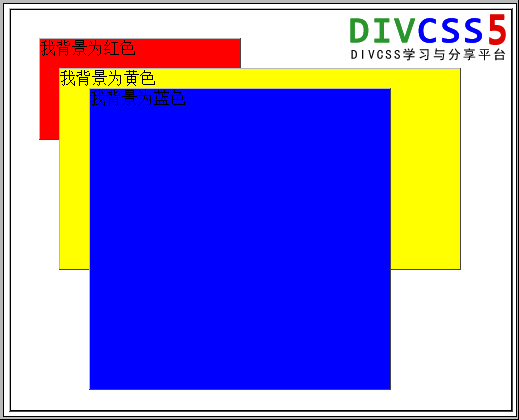
</html>2. Unarranged p stacking order p+css instance screenshot 
#Example description:
We use position to achieve absolute positioning, for the parent Set the position:relative attribute, and set position:absolute on its child plus left or right and top or bottom to achieve arbitrary positioning of the child within the parent. In the original case, the overlap is arranged in the order of the p code itself. The later the p box is entered, the closer it is to the front (floating on top). In addition to changing the order of the p code in the source code itself in html, we can also use css z-index to implement the p layer arrangement order.
2. Control p overlapping order through CSS
We use the above absolute positioning example code, only need to ".p-a", ".p-b", ".p-c" "Add z-index styles respectively to achieve any order.
Extended knowledge:
The value of z-index is a positive integer value. The larger the number, the more the object layer floats to the upper layer (the farther forward.
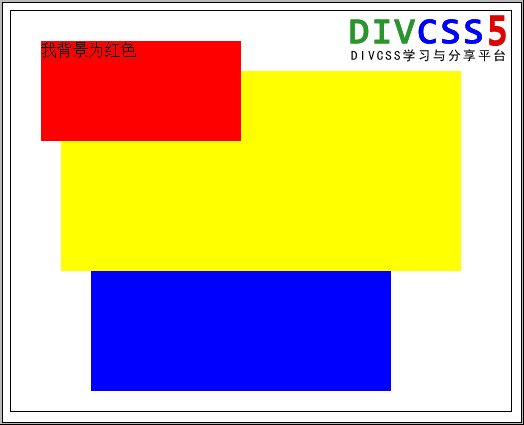
The default order of the above examples is ".p-c" floats on the top layer (blue background layer), ".p-b" floats on the middle layer (yellow background layer), and ".p-a" floats on the bottom layer (red background layer). We will use the z-index style next. The order is subverted without changing the html code. ".p-b" floats in the middle layer (yellow background layer) and the order remains unchanged. ".p-a" floats on the top layer (red background layer) and ".p-c" floats on the bottom layer (blue background layer). Color background layer).
1. Complete HTML code to arrange p cascading and overlapping order as desired:
<!DOCTYPE html>
<html>
<head>
<meta charset="utf-8" />
<title>p重叠 叠加实例 排层叠顺序 www.jb51.net</title>
<style>
.p-relative{position:relative;color:#000;border:1px solid #000;width:500px;height:400px}
.p-a{ position:absolute;left:30px;top:30px;z-index:100;background:#F00;width:200px;height:100px}
/* p背景色为红色 */
.p-b{ position:absolute;left:50px;top:60px;z-index:80;background:#FF0;width:400px;height:200px}
/* 背景为黄色 */
.p-c{ position:absolute;left:80px;top:80px;z-index:70;background:#00F;width:300px;height:300px}
/* 背景为蓝色 */
</style>
</head>
<body>
<p class="p-relative">
<p class="p-a">我背景为红色</p>
<p class="p-b">我背景为黄色</p>
<p class="p-c">我背景为蓝色</p>
</p>
</body>
</html>
2. Screenshots of examples of p stacking order
Screenshots of examples of replacing "p-a" with red background and "p-c" with blue background
We are not Change the HTML code of the first example, implement absolute positioning of "p-a", "p-b", and "p-c" and then add z-index to change the stacking order. 3. p Overlap Summary
To achieve p overlapping and change the overlapping order of p boxes, we use position:relative for the parent and position:absolute, z-index (overlapping order), left, right for the child. , top, bottom absolute positioning is equivalent to the specific position of the parent.
The above is the detailed content of Introduction to the random overlap method of implementing p using CSS. For more information, please follow other related articles on the PHP Chinese website!


