

Recommended 10 flexible box source codes (collection)
Add display: flex/inline-flex to the parent container. The attributes that can be used by the parent container are: 1.flex-direction: There are four attribute values that determine the direction of the main axis: row (default value): the main axis is the horizontal direction, the starting point At the left end. row-reverse: The main axis is horizontal and the starting point is at the right end. column: The main axis is vertical, and the starting point is at the upper edge. column-reverse: The main axis is vertical and the starting point is at the lower edge. 2.flex-wrap: If one axis line cannot be arranged, how to wrap it. There are 3 attribute values: nowrap (default): no line wrapping. When the parent container is not wide enough, each item will be squeezed appropriately. wrap: wrap, the first line is at the top of the parent container. wrap-reverse: wrap, the first line is at the bottom of the parent container. 3.flex-flow: The attribute is the abbreviation of the flex-direction attribute and the flex-wrap attribute. The default value is row nowrap. 4.justify-content: Defines the alignment of the item on the main axis. There are
1. Detailed introduction to the use of H5 flexible box layout (parent container attributes)

Introduction: This article introduces some properties of the html5 flexible box in detail, and uses examples to illustrate how to use the flexible box for layout.
2. Detailed explanation of the CSS flex-flow property of the Flexible flexible box model

Introduction: This article introduces the detailed explanation of the CSS flex-flow property of the Flexible flexible box model
3. The CSS flex- of the Flexible flexible box model direction attribute

Introduction: This article introduces the CSS flex-direction attribute of the Flexible flexible box model
4. Flexible Flexible Box Model CSS align-items attribute

Introduction: This article mainly introduces the CSS align-items property of the Flexible flexible box model
5. The CSS align-self property of the Flexible flexible box model

Introduction: This article mainly introduces the CSS align-self attribute of the Flexible elastic box model
6. Flexible Flexible Box Model CSS justify-content property
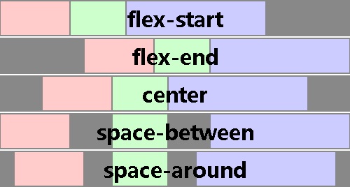
Introduction: This article mainly introduces the CSS justify-content property of the Flexible flexible box model
7. The CSS order property of the Flexible flexible box model

Introduction: This article mainly introduces the CSS order attribute of the Flexible elastic box model
##Introduction: 【CSS3】 CSS3: Flex Box
9. Flexible box layout in css3

Introduction: In CSS 3, the CSS Flexible Box module is a very important module, which is used to implement page layout processing in a very flexible way. Although other CSS style properties can be used to implement page layout processing, if you use the flexible box layout technology defined in the CSS Flexible Box module, the display mode of each local area in the page can be automatically adjusted according to the screen size or browser window size, that is, Very flexible layout handling. Although the CSS Flexible Box module has been announced for several years, the content defined in the module has undergone several major revisions since its initial release. The currently announced official version is ◦CSS
10. CSS Flexbox Flexbox Layout Detailed Explanation_html/css_WEB-ITnose
Introduction: Detailed explanation of CSS Flexbox Flexbox layout
[Related Q&A recommendations]:
The above is the detailed content of Recommended 10 flexible box source codes (collection). For more information, please follow other related articles on the PHP Chinese website!

Hot AI Tools

Undresser.AI Undress
AI-powered app for creating realistic nude photos

AI Clothes Remover
Online AI tool for removing clothes from photos.

Undress AI Tool
Undress images for free

Clothoff.io
AI clothes remover

AI Hentai Generator
Generate AI Hentai for free.

Hot Article
Hot Tools

Notepad++7.3.1
Easy-to-use and free code editor

SublimeText3 Chinese version
Chinese version, very easy to use

Zend Studio 13.0.1
Powerful PHP integrated development environment

Dreamweaver CS6
Visual web development tools

SublimeText3 Mac version
God-level code editing software (SublimeText3)
Hot Topics
 1377
1377
 52
52

 What is the purpose of the <progress> element?
Mar 21, 2025 pm 12:34 PM
What is the purpose of the <progress> element?
Mar 21, 2025 pm 12:34 PM
The article discusses the HTML <progress> element, its purpose, styling, and differences from the <meter> element. The main focus is on using <progress> for task completion and <meter> for stati
 What is the purpose of the <datalist> element?
Mar 21, 2025 pm 12:33 PM
What is the purpose of the <datalist> element?
Mar 21, 2025 pm 12:33 PM
The article discusses the HTML <datalist> element, which enhances forms by providing autocomplete suggestions, improving user experience and reducing errors.Character count: 159
 What is the purpose of the <meter> element?
Mar 21, 2025 pm 12:35 PM
What is the purpose of the <meter> element?
Mar 21, 2025 pm 12:35 PM
The article discusses the HTML <meter> element, used for displaying scalar or fractional values within a range, and its common applications in web development. It differentiates <meter> from <progress> and ex
 What are the best practices for cross-browser compatibility in HTML5?
Mar 17, 2025 pm 12:20 PM
What are the best practices for cross-browser compatibility in HTML5?
Mar 17, 2025 pm 12:20 PM
Article discusses best practices for ensuring HTML5 cross-browser compatibility, focusing on feature detection, progressive enhancement, and testing methods.
 How do I use HTML5 form validation attributes to validate user input?
Mar 17, 2025 pm 12:27 PM
How do I use HTML5 form validation attributes to validate user input?
Mar 17, 2025 pm 12:27 PM
The article discusses using HTML5 form validation attributes like required, pattern, min, max, and length limits to validate user input directly in the browser.
 What is the viewport meta tag? Why is it important for responsive design?
Mar 20, 2025 pm 05:56 PM
What is the viewport meta tag? Why is it important for responsive design?
Mar 20, 2025 pm 05:56 PM
The article discusses the viewport meta tag, essential for responsive web design on mobile devices. It explains how proper use ensures optimal content scaling and user interaction, while misuse can lead to design and accessibility issues.
 What is the purpose of the <iframe> tag? What are the security considerations when using it?
Mar 20, 2025 pm 06:05 PM
What is the purpose of the <iframe> tag? What are the security considerations when using it?
Mar 20, 2025 pm 06:05 PM
The article discusses the <iframe> tag's purpose in embedding external content into webpages, its common uses, security risks, and alternatives like object tags and APIs.
 Gitee Pages static website deployment failed: How to troubleshoot and resolve single file 404 errors?
Apr 04, 2025 pm 11:54 PM
Gitee Pages static website deployment failed: How to troubleshoot and resolve single file 404 errors?
Apr 04, 2025 pm 11:54 PM
GiteePages static website deployment failed: 404 error troubleshooting and resolution when using Gitee...
