

Detailed explanation of css3 flex layout examples

flex Layout is the most frequently used and outstanding function in css3. It is a bit complicated. It is divided into attributes applied to the container and attributes on the project, that is, on the parent element. of and attributes on child elements.
Attributes on the parent element
-
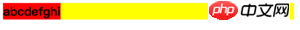
display: flex
<style>p{display: flex; background-color: yellow;}b{background-color: red;}</style><body> <p> <b>a</b><b>b</b><b>c</b><b>d</b><b>e</b><b>f</b><b>g</b><b>h</b><b>i</b> </p></body>Copy after loginWhen the parent element is set to
flexAfter, its parent element itself will appear as a block-level element. If you want to appear as an inline element, you can useinline-flex. All child elements, whether block-level or inline, will immediately become inline layout. This is due to the default values of other attributes and can be modified later.
- ##flex-
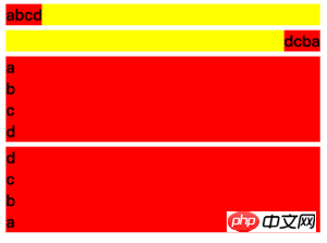
<style>p{display: flex; background-color: yellow; margin: 5px;}p.row{ flex-direction: row;}p.row-reverse{ flex-direction: row-reverse;}p.column{ flex-direction: column;}p.column-reverse{ flex-direction: column-reverse;}b{background-color: red;}</style><body> <p class="row"> <b>a</b><b>b</b><b>c</b><b>d</b> </p> <p class="row-reverse"> <b>a</b><b>b</b><b>c</b><b>d</b> </p> <p class="column"> <b>a</b><b>b</b><b>c</b><b>d</b> </p> <p class="column-reverse"> <b>a</b><b>b</b><b>c</b><b>d</b> </p></body>Copy after loginflex-direction
Decision Arrangement direction of child elements, default valuerow.##flex-wrap - flex-wrap
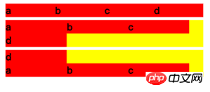
<style>p{display: flex; background-color: yellow; margin: 5px; }p.nowrap{ flex-wrap: nowrap;}p.wrap{ flex-wrap: wrap;}p.wrap-reverse{ flex-wrap: wrap-reverse;}b{background-color: red; width: 100px;}</style><body> <p class="nowrap"> <b>a</b><b>b</b><b>c</b><b>d</b> </p> <p class="wrap"> <b>a</b><b>b</b><b>c</b><b>d</b> </p> <p class="wrap-reverse"> <b>a</b><b>b</b><b>c</b><b>d</b> </p></body>Copy after loginDetermines how the child element should be handled when it exceeds one line. The default value
nowrapwill compress the width of child elements,wrapwill wrap a new line, andwrap-reversewill add a new line upwards. Note: This is discussed under the premise that the main axis is the X-axis.
##justify-content justify-content
Determines whether the child element is on the main axis (currently the X axis ), the default value isflex-start
. The distance betweenspace-betweenandspace-aroundis divided equally by the excess space, but the latter will also count the space for the left and right ends.##align-items<style>b{background-color: red; width: 40px;}b:nth-child(1){}b:nth-child(2){font-size: 30px; height: 40px;}b:nth-child(3){height: 50px;}b:nth-child(4){height: 60px;}p{display: flex; flex-wrap: wrap; background-color: yellow; margin: 5px; }p.start{ align-items: flex-start;}p.end{ align-items: flex-end;}p.center{ align-items: center;}p.baseline{ align-items: baseline;}p.stretch{ align-items: stretch;}</style><body> <p class="start"> <b>a</b><b>b</b><b>c</b><b>d</b> </p> <p class="end"> <b>a</b><b>b</b><b>c</b><b>d</b> </p> <p class="center"> <b>a</b><b>b</b><b>c</b><b>d</b> </p> <p class="baseline"> <b>a</b><b>b</b><b>c</b><b>d</b> </p> <p class="stretch"> <b>a</b><b>b</b><b>c</b><b>d</b> </p></body>Copy after login- align-items
Determine the secondary axis (currently the Y axis) The alignment of elements. The default value
stretchmeans that when the child element does not set a height, it will fill the height of the parent class.
align-content<style>b{background-color: red; width: 100px;}p{display: flex; flex-wrap: wrap; background-color: yellow; margin: 5px; height: 70px;}p.start{ align-content: flex-start;}p.end{ align-content: flex-end;}p.center{ align-content: center;}p.space-between{ align-content: space-between;}p.space-around{ align-content: space-around;}p.stretch{ align-content: stretch;}</style><body> <p class="start"> <b>a</b><b>b</b><b>c</b><b>d</b> </p> <p class="end"> <b>a</b><b>b</b><b>c</b><b>d</b> </p> <p class="center"> <b>a</b><b>b</b><b>c</b><b>d</b> </p> <p class="space-between"> <b>a</b><b>b</b><b>c</b><b>d</b> </p> <p class="space-around"> <b>a</b><b>b</b><b>c</b><b>d</b> </p> <p class="stretch"> <b>a</b><b>b</b><b>c</b><b>d</b> </p></body>Copy after login - align-content
indicates that when the child element has multiple lines, each line Position on the secondary axis (currently the Y axis). The default value
stretchmeans changing the height of each row of child elements until the parent element is filled.
Attributes on child elements
<style>b{background-color: red; }p{display: flex; background-color: yellow; margin: 5px; }p.start{ justify-content: flex-start;}p.end{justify-content: flex-end;}p.center{ justify-content: center;}p.space-between{ justify-content: space-between;}p.space-around{ justify-content: space-around;}</style><body> <p class="start"> <b>a</b><b>b</b><b>c</b><b>d</b> </p> <p class="end"> <b>a</b><b>b</b><b>c</b><b>d</b> </p> <p class="center"> <b>a</b><b>b</b><b>c</b><b>d</b> </p> <p class="space-between"> <b>a</b><b>b</b><b>c</b><b>d</b> </p> <p class="space-around"> <b>a</b><b>b</b><b>c</b><b>d</b> </p></body>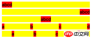 ##align-items
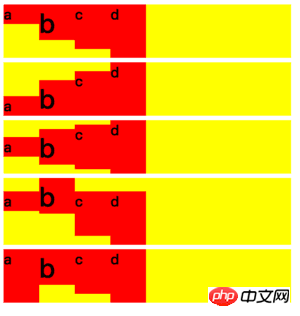 align-content
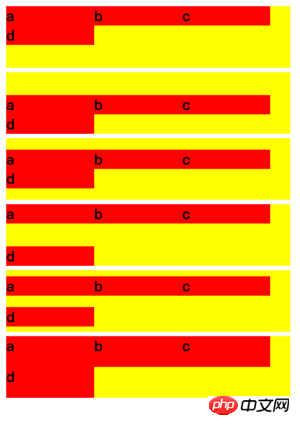 Attributes on child elements
order
<style>p{display: flex; background-color: yellow; margin: 5px;}b{background-color: red; }b.test{order: -1;}</style><body> <p class="start"> <b>a</b><b>b</b><b class="test">c</b><b>d</b> </p></body>- order
means arranging elements of the same level from small to large, the default value is
0.
##flex-grow
<style>p{display: flex; background-color: yellow; margin: 5px;}b{background-color: red; }b.test{flex-grow: 1; background-color: green;}</style><body> <p class="start"> <b>a</b><b>b</b><b class="test">c</b><b>d</b> </p></body>Copy after loginflex-grow - means when the main axis (currently the X axis) is on When there is remaining space, the proportion occupied by dividing the space equally. The default value is
0
, which means it does not occupy space. The current space bisection ratio is0 : 0 : 1 : 0
##flex-shrink, so c occupies all remaining space.<style>p{display: flex; background-color: yellow; margin: 5px;}b{background-color: red; width: 100px; flex-shrink: 0;}b.test{flex-shrink: 1; background-color: green;}</style><body> <p class="start"> <b>a</b><b>b</b><b class="test">c</b><b>d</b> </p></body>Copy after loginflex-shrink means when the main axis (currently the X axis) space When it is not enough to fill all the sub-elements, how should the sub-elements be compressed? The default value is - 1
, which means
1 : 1 : 1 : 1, that is, equal-ratio compression. The current ratio is
0: 0: 1: 0, indicating that all space is compressed by c.##flex-basis<style>p{display: flex; background-color: yellow; margin: 5px;}b{background-color: red; flex-grow: 1;}b.test{flex-basis: 100px; background-color: green;}</style><body> <p class="start"> <b>a</b><b>b</b><b class="test">c</b><b>d</b> </p></body>Copy after login
means when the main axis (currently the X axis) is on The position occupied before dividing the space equally. When the main axis is the X-axis, it is equivalent to settingflex-basis width - . When the main axis is the Y-axis, it is equivalent to setting
height
. The default valueauto
means equal towidthorheight.##align-self<style>p{display: flex; background-color: yellow; margin: 5px;}b{background-color: red; flex-grow: 1;}b:nth-child(1){height: 20px;}b:nth-child(2){height: 40px;}b:nth-child(3){height: 50px;}b:nth-child(4){height: 60px;}b.test{align-self: flex-end; background-color: green;}</style><body> <p class="start"> <b>a</b><b>b</b><b class="test">c</b><b>d</b> </p></body>Copy after loginalign-self表示当前元素可以覆盖父元素align-items所决定的副轴(当前为Y轴)上的方向。默认auto,即不设置。可选择与align-items一致,auto | flex-start | flex-end | center | baseline | stretch。
 flex-shrink
 flex-basis
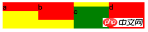
特别注意,为简化布局理解,上面事例都使用了默认的 flex-direction:row 作为子元素排序方向为基础。如果改为 flex-direction:column ,主轴将为变成 Y 轴,而副轴将变成 X 轴,所有属性的效果将会改变,这个留给读者自行实践。
学习过程中遇到什么问题或者想获取学习资源的话,欢迎加入学习交流群
343599877,我们一起学前端!
The above is the detailed content of Detailed explanation of css3 flex layout examples. For more information, please follow other related articles on the PHP Chinese website!

Hot AI Tools

Undresser.AI Undress
AI-powered app for creating realistic nude photos

AI Clothes Remover
Online AI tool for removing clothes from photos.

Undress AI Tool
Undress images for free

Clothoff.io
AI clothes remover

AI Hentai Generator
Generate AI Hentai for free.

Hot Article
Hot Tools

Notepad++7.3.1
Easy-to-use and free code editor

SublimeText3 Chinese version
Chinese version, very easy to use

Zend Studio 13.0.1
Powerful PHP integrated development environment

Dreamweaver CS6
Visual web development tools

SublimeText3 Mac version
God-level code editing software (SublimeText3)
Hot Topics
 1386
1386
 52
52

 How to use bootstrap in vue
Apr 07, 2025 pm 11:33 PM
How to use bootstrap in vue
Apr 07, 2025 pm 11:33 PM
Using Bootstrap in Vue.js is divided into five steps: Install Bootstrap. Import Bootstrap in main.js. Use the Bootstrap component directly in the template. Optional: Custom style. Optional: Use plug-ins.
 The Roles of HTML, CSS, and JavaScript: Core Responsibilities
Apr 08, 2025 pm 07:05 PM
The Roles of HTML, CSS, and JavaScript: Core Responsibilities
Apr 08, 2025 pm 07:05 PM
HTML defines the web structure, CSS is responsible for style and layout, and JavaScript gives dynamic interaction. The three perform their duties in web development and jointly build a colorful website.
 How to write split lines on bootstrap
Apr 07, 2025 pm 03:12 PM
How to write split lines on bootstrap
Apr 07, 2025 pm 03:12 PM
There are two ways to create a Bootstrap split line: using the tag, which creates a horizontal split line. Use the CSS border property to create custom style split lines.
 Understanding HTML, CSS, and JavaScript: A Beginner's Guide
Apr 12, 2025 am 12:02 AM
Understanding HTML, CSS, and JavaScript: A Beginner's Guide
Apr 12, 2025 am 12:02 AM
WebdevelopmentreliesonHTML,CSS,andJavaScript:1)HTMLstructurescontent,2)CSSstylesit,and3)JavaScriptaddsinteractivity,formingthebasisofmodernwebexperiences.
 How to resize bootstrap
Apr 07, 2025 pm 03:18 PM
How to resize bootstrap
Apr 07, 2025 pm 03:18 PM
To adjust the size of elements in Bootstrap, you can use the dimension class, which includes: adjusting width: .col-, .w-, .mw-adjust height: .h-, .min-h-, .max-h-
 How to set up the framework for bootstrap
Apr 07, 2025 pm 03:27 PM
How to set up the framework for bootstrap
Apr 07, 2025 pm 03:27 PM
To set up the Bootstrap framework, you need to follow these steps: 1. Reference the Bootstrap file via CDN; 2. Download and host the file on your own server; 3. Include the Bootstrap file in HTML; 4. Compile Sass/Less as needed; 5. Import a custom file (optional). Once setup is complete, you can use Bootstrap's grid systems, components, and styles to create responsive websites and applications.
 How to insert pictures on bootstrap
Apr 07, 2025 pm 03:30 PM
How to insert pictures on bootstrap
Apr 07, 2025 pm 03:30 PM
There are several ways to insert images in Bootstrap: insert images directly, using the HTML img tag. With the Bootstrap image component, you can provide responsive images and more styles. Set the image size, use the img-fluid class to make the image adaptable. Set the border, using the img-bordered class. Set the rounded corners and use the img-rounded class. Set the shadow, use the shadow class. Resize and position the image, using CSS style. Using the background image, use the background-image CSS property.
 How to use bootstrap button
Apr 07, 2025 pm 03:09 PM
How to use bootstrap button
Apr 07, 2025 pm 03:09 PM
How to use the Bootstrap button? Introduce Bootstrap CSS to create button elements and add Bootstrap button class to add button text
