

Create apple TV poster parallax effect using CSS3 and jQuery
Use CSS and jQuery to implement it, try to look the same as the original effect.
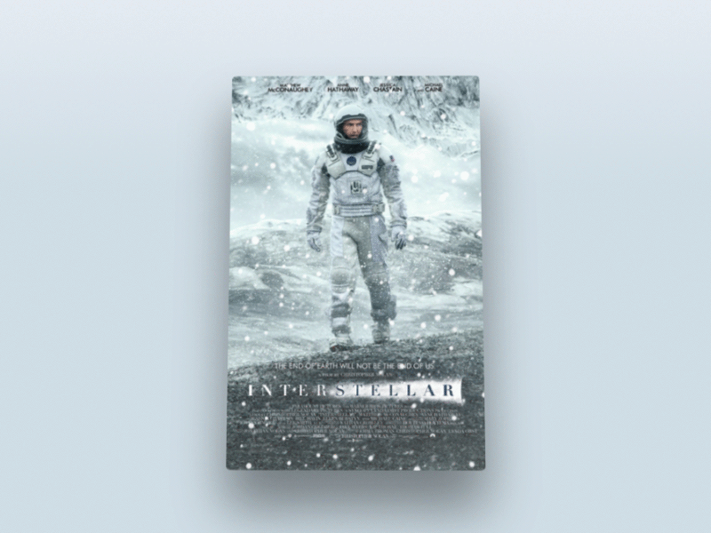
In this tutorial, I will use CSS, HTML and jQuery to create an approximate Apple TV parallax effect. If you Reading this, I assume you have a basic understanding of the above three techniques.
Without further ado, let’s start the first part.
HTML page
Our page structure is as follows:
<div class="poster">  <div class="shine"></div>
  <div class="layer-1"></div>
  <div class="layer-2"></div>
  <div class="layer-3"></div>
  <div class="layer-4"></div>
  <div class="layer-5"></div>
</div>
First, we need a div# with the style class .poster ##, this div contains 5 other style layers div. On top of these five layers div there is a shine div to add some sparkle.
body part of the web page is the entire page height:
body, html { height: 100%; min-height: 100%; }body Some background gradient colors:
body { background: linear-gradient(to bottom, #f6f7fc 0%,#d5e1e8 40%); }.poster a 3D rotation effect, the parent container needs to set perspective and transformation effects. As we can see, the parent container of div is body itself, so add the following CSS code:
body {background: linear-gradient(to bottom, #f6f7fc 0%,#d5e1e8 40%);transform-style: preserve-3d;transform: perspective(800px);
}.poster {width: 320px;height: 500px;position: absolute;top: 50%; left: 50%;margin: -250px 0 0 -160px;border-radius: 5px;box-shadow: 0 45px 100px rgba(0, 0, 0, 0.4);overflow:hidden;
}position to absolute, top:50% , 'left:50%', the upper margin value is a negative number that is half the height of div, and the left margin value is div A negative number that is half the width. What needs to be remembered is that the center of .poster is also the center of the entire page.

Shadow effect
div[class *= 'layer-']
.poster has been designed, let’s see the effect.
div that contain "layer-" in their class names.
position value of all layers to absolute, and the background-repeat value to no-repeat , background-position is top left, and the size of the layer background is 100% width and automatic height.
div[class*="layer-"] {position: absolute;top: -10px; left: -10px;right: -10px; bottom: -10px;background-size: 100% auto;background-repeat: no-repeat;background-position: 0 0;transition:0.1s;
}top,left,right,bottom are all -10px, the purpose is to make The size of the layer is 20px larger than poster, so that when inspecting the effects of each layer, the edges of the layer will not be visible.
.layer-1 {background-image: url('http://designmodo.com/demo/apple-tv-parallax/images/1.png');
}.layer-2 {background-image: url('http://designmodo.com/demo/apple-tv-parallax/images/2.png');
}.layer-3 {top: 0; bottom: 0;left: 0; right: 0;background-image: url('http://designmodo.com/demo/apple-tv-parallax/images/3.png');
}.layer-4 {background-image: url('http://designmodo.com/demo/apple-tv-parallax/images/4.png');
}.layer-5 {background-image: url('http://designmodo.com/demo/apple-tv-parallax/images/5.png');
}layer-3 part, the layer will not move, so the size does not need to be too large.

Complete static effect
JavaScript部分
在开始之前,请确保已经引入了jQuery库,否则会报错的。
视差效果的逻辑是这样的,每当鼠标移动的时候,根据光标的位置,.poster 的 transforms:translateY,rotate,rotateY 属性将会改变。光标距离页面左上角越远,动画的效果越明显。
公式就类似于这样的:offsetX=0.5-光标距离页面顶端的位置/宽度。
为了每个元素的值都不一样,将给每一个光标公式返回的值乘以一个自定义的值,返回HTML的代码给每个会有动画的层元素添加 data-offset=数字 的属性。
<div data-offset="15" class="poster">
    <div class="shine"></div>
    <div data-offset="-2" class="layer-1"></div>
    <div class="layer-2"></div>
    <div data-offset="1" class="layer-3"></div>
    <div data-offset="3" class="layer-4"></div>
    <div data-offset="10" class="layer-5"></div>
</div>每一个 .layers 的规则都相同,但是我们给他们应用到 translateY 和 translateX 属性上。
data-offset 属性的值越大,动画的效果越明显,可以改变这些值体验下。
为了代码可读性,我们在JavaScript里给 .poster 赋值给 $poster 变量,.shine 给 $shine 变量,$layer 变量代表所有层,w,h代表页面的宽度和高度。
var $poster = $('.poster'),$shine = $('.shine'),$layer = $('div[class*="layer-"]’);
现在,需要考虑下当光标移动的时候获取到光标位置的问题。我们可以用 $(window) 的 mousemove 事件来实现,这个事件会返回一个JavaScript对象,含有我们需要的位置信息和其他一些我们暂时还用不到的变量。
$(window).on('mousemove', function(e) {var w=e.currentTarget.innerWidth,h=e.currentTarget.innerHeight;var offsetX = 0.5 - e.pageX / w, /* where e.pageX is our cursor X coordinate */
    offsetY = 0.5 - e.pageY / h,
    offsetPoster = $poster.data('offset'), /* custom value for animation depth */
    transformPoster = 'translateY(' + -offsetX * offsetPoster + 'px) rotateX(' + (-offsetY * offsetPoster) + 'deg) rotateY(' + (offsetX * (offsetPoster * 2)) + 'deg)';/* apply transform to $poster */
    $poster.css('transform', transformPoster);/* parallax foreach layer *//* loop thought each layer *//* get custom parallax value *//* apply transform */
    $layer.each(function() {var $this = $(this);var offsetLayer = $this.data('offset') || 0; /* get custom parallax value, if element docent have data-offset, then its 0 */var transformLayer = 'translateX(' + offsetX * offsetLayer + 'px) translateY(' + offsetY * offsetLayer + 'px)';

        $this.css('transform', transformLayer);
    });
});下一步,就是用上面解释的公式来计算offsetY和offsetX的值,然后就是把视差效果应用到.posert和每一个海报层。
非常酷啊,现在我们就有了一个有视差效果的小部件了。

但是还没完,海报上的光泽部分还没设置
现在回到CSS部分,给.shine div 绝对定位,添加一个渐变颜色效果,设置z-index属性值为100,让它在所有层的上面。
.shine {position: absolute;top: 0; left: 0; right: 0; bottom: 0;background: linear-gradient(90deg, rgba(255,255,255,.5) 0%,rgba(255,255,255,0) 60%);z-index: 100;
}已经有了一个漂亮的闪光层在海报上,但是为了达到更逼真的效果,光照应该随着光标的移动而变化。

我们怎么做呢?可能你还记得无聊的初三数学课,当你想着你在学一些你从来都不会用到的公式的时候,我们现在就用到了。
所以,倾斜的角度应该等于光标与海报中心形成三角形的角度的相反值。(还记得吧,海报的中心就是整个页面的中心啊,也就是页面宽度和高度的二分之一)

首先,找到光标与页面中心形成的三角形的直角边,光标与中心连线后作出一个直角三角形。
然后用 Math.atan2() 函数得到中心点的角度值。注意这个函数的返回值使用弧度值来表示的,所以我们得在CSS中转换成角的度数,用以下公式:
弧度值*180/pi = 角度值
var $poster = $('.poster');var $shine = $('.shine');var $layer = $('div[class *= "layer-"]');

    $poster.data("offset",15);

    $(window).on('mousemove', function(e) {var w=e.currentTarget.innerWidth,h=e.currentTarget.innerHeight;var offsetX = 0.5 - e.pageX / w, /* where e.pageX is our cursor X coordinate */
        offsetY = 0.5 - e.pageY / h,
        offsetPoster = $poster.data('offset'), /* custom value for animation depth */
        transformPoster = 'translateY(' + -offsetX * offsetPoster + 'px) rotateX(' + (-offsetY * offsetPoster) + 'deg) rotateY(' + (offsetX * (offsetPoster * 2)) + 'deg)';

        dy = e.pageY - h / 2,
        dx = e.pageX - w / 2,
        theta = Math.atan2(dy,dx), /* get angle in radians */
        angle = theta * 180 / Math.PI; /* convert rad in degrees *//* apply transform to $poster */
        $poster.css('transform', transformPoster);/* parallax foreach layer *//* loop thought each layer *//* get custom parallax value *//* apply transform */
        $layer.each(function() {var $this = $(this);var offsetLayer = $this.data('offset') || 0; /* get custom parallax value, if element docent have data-offset, then its 0 */var transformLayer = 'translateX(' + offsetX * offsetLayer + 'px) translateY(' + offsetY * offsetLayer + 'px)';

            $this.css('transform', transformLayer);
        });
});你会发现角度值的范围是从-180到180度,以下代码修复这个问题让角度值从0-360度:
if (angle < 0) {angle = angle + 360;
}现在角度有了,就可以随着光标的移动来动态改变渐变颜色的角度值:
<code class="lsl">$shine.css('background', 'linear-gradient(' + (angle - <span class="hljs-number">90) + 'deg, rgba(<span class="hljs-number">255,<span class="hljs-number">255,<span class="hljs-number">255,' + e.pageY / h + ') <span class="hljs-number">0%,rgba(<span class="hljs-number">255,<span class="hljs-number">255,<span class="hljs-number">255,<span class="hljs-number">0) <span class="hljs-number">80%)');<br/><br/></span></span></span></span></span></span></span></span></span></span></code>
学习过程中遇到什么问题或者想获取学习资源的话,欢迎加入学习交流群
343599877,我们一起学前端!
注意 :减去90度的原因是 linear-gradient 属性的需要,如果你使用 -webkit-linear-gradient,-moz-linear-gradient属性就没有必要。
转译
The above is the detailed content of Create apple TV poster parallax effect using CSS3 and jQuery. For more information, please follow other related articles on the PHP Chinese website!

Hot AI Tools

Undresser.AI Undress
AI-powered app for creating realistic nude photos

AI Clothes Remover
Online AI tool for removing clothes from photos.

Undress AI Tool
Undress images for free

Clothoff.io
AI clothes remover

AI Hentai Generator
Generate AI Hentai for free.

Hot Article
Hot Tools

Notepad++7.3.1
Easy-to-use and free code editor

SublimeText3 Chinese version
Chinese version, very easy to use

Zend Studio 13.0.1
Powerful PHP integrated development environment

Dreamweaver CS6
Visual web development tools

SublimeText3 Mac version
God-level code editing software (SublimeText3)
Hot Topics
 1359
1359
 52
52

 How to remove the default style in Bootstrap list?
Apr 07, 2025 am 10:18 AM
How to remove the default style in Bootstrap list?
Apr 07, 2025 am 10:18 AM
The default style of the Bootstrap list can be removed with CSS override. Use more specific CSS rules and selectors, follow the "proximity principle" and "weight principle", overriding the Bootstrap default style. To avoid style conflicts, more targeted selectors can be used. If the override is unsuccessful, adjust the weight of the custom CSS. At the same time, pay attention to performance optimization, avoid overuse of !important, and write concise and efficient CSS code.
 How to do PS gradient color picker
Apr 06, 2025 pm 10:09 PM
How to do PS gradient color picker
Apr 06, 2025 pm 10:09 PM
Gradient color pickers give designers the flexibility to extract and create gradients from images. It simplifies gradient creation, ensures accuracy, inspires, improves efficiency and provides cross-platform support, and covers a wide range of applications including websites, graphic design, UI/UX design and digital art.
 Does the image centering support image zooming?
Apr 07, 2025 am 07:42 AM
Does the image centering support image zooming?
Apr 07, 2025 am 07:42 AM
How to achieve image centering and scaling in Bootstrap: Use d-flex justify-content-center to center images horizontally. Use align-items-center and fixed parent element height vertically center the image. Use the width and height attributes to control the image size, or use max-width and max-height to limit the maximum size. Use the img-fluid class or responsive design mechanism, such as media queries, to achieve responsive scaling. Optimize image size, control scaling using the object-fit attribute, and follow best practices to ensure performance and maintainability.
 How to build a bootstrap framework
Apr 07, 2025 pm 12:57 PM
How to build a bootstrap framework
Apr 07, 2025 pm 12:57 PM
To create a Bootstrap framework, follow these steps: Install Bootstrap via CDN or install a local copy. Create an HTML document and link Bootstrap CSS to the <head> section. Add Bootstrap JavaScript file to the <body> section. Use the Bootstrap component and customize the stylesheet to suit your needs.
 How to view Bootstrap's grid system
Apr 07, 2025 am 09:48 AM
How to view Bootstrap's grid system
Apr 07, 2025 am 09:48 AM
Bootstrap's mesh system is a rule for quickly building responsive layouts, consisting of three main classes: container (container), row (row), and col (column). By default, 12-column grids are provided, and the width of each column can be adjusted through auxiliary classes such as col-md-, thereby achieving layout optimization for different screen sizes. By using offset classes and nested meshes, layout flexibility can be extended. When using a grid system, make sure that each element has the correct nesting structure and consider performance optimization to improve page loading speed. Only by in-depth understanding and practice can we master the Bootstrap grid system proficiently.
 How to view the CSS style of Bootstrap
Apr 07, 2025 am 10:24 AM
How to view the CSS style of Bootstrap
Apr 07, 2025 am 10:24 AM
How to view Bootstrap CSS: Using Browser Developer Tools (F12). Find the "Elements" or "Inspector" tab and find the Bootstrap component. View the CSS styles that the component applies in the Styles panel. Developer tools can be used to filter styles or debug code to gain insight into how it works. Proficient in developer tools and avoid detours.
 How to set the bootstrap navigation bar
Apr 07, 2025 pm 01:51 PM
How to set the bootstrap navigation bar
Apr 07, 2025 pm 01:51 PM
Bootstrap provides a simple guide to setting up navigation bars: Introducing the Bootstrap library to create navigation bar containers Add brand identity Create navigation links Add other elements (optional) Adjust styles (optional)
 How to layout bootstrap
Apr 07, 2025 pm 02:24 PM
How to layout bootstrap
Apr 07, 2025 pm 02:24 PM
To use Bootstrap to layout a website, you need to use a grid system to divide the page into containers, rows, and columns. First add the container, then add the rows in it, add the columns within the row, and finally add the content in the column. Bootstrap's responsive layout function automatically adjusts the layout according to breakpoints (xs, sm, md, lg, xl). Different layouts under different screen sizes can be achieved by using responsive classes.
