

Detailed explanation of the box model in CSS

1. Box model
The so-called box model treats the elements in the HTML page as a rectangular box, which is a container that holds content. Each rectangle consists of the element's content, padding, border, and margin.
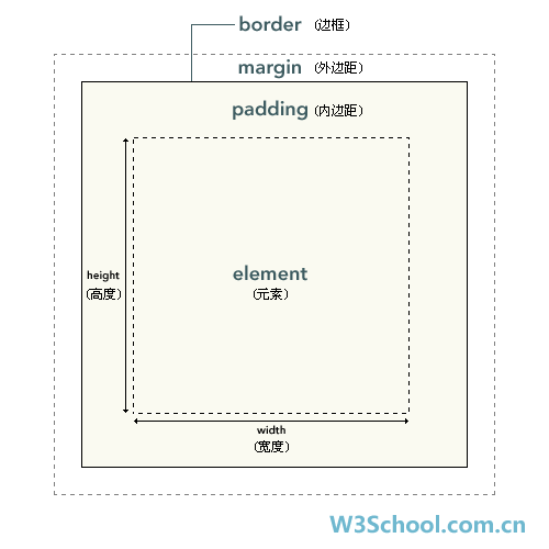
The formula is expressed as: Box = border + inner margin + content area + outer margin
The innermost part of the element box Part is the actual content, and what directly surrounds the content is the padding. Padding presents the element's background. The edge of the padding is the border. Outside the border is the margin, which is transparent by default and therefore does not obscure any elements behind it.
Note: The background is applied to the area consisting of content, padding, and borders.


You can see that the background color penetrates the content area, padding area and border.
Padding, borders, and margins are all optional, and the default value is zero. However, many elements will have margins and padding set by user-agent style sheets. These browser styles can be overridden by setting the element's margin and padding to zero. This can be done individually or using a universal selector for all elements:
* {margin: 0;padding: 0;
}In CSS, width and height refer to the width and height of the content area. Increasing padding, borders, and margins will not affect the size of the content area, but it will increase the overall size of the element's box.
2. Padding
The blank area between the border and the content area is called padding, which is defined by the padding attribute of CSS. You can use length values or percentage values, but they are not allowed. Use negative values (setting has no effect).
You can set the top, right, bottom, and left padding (clockwise) by using the following four separate properties.
padding-top
padding-right
padding-bottom
padding-left
For example:


padding attribute is a composite attribute
padding:10px; means up, down, left and right They all have a padding of 10px
padding:10px 12px; means setting a width of 10px for the top and bottom, and a width of 12px for the left and right
padding :10px 12px 13px 14px; Set the width of the top, right, bottom and left margins respectively
padding:10px 20px 5px; means the top margin is 10px, the left and right margins are 20px, and the bottom margin is 5px
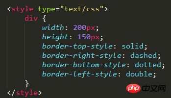
3. Border
The border of an element is one or more lines surrounding the content and padding of the element. The CSS border property allows you to specify the style, width, and color of an element's border.
3.1. Border style
You can use the following four properties to set the styles of the top, right, bottom, and left borders respectively (clockwise)
border-top-style
border-right-style
- ##border-bottom-style
- border-left-style

- border-top-width
- border-right-width
- border-bottom-width
- border-left-width


- border-top-color
- border-right-color
- border-bottom-color
- border-left-color


- margin-top
- margin-right
- margin-bottom
- margin-left


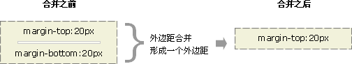
Margin merging (overlapping) is a fairly simple concept. However, it can cause a lot of confusion when laying out web pages in practice.
Simply put, margin merging means that when two vertical margins meet, they will form one margin. The height of the merged margin is equal to the greater of the heights of the two merged margins.
When an element appears above another element, the bottom margin of the first element and the top margin of the second element will be merged. Take a look at the image below:

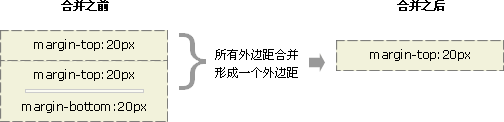
When an element is contained within another element (assuming there is no padding or border separating the margins), their top and /Or the bottom margin will also be merged. Take a look at the image below:

#Although it looks a little strange, margins can even merge with themselves.
Suppose there is an empty element, which has margins, but no borders or padding. In this case, the top margin and the bottom margin meet together, and they will merge:
If this margin meets the margin of another element , it will also merge:
This is why a series of paragraph elements take up very little space, because all their margins are merged together to form a Small margins.
Margin merging may seem a bit strange at first, but in reality, it makes sense. Take, for example, a typical text page consisting of several paragraphs. The space above the first paragraph is equal to the paragraph's top margin. Without margin merging, the margins between all subsequent paragraphs will be the sum of the adjacent top and bottom margins. This means the space between paragraphs is twice as large as the top of the page. If margin merging occurs, the top and bottom margins between paragraphs are merged together so that the distances everywhere are consistent.

Note: Margin merging will only occur for the vertical margins of block boxes in normal document flow. Margins between inline boxes, floated boxes, or absolutely positioned boxes are not merged.
The above is the detailed content of Detailed explanation of the box model in CSS. For more information, please follow other related articles on the PHP Chinese website!

Hot AI Tools

Undresser.AI Undress
AI-powered app for creating realistic nude photos

AI Clothes Remover
Online AI tool for removing clothes from photos.

Undress AI Tool
Undress images for free

Clothoff.io
AI clothes remover

Video Face Swap
Swap faces in any video effortlessly with our completely free AI face swap tool!

Hot Article
Hot Tools

Notepad++7.3.1
Easy-to-use and free code editor

SublimeText3 Chinese version
Chinese version, very easy to use

Zend Studio 13.0.1
Powerful PHP integrated development environment

Dreamweaver CS6
Visual web development tools

SublimeText3 Mac version
God-level code editing software (SublimeText3)
Hot Topics
 1386
1386
 52
52

 How to use bootstrap in vue
Apr 07, 2025 pm 11:33 PM
How to use bootstrap in vue
Apr 07, 2025 pm 11:33 PM
Using Bootstrap in Vue.js is divided into five steps: Install Bootstrap. Import Bootstrap in main.js. Use the Bootstrap component directly in the template. Optional: Custom style. Optional: Use plug-ins.
 The Roles of HTML, CSS, and JavaScript: Core Responsibilities
Apr 08, 2025 pm 07:05 PM
The Roles of HTML, CSS, and JavaScript: Core Responsibilities
Apr 08, 2025 pm 07:05 PM
HTML defines the web structure, CSS is responsible for style and layout, and JavaScript gives dynamic interaction. The three perform their duties in web development and jointly build a colorful website.
 How to write split lines on bootstrap
Apr 07, 2025 pm 03:12 PM
How to write split lines on bootstrap
Apr 07, 2025 pm 03:12 PM
There are two ways to create a Bootstrap split line: using the tag, which creates a horizontal split line. Use the CSS border property to create custom style split lines.
 Understanding HTML, CSS, and JavaScript: A Beginner's Guide
Apr 12, 2025 am 12:02 AM
Understanding HTML, CSS, and JavaScript: A Beginner's Guide
Apr 12, 2025 am 12:02 AM
WebdevelopmentreliesonHTML,CSS,andJavaScript:1)HTMLstructurescontent,2)CSSstylesit,and3)JavaScriptaddsinteractivity,formingthebasisofmodernwebexperiences.
 How to set up the framework for bootstrap
Apr 07, 2025 pm 03:27 PM
How to set up the framework for bootstrap
Apr 07, 2025 pm 03:27 PM
To set up the Bootstrap framework, you need to follow these steps: 1. Reference the Bootstrap file via CDN; 2. Download and host the file on your own server; 3. Include the Bootstrap file in HTML; 4. Compile Sass/Less as needed; 5. Import a custom file (optional). Once setup is complete, you can use Bootstrap's grid systems, components, and styles to create responsive websites and applications.
 How to insert pictures on bootstrap
Apr 07, 2025 pm 03:30 PM
How to insert pictures on bootstrap
Apr 07, 2025 pm 03:30 PM
There are several ways to insert images in Bootstrap: insert images directly, using the HTML img tag. With the Bootstrap image component, you can provide responsive images and more styles. Set the image size, use the img-fluid class to make the image adaptable. Set the border, using the img-bordered class. Set the rounded corners and use the img-rounded class. Set the shadow, use the shadow class. Resize and position the image, using CSS style. Using the background image, use the background-image CSS property.
 How to resize bootstrap
Apr 07, 2025 pm 03:18 PM
How to resize bootstrap
Apr 07, 2025 pm 03:18 PM
To adjust the size of elements in Bootstrap, you can use the dimension class, which includes: adjusting width: .col-, .w-, .mw-adjust height: .h-, .min-h-, .max-h-
 How to use bootstrap button
Apr 07, 2025 pm 03:09 PM
How to use bootstrap button
Apr 07, 2025 pm 03:09 PM
How to use the Bootstrap button? Introduce Bootstrap CSS to create button elements and add Bootstrap button class to add button text
