

Organize the usage of a tag

This is the method of using the a tag that I compiled when I was making a website. I organized it for easy use next time.
1. Code of a hyperlink
The analysis is as follows:
target
_blank -- Open the link in a new window
_parent - - Open the link in the parent form
_self -- Open the link in the current form, this is the default value
_top -- Open the link in the current form, and replace the current entire form (frame page)
title is followed by a description of the link target, which is a brief description of the URL being linked to the hyperlink, or the title
CSS can control the hyperlink style -css link styleas follows
a:link is the initial state of the hyperlink
a:hover is the state when the mouse is placed on it
a:active is the state when the mouse is clicked
a:visited is the state after the visit
2. Simple hyperlink style
1. Usually the method of styling hyperlinks for the entire site
a{color:#333;text-decoration:none; } // The color style of the text with links to the entire site is color:#333; and directly ununderlined text-decoration:none;
a:hover {color:#CC3300;text-decoration:underline;}//On the mouse position The text color style on the hyperlink changes to color:#CC3300; and the text link is underlined text-decoration:underline;
2. Control the hyperlink style css method by setting the class in the link
Case hyperlink code CSS
Corresponding CSS code
a.yangshi{color:#333;text-decoration :none; }
a.yangshi:hover {color:#CC3300;text-decoration:underline;}
Through this setting, you can control the style of the hyperlink with the css class name "yangshi" in the link
3. Control the style of the hyperlink through the css style of the css class corresponding to the parent outside the hyperlink
Case hyperlink code
Corresponding CSS code
.yangshi a{color:#333;text-decoration:none; }
.yangshi a:hover {color:#CC3300;text-decoration:underline;}
What is worth noting here is the difference in style css code between a.yangshi and .yangshi a
3. Basic understanding
Introducing the functions and explanations of these 4 common pseudo-classes
1. a:link
Set the a object before it has been accessed (has not been clicked and the mouse has not passed ) stylesheet properties. That is, the initial style of the content of the html a anchor text tag.
2. a:hover
Set the style sheet properties of the object when the mouse is hovering, that is, when the mouse has just passed the a tag and stayed on the A link.
3. a:active
Set the style sheet properties of the A object when it is activated by the user (an event that occurs between mouse click and release). That is, the short style effect between clicking the html A link object with the left mouse button and releasing the right mouse button.
4. a:visited
Set the style sheet attribute of the a object that has been visited when its link address has been visited. That is, the CSS style effect after the html a hyperlink text is clicked and accessed.
4. Application Usage Case
We set a hyperlink, set CSS style to it, and set its four style effects through CSS A. Learn CSS a anchor text style through a simple setting of css a style for text.
1. Case css code
style>
.divcss5 a:link{ color:#F00}/* The link is red by default */
.divcss5 a:hover{ color:#000} /* Black when the mouse is hovering */
- ##.divcss5 a:active{ color:#03F}/* Blue when the mouse is clicked and released */
- .divcss5 a:visited{ color:#F0F}/* Visited is pink */
- /* Set the style of a hyperlink in the divcss5 object */
style>
- ##div class="divcss5"> ##DIVCSS5About
- a
- >
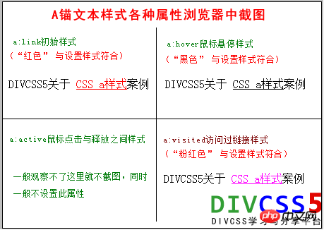
3. Screenshots from the case software

4. Screenshots of actual browser styles
Summary:
General a: The active style effect cannot be observed instantaneously, so there is no need to set it when using it. At the same time, hyperlinks are automatically underlined by default. If you want to remove or add underlines, you can set css text-decoration.credcredule/
href="http:// www.divcss5.com/shili/s57.shtml">CSS a stylea>Case
#div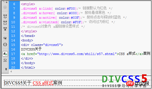
The above is the detailed content of Organize the usage of a tag. For more information, please follow other related articles on the PHP Chinese website!

Hot AI Tools

Undresser.AI Undress
AI-powered app for creating realistic nude photos

AI Clothes Remover
Online AI tool for removing clothes from photos.

Undress AI Tool
Undress images for free

Clothoff.io
AI clothes remover

AI Hentai Generator
Generate AI Hentai for free.

Hot Article
Hot Tools

Notepad++7.3.1
Easy-to-use and free code editor

SublimeText3 Chinese version
Chinese version, very easy to use

Zend Studio 13.0.1
Powerful PHP integrated development environment

Dreamweaver CS6
Visual web development tools

SublimeText3 Mac version
God-level code editing software (SublimeText3)
Hot Topics
 1385
1385
 52
52

 How to use bootstrap in vue
Apr 07, 2025 pm 11:33 PM
How to use bootstrap in vue
Apr 07, 2025 pm 11:33 PM
Using Bootstrap in Vue.js is divided into five steps: Install Bootstrap. Import Bootstrap in main.js. Use the Bootstrap component directly in the template. Optional: Custom style. Optional: Use plug-ins.
 The Roles of HTML, CSS, and JavaScript: Core Responsibilities
Apr 08, 2025 pm 07:05 PM
The Roles of HTML, CSS, and JavaScript: Core Responsibilities
Apr 08, 2025 pm 07:05 PM
HTML defines the web structure, CSS is responsible for style and layout, and JavaScript gives dynamic interaction. The three perform their duties in web development and jointly build a colorful website.
 How to write split lines on bootstrap
Apr 07, 2025 pm 03:12 PM
How to write split lines on bootstrap
Apr 07, 2025 pm 03:12 PM
There are two ways to create a Bootstrap split line: using the tag, which creates a horizontal split line. Use the CSS border property to create custom style split lines.
 Understanding HTML, CSS, and JavaScript: A Beginner's Guide
Apr 12, 2025 am 12:02 AM
Understanding HTML, CSS, and JavaScript: A Beginner's Guide
Apr 12, 2025 am 12:02 AM
WebdevelopmentreliesonHTML,CSS,andJavaScript:1)HTMLstructurescontent,2)CSSstylesit,and3)JavaScriptaddsinteractivity,formingthebasisofmodernwebexperiences.
 How to resize bootstrap
Apr 07, 2025 pm 03:18 PM
How to resize bootstrap
Apr 07, 2025 pm 03:18 PM
To adjust the size of elements in Bootstrap, you can use the dimension class, which includes: adjusting width: .col-, .w-, .mw-adjust height: .h-, .min-h-, .max-h-
 How to set up the framework for bootstrap
Apr 07, 2025 pm 03:27 PM
How to set up the framework for bootstrap
Apr 07, 2025 pm 03:27 PM
To set up the Bootstrap framework, you need to follow these steps: 1. Reference the Bootstrap file via CDN; 2. Download and host the file on your own server; 3. Include the Bootstrap file in HTML; 4. Compile Sass/Less as needed; 5. Import a custom file (optional). Once setup is complete, you can use Bootstrap's grid systems, components, and styles to create responsive websites and applications.
 How to insert pictures on bootstrap
Apr 07, 2025 pm 03:30 PM
How to insert pictures on bootstrap
Apr 07, 2025 pm 03:30 PM
There are several ways to insert images in Bootstrap: insert images directly, using the HTML img tag. With the Bootstrap image component, you can provide responsive images and more styles. Set the image size, use the img-fluid class to make the image adaptable. Set the border, using the img-bordered class. Set the rounded corners and use the img-rounded class. Set the shadow, use the shadow class. Resize and position the image, using CSS style. Using the background image, use the background-image CSS property.
 How to use bootstrap button
Apr 07, 2025 pm 03:09 PM
How to use bootstrap button
Apr 07, 2025 pm 03:09 PM
How to use the Bootstrap button? Introduce Bootstrap CSS to create button elements and add Bootstrap button class to add button text
