box-sizing + negative margin upgrade double flying wing layout

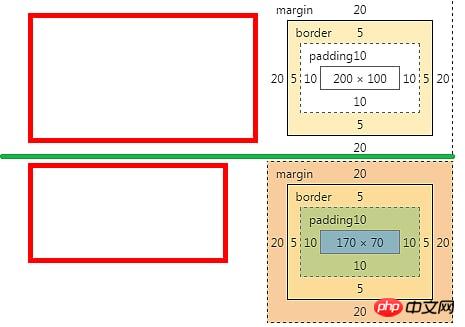
.content-size, .border-size{width: 200px;height: 100px;padding: 10px;border: 5px solid red;margin: 20px;
}.content-size{box-sizing: content-box;
}.border-size{box-sizing: border-box;
}The width, height, padding, border, and margin values of the two classes of context-size and border-size are the same.
box-sizing: content-box, the width and height of the div are the values of width and height
box-sizing: border- box, the width and height of the div are padding + border + width (content height)
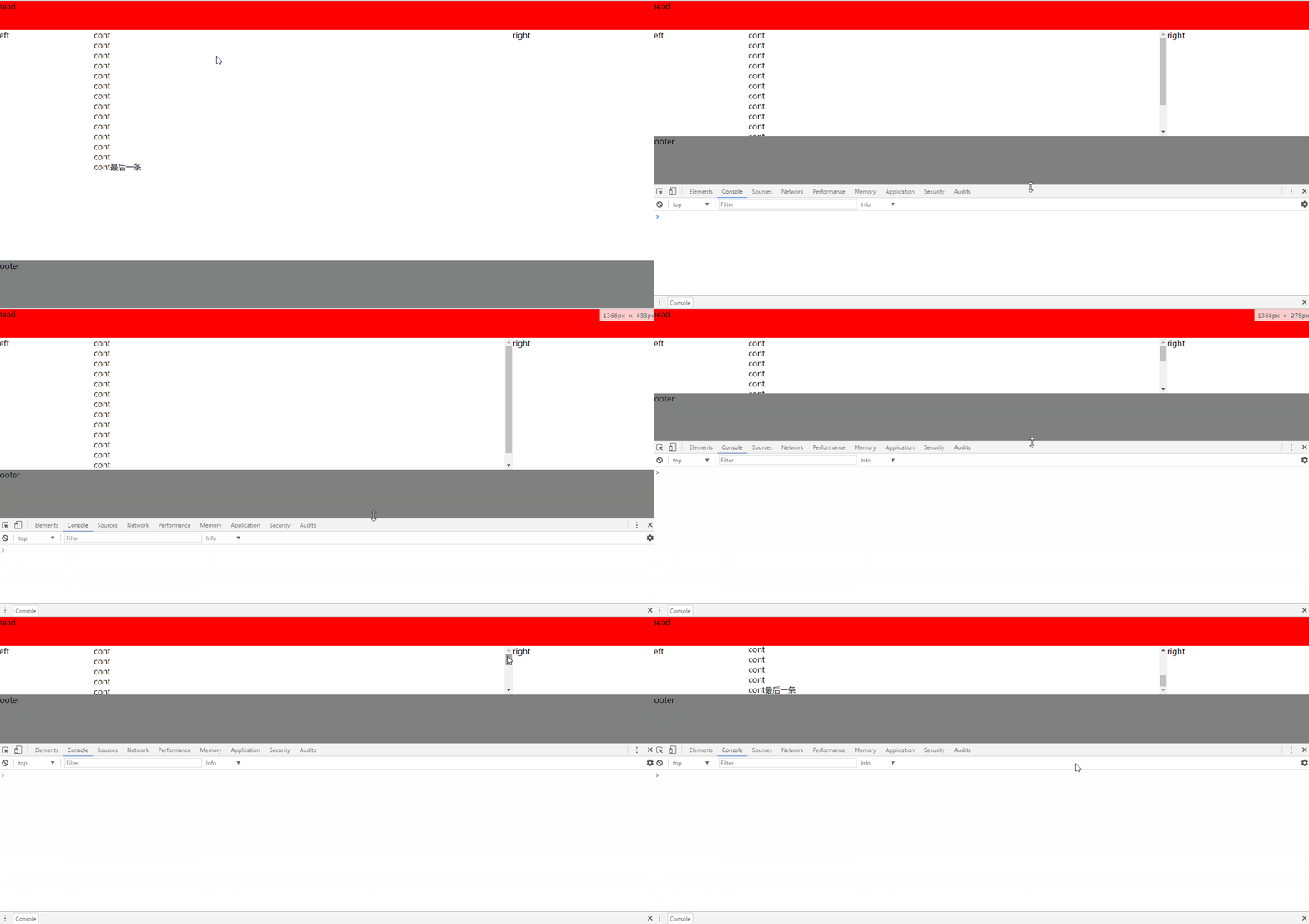
Transformation of the double-wing layout , the traditional double flight height is adaptive. This time, the height of the double-wing layout is fixed through the border-box value of the box-sizing attribute, so that the head and footer are fixed, and the scroll bar automatically appears in the middle content part.
<html><head><meta charset="UTF-8"><title>Document</title><style>div, body{margin: 0px;} .head{ height: 60px; background: red; } .main { height: 100%; clear: both; box-sizing: border-box; padding: 60px 0px 100px 0px; margin: -60px 0px -100px 0px; } .main-main{ clear: both; } .main-main:after{ content: ''; display: block; overflow: hidden; clear: both; } .cont-main{ margin: 0px 300px 0px 200px; overflow: hidden; overflow-y: auto; height: inherit; } .main .cont, .main .left, .main .right{ float: left; height: 100%; } .main .cont{ width: 100%; } .main .left{width: 200px;margin-left: -100%; } .main .right{width: 300px;margin-left: -300px; } .footer{ height: 100px; background: gray; }</style></head><body><div class="head">head</div><div class="main"><div class="main-main"><div class="cont"><div class="cont-main">cont<br/>cont<br/>cont<br/>cont<br/>cont<br/>cont<br/>cont<br/>cont<br/>cont<br/>cont<br/>cont<br/>cont<br/>cont<br/>cont最后一条<br/></div></div><div class="left">left</div><div class="right">right</div></div></div><div class="footer">footer</div></body></html>Rendering:

To achieve the traditional double-flying wing layout, I will not go into details here.
According to the introduction of the box-sizing attribute, you can know that when set to border-box, its height = padding + border value, and the negative value of margin needs to be used.
padding reduces the height of the content itself
margin negative The value brings the distance between the head, footer and content closer The outermost div of the part, such as .main) must be set to height:100% so that its height fills the screen. Therefore, a div (such as .main-main) needs to be added to the outer layer of the content layout. At this time, the height of .main-main is what we want. The following middle body part contains the css code:
.main {  height: 100%;  clear: both;  box-sizing: border-box;  padding: 60px 0px 100px 0px;  margin: -60px 0px -100px 0px;
}The above is the detailed content of Detailed explanation of the transformation and use of the double flying wing layout. For more information, please follow other related articles on the PHP Chinese website!
 What does margin mean in css
 The reason why header function returns 404 failure
 python environment variable configuration
 How to use the norm function in python
 sublime runs js code
 How to open Windows 7 Explorer
 How to buy Bitcoin
 Where are the number of online viewers at station b?
 float usage in css


