

Example code for forms in bootstrap

1. Basic form: For the basic form, Bootstrap did not do much customized effect design, only customized the fieldset, legend, and label tags in the form.


fieldset {
min-width: 0;
padding: 0;
margin: 0;
border: 0;
}
legend {
display: block;
width: 100%;
padding: 0;
margin-bottom: 20px;
font-size: 21px;
line-height: inherit;
color: #333;
border: 0;
border-bottom: 1px solid #e5e5e5;
}

label {
display: inline-block;
margin-bottom: 5px;
font-weight: bold;
}2. Horizontal form class name “form-horizontal”


 ##
##.form-horizontal .control-label,
.form-horizontal .radio,
.form-horizontal .checkbox,
.form-horizontal .radio-inline,
.form-horizontal .checkbox-inline {
padding-top: 7px;
margin-top: 0;
margin-bottom: 0;
}
.form-horizontal .radio,
.form-horizontal .checkbox {
min-height: 27px;
}
.form-horizontal .form-group {
margin-right: -15px;
margin-left: -15px;
}
.form-horizontal .form-control-static {
padding-top: 7px;
}
@media (min-width: 768px) {
.form-horizontal .control-label {
text-align: right;
}
}
.form-horizontal .has-feedback .form-control-feedback {
top: 0;
right: 15px;
}


 Example
1.Input box input: for To make the control style correct in various form styles, you need to add the class name "form-control". Each form control below can be added.


nbsp;html>


    <meta>
    <title>表单控件——输入框input</title>
    <link>

 Example
 Example
3.内联表单 类名“form-inline”


ea:添加了类名“form-control”类名,则无需设置cols属性。


示例
4.复选框checkbox和单选择按钮radio:水平排列加类名“checkbox-inline”||类名“radio-inline”


4.复选框checkbox和单选择按钮radio:水平排列加类名“checkbox-inline”||类名“radio-inline”


nbsp;html>


    <meta>
    <title>表单控件——表单控件大小</title>
    <link>


.radio,
.checkbox {
display: block;
min-height: 20px;
padding-left: 20px;
margin-top: 10px;
margin-bottom: 10px;
}
.radio label,
.checkbox label {
display: inline;
font-weight: normal;
cursor: pointer;
}
.radio input[type="radio"],
.radio-inline input[type="radio"],
.checkbox input[type="checkbox"],
.checkbox-inline input[type="checkbox"] {
float: left;
margin-left: -20px;
}
.radio + .radio,
.checkbox + .checkbox {
margin-top: -5px;
}

.radio-inline,
.checkbox-inline {
display: inline-block;
padding-left: 20px;
margin-bottom: 0;
font-weight: normal;
vertical-align: middle;
cursor: pointer;
}
.radio-inline + .radio-inline,
.checkbox-inline + .checkbox-inline {
margin-top: 0;
margin-left: 10px;
}5.控件大小:类名input-sm:让控件比正常大小更小;类名input-lg:让控件比正常大小更大;宽度配合Bootstrap的网格系统


.input-sm {
height: 30px;
padding: 5px 10px;
font-size: 12px;
line-height: 1.5;
border-radius: 3px;
}
select.input-sm {
height: 30px;
line-height: 30px;
}
textarea.input-sm,
select[multiple].input-sm {
height: auto;
}
.input-lg {
height: 46px;
padding: 10px 16px;
font-size: 18px;
line-height: 1.33;
border-radius: 6px;
}
select.input-lg {
height: 46px;
line-height: 46px;
}
textarea.input-lg,
select[multiple].input-lg {
height: auto;
}6.表单控件状态(焦点状态):类名form-control


.form-control:focus {
border-color: #66afe9;
outline: 0;
  -webkit-box-shadow: inset 0 1px 1pxrgba(0,0,0,.075), 0 0 8px rgba(102, 175, 233, .6);
box-shadow: inset 0 1px 1pxrgba(0,0,0,.075), 0 0 8px rgba(102, 175, 233, .6);
}7.表单控件状态(禁用状态):form-control别忘记加①在需要禁用的表单控件上加上“disabled”;②fieldset设置了disabled属性,整个域都将处于被禁用状态。


.form-control[disabled],
.form-control[readonly],
fieldset[disabled] .form-control {
cursor: not-allowed;
background-color: #eee;
opacity: 1;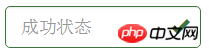
}8.表单控件状态(验证状态):1、.has-warning:警告状态(黄色) 2、.has-error:错误状态(红色) 3、.has-success:成功状态(绿色)


 :需要类名has-feedback +
9.表单提示信息:"help-block" 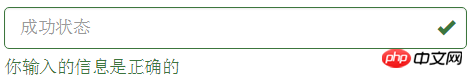


.help-block {
display: block;
margin-top: 5px;
margin-bottom: 10px;
color: #737373;
}按钮
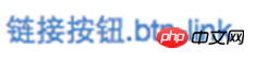
建议使用button或a标签来制作按钮
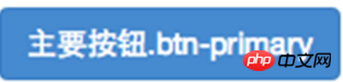
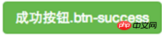
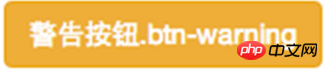
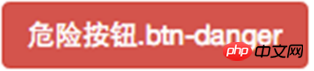
1.基本按钮:类名“btn”


.btn {
display: inline-block;
padding: 6px 12px;
margin-bottom: 0;
font-size: 14px;
font-weight: normal;
line-height: 1.42857143;
text-align: center;
white-space: nowrap;
vertical-align: middle;
cursor: pointer;
  -webkit-user-select: none;
     -moz-user-select: none;
      -ms-user-select: none;
user-select: none;
background-image: none;
border: 1px solid transparent;
border-radius: 4px;
}2.默认按钮: 类名“btn” + 类名“btn-default” 


.btn-default {
color: #333;
background-color: #fff;
border-color: #ccc;
}

4.按钮大小: .btn-lg:大型按钮 .btn-sm:小型按钮 .btn-cs:超小型按钮


.btn-lg,
.btn-group-lg> .btn {
padding: 10px 16px;
font-size: 18px;
line-height: 1.33;
border-radius: 6px;
}
.btn-sm,
.btn-group-sm> .btn {
padding: 5px 10px;
font-size: 12px;
line-height: 1.5;
border-radius: 3px;
}
.btn-xs,
.btn-group-xs> .btn {
padding: 1px 5px;
font-size: 12px;
line-height: 1.5;
border-radius: 3px;
}5.块状按钮: 类名“btn-block”
6.禁用状态: 使用disabled类或disabled属性
图像 1.img-responsive:响应式图片,主要针对于响应式设计 2.img-rounded:圆角图片 3.img-circle:圆形图片 4.img-thumbnail:缩略图片


img {
vertical-align: middle;
}
.img-responsive,
.thumbnail>img,
.thumbnail a >img,
.carousel-inner > .item >img,
.carousel-inner > .item > a >img {
display: block;
max-width: 100%;
height: auto;
}
.img-rounded {
border-radius: 6px;
}
.img-thumbnail {
display: inline-block;
max-width: 100%;
height: auto;
padding: 4px;
line-height: 1.42857143;
background-color: #fff;
border: 1px solid #ddd;
border-radius: 4px;
  -webkit-transition: all .2s ease-in-out;
transition: all .2s ease-in-out;
}
.img-circle {
border-radius: 50%;
}图标
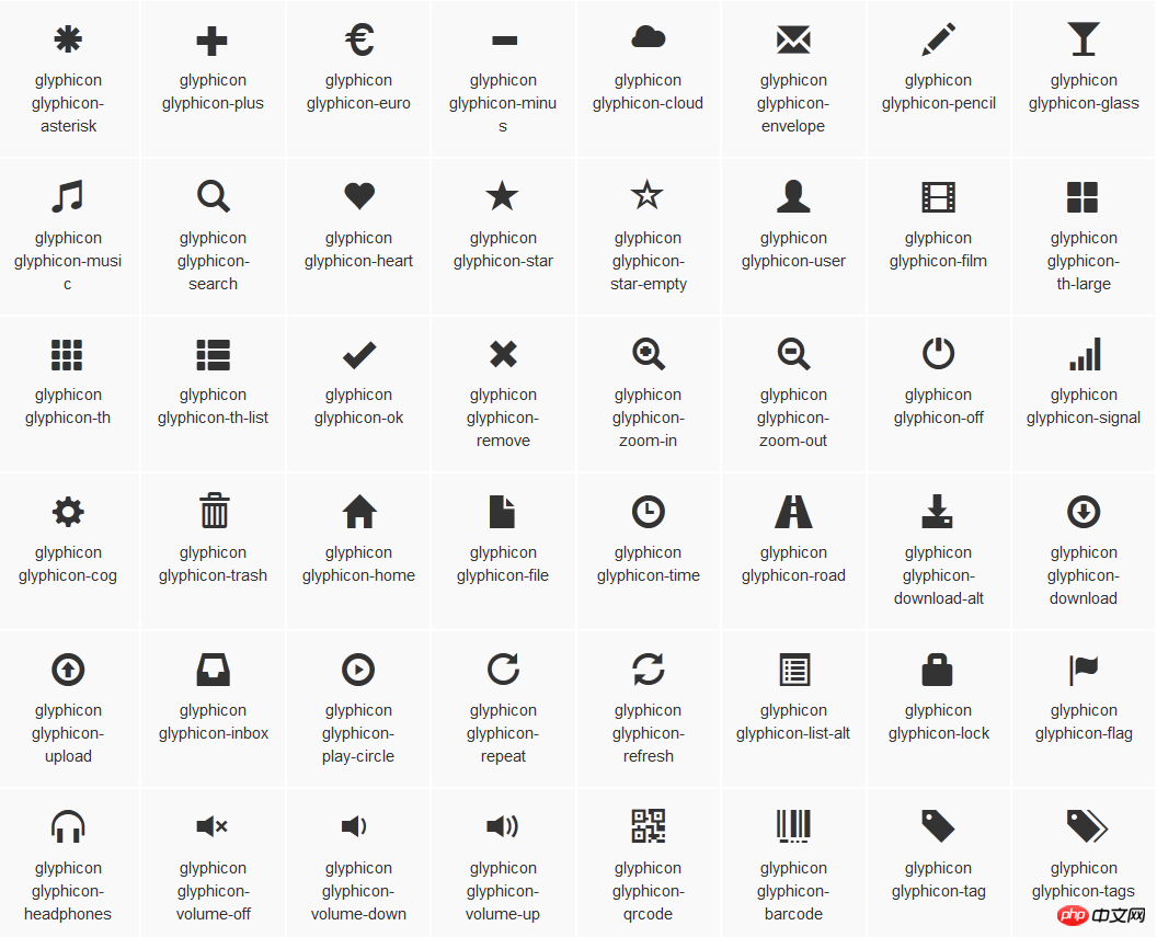
:查看全部图标

@font-face {
font-family: 'Glyphicons Halflings';
src: url('../fonts/glyphicons-halflings-regular.eot');
src: url('../fonts/glyphicons-halflings-regular.eot?#iefix') format('embedded-opentype'), url('../fonts/glyphicons-halflings-regular.woff') format('woff'), url('../fonts/glyphicons-halflings-regular.ttf') format('truetype'), url('../fonts/glyphicons-halflings-regular.svg#glyphicons_halflingsregular') format('svg');
}

<!--使用-->
.glyphicon {
position: relative;
top: 1px;
display: inline-block;
font-family: 'Glyphicons Halflings';
font-style: normal;
font-weight: normal;
line-height: 1;
  -webkit-font-smoothing: antialiased;
  -moz-osx-font-smoothing: grayscale;
}
.glyphicon-asterisk:before {
content: "\2a";
}
The above is the detailed content of Example code for forms in bootstrap. For more information, please follow other related articles on the PHP Chinese website!

Hot AI Tools

Undresser.AI Undress
AI-powered app for creating realistic nude photos

AI Clothes Remover
Online AI tool for removing clothes from photos.

Undress AI Tool
Undress images for free

Clothoff.io
AI clothes remover

AI Hentai Generator
Generate AI Hentai for free.

Hot Article
Hot Tools

Notepad++7.3.1
Easy-to-use and free code editor

SublimeText3 Chinese version
Chinese version, very easy to use

Zend Studio 13.0.1
Powerful PHP integrated development environment

Dreamweaver CS6
Visual web development tools

SublimeText3 Mac version
God-level code editing software (SublimeText3)
Hot Topics
 1385
1385
 52
52

 How to get the bootstrap search bar
Apr 07, 2025 pm 03:33 PM
How to get the bootstrap search bar
Apr 07, 2025 pm 03:33 PM
How to use Bootstrap to get the value of the search bar: Determines the ID or name of the search bar. Use JavaScript to get DOM elements. Gets the value of the element. Perform the required actions.
 How to use bootstrap in vue
Apr 07, 2025 pm 11:33 PM
How to use bootstrap in vue
Apr 07, 2025 pm 11:33 PM
Using Bootstrap in Vue.js is divided into five steps: Install Bootstrap. Import Bootstrap in main.js. Use the Bootstrap component directly in the template. Optional: Custom style. Optional: Use plug-ins.
 How to write split lines on bootstrap
Apr 07, 2025 pm 03:12 PM
How to write split lines on bootstrap
Apr 07, 2025 pm 03:12 PM
There are two ways to create a Bootstrap split line: using the tag, which creates a horizontal split line. Use the CSS border property to create custom style split lines.
 How to do vertical centering of bootstrap
Apr 07, 2025 pm 03:21 PM
How to do vertical centering of bootstrap
Apr 07, 2025 pm 03:21 PM
Use Bootstrap to implement vertical centering: flexbox method: Use the d-flex, justify-content-center, and align-items-center classes to place elements in the flexbox container. align-items-center class method: For browsers that do not support flexbox, use the align-items-center class, provided that the parent element has a defined height.
 How to resize bootstrap
Apr 07, 2025 pm 03:18 PM
How to resize bootstrap
Apr 07, 2025 pm 03:18 PM
To adjust the size of elements in Bootstrap, you can use the dimension class, which includes: adjusting width: .col-, .w-, .mw-adjust height: .h-, .min-h-, .max-h-
 How to set up the framework for bootstrap
Apr 07, 2025 pm 03:27 PM
How to set up the framework for bootstrap
Apr 07, 2025 pm 03:27 PM
To set up the Bootstrap framework, you need to follow these steps: 1. Reference the Bootstrap file via CDN; 2. Download and host the file on your own server; 3. Include the Bootstrap file in HTML; 4. Compile Sass/Less as needed; 5. Import a custom file (optional). Once setup is complete, you can use Bootstrap's grid systems, components, and styles to create responsive websites and applications.
 How to insert pictures on bootstrap
Apr 07, 2025 pm 03:30 PM
How to insert pictures on bootstrap
Apr 07, 2025 pm 03:30 PM
There are several ways to insert images in Bootstrap: insert images directly, using the HTML img tag. With the Bootstrap image component, you can provide responsive images and more styles. Set the image size, use the img-fluid class to make the image adaptable. Set the border, using the img-bordered class. Set the rounded corners and use the img-rounded class. Set the shadow, use the shadow class. Resize and position the image, using CSS style. Using the background image, use the background-image CSS property.
 What to do if the Bootstrap Table uses AJAX to get data garbled
Apr 07, 2025 am 11:54 AM
What to do if the Bootstrap Table uses AJAX to get data garbled
Apr 07, 2025 am 11:54 AM
Solutions to the garbled code of Bootstrap Table when using AJAX to obtain data from the server: 1. Set the correct character encoding of the server-side code (such as UTF-8). 2. Set the request header in the AJAX request and specify the accepted character encoding (Accept-Charset). 3. Use the "unescape" converter of the Bootstrap Table to decode the escaped HTML entity into original characters.
