Most of the website pages we see will divide a page into a header block, a content block and a footer block. When the header block and content block have less content, Footers can be anchored to the bottom of the screen rather than following the flow of the document. When there is a lot of content on the page, the footer can automatically expand with the flow of the document and be displayed at the bottom of the page. This is the Sticky footer layout.
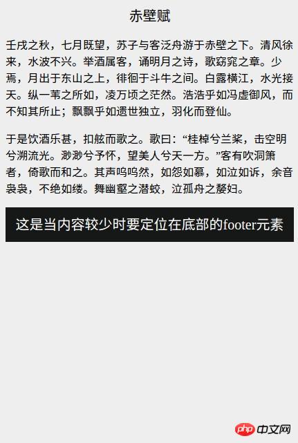
When the content is small, the normal document flow effect is as follows

In normal document flow, when the page content is small, the footer part is not fixed at the bottom of the window. In this case, the Stickyfooter layout must be used.
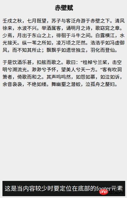
The layout effect of Sticky footer is as shown below

This is in line with our expected effect, as you can see The application scenarios of sticky footer layout are still very wide.
html code:
<div class="wrapper clearfix"><div class="content"> // 这里是页面内容</div> </div><div class="footer">// 这里是footer的内容</div>
css code:
.wrapper {min-height: 100%;}.wrapper .content{padding-bottom: 50px; /* footer区块的高度 */}.footer {position: relative;margin-top: -50px; /* 使footer区块正好处于content的padding-bottom位置 */height: 50px;clear: both;}.clearfix::after {display: block;content: ".";height: 0;clear: both;visibility: hidden;}Note: The
padding-bottomof thecontentelement, the height of thefooterelement and thefooterelementmargin-topThe value must be consistent.
This negative margin layout method is the most compatible layout scheme. All major browsers are perfectly compatible and suitable for various scenarios. However, the prerequisite for using this method is that Know the height of the footer element, and the structure is relatively complex.
html code:
<div class="wrapper"><div class="content">这里是主要内容</div><div class="footer">这是页脚区块</div> </div>
css code:
.wrapper {display: flex;flex-direction: column;min-height: 100vh;}.content {flex: 1;}.footer {flex: 0;}This layout The method has a simple structure and a small amount of code, and is also a recommended layout method.
Sticky footer layout is a very common page layout form, and there are many ways to implement it. The above two methods are the most commonly used and can basically meet all application scenarios.
The above is the detailed content of What is the layout of Sticky footer?. For more information, please follow other related articles on the PHP Chinese website!
 How to download and save today's headline videos
 The difference between windows hibernation and sleep
 How to solve Java large file read exception
 what is dandelion
 What are the benefits of java factory pattern
 What does Linux mean?
 Introduction to SSL detection tools
 What are the data backup software?
 How to unlock android permission restrictions


